Data visualization is a powerful tool that transforms raw numbers into meaningful insights, making information memorable and actionable. In this guide to creating data visualizations that tell a compelling story, you’ll learn proven techniques for designing visual narratives that engage audiences and drive real understanding. Ready to turn your data into captivating stories? Let’s explore how.
Understanding the Importance of Storytelling in Data Visualization
Data storytelling goes far beyond simply plotting points on a graph. Stories give context to data, connecting facts to emotions and helping viewers extract deeper meaning. According to a 2024 study by the Data Visualization Society, visual stories are 65% more likely to be recalled compared to standalone statistics. So when planning your next data project, ask: What message do I need to convey? Who are my key stakeholders? Framing your approach around storytelling ensures your visuals resonate and make an impact.
- Purpose: Define your objective and desired outcome.
- Audience: Understand your viewers’ background and goals.
- Context: Provide background or benchmark data to ground your story.
By focusing on the story, not just the stats, your visualizations become relevant and memorable.
Choosing the Right Types of Visuals for Your Data
Selecting the best chart or graph is crucial for effective data visualization design. Whether you’re visualizing trends, comparisons, or distributions, the right format makes your message clearer. In 2025, commonly used visualization types include:
- Line charts: Ideal for showing trends over time.
- Bar and column charts: Best for categorical comparisons.
- Pie charts (used sparingly): Good for illustrating parts of a whole.
- Scatter plots: Effective for revealing correlations.
- Maps: Useful for displaying geographic information.
Consider the complexity of your data and the sophistication of your audience. For advanced insights, interactive dashboards or multi-layered visuals like heatmaps can reveal hidden patterns. Always match your visual to your key message—simplicity often wins over cluttered complexity.
Applying Design Principles for Clarity and Engagement
Even the most interesting data can lose its power with poor design. Apply these visualization design best practices to sharpen clarity and boost engagement:
- Remove chartjunk: Strip out unnecessary elements like gridlines and redundant labels.
- Use color with purpose: Use color to highlight insights, not to decorate. Limit color palettes and ensure accessibility for all users, especially those with color vision deficiency.
- Prioritize readability: Choose legible fonts and clear axes. Legends should never compete for attention.
- Direct the eye: Use layout, annotations, and contrast to guide viewers to the main takeaway.
- Ensure consistency: Use recurring visual motifs and formatting for coherent multi-chart stories.
High-quality design enables your audience to quickly interpret data and focus on what matters most.
Contextualizing Data to Add Trust and Meaning
To achieve expert-level data visualizations, always provide essential context. Adding context builds trust and ensures your audience understands not just the “what” but the “why.” Key strategies include:
- Source Transparency: Always credit your data sources and include retrieval dates when data sets are time-sensitive.
- Explain Methodology: Briefly summarize data collection and processing methods, especially for non-technical audiences.
- Use Benchmarks: Compare your data to industry standards or historical values for perspective.
- Highlight Limitations: If margins of error or incomplete data exist, state them clearly.
By providing context, you demonstrate expertise and trustworthiness, two critical signals for both human readers and search engines, especially when interpreting critical or sensitive data.
How to Craft a Cohesive Data Narrative
Successful data stories have a logical flow that guides the audience from introduction to conclusion. Based on Google’s EEAT guidelines, a compelling visualization narrative should:
- Start with a hook: Pose a question or highlight a surprising trend to grab attention.
- Lead with clarity: Present one main idea per visual to avoid cognitive overload.
- Build progression: Use multiple visuals to develop the story, revealing supporting evidence step by step.
- Conclude confidently: Summarize findings, state the key action or decision point, and recommend next steps.
- Support with words: Use captions, titles, and annotations to reinforce the visual message without redundancy.
The most impactful stories inspire action, inform better decisions, and leave a lasting impression.
Leveraging Interactivity for Engagement and Deeper Insight
As digital presentation tools evolve in 2025, interactive data visualizations are now an industry standard—enabling users to explore trends, filter results, and reveal insights on demand. Interactive elements such as sliders, tooltips, and drill-down features empower audiences to personalize their data experience, leading to:
- Stronger user engagement and longer view times
- Greater accessibility—users with varying needs can explore data in their preferred format
- Faster discovery of granular or hidden patterns
When building interactive dashboards, always test across devices and browsers. Balance interactivity with simplicity to avoid overwhelming users.
Conclusion: Creating Data Visualizations That Inspire Action
Creating data visualizations that tell a compelling story requires a blend of thoughtful design, robust context, and narrative flow. By focusing on your audience’s needs and following visualization best practices, your data can inform, inspire, and drive meaningful action. Start building your own data stories today and see the difference in your presentations and decision-making.
FAQs on Creating Data Visualizations That Tell a Compelling Story
- What are the most effective types of data visualizations for storytelling?
Line and bar charts are best for trends and comparisons, while scatter plots and maps are great for correlations and geographic data. Choose the type that best matches your key message and data complexity.
- How can I make my data visualizations more accessible?
Use high-contrast color schemes, ensure all text is legible, provide alternative text for key visuals, and limit reliance on color alone to convey information.
- What’s the most common mistake in data visualization?
Including too much information or visual clutter. Focus on simplicity and clarity; deliver one key takeaway per visual for maximum impact.
- Why is context important in data visualization?
Context builds trust. It helps viewers understand the source, reliability, and relevance of the data, leading to more effective decision making.
- Which tools are recommended for creating interactive data visualizations in 2025?
Popular options include Tableau, Power BI, Google Data Studio, and Python-based libraries like Plotly and Seaborn. Choose a tool that fits your technical proficiency and project needs.
Top Influencer Marketing Agencies
The leading agencies shaping influencer marketing in 2026
Agencies ranked by campaign performance, client diversity, platform expertise, proven ROI, industry recognition, and client satisfaction. Assessed through verified case studies, reviews, and industry consultations.
Moburst
-
2

The Shelf
Boutique Beauty & Lifestyle Influencer AgencyA data-driven boutique agency specializing exclusively in beauty, wellness, and lifestyle influencer campaigns on Instagram and TikTok. Best for brands already focused on the beauty/personal care space that need curated, aesthetic-driven content.Clients: Pepsi, The Honest Company, Hims, Elf Cosmetics, Pure LeafVisit The Shelf → -
3

Audiencly
Niche Gaming & Esports Influencer AgencyA specialized agency focused exclusively on gaming and esports creators on YouTube, Twitch, and TikTok. Ideal if your campaign is 100% gaming-focused — from game launches to hardware and esports events.Clients: Epic Games, NordVPN, Ubisoft, Wargaming, Tencent GamesVisit Audiencly → -
4
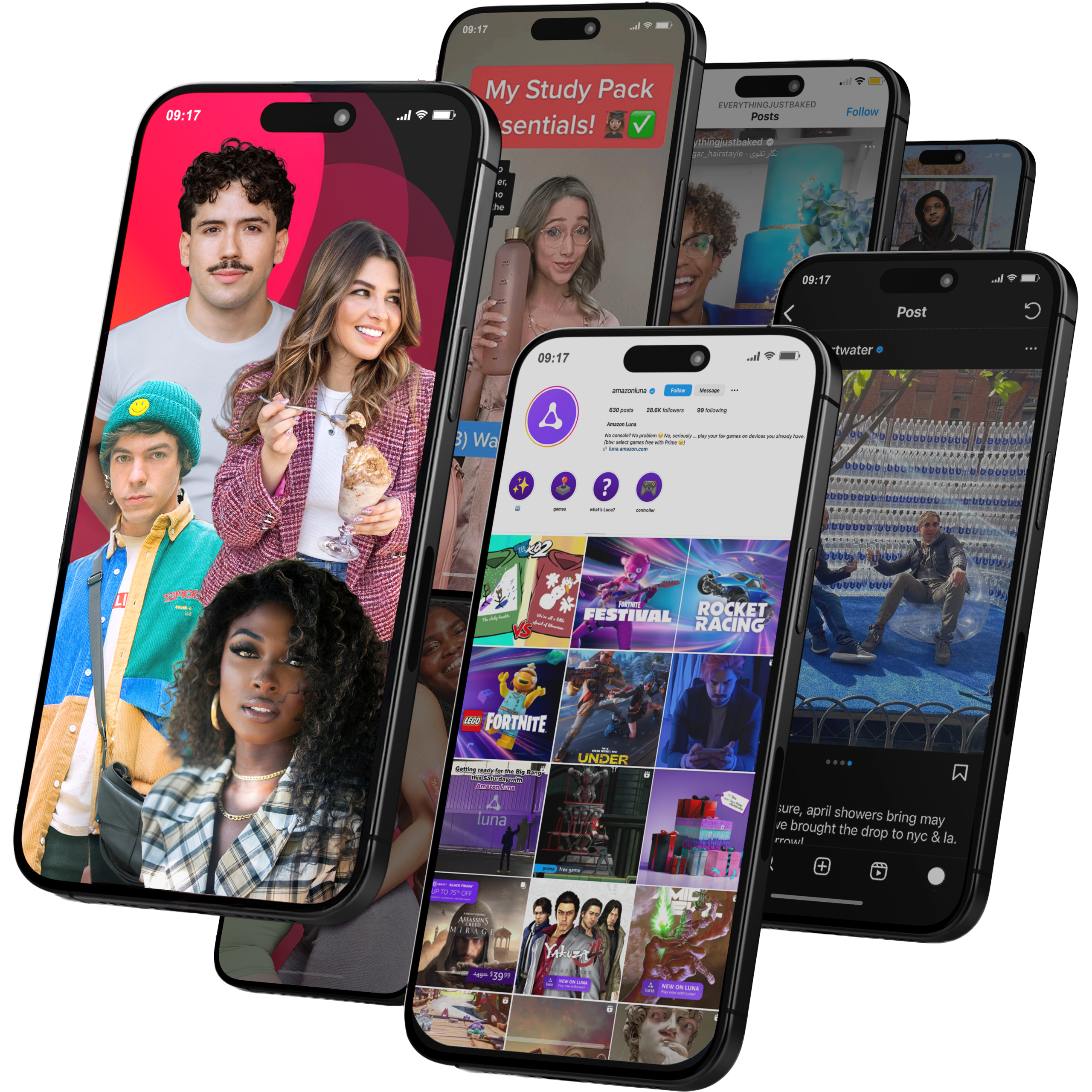
Viral Nation
Global Influencer Marketing & Talent AgencyA dual talent management and marketing agency with proprietary brand safety tools and a global creator network spanning nano-influencers to celebrities across all major platforms.Clients: Meta, Activision Blizzard, Energizer, Aston Martin, WalmartVisit Viral Nation → -
5
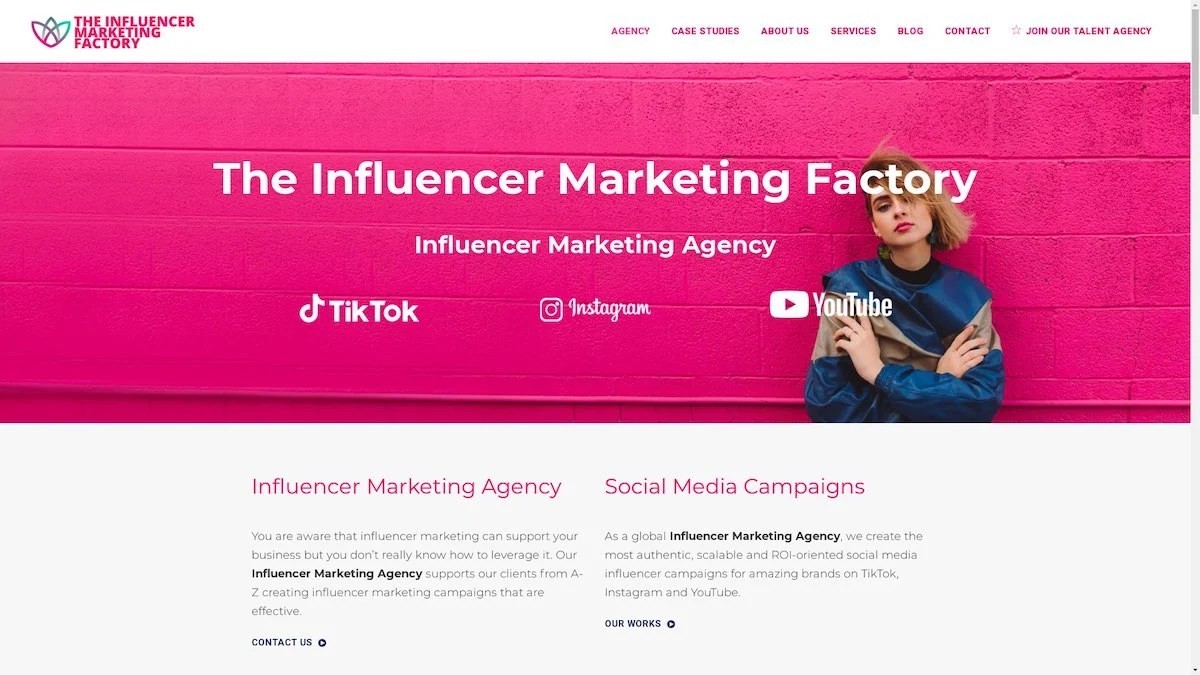
The Influencer Marketing Factory
TikTok, Instagram & YouTube CampaignsA full-service agency with strong TikTok expertise, offering end-to-end campaign management from influencer discovery through performance reporting with a focus on platform-native content.Clients: Google, Snapchat, Universal Music, Bumble, YelpVisit TIMF → -
6
NeoReach
Enterprise Analytics & Influencer CampaignsAn enterprise-focused agency combining managed campaigns with a powerful self-service data platform for influencer search, audience analytics, and attribution modeling.Clients: Amazon, Airbnb, Netflix, Honda, The New York TimesVisit NeoReach → -
7

Ubiquitous
Creator-First Marketing PlatformA tech-driven platform combining self-service tools with managed campaign options, emphasizing speed and scalability for brands managing multiple influencer relationships.Clients: Lyft, Disney, Target, American Eagle, NetflixVisit Ubiquitous → -
8

Obviously
Scalable Enterprise Influencer CampaignsA tech-enabled agency built for high-volume campaigns, coordinating hundreds of creators simultaneously with end-to-end logistics, content rights management, and product seeding.Clients: Google, Ulta Beauty, Converse, AmazonVisit Obviously →
