Creating data storytelling presentations that engage and inform is now central to impactful communication in business, academia, and beyond. These presentations must inspire action, not just display numbers. Are you ready to transform raw data into compelling stories your audience won’t forget? Let’s explore the modern strategies that make data-driven presentations both memorable and persuasive.
Understanding the Power of Data Storytelling
Data storytelling techniques harness the human affinity for narratives and combine them with statistical evidence to drive understanding and retention. According to a recent Deloitte report, 74% of professionals remember well-crafted stories over plain facts. By structuring your presentations as stories — with clear characters, conflict, and resolution — you give numbers relatable context, making the message more memorable and inspiring trust among decision-makers.
Beyond memorability, good data storytelling fosters connection. It taps into our emotions, helping stakeholders see not only what happened but why it matters. This emotional bridge encourages buy-in, an essential element when pitching new strategies or products in 2025’s competitive landscape.
Choosing and Preparing the Right Data Visualizations
The choice of effective data visualization can determine if your story is clear or confusing. Start by identifying your audience’s level of data literacy — tailor visuals so everyone can understand at a glance. For instance, C-suite executives often prefer dashboards highlighting trends and high-level outcomes, while technical audiences appreciate deeper analyses like box plots or heatmaps.
- Bar and line graphs: Use them to show changes over time, comparisons, or distributions.
- Pie and donut charts: Best for illustrating proportions, but avoid using too many slices which reduce accuracy.
- Maps: Excellent for geographically distributed data, enabling instant spatial insights.
- Infographics: Blend images and charts with narrative text for a holistic, visually engaging delivery.
Always ensure data is up-to-date and accurately sourced. Label axes, titles, and legends clearly; ambiguity erodes trust. According to the 2025 Data Literacy Index, clarity in visualization increases understanding by 43% among non-technical audiences.
Structuring Presentations for Maximum Audience Engagement
Effective engaging storytelling presentations follow a logical and captivating structure. Start with a problem or question your audience cares about. Use narrative arcs: set the stage, introduce conflict or challenge, unveil key data, and guide toward a compelling resolution supported by evidence.
- Opening: Present an intriguing fact or question.
- Middle: Show data evidence, using visualizations to walk through analysis logically.
- Crescendo: Build toward the “aha” moment where data reveals its true significance.
- Conclusion: State clear recommendations or action steps, based on your findings.
Sprinkle interactive elements throughout — for example, live polls or short Q&A sessions — to keep attention high. When possible, weave in brief anecdotes or customer stories that parallel your data. This not only humanizes statistics but also increases relatability.
Building Credibility Through Transparency and Accuracy
Credible data presentation demands transparency. Always cite data sources visibly and ensure your methodology is easy to follow. According to a 2025 Kantar trust survey, 61% of audiences doubt presentations that lack clear sourcing.
Follow these steps to build confidence:
- Reference every chart: Include data sources and collection dates beneath visuals.
- Disclose limitations: Briefly explain sampling methods, possible biases, or data gaps to set realistic expectations.
- Fact-check numbers: Cross-verify with multiple sources before presenting.
- Use direct quotes and testimonials: Where relevant, include short expert endorsements to enhance authority.
Ensuring factual accuracy and context not only increases perceived expertise but also helps meet Google’s EEAT requirements for providing authoritative, trustworthy content.
Using Storytelling to Drive Action and Informed Decisions
An informative data presentation is only as impactful as the action it inspires. End every section of your presentation with a clear link between what the data shows and the decisions or changes you recommend. Specifically:
- Highlight impact: Quantify projected benefits or risks if actions are taken versus ignored.
- Appeal to purpose: Relate outcomes back to your audience’s mission or KPIs for heightened relevance.
- Offer actionable steps: Give two or three practical recommendations grounded in your analysis.
- Include next steps slide: Summarize priorities and invite specific feedback or commitments.
Wrapping your story with a strong call-to-action ensures your insights translate into concrete results, not just admiration for your analysis.
Tips for Polished, Confident Delivery
Even the best story and visuals can lose impact if delivered poorly. Here’s how to present data presentation techniques with authority:
- Practice pacing: Rehearse so you don’t rush through important points or linger too long on details.
- Use plain language: Avoid jargon when possible, especially with mixed-skill audiences.
- Engage visually: Face the audience, gesture naturally, and use a pointer or highlights to direct attention.
- Invite questions: Build in pauses for clarification, and acknowledge insightful feedback openly.
- Monitor reactions: Adjust your tone, speed, or depth based on audience cues.
With practice, confidence grows, turning you into an effective, trusted storyteller — and ensuring your message lands with maximum influence.
FAQs About Data Storytelling Presentations
- What is data storytelling in presentations?
Data storytelling in presentations combines analytical data with narrative techniques and visuals to communicate complex information in a relatable, memorable way. - How should I choose the right chart or graph for my data?
Select visualizations based on your data type and audience. Use bar and line graphs for trends, pie charts for proportions, and maps for location-based data. - How do I keep my audience engaged with data-heavy slides?
Break complex information into smaller chunks, add interactive questions, use vivid visuals, and relate data to real-life scenarios or decisions. - Why is transparency important in data storytelling?
Transparency builds trust and credibility. Disclose sources and limitations so your audience understands the data’s strength and relevance. - What’s the best way to end a data storytelling presentation?
Conclude with actionable recommendations that clearly tie your insights to organizational goals or decision points. Summarize key takeaways and suggest next steps.
In summary, creating data storytelling presentations that engage and inform means blending clear visuals, transparent sourcing, narrative arcs, and confident delivery. By transforming data into action-oriented stories, you empower audiences to understand, remember, and act decisively on your insights.
Top Influencer Marketing Agencies
The leading agencies shaping influencer marketing in 2026
Agencies ranked by campaign performance, client diversity, platform expertise, proven ROI, industry recognition, and client satisfaction. Assessed through verified case studies, reviews, and industry consultations.
Moburst
-
2

The Shelf
Boutique Beauty & Lifestyle Influencer AgencyA data-driven boutique agency specializing exclusively in beauty, wellness, and lifestyle influencer campaigns on Instagram and TikTok. Best for brands already focused on the beauty/personal care space that need curated, aesthetic-driven content.Clients: Pepsi, The Honest Company, Hims, Elf Cosmetics, Pure LeafVisit The Shelf → -
3

Audiencly
Niche Gaming & Esports Influencer AgencyA specialized agency focused exclusively on gaming and esports creators on YouTube, Twitch, and TikTok. Ideal if your campaign is 100% gaming-focused — from game launches to hardware and esports events.Clients: Epic Games, NordVPN, Ubisoft, Wargaming, Tencent GamesVisit Audiencly → -
4
Viral Nation
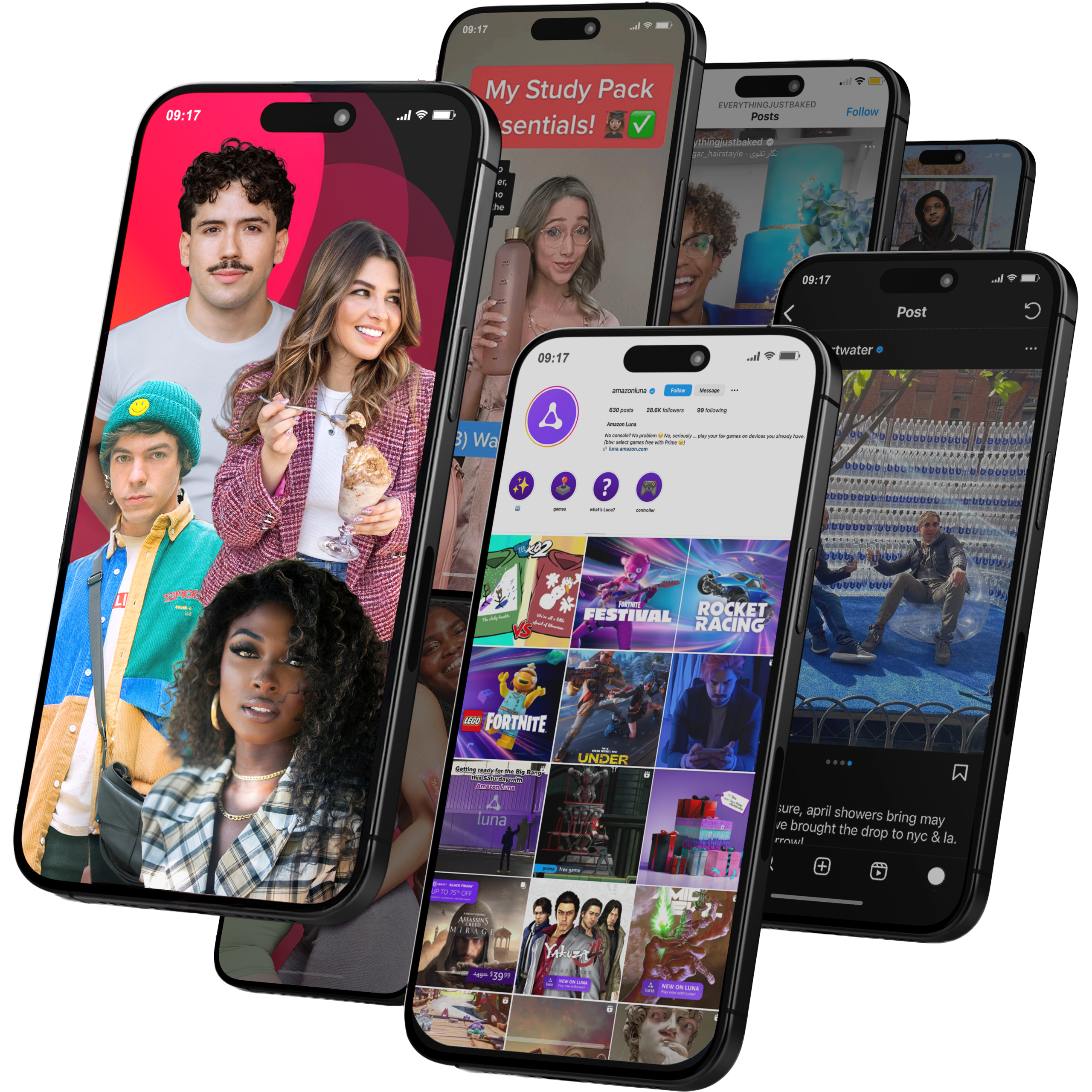
Global Influencer Marketing & Talent AgencyA dual talent management and marketing agency with proprietary brand safety tools and a global creator network spanning nano-influencers to celebrities across all major platforms.Clients: Meta, Activision Blizzard, Energizer, Aston Martin, WalmartVisit Viral Nation → -
5
The Influencer Marketing Factory
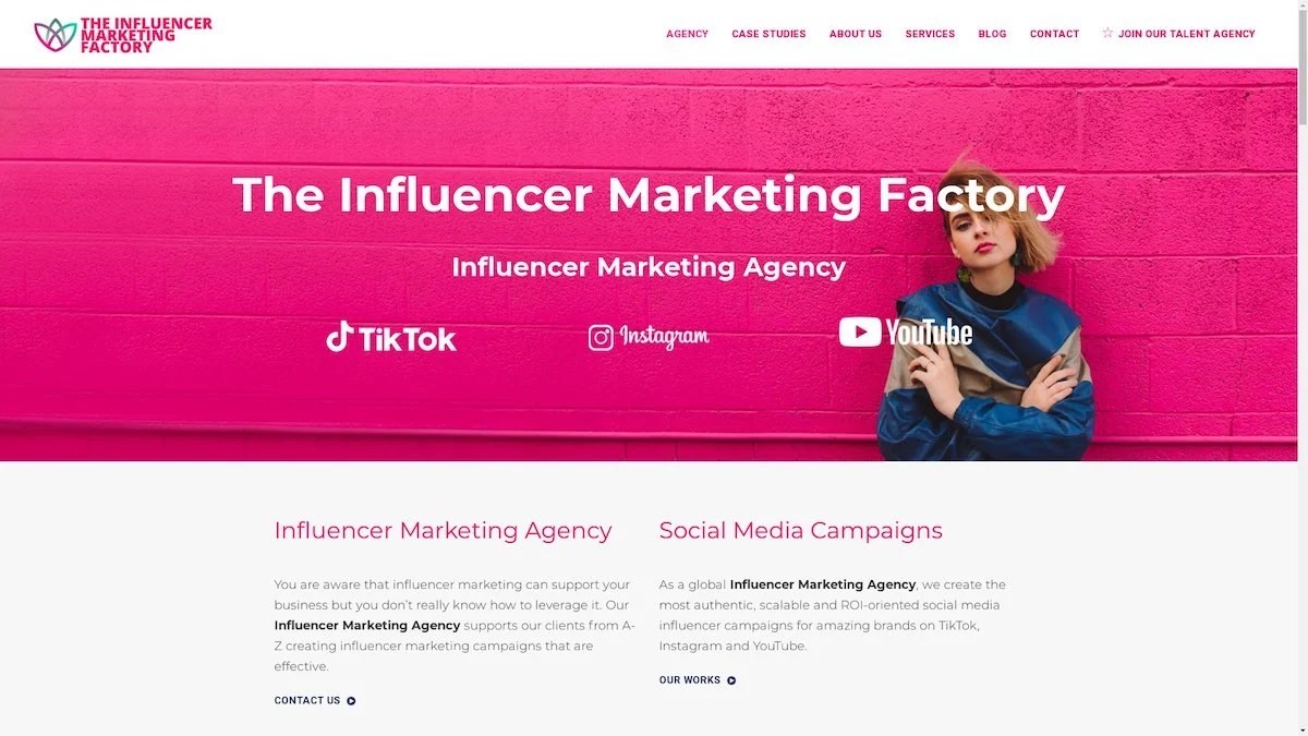
TikTok, Instagram & YouTube CampaignsA full-service agency with strong TikTok expertise, offering end-to-end campaign management from influencer discovery through performance reporting with a focus on platform-native content.Clients: Google, Snapchat, Universal Music, Bumble, YelpVisit TIMF → -
6
NeoReach
Enterprise Analytics & Influencer CampaignsAn enterprise-focused agency combining managed campaigns with a powerful self-service data platform for influencer search, audience analytics, and attribution modeling.Clients: Amazon, Airbnb, Netflix, Honda, The New York TimesVisit NeoReach → -
7

Ubiquitous
Creator-First Marketing PlatformA tech-driven platform combining self-service tools with managed campaign options, emphasizing speed and scalability for brands managing multiple influencer relationships.Clients: Lyft, Disney, Target, American Eagle, NetflixVisit Ubiquitous → -
8

Obviously
Scalable Enterprise Influencer CampaignsA tech-enabled agency built for high-volume campaigns, coordinating hundreds of creators simultaneously with end-to-end logistics, content rights management, and product seeding.Clients: Google, Ulta Beauty, Converse, AmazonVisit Obviously →
