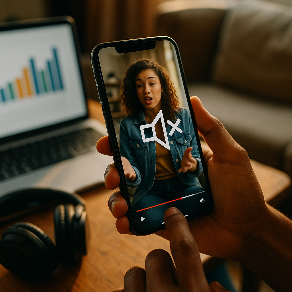
Designing High-Impact Audio Visuals For Sound-Off Mobile Environments is now a baseline skill for marketers, product teams, and creators who want attention in fast-scrolling feeds. In 2025, many mobile viewers default to mute, so your message must land through visuals first and audio second. This guide shows how to plan, design, test, and scale sound-off creative that still feels human—ready to upgrade your next campaign?
Sound-off mobile video strategy: start with viewer intent
Sound-off doesn’t mean “no story.” It means the story must be readable at a glance and complete without narration. Begin with the moments that matter: what the viewer needs to know in the first 1–2 seconds, what will keep them watching, and what action you want them to take.
Clarify the job-to-be-done before you design a single frame. Most sound-off views happen in micro-moments: commuting, waiting in line, watching in bed, or multitasking at work. These users want quick understanding, low effort, and obvious relevance.
Define one primary message per asset. If you try to communicate three benefits, none will survive the mute scroll. Make a single promise, then back it up with proof.
Answer follow-up questions inside the creative so viewers don’t need audio or a long caption to interpret it:
- What is it? Show the product/service in use within the first 2 seconds.
- Who is it for? Use visual context: environment, device, user type, or scenario.
- Why should I care? State the outcome clearly (time saved, results, comfort, clarity).
- What do I do next? Include a simple CTA with a visible endpoint (tap, swipe, shop, learn).
Design for “silent comprehension” with a quick internal test: if someone can watch the first 5 seconds with sound off and accurately explain the offer, you’re on the right path. If not, simplify and restage the first beat.
On-screen text & captions: make meaning instantly visible
Captions are table stakes, but captions alone don’t create clarity. High-impact sound-off visuals depend on a deliberate text system: short, scannable, and styled for small screens. Treat typography as a product feature, not decoration.
Use two text layers: (1) a headline that states the point, (2) supporting microcopy that answers the next question. Keep the headline under 7–9 words whenever possible.
Prioritize legibility over brand flourish. If your brand font is thin, condensed, or low-contrast, pair it with a more readable system font for captions, or adjust weight, stroke, and background.
Practical rules for mobile readability:
- High contrast between text and background; add a subtle solid bar or gradient if needed.
- Safe margins to avoid UI overlays; keep key text away from edges and common button zones.
- Line breaks by meaning, not by width. Break lines where the idea breaks.
- Progressive disclosure: reveal text in steps instead of dumping paragraphs at once.
- Caption timing should match the visual beat. Even muted viewers “read rhythm.”
Write captions for scanning, not transcripts. If the spoken audio includes filler, remove it from captions. Condense to the essential meaning while staying faithful. This keeps reading effortless and reduces drop-off.
Localization and accessibility matter for performance and trust. If you run campaigns across regions, build a template that supports longer strings and different reading directions when relevant, and always test line wrapping before launch.
Motion graphics & visual hierarchy: communicate without voice
When audio is absent, motion becomes your narrator. The goal is not flashy animation; it’s visual hierarchy that guides the eye: what to look at, when to look, and what it means.
Design the first frame as a poster. Many placements autoplay only after a brief delay or start mid-scroll. If the first frame doesn’t explain the topic, you lose the viewer before motion even helps.
Use movement to signal structure:
- Entrance introduces a new idea (headline appears, product enters).
- Emphasis highlights proof (numbers, results, key feature callout).
- Transition indicates a new section (problem → solution, before → after).
Keep animation purposeful and readable. Fast movement can reduce comprehension and cause fatigue. Use easing that feels natural, and avoid micro-text that animates too quickly to read.
Show, then label. Demonstration beats explanation in sound-off viewing. For example:
- Show the app completing a task in 3 taps, then label the benefit: “Done in 10 seconds.”
- Show the stain lifting, then label: “Works in cold water.”
- Show the setup, then label: “No tools required.”
Use visual anchors such as circles, arrows, highlights, and zooms to guide attention. These are especially effective on small screens where detail can disappear.
Build trust with proof visuals rather than long claims. Replace vague lines like “Best quality” with evidence: demo results, clear product shots, certifications, real interfaces, or verified customer outcomes—presented with clean, readable overlays.
Mobile-first composition & branding: win the thumb zone
Sound-off success is often lost to simple framing errors: tiny subjects, cluttered backgrounds, and brand cues that appear too late. Compose for vertical-first experiences and assume the viewer is holding the phone one-handed.
Design for vertical dominance. Even if you deliver multiple aspect ratios, create from a vertical master so the essential story survives cropping. Keep your subject large and centered with enough headroom for text.
Make branding early but not intrusive. A subtle logo bug, a consistent color cue, or a recognizable product silhouette can establish identity without blocking the message. If you wait until the end card, you risk paying for views you can’t attribute in the viewer’s memory.
Use consistent brand codes that work without sound:
- Color system that stays readable on bright screens outdoors.
- Type scale that remains consistent across formats and platforms.
- Icon style for quick comprehension of features and steps.
- On-screen “voice” that matches your brand tone (direct, warm, technical, playful).
Plan for platform UI. Mobile interfaces add captions toggles, progress bars, profile elements, and CTAs that can cover your content. Keep critical information in safe areas and test within actual placements—not just in an editing timeline.
Control clutter by limiting concurrent elements. If you show the product, a headline, a badge, and a CTA all at once, you force the viewer to choose. Sequence information instead: headline first, proof second, CTA last.
Performance testing & analytics: optimize for silent engagement
In 2025, creative iteration is a competitive advantage. Sound-off environments are measurable: you can diagnose comprehension and attention problems quickly if you know what to look for.
Track metrics that map to silent comprehension, not just vanity views:
- Thumb-stop rate: do viewers pause long enough to read the first message?
- 3-second and 6-second hold: do the first beats deliver value fast?
- Completion rate: does the narrative flow without audio?
- Click-through and post-click behavior: are expectations aligned with the landing page?
- Incremental lift when available: does the creative drive brand or sales outcomes beyond baseline?
A/B test the first two seconds first. Small changes here can outperform large edits later. Test:
- Headline variants (benefit-led vs problem-led)
- First-frame composition (product close-up vs person using it)
- Text treatment (solid bar vs outline vs drop shadow)
- Proof order (demo first vs claim first)
Use structured experiments. Change one variable at a time when possible, and run tests long enough to avoid misleading results. If you must change multiple elements, use a clear hypothesis: “If we show the result before the process, more viewers will hold through 6 seconds.”
Qualitative checks matter for EEAT and real-world clarity. Review comments, run quick user panels, and ask a simple question: “What is this offering, and what would you do next?” If answers vary widely, your creative is ambiguous—fix that before scaling spend.
EEAT & accessibility for video: build trust with transparent, inclusive design
High-impact creative earns attention, but trust earns action. EEAT best practices—experience, expertise, authoritativeness, and trust—show up in the details of your visuals, your claims, and your accessibility choices.
Demonstrate real experience by showing authentic usage: real hands, real environments, actual UI recordings, and believable workflows. Overly polished visuals can look like stock and trigger skepticism, especially when sound is off and viewers rely on cues to judge credibility.
Signal expertise through specificity. Replace broad claims with concrete information:
- Constraints: “Sets in 30 minutes” or “Fits 13–17 inch laptops.”
- Process: “3 steps” with visible step markers.
- Proof: screenshots of verified reviews, lab-style comparisons, or on-screen results with context.
Maintain trustworthiness by avoiding misleading visual edits. If you use before/after comparisons, keep lighting and framing consistent and add a short on-screen qualifier if conditions differ. If results vary, say so briefly and clearly.
Design for accessibility from the start:
- Captions for all spoken content and relevant sound cues (e.g., “doorbell rings”).
- Color contrast that supports readability for low-vision viewers.
- Readable pacing so captions and on-screen text are not rushed.
- Non-audio redundancy: don’t rely on a chime, voiceover, or music cue to explain a key moment.
Keep compliance practical. If you operate in regulated categories, coordinate with legal early so disclaimers are integrated cleanly (and readable on mobile) instead of crammed into the final frame.
FAQs about sound-off mobile audio visuals
Do I need captions if there is no dialogue?
If your video contains meaningful audio cues (alarms, notifications, product sounds) or any spoken words, add captions. If it is purely visual, focus on concise on-screen text and clear sequencing. Captions still help accessibility and can improve comprehension when viewers choose to enable sound later.
How long should on-screen text stay visible on mobile?
Long enough to read comfortably without rushing. As a practical guideline, keep each key message to one short sentence and avoid rapid-fire swaps. If a line feels dense, split it into two beats and pair each with a supporting visual.
What’s the best first frame for sound-off performance?
One that communicates the topic instantly: a clear product-in-use shot or a strong outcome visual plus a short headline. Avoid abstract openers and tiny subjects. Treat the first frame like a thumbnail that must sell the story on its own.
Should I design separate versions for each platform?
Yes, when budget allows. Start with a vertical master and adapt placements with platform-safe text areas, correct aspect ratios, and UI-aware composition. Small layout changes often outperform “one-size-fits-all” exports in sound-off environments.
How do I keep brand identity strong without overpowering the message?
Use consistent brand codes—color, typography, icon style, and tone of on-screen copy—rather than oversized logos. Introduce branding early through subtle cues and reinforce it at the end with a clean end card and clear CTA.
What are the most common mistakes in sound-off mobile video?
Starting with a vague hook, using tiny or low-contrast text, relying on voiceover to explain the offer, cramming too many claims into one asset, and ignoring platform UI safe areas. Fixing these usually improves hold and conversion without increasing spend.
Sound-off mobile viewing is the default in 2025, so your creative must communicate through visuals, structure, and readable text before audio ever matters. Build a clear first frame, design captions and typography for small screens, and use motion to guide attention—not distract from it. Test the first two seconds relentlessly, and protect trust with accessible, evidence-led claims. Make silent comprehension your standard, and performance will follow.
Top Influencer Marketing Agencies
The leading agencies shaping influencer marketing in 2026
Agencies ranked by campaign performance, client diversity, platform expertise, proven ROI, industry recognition, and client satisfaction. Assessed through verified case studies, reviews, and industry consultations.
Moburst

-
2

The Shelf
Boutique Beauty & Lifestyle Influencer AgencyA data-driven boutique agency specializing exclusively in beauty, wellness, and lifestyle influencer campaigns on Instagram and TikTok. Best for brands already focused on the beauty/personal care space that need curated, aesthetic-driven content.Clients: Pepsi, The Honest Company, Hims, Elf Cosmetics, Pure LeafVisit The Shelf → -
3

Audiencly
Niche Gaming & Esports Influencer AgencyA specialized agency focused exclusively on gaming and esports creators on YouTube, Twitch, and TikTok. Ideal if your campaign is 100% gaming-focused — from game launches to hardware and esports events.Clients: Epic Games, NordVPN, Ubisoft, Wargaming, Tencent GamesVisit Audiencly → -
4

Viral Nation
Global Influencer Marketing & Talent AgencyA dual talent management and marketing agency with proprietary brand safety tools and a global creator network spanning nano-influencers to celebrities across all major platforms.Clients: Meta, Activision Blizzard, Energizer, Aston Martin, WalmartVisit Viral Nation → -
5

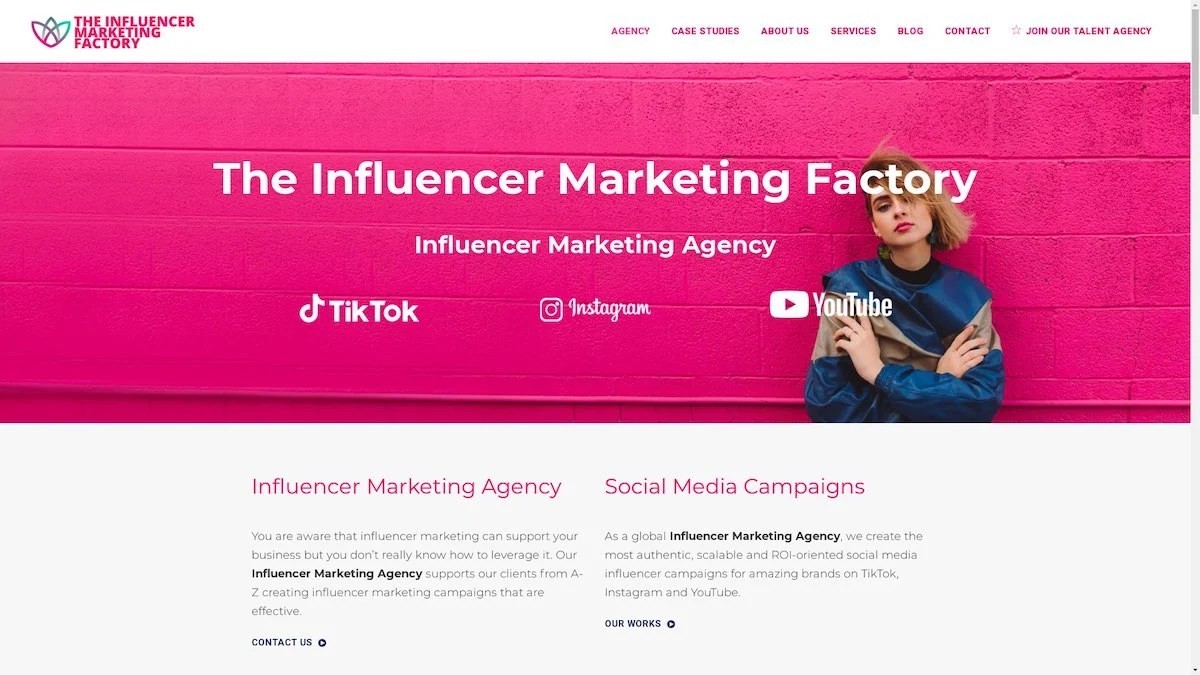
The Influencer Marketing Factory
TikTok, Instagram & YouTube CampaignsA full-service agency with strong TikTok expertise, offering end-to-end campaign management from influencer discovery through performance reporting with a focus on platform-native content.Clients: Google, Snapchat, Universal Music, Bumble, YelpVisit TIMF → -
6

NeoReach
Enterprise Analytics & Influencer CampaignsAn enterprise-focused agency combining managed campaigns with a powerful self-service data platform for influencer search, audience analytics, and attribution modeling.Clients: Amazon, Airbnb, Netflix, Honda, The New York TimesVisit NeoReach → -
7

Ubiquitous
Creator-First Marketing PlatformA tech-driven platform combining self-service tools with managed campaign options, emphasizing speed and scalability for brands managing multiple influencer relationships.Clients: Lyft, Disney, Target, American Eagle, NetflixVisit Ubiquitous → -
8

Obviously
Scalable Enterprise Influencer CampaignsA tech-enabled agency built for high-volume campaigns, coordinating hundreds of creators simultaneously with end-to-end logistics, content rights management, and product seeding.Clients: Google, Ulta Beauty, Converse, AmazonVisit Obviously →
