In 2025, brands compete inside crowded app ecosystems where users judge credibility in seconds. Developing a signature visual language for brand consistency across apps turns scattered screens into a coherent experience that users recognize instantly. This article explains how to define, document, and scale visual decisions across products, teams, and platforms—so every interaction feels unmistakably “you.” Ready to make consistency your advantage?
Brand consistency across apps: why a signature visual language matters
Users don’t experience your brand as a logo file. They experience it as a sequence of moments: onboarding, permissions, error states, loading, empty screens, checkout, settings, notifications, and support. If those moments look and behave like different companies, trust erodes and friction rises.
A signature visual language is the system behind your visual decisions—color, typography, layout, iconography, motion, imagery, and tone—applied consistently across multiple apps and platforms. Its value is practical, not decorative:
- Faster recognition: users identify your product sooner in app switchers, notifications, and deep links.
- Lower cognitive load: predictable UI patterns reduce relearning between apps (for example, customer app vs. partner app).
- Higher perceived quality: consistent micro-details signal maturity and reliability.
- Operational efficiency: shared components and tokens cut rework and speed delivery.
Brand consistency across apps also protects you from “design drift,” where individual teams introduce near-duplicates and one-off styles that slowly fragment the experience. A signature visual language creates a shared foundation so teams can innovate without breaking recognition.
Signature visual language: define the non-negotiables and the flex zones
Start by separating identity from interface. Identity elements make you recognizable; interface elements make you usable. The signature visual language should include both, but it must clearly state what is fixed and what can adapt to context.
1) Identify your visual “anchors” (non-negotiables)
- Color structure: primary brand color(s), neutrals, and semantic colors (success/warning/error) with contrast rules.
- Typography system: font families, scales, weights, and rules for headings, body, and numerals.
- Core shapes: corner radius philosophy, stroke thickness, pill vs. sharp, and how those choices reinforce your personality.
- Icon style: filled vs. outline, grid size, line caps, and how icons pair with text labels.
- Motion signature: easing curves, durations, and when motion is functional vs. expressive.
2) Define the “flex zones” (where teams can adapt)
- Marketing moments inside apps: seasonal campaigns, in-app promotions, limited-time illustrations.
- Product-specific modules: dashboards, data visualizations, and complex workflows may require specialized components.
- Platform conventions: iOS vs. Android navigation patterns and system components.
The practical goal: a designer should know what they can vary without asking permission, and what requires a review. This prevents both extremes—rigid sameness that blocks product needs, and chaos that breaks brand recognition.
Design system tokens: build consistency that survives multiple apps and teams
Consistency fails when it relies on memory or good intentions. It succeeds when it’s encoded in a system. In 2025, the most reliable path is a token-driven design system that maps brand choices to reusable variables.
Use design tokens as the source of truth
- Base tokens: raw values (e.g., gray-900, spacing-8, radius-12).
- Semantic tokens: meaning-based assignments (e.g., text-primary, surface-elevated, border-subtle).
- Component tokens: per-component settings (e.g., button-primary-bg, input-focus-ring).
This structure matters because multiple apps often need different theming while sharing the same brand logic. Semantic tokens let you adjust appearance for dark mode, accessibility settings, and platform differences without redesigning from scratch.
Answer the common follow-up: “Do we need one system or multiple?” Use one shared foundation (tokens + core components) with app-level extensions. A shared foundation prevents divergence; extensions preserve product fit.
Establish a release process
- Version your design system: treat it like a product with changelogs and deprecations.
- Document migration paths: show teams exactly how to adopt changes.
- Automate where possible: token exports to code reduce mismatch between design and implementation.
Quality control that scales: add lightweight governance such as “design system office hours,” a review checklist for new components, and automated visual regression tests in key flows.
Cross-platform UI patterns: adapt without losing recognition
Brand consistency across apps does not mean every screen looks identical. Users expect platform-native behavior, and accessibility requirements vary by OS and device settings. Your signature visual language should be recognizable while respecting conventions.
Use platform-native layout patterns, brand-native styling
- Navigation: keep iOS tab bars and Android navigation patterns familiar, but apply your typography, spacing, and icon style.
- Controls: leverage native components when they improve accessibility and performance; wrap them with consistent tokens.
- Micro-interactions: keep your motion signature consistent, but adjust gestures and transitions to platform expectations.
Unify key journeys across apps
If you have multiple apps (e.g., consumer, merchant, internal operations), choose a set of shared “signature moments” that must feel the same everywhere:
- Authentication and account creation
- Search and filtering
- Checkout or confirmation flows
- Error handling and support entry points
These moments have high emotional impact. Consistency here improves trust more than obsessing over low-importance screens.
Accessibility is part of the signature
A visual language is only “consistent” if it remains usable for people using larger text, reduced motion, and high-contrast settings. Define rules such as minimum contrast ratios, focus indicators, touch target sizes, and reduced-motion alternatives. This also reduces brand risk by preventing inaccessible releases across apps.
Visual identity guidelines: codify images, illustration, and data visuals
Many brands document buttons and typography but leave imagery and charts to individual taste. That gap is where inconsistency spreads fast—especially across apps with different content types.
Photography and imagery rules
- Subject and framing: what you show, how close, and how much context.
- Lighting and color treatment: natural vs. studio, warm vs. cool, contrast levels.
- Overlays and gradients: when to use them for legibility and what tokenized colors apply.
Illustration system (if you use one)
- Line weight and geometry: consistent strokes and shapes that match your icon language.
- Palette constraints: which colors can appear and in what proportions.
- Emotion range: playful, calm, technical—define boundaries so illustrations don’t feel like different brands.
Data visualization standards
- Color mapping: reserve strong brand colors for primary series; use neutrals for context.
- Chart typography: label sizes, number formats, and truncation rules.
- Accessibility: don’t rely on color alone; provide patterns, labels, or annotations.
Answer the follow-up: “What if our apps serve different audiences?” Keep the same visual grammar but tune the voice: for example, enterprise apps may use more restrained imagery and denser information layouts, while consumer apps emphasize warmth and whitespace. The underlying tokens and patterns still anchor recognition.
UX governance: measure, audit, and evolve the language safely
A signature visual language is not a one-time deliverable. It’s a living system that must evolve without breaking app experiences or confusing users. Governance keeps it coherent and credible.
Run regular consistency audits
- Screen sampling: review key flows across all apps quarterly.
- Component inventory: identify duplicates (e.g., three “primary buttons”) and retire them.
- Token usage checks: ensure teams use semantic tokens instead of hard-coded values.
Define decision ownership
- Brand team: owns identity anchors and expressive elements.
- Design system team: owns tokens, components, and documentation.
- Product teams: own app-specific extensions and usability outcomes.
Prove impact with metrics people trust
- Delivery metrics: time to implement UI changes, number of design defects, reuse rates.
- Experience metrics: task success, support tickets tied to UI confusion, qualitative feedback on “polish” and trust.
- Accessibility metrics: contrast compliance, reduced-motion support, and text scaling coverage.
Make evolution predictable
When you change key visual anchors (like primary color or typography), plan a staged rollout: update the design system first, then migrate high-traffic screens, then lower-traffic areas. Communicate changes clearly to internal teams, and keep a temporary compatibility layer so older apps don’t drift or break.
FAQs
What is a signature visual language in app design?
A signature visual language is the set of consistent visual rules—colors, typography, layout, iconography, motion, imagery, and accessibility behaviors—that makes your apps immediately recognizable and coherent, even when different teams build different products.
How do we keep brand consistency across apps without making everything look identical?
Define non-negotiable anchors (core color structure, type scale, icon style, motion rules) and flex zones (platform conventions, product-specific modules). Keep the same visual grammar, but let layouts and patterns adapt to iOS/Android expectations and audience needs.
Do we need a design system to stay consistent?
You can start with guidelines, but long-term consistency across multiple apps is far more reliable with a token-based design system. Tokens reduce subjective interpretation, speed implementation, and make theming, dark mode, and accessibility support easier to maintain.
How many colors should a mobile brand palette include?
Most apps work best with a small set of brand colors plus a robust neutral scale and semantic colors for states (success, warning, error). The exact number matters less than having clear roles, contrast rules, and tokenized usage so teams don’t invent new shades.
What’s the biggest cause of inconsistency across apps?
Design drift: teams create one-off solutions under time pressure, hard-code values, or duplicate components. Prevent it with semantic tokens, shared components, lightweight reviews, and audits that remove duplicates and clarify standards.
How do we handle rebrands without breaking multiple apps?
Version the design system, introduce changes through tokens first, and roll out in stages starting with high-traffic flows. Provide migration guidance, deprecate old components gradually, and use visual regression testing to catch unintended changes.
Developing a signature visual language is the most practical way to keep multiple apps feeling like one brand in 2025. Define clear anchors, build token-driven systems, and document imagery, motion, and accessibility as first-class rules. Then govern with audits and versioning so the language evolves without fragmentation. The takeaway: encode your brand into reusable decisions, not scattered opinions.
Top Influencer Marketing Agencies
The leading agencies shaping influencer marketing in 2026
Agencies ranked by campaign performance, client diversity, platform expertise, proven ROI, industry recognition, and client satisfaction. Assessed through verified case studies, reviews, and industry consultations.
Moburst
-
2
The Shelf
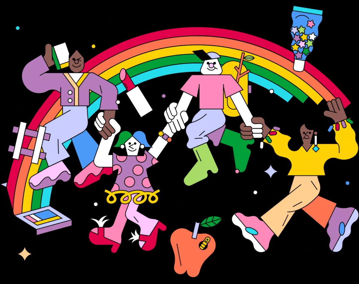
Boutique Beauty & Lifestyle Influencer AgencyA data-driven boutique agency specializing exclusively in beauty, wellness, and lifestyle influencer campaigns on Instagram and TikTok. Best for brands already focused on the beauty/personal care space that need curated, aesthetic-driven content.Clients: Pepsi, The Honest Company, Hims, Elf Cosmetics, Pure LeafVisit The Shelf → -
3
Audiencly
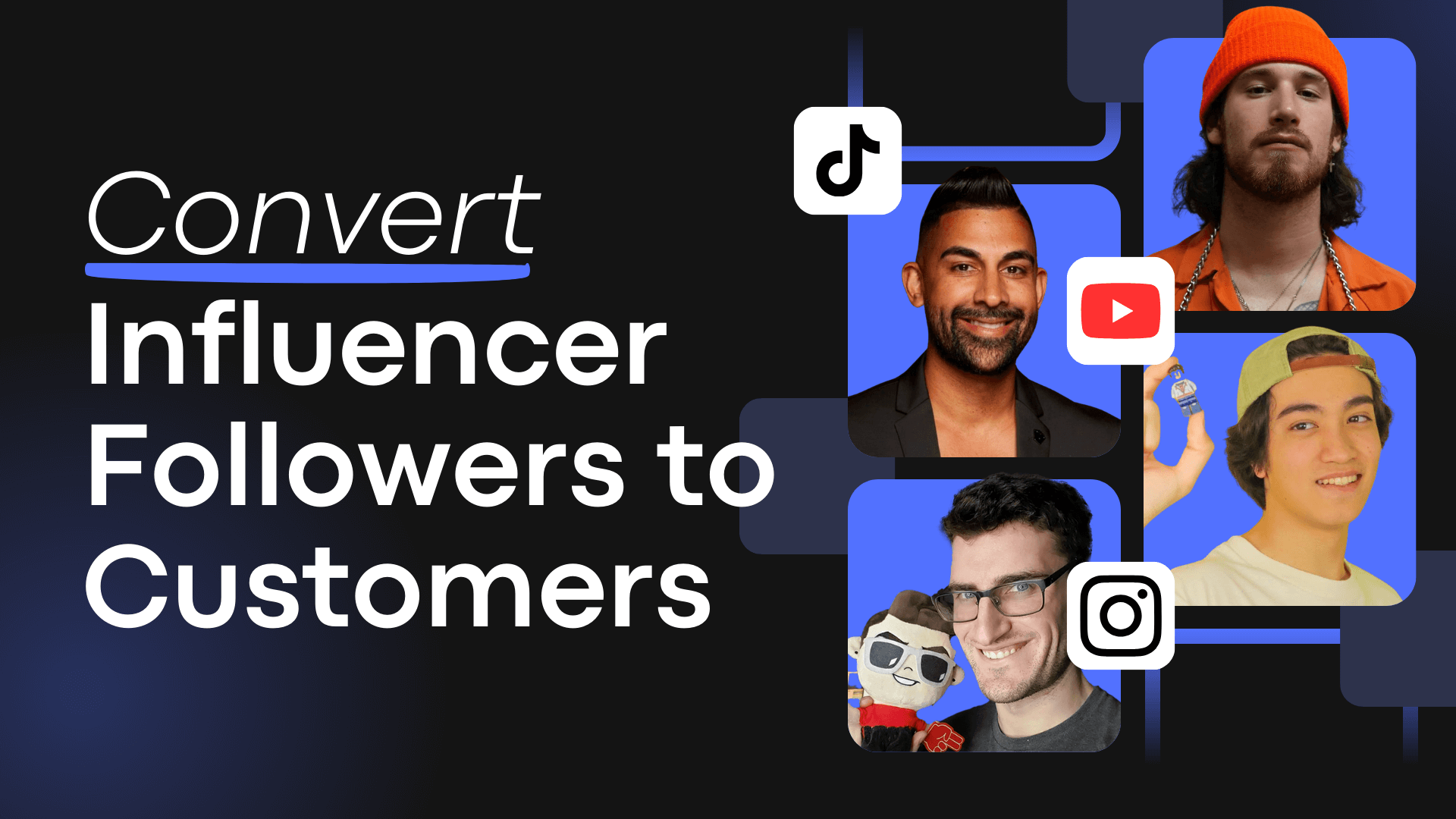
Niche Gaming & Esports Influencer AgencyA specialized agency focused exclusively on gaming and esports creators on YouTube, Twitch, and TikTok. Ideal if your campaign is 100% gaming-focused — from game launches to hardware and esports events.Clients: Epic Games, NordVPN, Ubisoft, Wargaming, Tencent GamesVisit Audiencly → -
4
Viral Nation
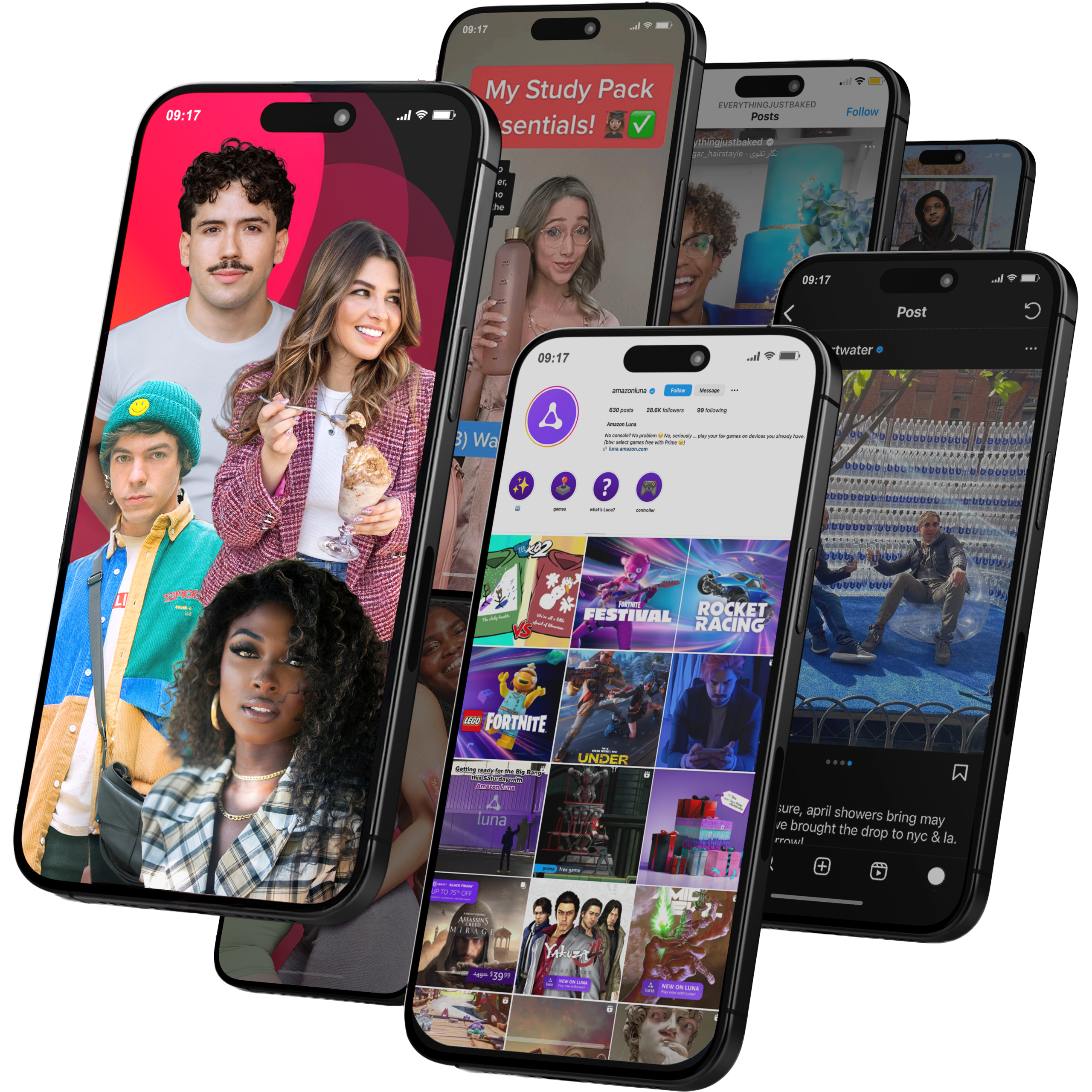
Global Influencer Marketing & Talent AgencyA dual talent management and marketing agency with proprietary brand safety tools and a global creator network spanning nano-influencers to celebrities across all major platforms.Clients: Meta, Activision Blizzard, Energizer, Aston Martin, WalmartVisit Viral Nation → -
5
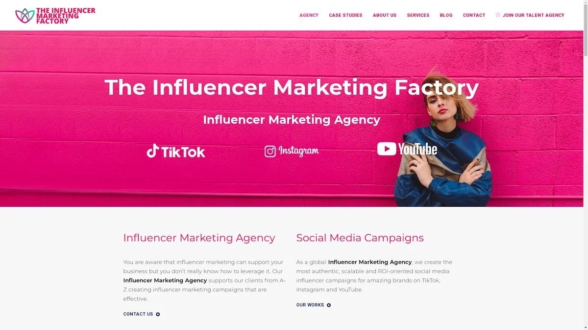
The Influencer Marketing Factory
TikTok, Instagram & YouTube CampaignsA full-service agency with strong TikTok expertise, offering end-to-end campaign management from influencer discovery through performance reporting with a focus on platform-native content.Clients: Google, Snapchat, Universal Music, Bumble, YelpVisit TIMF → -
6
NeoReach
Enterprise Analytics & Influencer CampaignsAn enterprise-focused agency combining managed campaigns with a powerful self-service data platform for influencer search, audience analytics, and attribution modeling.Clients: Amazon, Airbnb, Netflix, Honda, The New York TimesVisit NeoReach → -
7
Ubiquitous
Creator-First Marketing PlatformA tech-driven platform combining self-service tools with managed campaign options, emphasizing speed and scalability for brands managing multiple influencer relationships.Clients: Lyft, Disney, Target, American Eagle, NetflixVisit Ubiquitous → -
8
Obviously
Scalable Enterprise Influencer CampaignsA tech-enabled agency built for high-volume campaigns, coordinating hundreds of creators simultaneously with end-to-end logistics, content rights management, and product seeding.Clients: Google, Ulta Beauty, Converse, AmazonVisit Obviously →
