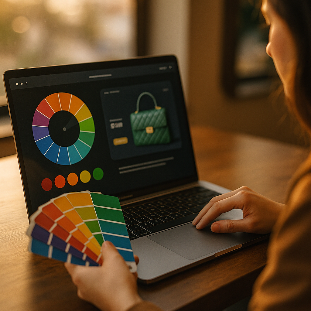
In 2025, premium shoppers don’t just compare specs and prices—they react to meaning, mood, and trust cues in milliseconds. The psychology of color in high-ticket e-commerce decision making influences perceived quality, risk, credibility, and urgency long before a buyer reads your warranty or return policy. When every click could mean thousands in revenue, color becomes a silent closer—or a silent deal-breaker. Are you guiding decisions or leaving them to chance?
Color psychology in luxury e-commerce: how buyers assign value fast
High-ticket purchases trigger a different mental path than low-cost impulse buys. Buyers feel more risk, demand more justification, and look for signals that reduce uncertainty. Color is one of the earliest signals they process, shaping expectations about craftsmanship, customer service, and legitimacy before they consciously evaluate product details.
In luxury and premium categories, shoppers typically seek three outcomes: status, confidence, and control. Your palette can support or sabotage all three. For example, deep neutrals (black, charcoal, navy) often communicate authority and stability, while bright, saturated combinations can feel “salesy” if not handled with restraint. That doesn’t mean bright colors are wrong—it means they require a premium context (high-quality photography, whitespace, refined typography, clear policies) to avoid cheapening perception.
Color also shapes perceived price fairness. A minimal palette with strong contrast can make a high price feel intentional and justified. A busy, clashing palette can create cognitive friction and push buyers to question whether the brand is as careful with product quality as it is with presentation.
Practical takeaway: treat color as part of your value proposition. Decide what your brand must communicate in under one second—precision, heritage, innovation, calm—and then build a palette that reinforces that promise across pages, ads, and post-purchase flows.
Trust signals and risk reduction: using color to reassure high-intent shoppers
High-ticket buyers look for reassurance: security, authenticity, support, and predictable outcomes. Color can strengthen these trust signals when used consistently and intentionally.
Blues often support perceptions of reliability and competence, which is why many financial and security brands use them. In high-ticket e-commerce, blue can improve comfort around payment steps, financing, warranties, and identity checks. Greens can suggest safety, approval, and “good to proceed,” which works well for confirmation states (e.g., “in stock,” “verified,” “protected checkout”). Neutrals signal maturity and reduce visual noise, helping product photography and technical details do the convincing.
However, trust is rarely about one color. It’s about coherence. If your product page is calm and premium but your checkout turns neon and aggressive, you create a subtle mismatch that can spike hesitation. Keep your palette stable across the entire funnel—landing page, product page, cart, checkout, email receipts, and account portal—so the experience feels like one trustworthy system.
To strengthen EEAT in a way color can support, pair visual reassurance with explicit proof:
- Security cues: clear payment options, fraud protection, and visible policies; use calm, high-contrast colors for readability and confidence.
- Authenticity cues: verified reviews, rich product specs, and expert comparisons; use structured sections and consistent accent colors for scannability.
- Support cues: chat, phone, and response-time expectations; use a distinct, non-alarming color for help elements so they’re easy to find.
Follow-up question buyers silently ask: “What happens if this goes wrong?” Use color to make answers easy to spot—returns, warranties, shipping estimates—without making those areas look like warnings. A neutral info background with a single refined accent color often reads as “transparent,” not “problematic.”
High-ticket product page design colors: guiding attention without pressure
On premium product pages, the goal is not to shout; it’s to direct attention. Buyers need to review details, compare configurations, and imagine ownership. Color helps you choreograph that process.
Start with a restrained base palette and deploy color as a navigation tool:
- Hierarchy: use one primary accent color for key actions and highlights, and a secondary accent for supporting actions (e.g., “Save to wishlist”).
- Contrast for clarity: high-ticket shoppers read more. Ensure text contrast is strong enough to reduce fatigue and misinterpretation, especially for specs and warranty terms.
- Whitespace and neutral fields: premium experiences feel “expensive” partly because they are easy to process. Neutral space reduces cognitive load.
Use color to support the decision sequence. A common high-ticket path looks like this: validate fit (size, compatibility, configuration) → validate outcomes (performance, results, benefits) → validate risk (shipping, returns, warranty) → commit. Color-coded modules can help: for example, configuration sections in neutral panels, performance highlights in your accent color, and risk reducers in soft, calm tones.
Also address the follow-up question: “Is this actually premium?” Color can reinforce premium cues when paired with details like:
- High-fidelity images with consistent color grading (avoid unnatural saturation that makes products look cheap).
- Material and finish descriptors aligned with palette (e.g., brushed metal tones, matte blacks, warm neutrals).
- Consistent iconography that uses the same accent color throughout the page.
If your catalog includes multiple product lines, avoid assigning wildly different palettes per product page unless those sub-brands are truly separate. Inconsistent palettes can trigger subconscious “drop-shipping” vibes in high-consideration categories.
Checkout CTA color strategy: increasing conversions while protecting brand perception
Your call-to-action is where color decisions become measurable. But high-ticket conversion isn’t just about getting clicks—it’s about getting confident clicks that don’t lead to cancellations, chargebacks, or regret. The best checkout CTA color strategy balances visibility with credibility.
Principles that work well in 2025 for premium funnels:
- One dominant CTA color: choose a single color for “Add to cart,” “Continue,” and “Place order.” This trains the user’s brain and reduces hesitation.
- Reserve the CTA color: don’t use it for random badges or decorative elements. Scarcity increases impact.
- Use semantic color correctly: red can signal danger or urgency; it can work for limited-time events, but it can also feel manipulative on luxury checkouts. If you use red, keep it restrained and validate urgency with clear terms.
- Make secondary actions quieter: “PayPal,” “Klarna,” “Talk to an expert,” and “Save for later” should be accessible but not compete with the primary CTA. Use a neutral outline style or softer tone.
High-ticket buyers often want reassurance at the moment of commitment. Add supportive microcopy near the CTA and use color to organize it:
- Delivery confidence: “Ships in 24–48 hours” or “White-glove delivery available.”
- Risk reversal: “30-day returns” and “2-year warranty” placed adjacent in a calm, neutral info style.
- Payment clarity: “Taxes calculated at checkout” or “No hidden fees” displayed with clear contrast.
Answer the likely follow-up: “Should my CTA be green?” Sometimes. Green is often associated with “go,” but the best CTA color is the one that delivers clear contrast with your brand palette while still matching your premium tone. A luxury brand can use off-white + black + a muted gold CTA, while a tech premium brand might use charcoal + electric blue. The key is consistency, contrast, and restraint.
Cross-cultural color meaning in global e-commerce: avoiding expensive misreads
High-ticket brands increasingly sell internationally. Color meanings are not universal, and the cost of misreading them grows with average order value. Cross-cultural color meaning in global e-commerce matters in ads, landing pages, seasonal campaigns, and gifting flows.
Some patterns are common but not absolute. White can signal cleanliness and minimalism in many markets, but in some cultures it can carry associations that don’t fit celebratory gifting. Red can feel bold and lucky in some contexts, but it can also read as warning or “clearance sale” depending on how you deploy it. Gold can convey premium, but too much can feel gaudy if the typography and layout aren’t equally refined.
To reduce risk:
- Localize campaigns: use region-specific creative for major promos rather than forcing one global palette onto all markets.
- Test by locale: run A/B tests segmented by country or language, especially for CTA colors and promotional banners.
- Focus on clarity first: legibility, contrast, and layout hierarchy often matter more than “perfect cultural symbolism.”
- Use product-led color: let product materials and real photography drive the palette. Authentic visuals translate better than symbolic color choices.
Follow-up question: “Do I need a different brand palette per country?” Usually not. You need a consistent core identity plus flexibility in campaign accents and seasonal creative. Keep your brand foundations stable (neutrals, typography, photography style), then adapt accent colors for local resonance and promotional context.
A/B testing color in premium funnels: what to measure beyond clicks
Testing color is essential, but high-ticket e-commerce needs smarter success metrics than button clicks. A CTA color can increase clicks but reduce final revenue if it attracts low-intent buyers or creates buyer’s remorse. In premium funnels, measure outcomes that reflect commitment and satisfaction.
What to test:
- CTA contrast levels: not just hue. Test a muted vs high-contrast version within your brand tone.
- Accent color usage: CTA-only vs CTA + key highlights (warranty, delivery, financing).
- Information modules: test calm info backgrounds for policies vs plain text; evaluate readability and perceived transparency.
- Checkout step states: progress indicators and error states; ensure colors reduce anxiety, not create it.
What to measure (high-ticket relevant):
- Revenue per visitor (RPV): the most honest measure when AOV is high.
- Checkout completion rate: segmented by device and traffic source.
- Time to purchase: a premium buyer may take longer; your goal is clarity, not speed at any cost.
- Refund and cancellation rate: color that feels pushy can increase regret.
- Support contact rate: confusion about shipping, returns, or financing shows up here first.
EEAT best practice: document your testing approach and decisions. Internally, keep a log of hypotheses, results, and rollouts. Externally, ensure your site communicates expertise and transparency through consistent UX patterns, clear policies, and accurate product information—color then amplifies those trust foundations rather than trying to compensate for missing proof.
FAQs
What is the best color for selling expensive products online?
There isn’t one universal best color. High-ticket products sell best when the palette supports trust, clarity, and premium positioning. Many brands succeed with deep neutrals plus one restrained accent color for CTAs. Choose based on your category, photography style, and the contrast needed for accessibility.
Does changing button color really increase high-ticket conversions?
It can, but the impact depends on context. Button color works when it improves visual hierarchy and reduces hesitation. For high-ticket carts, test for revenue per visitor and refund rate—not just clicks—so you don’t optimize for shallow engagement.
Should luxury e-commerce use bright colors?
Bright colors can work when used sparingly as accents and supported by premium design elements like whitespace, refined typography, and high-quality imagery. If bright colors dominate the page, shoppers may interpret the experience as promotional rather than premium.
How do I use color to improve trust at checkout?
Keep the palette consistent from product page to checkout, use calm tones for security and policy information, and reserve one high-contrast accent for the primary CTA. Avoid sudden color shifts that make the checkout feel like a different site.
How do I handle color meanings across different countries?
Maintain a consistent core brand palette, then localize campaign accents and seasonal creative by region. Validate with segmented A/B tests. Prioritize clarity and authentic product photography, which travel better than symbolic color choices.
What are the biggest color mistakes in high-ticket e-commerce?
Common mistakes include using too many accent colors, low contrast text that hurts readability, aggressive urgency colors that feel manipulative, and inconsistent palettes across the funnel. Another costly error is ignoring how color interacts with photography color grading and material finishes.
Color doesn’t persuade high-ticket shoppers by magic; it persuades by reducing doubt, sharpening focus, and reinforcing a premium promise across every step. In 2025, the winners treat color as a system: brand palette, hierarchy, trust cues, and testing discipline working together. Audit your funnel for consistency, reserve strong accents for decisive moments, and test for revenue and retention—not clicks.
Top Influencer Marketing Agencies
The leading agencies shaping influencer marketing in 2026
Agencies ranked by campaign performance, client diversity, platform expertise, proven ROI, industry recognition, and client satisfaction. Assessed through verified case studies, reviews, and industry consultations.
Moburst
-
2

The Shelf
Boutique Beauty & Lifestyle Influencer AgencyA data-driven boutique agency specializing exclusively in beauty, wellness, and lifestyle influencer campaigns on Instagram and TikTok. Best for brands already focused on the beauty/personal care space that need curated, aesthetic-driven content.Clients: Pepsi, The Honest Company, Hims, Elf Cosmetics, Pure LeafVisit The Shelf → -
3

Audiencly
Niche Gaming & Esports Influencer AgencyA specialized agency focused exclusively on gaming and esports creators on YouTube, Twitch, and TikTok. Ideal if your campaign is 100% gaming-focused — from game launches to hardware and esports events.Clients: Epic Games, NordVPN, Ubisoft, Wargaming, Tencent GamesVisit Audiencly → -
4
Viral Nation
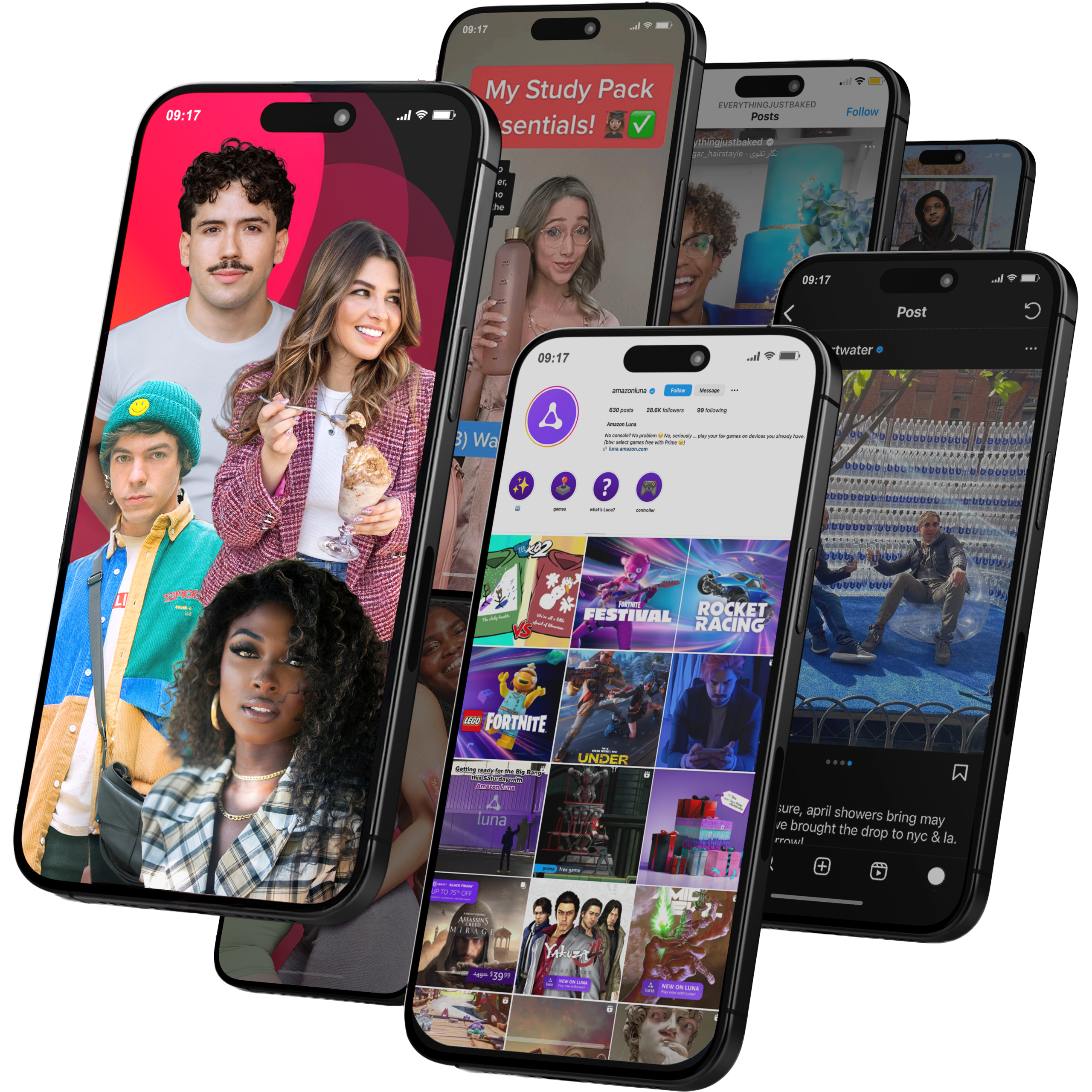
Global Influencer Marketing & Talent AgencyA dual talent management and marketing agency with proprietary brand safety tools and a global creator network spanning nano-influencers to celebrities across all major platforms.Clients: Meta, Activision Blizzard, Energizer, Aston Martin, WalmartVisit Viral Nation → -
5
The Influencer Marketing Factory
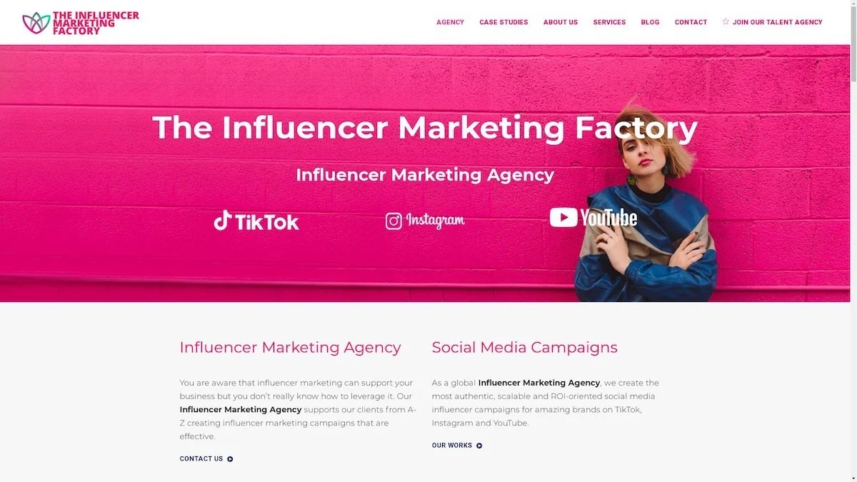
TikTok, Instagram & YouTube CampaignsA full-service agency with strong TikTok expertise, offering end-to-end campaign management from influencer discovery through performance reporting with a focus on platform-native content.Clients: Google, Snapchat, Universal Music, Bumble, YelpVisit TIMF → -
6
NeoReach
Enterprise Analytics & Influencer CampaignsAn enterprise-focused agency combining managed campaigns with a powerful self-service data platform for influencer search, audience analytics, and attribution modeling.Clients: Amazon, Airbnb, Netflix, Honda, The New York TimesVisit NeoReach → -
7
Ubiquitous
Creator-First Marketing PlatformA tech-driven platform combining self-service tools with managed campaign options, emphasizing speed and scalability for brands managing multiple influencer relationships.Clients: Lyft, Disney, Target, American Eagle, NetflixVisit Ubiquitous → -
8

Obviously
Scalable Enterprise Influencer CampaignsA tech-enabled agency built for high-volume campaigns, coordinating hundreds of creators simultaneously with end-to-end logistics, content rights management, and product seeding.Clients: Google, Ulta Beauty, Converse, AmazonVisit Obviously →
