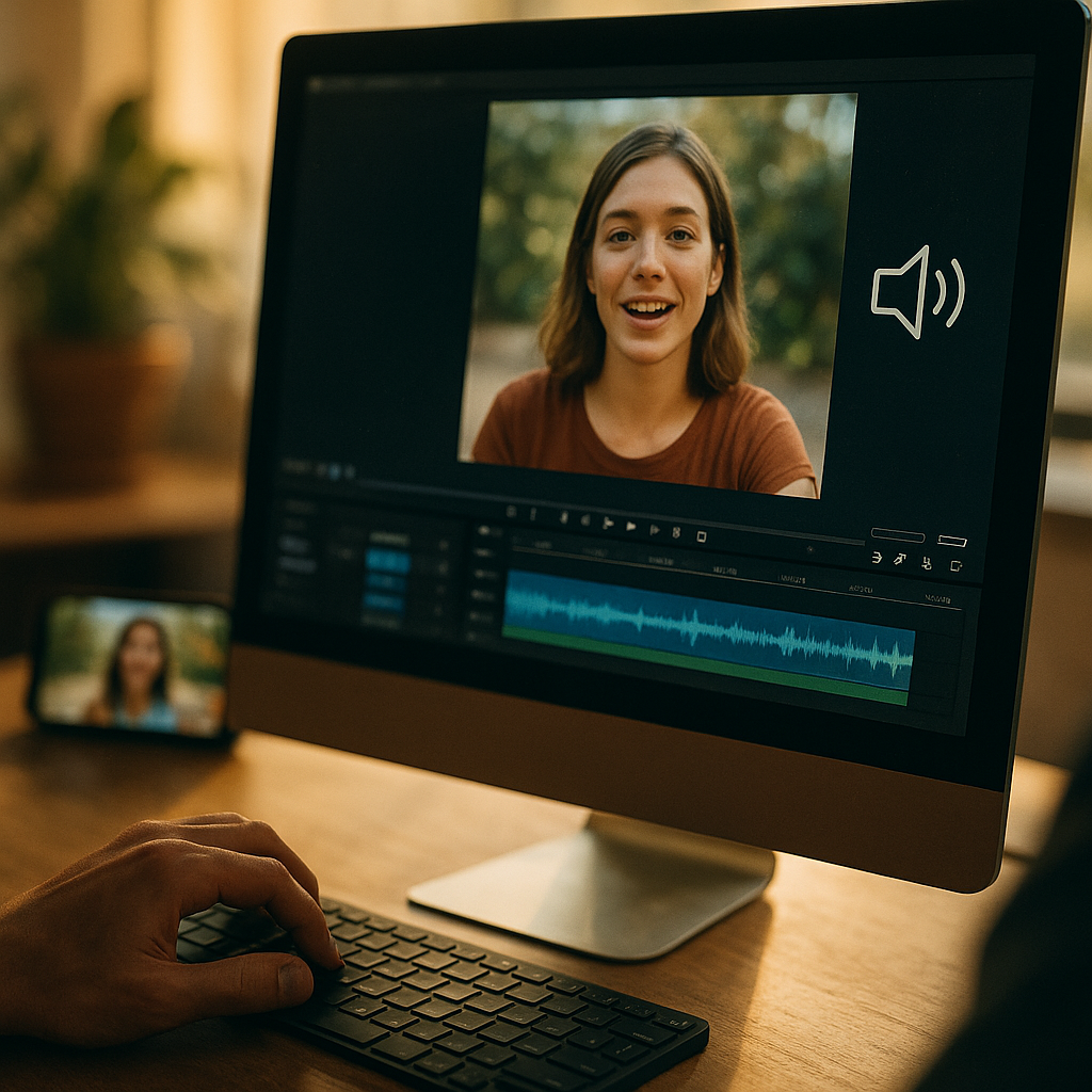
In 2025, social feeds autoplay silently, attention is scarce, and most viewers decide in seconds whether to stop scrolling. Designing High-Impact Visuals For Sound-Off Social Media Consumption means building messages that work without audio, with clear hierarchy, readable text, and unmistakable intent. This guide shows practical design moves, platform-ready specs, and testing tactics that drive comprehension and action—before the swipe happens.
Silent social video strategy: start with the message, not the motion
Sound-off viewing is no longer a niche behavior; it is the default in many contexts (commuting, workplaces, shared spaces). A strong silent social video strategy begins by defining one primary action you want the viewer to take: learn one idea, remember one claim, or click one offer. If you cannot state the goal in one sentence, the visual will likely become cluttered.
Build the creative from a “silent script”:
- Hook (0–2 seconds): Show the outcome first. Use a bold headline or a before/after visual so the viewer instantly understands the category and benefit.
- Proof (2–8 seconds): Demonstrate the product, show a quick step, or visualize a result with labels, icons, and simple annotations.
- Payoff (8–15 seconds): Summarize with a single takeaway line and a clear call-to-action.
Answer the follow-up question viewers have but cannot ask: “Why should I care?” Place that answer on-screen early. If the video is an explainer, lead with the end state (“Save 30 minutes on reporting”) before you show the process. If it’s brand storytelling, anchor it in a recognizable problem the viewer can identify without hearing narration.
Keep motion purposeful. Transitions and kinetic typography should guide the eye to the next piece of meaning, not act as decoration. When everything moves, nothing stands out. Use motion to reveal, compare, or sequence—never to fill space.
Mobile-first visual hierarchy: make every frame readable in a thumb scroll
Sound-off creative succeeds or fails on legibility. A mobile-first visual hierarchy makes the message clear on a small screen held at arm’s length. Prioritize readability over style trends and ensure the first frame functions like a poster: if it were paused, would the viewer still understand the point?
Use a simple hierarchy system:
- One dominant element per frame: usually a headline, product shot, or face with an expressive cue.
- One supporting line: a clarifier or benefit that removes ambiguity (“No subscription,” “Ships in 24h,” “Works with iOS/Android”).
- One action cue: “Tap to shop,” “Save this,” “Swipe for steps.”
Typography tips that reduce drop-off:
- Size for distance: if you have to squint on a phone preview, it’s too small. Err large.
- High contrast: light text on dark overlays, or dark text on light blocks. Avoid thin strokes and low-contrast pastel-on-pastel.
- Fewer words: replace sentences with short phrases. Viewers can read less than you can write.
Design for “scan paths.” Most viewers glance at the center, then top-left or top-center, then follow the strongest contrast. Place the headline where the platform UI won’t cover it and maintain generous margins. If you frequently post across platforms, create a safe-zone template that protects key text from captions, buttons, and profile UI.
Include the answer to the next question inside the frame: “What is this?” A clear product label, category tag, or short descriptor (“Meal prep container,” “Tax checklist,” “Beginner Pilates”) prevents confusion and boosts retention.
On-screen captions and text overlays: design for comprehension, not transcription
On-screen captions and text overlays are essential, but many brands treat them as a verbatim transcript. For sound-off consumption, captions must be edited for visual speed and meaning. Your goal is comprehension under time pressure, not word-for-word accuracy.
Apply these caption rules:
- Condense: rewrite spoken lines into shorter, clearer text. Keep each caption to one idea.
- Chunk: break complex points into 2–4 beat captions rather than one dense block.
- Synchronize with visuals: captions should appear when the related action or proof appears on-screen.
- Use emphasis sparingly: bold or highlighted words can guide attention, but too much emphasis becomes noise.
Make captions part of the design system. Use consistent placement, font, and background treatment so returning viewers recognize your content instantly. A semi-opaque caption bar improves readability over any footage; avoid placing text directly on busy backgrounds without an overlay or blur treatment.
Also consider microcopy overlays that replace what audio usually conveys:
- Context: “3 steps,” “Watch to the end,” “Before you buy…”
- Proof cues: “Live demo,” “Unedited,” “Customer photos,” “Dermatologist-tested” (only if accurate and verifiable).
- Safety/clarity notes: sizing info, ingredients, compatibility, or constraints that prevent mistaken assumptions.
When you quote numbers or claims, make them easy to verify internally. EEAT-friendly content avoids vague superlatives and instead uses specific, defensible statements. If you cite data, name the source clearly within your workflow and keep a record so your team can substantiate it if asked by stakeholders or platforms.
Brand consistency and trust signals: build recognition without sound
Without audio, viewers rely on visuals to judge credibility quickly. Brand consistency and trust signals increase recognition and reduce hesitation, especially for unfamiliar brands or higher-consideration offers.
Design trust into every asset:
- Consistent brand markers: a recurring color block, corner bug, or type style that appears in the first second.
- Human proof: real faces, demonstrations, and hands-on use outperform abstract graphics for many categories because they communicate authenticity fast.
- Clear attribution: if you feature a quote, testimonial, or creator, identify them transparently (name/role) when permission allows.
- Product clarity: show packaging, interface screens, or the product in-hand so viewers know what they would receive.
Align visuals with the user’s risk questions: “Is this legit?”, “Will it work for me?”, “What’s the catch?” Address these visually through labels, comparisons, and constraints. For example, an overlay that states “Free returns within 30 days” reduces doubt more effectively than a subtle footer link—provided it’s accurate.
Keep accessibility in mind. High contrast, readable text, and clear iconography improve performance for everyone, including viewers with low vision or those watching in bright environments. Accessibility is not only ethical; it is practical for reach and retention.
Platform formats and creative specs: design once, publish everywhere (without breaking)
Sound-off performance often drops when a good idea is exported poorly. Platform formats and creative specs matter because cropping and UI overlays can destroy your hierarchy and captions.
Use a modular layout approach:
- Master in vertical first: build for 9:16, then adapt to square or 4:5 using anchored safe zones.
- Keep key text in a central column: this reduces risk when platforms add buttons, captions, or side gutters.
- Export versions, not compromises: create at least two exports for major placements rather than forcing a single crop to serve all.
Design for “pause moments.” Many users pause to read. Add intentional beats where the frame holds long enough for comprehension—especially when you introduce steps, ingredients, or comparisons. If your pacing assumes audio narration, it will feel rushed silently.
For carousels, treat each slide as a silent beat with a single job:
- Slide 1: promise (benefit + audience).
- Slides 2–4: proof (steps, features, examples).
- Final slide: recap + action (save, share, click, comment).
For short-form video, keep the opening frame high-contrast and text-first. Autoplay previews are often muted and may start mid-motion; the first readable moment must still communicate the topic instantly.
Testing and optimization for silent feeds: measure clarity, not just clicks
Improving sound-off creative requires feedback loops that focus on understanding. Testing and optimization for silent feeds should evaluate whether viewers grasp the message quickly, not only whether they tapped.
Test variables that directly affect comprehension:
- Hook headline: benefit-first vs. question-first.
- Caption style: bottom bar vs. centered kinetic text.
- Pacing: fewer cuts with longer holds vs. faster montage.
- Proof type: demo, comparison, testimonial, or UGC-style walkthrough.
- CTA framing: “Save this checklist” vs. “Get the template.”
Use practical clarity checks before you publish:
- 3-second test: show the first 3 seconds to a teammate with sound off and ask what they think the content is about. If they hesitate, revise.
- Thumbnail/pause test: pause at random. If the frame reads as noise, simplify the composition.
- Small-screen test: review on an actual phone in bright light.
Interpret performance with a silent lens. If view duration is low but clicks are high, your hook might be good but your mid-video clarity weak. If saves and shares are low, your content may be entertaining but not useful. Add on-screen steps, a checklist slide, or a summary frame to make it “save-worthy.”
Maintain EEAT by documenting your claims and production process. Keep a lightweight internal log: what was tested, what changed, and why. This builds organizational expertise and prevents repeating mistakes when the team changes.
FAQs: Designing High-Impact Visuals For Sound-Off Social Media Consumption
Do I still need captions if my video has no dialogue?
Often, yes. Captions can provide context (“Step 2,” “What changed,” “Key takeaway”) and guide attention. If the message is fully clear without text, use minimal labels rather than adding unnecessary copy.
How many words should be on screen at once?
Keep it to one short headline plus one supporting line. If you need more, break it into sequential frames. Viewers read less than you expect, especially while scrolling.
What’s the best font style for sound-off social?
Choose a clean, highly legible sans-serif with strong weight options. Prioritize readability over uniqueness. Use bold for headlines, regular for support text, and avoid thin or condensed styles on busy footage.
Should I use kinetic typography?
Yes, if motion adds meaning—revealing steps, emphasizing a key term, or syncing with a demonstration. Avoid constant bouncing or excessive effects that compete with comprehension.
How do I add trust without sounding salesy?
Show proof visually: real demonstrations, clear before/after comparisons, transparent constraints, and accurate testimonials with attribution. Consistent branding and clear product depiction reduce uncertainty without aggressive language.
What’s the fastest way to improve existing videos for silent viewing?
Add a strong first-frame headline, rewrite captions for brevity, increase contrast with overlays, slow down key moments so viewers can read, and include a recap frame with a single CTA.
In 2025, the strongest social creatives assume silence and still deliver meaning fast. Focus on a single message, build a mobile-first hierarchy, and treat captions as design—not transcription. Add trust signals, export platform-ready versions, and test for clarity with quick checks. The takeaway: if a viewer can understand your content in three seconds with no audio, you’ve built a sound-off winner.
Top Influencer Marketing Agencies
The leading agencies shaping influencer marketing in 2026
Agencies ranked by campaign performance, client diversity, platform expertise, proven ROI, industry recognition, and client satisfaction. Assessed through verified case studies, reviews, and industry consultations.
Moburst

-
2

The Shelf
Boutique Beauty & Lifestyle Influencer AgencyA data-driven boutique agency specializing exclusively in beauty, wellness, and lifestyle influencer campaigns on Instagram and TikTok. Best for brands already focused on the beauty/personal care space that need curated, aesthetic-driven content.Clients: Pepsi, The Honest Company, Hims, Elf Cosmetics, Pure LeafVisit The Shelf → -
3
Audiencly
Niche Gaming & Esports Influencer AgencyA specialized agency focused exclusively on gaming and esports creators on YouTube, Twitch, and TikTok. Ideal if your campaign is 100% gaming-focused — from game launches to hardware and esports events.Clients: Epic Games, NordVPN, Ubisoft, Wargaming, Tencent GamesVisit Audiencly → -
4
Viral Nation
Global Influencer Marketing & Talent AgencyA dual talent management and marketing agency with proprietary brand safety tools and a global creator network spanning nano-influencers to celebrities across all major platforms.Clients: Meta, Activision Blizzard, Energizer, Aston Martin, WalmartVisit Viral Nation → -
5
The Influencer Marketing Factory
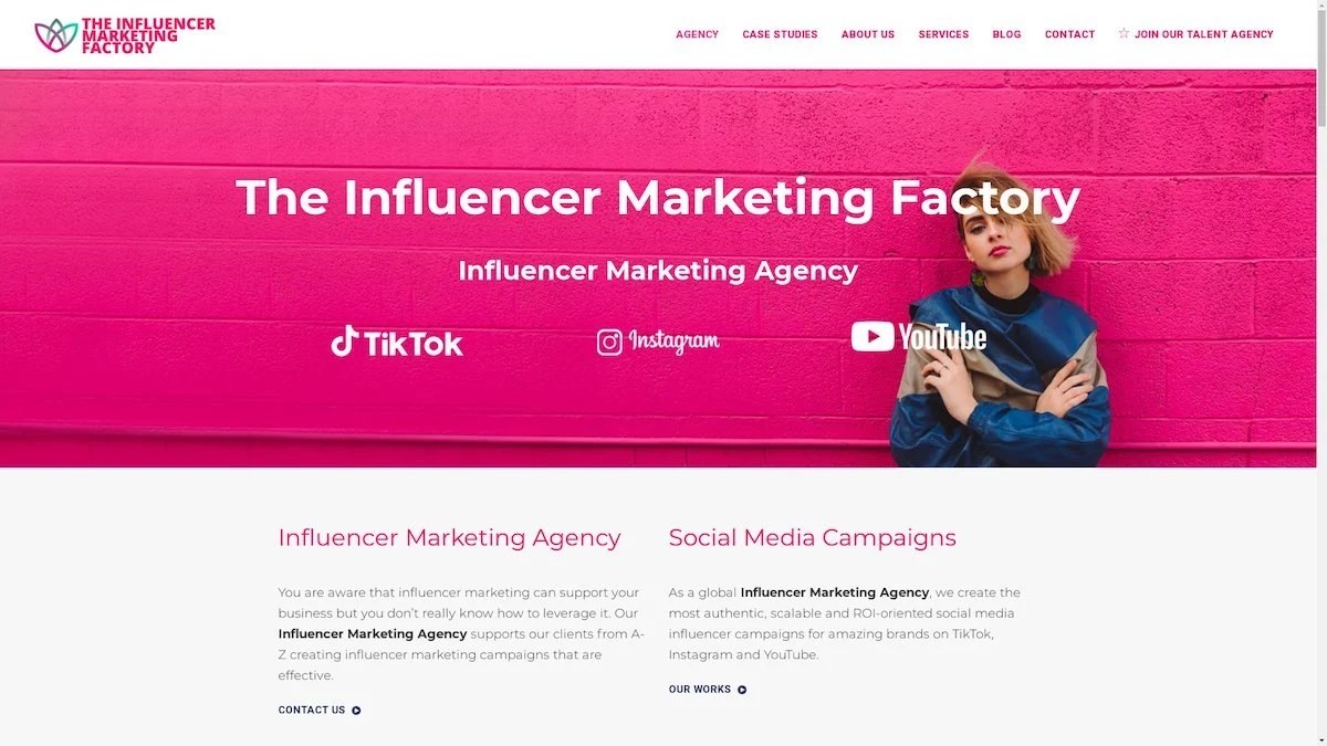
TikTok, Instagram & YouTube CampaignsA full-service agency with strong TikTok expertise, offering end-to-end campaign management from influencer discovery through performance reporting with a focus on platform-native content.Clients: Google, Snapchat, Universal Music, Bumble, YelpVisit TIMF → -
6

NeoReach
Enterprise Analytics & Influencer CampaignsAn enterprise-focused agency combining managed campaigns with a powerful self-service data platform for influencer search, audience analytics, and attribution modeling.Clients: Amazon, Airbnb, Netflix, Honda, The New York TimesVisit NeoReach → -
7

Ubiquitous
Creator-First Marketing PlatformA tech-driven platform combining self-service tools with managed campaign options, emphasizing speed and scalability for brands managing multiple influencer relationships.Clients: Lyft, Disney, Target, American Eagle, NetflixVisit Ubiquitous → -
8
Obviously
Scalable Enterprise Influencer CampaignsA tech-enabled agency built for high-volume campaigns, coordinating hundreds of creators simultaneously with end-to-end logistics, content rights management, and product seeding.Clients: Google, Ulta Beauty, Converse, AmazonVisit Obviously →
