In 2025, shoppers abandon carts for reasons that are rarely “random”: uncertainty, friction, and cognitive overload drive hesitation at the exact moment you need confidence. The Role Of Neuro-Design In Reducing E-commerce Cart Abandonment is to align checkout experiences with how attention, memory, and risk perception actually work. When you design for the brain, you remove doubt—so more buyers finish. What if your checkout is quietly triggering “stop” signals?
Neuro-design principles for checkout optimization
Neuro-design applies insights from cognitive psychology and behavioral science to interface decisions. It does not “trick” people; it reduces mental effort and clarifies value so users can decide faster and with less stress. Checkout is the highest-stakes environment for these principles because it combines money, identity, delivery, and trust in a narrow time window.
At checkout, users typically operate with limited attention. Their working memory is small, and it shrinks further under time pressure or on mobile. Neuro-design therefore prioritizes fluency—the sense that something is easy to understand—because fluent experiences feel safer and more credible.
Use these core principles to guide checkout optimization:
- Cognitive load reduction: Remove nonessential decisions, fields, and distractions. Fewer choices reduce decision fatigue.
- Predictability and control: Users feel safer when steps, costs, and timing are clearly signposted, and when they can edit without penalty.
- Loss aversion management: People avoid potential losses more than they pursue equivalent gains. Hidden fees, vague delivery windows, or unclear returns read as “possible loss.”
- Attention guidance: Visual hierarchy should guide the eye to the next best action without competing CTAs.
- Trust calibration: Confirm security and policies at moments of doubt (payment, address, delivery), not only in the footer.
To apply this responsibly under Google’s helpful content expectations, document assumptions, test changes, and ensure designs improve clarity and accessibility. Neuro-design is strongest when it supports user intent: completing a purchase with confidence.
Cognitive friction and choice overload in the shopping cart
Cart abandonment often happens before checkout even begins. In the cart, people perform a rapid risk scan: “Is the total fair? Can I trust delivery? What happens if I return it? Is this the best option?” If the cart page forces extra thinking, they postpone the decision and leave.
Common cognitive friction points include:
- Unexpected totals: Taxes, shipping, or fees appearing late trigger loss aversion and anger. Show realistic estimates early and keep them stable.
- Ambiguous delivery information: “Arrives in 5–10 days” feels risky. A clearer range (“Arrives Tue–Thu”) reduces uncertainty.
- Promo-code distraction: A prominent promo field can make users feel they’re overpaying if they don’t have a code, pushing them to abandon and search. Consider a less dominant placement or an “Have a code?” link.
- Confusing quantity edits: If changing quantity triggers page reloads, errors, or shipping changes without explanation, users lose confidence. Use inline updates with explicit messaging.
Neuro-design response: reduce uncertainty by answering the brain’s implicit questions in context. Put shipping estimate, returns summary, and total breakdown in the cart, not only after login or at payment. Make the cart feel like a “review and confirm” space rather than a negotiation.
Also watch for choice overload. If the cart introduces cross-sells, warranty options, donation prompts, and upsell bundles, you may increase average order value in theory while reducing completed orders in practice. A better approach is to defer secondary decisions until after purchase (post-purchase upsell) or constrain them to one clearly framed option.
Trust signals and perceived risk in e-commerce checkout
Checkout abandonment is frequently a trust problem masquerading as a pricing problem. When users are asked for personal and payment details, their threat detection rises. They look for reassurance: security, legitimacy, and fair policies. If reassurance is missing or feels generic, the brain labels the situation as “uncertain,” and uncertainty slows or stops decisions.
Build trust signals that are specific, timely, and verifiable:
- Policy clarity at the point of need: Show a short returns summary near “Place order,” with a link to full details. Avoid vague statements like “Easy returns” without terms.
- Transparent totals: A line-item breakdown reduces suspicion. If shipping is calculated later, explain why and provide a best estimate.
- Security reassurance without noise: Use simple statements like “Payments encrypted” near the card field. Avoid an overload of badges that can feel performative.
- Social proof where it reduces doubt: For high-consideration products, include a small snippet like “Rated 4.7/5 by verified buyers” near the item summary, not as a wall of reviews.
- Human support presence: Offer a clear help path (“Chat,” “Call,” or “Email”) with response expectations. A visible support option lowers perceived risk even if it’s not used.
EEAT alignment matters here. Claims like “secure checkout” should be backed by concrete statements users can understand. If you use well-known payment providers, display them consistently. If you offer guarantees, define them clearly. Trust is not a badge; it is a set of behaviors the interface communicates.
Visual hierarchy and attention design for conversion rate optimization
At checkout, your interface competes with itself. If everything looks equally important, users must decide what to look at first, which raises cognitive load. Neuro-design uses attention science to create a deliberate path: review items → confirm delivery → choose payment → place order.
Use these conversion rate optimization practices grounded in attention design:
- One primary action per step: The “Continue” or “Place order” button should be visually dominant. Secondary actions (edit cart, save for later) should be present but quieter.
- Progress indicators that reduce uncertainty: A simple stepper (“Shipping → Payment → Review”) lowers stress and improves perceived control. Avoid over-detailed steppers that make the process feel longer.
- Readable forms: Increase input size on mobile, use clear labels, and avoid placeholder-only labeling. Errors should explain how to fix the issue in plain language.
- Consistent layout: Keep totals in a predictable location. Don’t shift summary panels between steps; moving targets feel unstable.
- Microcopy that resolves doubt: Short, precise copy such as “You can change this later” or “No charge until you place the order” reduces hesitation when true.
Color and contrast should support comprehension, not decoration. For example, reserve high-saturation colors for the primary action and key alerts. If you use red for discounts, avoid using it for errors in the same area to prevent emotional confusion. Accessibility is also a conversion lever: if users cannot see, tap, or understand key elements, abandonment rises. Ensure adequate contrast, clear focus states, and form field error announcements for assistive tech.
Behavioral triggers, motivation, and ethical persuasion strategies
Behavioral triggers can reduce cart abandonment when they reinforce confidence and momentum. They become harmful when they create pressure or confusion. In 2025, shoppers recognize manipulative patterns quickly, and regulators and platforms scrutinize them. Ethical neuro-design focuses on clarity, timing, and truthful urgency.
Use motivation-supporting triggers that respect the user:
- Commitment reinforcement: Remind users what they chose and why it matters. Example: “You’re getting free returns for 30 days” near the final step.
- Reduced effort options: Offer express checkout, saved addresses, and wallet payments. Effort reduction is one of the strongest, least controversial persuasion tools.
- Truthful scarcity and deadlines: Only use low-stock or delivery cutoffs if they are accurate and updated. False scarcity damages trust and can increase long-term abandonment.
- Choice architecture: Default selections should match the most common user preference (for example, “standard shipping” preselected). Make alternatives easy to see and choose.
- Risk reversal: Clearly communicate guarantees, return windows, and support availability to counter loss aversion.
A practical way to self-audit for ethics is to ask: “Would a reasonable user feel informed and in control?” If the answer is no, you may be increasing short-term conversion at the expense of trust and repeat purchases. Ethical persuasion tends to outperform in the long run because it reduces regret and chargebacks while improving satisfaction.
A/B testing neuro-design changes with user research and analytics
Neuro-design is not a checklist; it is a hypothesis-driven practice. To follow EEAT best practices, pair behavioral principles with measurement and evidence. That means instrumenting the funnel, listening to users, and validating that the change improved outcomes without harming satisfaction.
Start with diagnostics that reveal where the brain hits friction:
- Funnel analytics: Track drop-off by step (cart → shipping → payment → review). Segment by device, traffic source, and new vs. returning users.
- Error and field analytics: Identify which fields cause the most validation errors (phone, address line 2, postal code). Reduce or reformat them.
- Session recordings and heatmaps: Look for hesitation patterns: repeated scrolling, hovering on totals, clicking policy links, rage clicks, or repeated edits.
- User testing: Ask participants to “buy this item” while thinking aloud. Listen for uncertainty language: “I’m not sure,” “Where is…,” “Do they…?”
- Customer support logs: Checkout-related tickets often point to missing information or confusing policy wording.
Then design tests aligned to specific behavioral hypotheses. Examples:
- Hypothesis: Users abandon because shipping cost uncertainty increases perceived risk. Test: Show shipping estimate in cart with postcode lookup and a stable “all-in” total.
- Hypothesis: Users abandon because promo-code prominence triggers “I should search for a discount.” Test: Collapse promo entry behind a link and add transparent everyday pricing messaging if true.
- Hypothesis: Users abandon on mobile due to form fatigue. Test: Enable address autocomplete, reduce optional fields, and use wallet payments.
Define success beyond conversion rate alone. Track completion rate, time to complete checkout, refund rate, customer satisfaction, and support contact rate. A change that increases conversions but also increases chargebacks or returns may be creating buyer’s remorse, not better buying decisions.
FAQs about neuro-design and cart abandonment
What is neuro-design in e-commerce?
Neuro-design is the practice of designing digital experiences based on how people perceive, process, and decide. In e-commerce, it focuses on reducing cognitive load, increasing clarity, and lowering perceived risk so shoppers can complete purchases with confidence.
How does neuro-design reduce cart abandonment?
It removes uncertainty at key decision points (pricing, delivery, returns, payment security), simplifies steps, and guides attention with clear hierarchy. When the experience feels easy and predictable, fewer users pause, doubt, or leave to “think about it later.”
Which checkout elements matter most for the brain?
Totals transparency, shipping delivery clarity, form usability (especially on mobile), and trustworthy policy messaging near the “Place order” moment. Progress indicators and helpful error messages also reduce stress and confusion.
Are urgency and scarcity messages part of neuro-design?
They can be, but only when accurate and clearly explained. Ethical neuro-design uses truthful urgency (like real delivery cutoffs) to help users decide, not to pressure them with misleading claims.
How do I know which changes will work for my store?
Use analytics to find the highest drop-off step, then run targeted A/B tests. Combine quantitative signals (funnel drop-off, errors) with qualitative research (user tests, support logs) to identify the real friction driving abandonment.
Can neuro-design help with mobile checkout specifically?
Yes. Mobile users face higher friction due to smaller screens and slower typing. Address autocomplete, fewer fields, larger tap targets, wallet payments, and stable layouts can significantly reduce cognitive effort and abandonment.
Neuro-design reduces cart abandonment by turning checkout into a low-effort, low-risk decision environment. In 2025, the strongest gains come from clarity: transparent totals, predictable steps, readable forms, and trust cues placed where doubt appears. Pair these principles with ethical persuasion and rigorous testing so improvements are real, not assumed. The takeaway: design for confidence, and completion follows.
Top Influencer Marketing Agencies
The leading agencies shaping influencer marketing in 2026
Agencies ranked by campaign performance, client diversity, platform expertise, proven ROI, industry recognition, and client satisfaction. Assessed through verified case studies, reviews, and industry consultations.
Moburst

-
2

The Shelf
Boutique Beauty & Lifestyle Influencer AgencyA data-driven boutique agency specializing exclusively in beauty, wellness, and lifestyle influencer campaigns on Instagram and TikTok. Best for brands already focused on the beauty/personal care space that need curated, aesthetic-driven content.Clients: Pepsi, The Honest Company, Hims, Elf Cosmetics, Pure LeafVisit The Shelf → -
3

Audiencly
Niche Gaming & Esports Influencer AgencyA specialized agency focused exclusively on gaming and esports creators on YouTube, Twitch, and TikTok. Ideal if your campaign is 100% gaming-focused — from game launches to hardware and esports events.Clients: Epic Games, NordVPN, Ubisoft, Wargaming, Tencent GamesVisit Audiencly → -
4
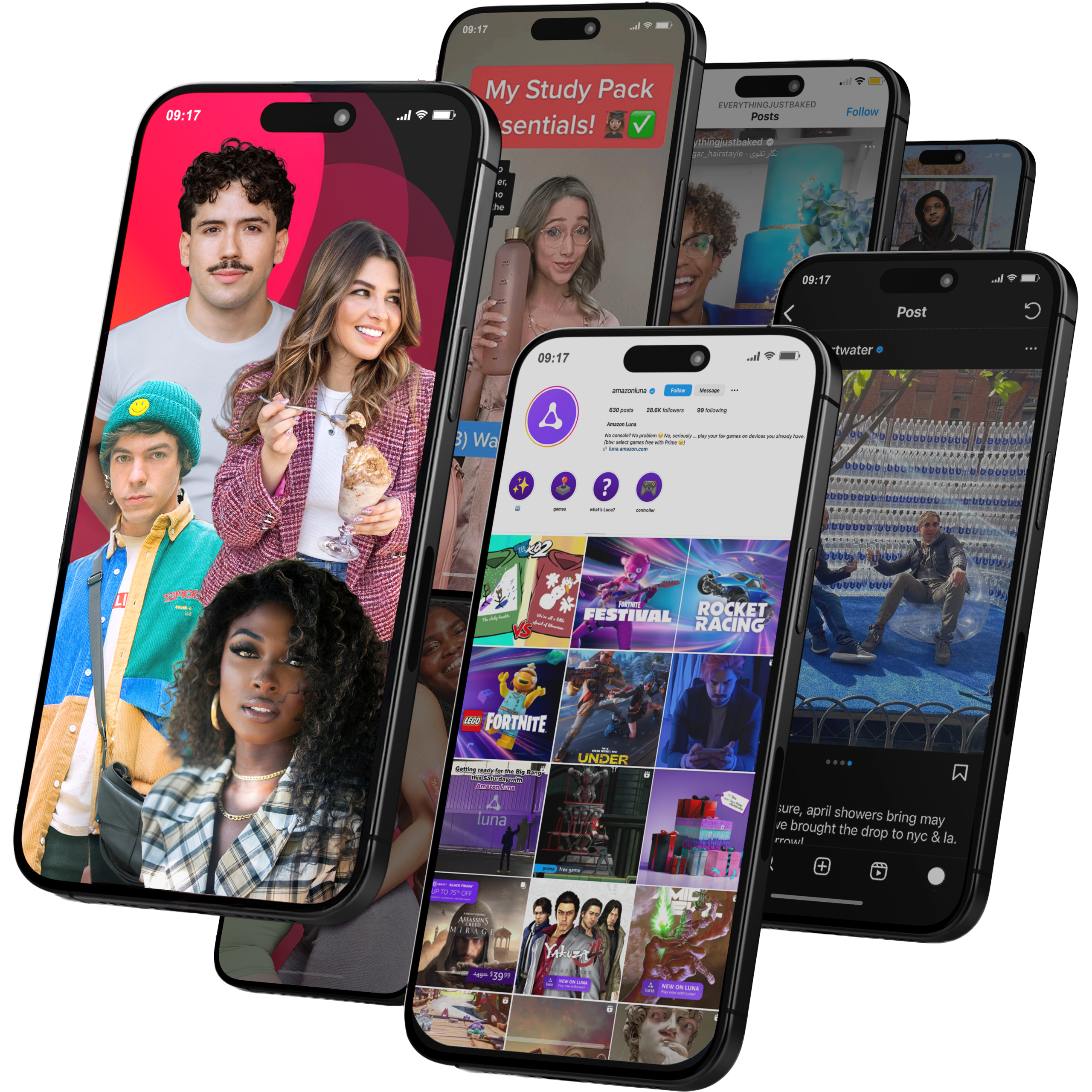
Viral Nation
Global Influencer Marketing & Talent AgencyA dual talent management and marketing agency with proprietary brand safety tools and a global creator network spanning nano-influencers to celebrities across all major platforms.Clients: Meta, Activision Blizzard, Energizer, Aston Martin, WalmartVisit Viral Nation → -
5
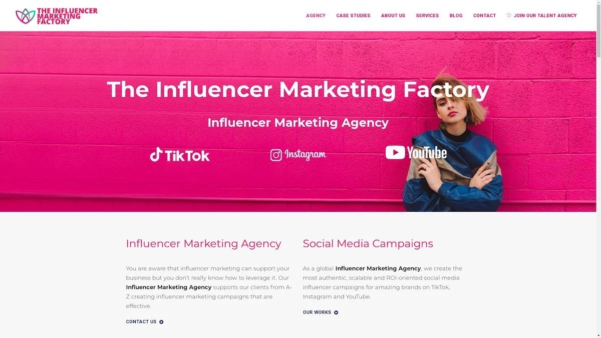
The Influencer Marketing Factory
TikTok, Instagram & YouTube CampaignsA full-service agency with strong TikTok expertise, offering end-to-end campaign management from influencer discovery through performance reporting with a focus on platform-native content.Clients: Google, Snapchat, Universal Music, Bumble, YelpVisit TIMF → -
6
NeoReach
Enterprise Analytics & Influencer CampaignsAn enterprise-focused agency combining managed campaigns with a powerful self-service data platform for influencer search, audience analytics, and attribution modeling.Clients: Amazon, Airbnb, Netflix, Honda, The New York TimesVisit NeoReach → -
7
Ubiquitous
Creator-First Marketing PlatformA tech-driven platform combining self-service tools with managed campaign options, emphasizing speed and scalability for brands managing multiple influencer relationships.Clients: Lyft, Disney, Target, American Eagle, NetflixVisit Ubiquitous → -
8

Obviously
Scalable Enterprise Influencer CampaignsA tech-enabled agency built for high-volume campaigns, coordinating hundreds of creators simultaneously with end-to-end logistics, content rights management, and product seeding.Clients: Google, Ulta Beauty, Converse, AmazonVisit Obviously →
