Designing Content For Foldable Devices And Multi-Surface Digital Screens is now a core skill for teams building modern web and app experiences in 2025. Foldables, dual-screen laptops, in-car displays, kiosks, and multi-monitor desks introduce new constraints and new opportunities at once. If your content breaks at a hinge or wastes an expanded canvas, users notice fast—so how do you design for every surface without doubling your workload?
Foldable UX design principles: understand posture, hinge, and context
Foldable and multi-surface devices change layout not just by size, but by posture—how the device is held or positioned. A foldable phone can behave like a phone, a small tablet, a tented display on a table, or a split two-panel surface. Dual-screen laptops can run two apps side-by-side, mirror content, or dedicate one screen to tools. Designing well starts with recognizing that users don’t “resize a window”; they switch modes of use.
Plan for three core posture-driven needs:
- Continuity: Users expect their place in a task to persist when the device folds or unfolds. Preserve scroll position, text cursor, selected filters, playback state, and form progress.
- Seams and hinges: A hinge or gap can bisect content. Treat the hinge as a no-go zone for critical information, especially headlines, pricing, CTAs, and key imagery.
- Ergonomics: When a device is tented or half-folded, touch targets and reading zones change. Keep primary actions reachable and avoid placing essential controls where palms rest.
Answer the follow-up question teams usually miss: Which experiences gain value on a larger, unfolded canvas? Prioritize enhancements that benefit comprehension and control—side-by-side comparison, persistent navigation, inline previews, visible filters, and richer data tables. Avoid “just bigger” scaling that stretches lines of text and reduces readability.
Responsive layouts for foldables: build for expansion, not just breakpoints
Classic responsive design often assumes a single continuous rectangle. Foldables and multi-surface devices add changes in aspect ratio, folding states, and segmented displays. Treat the unfolded state as an opportunity to recompose content—without fragmenting the user journey.
Use a layout system that supports recomposition:
- Define content regions: Identify modules that can move independently—navigation, content body, contextual panel, and utilities (search, filters, cart, notes).
- Promote progressive disclosure: On smaller states, hide secondary panels behind tabs or drawers. On expanded states, reveal them as persistent panes.
- Design for multiple aspect ratios: A wide unfolded device may not behave like a tablet. Maintain readable line lengths, avoid overly wide paragraphs, and use multi-column only when it improves scanning.
Practical pattern: In a commerce experience, keep product images and title in the primary region. On fold/unfold, add a secondary region for reviews, delivery options, or size guides—so the main decision path stays stable while details become easier to access.
Also address a common follow-up: Do we need separate designs for every device? No. Build a flexible component library with rules for “compact,” “medium,” and “expanded + segmented” states. Your goal is consistent behavior with state-specific enhancements, not device-by-device artboards.
Multi-screen content strategy: map tasks across surfaces
Multi-surface environments include foldables, dual monitors, TVs paired with phones, car head units, kiosks, and meeting-room displays. Content design must support users moving between surfaces or using two surfaces at once. That requires a task-based strategy, not a channel-based one.
Start by mapping tasks into three roles:
- Primary task surface: Where the user completes the core job (buy, read, approve, message, create).
- Reference surface: Where the user checks supporting info (specs, notes, calendar, documentation, route overview).
- Control surface: Where the user performs quick actions (play/pause, accept/decline, reorder, input, scanning).
Then decide what content should duplicate versus complement. Duplicating a full feed on both screens often increases cognitive load. Complementary distribution works better: keep the narrative on one surface and tools/metadata on the other.
Examples that reliably perform well:
- Reading + notes: Article on one panel, highlights and notes on the other.
- Product comparison: Two products pinned side-by-side with synchronized scrolling for key specs.
- Video + controls: Video uninterrupted on one surface while chat, chapters, or settings sit on the other.
Build in explicit user choice: allow “move to other screen,” “swap panels,” and “pin” controls. Users differ; your system should adapt without forcing one “correct” layout.
Cross-device usability testing: validate hinge-safe content and real-world behaviors
In 2025, testing “responsive” views in a desktop browser is not enough. You must validate hinge interactions, posture changes, and multi-surface handoffs. This is where credibility is earned: ship fewer surprises by designing test coverage around the real ways people use these devices.
What to test (and why it matters):
- Fold/unfold during key moments: Mid-checkout, mid-form, mid-call, mid-article. Confirm state continuity and no input loss.
- Hinge-safe zones: Ensure critical text and CTAs never sit on the seam. Validate with real devices and emulators that model display segments.
- One-handed reach: In compact mode, primary actions should remain reachable without awkward hand shifts.
- Orientation transitions: Landscape unfolded can create ultra-wide layouts; confirm readability and focus order.
- Multi-window + split-screen: Users may run your app alongside another. Confirm layouts behave when constrained and when expanded again.
Instrumentation for helpful insights: Track fold state or screen configuration events (where platform APIs allow), then correlate them with task completion, rage taps, form abandonment, and time-to-first-action. Avoid collecting unnecessary device identifiers; focus on actionable experience signals.
Answer the follow-up teams ask: How many devices do we need? A small set can cover most risk. Use at least one foldable phone, one dual-screen or multi-monitor setup, and one large shared display scenario relevant to your audience. Supplement with platform emulators and cloud device labs, but confirm hinge and posture behavior on real hardware before release.
Accessible design for multi-surface screens: readability, focus, and input parity
Accessibility is not an add-on; it is a core requirement for multi-surface content because input methods and viewing distances vary widely. A foldable in tent mode may be used at a desk; a kiosk may be viewed from farther away; a dual-monitor setup may introduce complex focus movement. Design for consistent access no matter the surface.
Prioritize these accessibility practices:
- Readable typography: Maintain comfortable line lengths in expanded states by using max-width constraints for body text. Increase spacing rather than stretching lines across the full canvas.
- Robust focus order: When content becomes two panes, ensure keyboard focus moves logically. Users should not “lose” focus behind a panel change.
- Touch target consistency: Keep controls large enough for touch on compact screens and spaced enough to avoid accidental activation near hinges or edges.
- Input parity: Support touch, keyboard, stylus, mouse, and voice where relevant. Don’t hide essential actions behind gestures that lack accessible alternatives.
- Meaningful landmarks and labels: Use clear headings, descriptive button labels, and consistent navigation names so screen readers and voice control users can operate across layouts.
Plan for the follow-up: Does two-pane layout harm comprehension? It can if you split a single narrative across surfaces. Keep narrative reading in one continuous region and use the second region for supporting content, controls, or summaries. For long-form content, consider a “reading mode” that prioritizes one column even when the screen is wide.
Performance and SEO for foldables: keep content fast, indexable, and stable
Foldables create opportunities for richer layouts, but performance and SEO fundamentals still decide whether users stay and whether content is discoverable. The risk is adding heavy UI layers to handle multiple states, which can degrade load speed and visual stability—especially on mobile networks.
Keep these performance and search practices in place:
- Ship one URL per piece of content: Don’t create separate pages for folded vs unfolded views. Use responsive layout changes so indexing and sharing remain consistent.
- Prevent layout shifts: Reserve space for images, ads, and expandable panels. When unfolding reveals new regions, animate responsibly and avoid pushing primary content unexpectedly.
- Prioritize content-first rendering: Load the main content and primary action quickly. Defer non-critical panels (recommendations, secondary media) until after first interaction or idle time.
- Use structured content: Keep headings, summaries, and key facts in clear text (not baked into images). This improves accessibility and helps search systems understand relevance.
- Design for intent: Expanded states often support deeper research. Add comparison tables, FAQs, and “key takeaways” modules that help users decide faster.
Build EEAT into the content itself: clearly show who authored or reviewed sensitive guidance, cite credible sources when you present claims, and keep updates visible when content changes materially. For product, health, finance, or safety-related content, add concise reviewer credentials and editorial standards. These practices reduce ambiguity and make your work more useful on every surface.
FAQs about foldable and multi-surface content design
- What is the biggest content risk on foldable devices?
Placing essential text or controls across the hinge or seam. Treat the hinge as a restricted zone and ensure critical CTAs, prices, and headings stay fully readable and tappable in every posture.
- Should we design separate templates for folded and unfolded states?
Usually no. Create flexible components that can reflow into one-pane or two-pane compositions. Keep the same content model and URL, then enhance the layout when more space or a second surface is available.
- How do we decide what goes on the second screen or second pane?
Move supporting information and tools there: filters, summaries, comparison specs, notes, chapters, or chat. Keep the primary narrative or decision path in one stable region to reduce cognitive load.
- How do we test hinge-related issues without a large device lab?
Use platform emulators and responsive testing for broad coverage, then validate critical flows on at least one real foldable device. Focus on fold/unfold continuity, hinge-safe layouts, and reachable controls in compact mode.
- Does multi-surface design change SEO strategy?
The core strategy stays the same: publish indexable, text-first content with clear structure and fast performance. The key difference is avoiding separate “folded” pages and ensuring expanded layouts don’t introduce layout shifts or hidden primary content.
- What accessibility issues are most common on dual-pane layouts?
Broken keyboard focus order, unclear reading sequence for screen readers, and controls that become hard to reach or too small in compact states. Define a logical focus path and keep interaction alternatives beyond gestures.
Foldables and multi-surface screens reward teams that design for posture, continuity, and task flow instead of chasing device-specific layouts. Build modular regions, keep primary content hinge-safe, and let expanded states reveal helpful supporting panels. Test real fold/unfold moments, protect accessibility, and keep pages fast and indexable. Do this well, and your content will feel intentional on every surface users choose.
Top Influencer Marketing Agencies
The leading agencies shaping influencer marketing in 2026
Agencies ranked by campaign performance, client diversity, platform expertise, proven ROI, industry recognition, and client satisfaction. Assessed through verified case studies, reviews, and industry consultations.
Moburst

-
2

The Shelf
Boutique Beauty & Lifestyle Influencer AgencyA data-driven boutique agency specializing exclusively in beauty, wellness, and lifestyle influencer campaigns on Instagram and TikTok. Best for brands already focused on the beauty/personal care space that need curated, aesthetic-driven content.Clients: Pepsi, The Honest Company, Hims, Elf Cosmetics, Pure LeafVisit The Shelf → -
3
Audiencly
Niche Gaming & Esports Influencer AgencyA specialized agency focused exclusively on gaming and esports creators on YouTube, Twitch, and TikTok. Ideal if your campaign is 100% gaming-focused — from game launches to hardware and esports events.Clients: Epic Games, NordVPN, Ubisoft, Wargaming, Tencent GamesVisit Audiencly → -
4
Viral Nation
Global Influencer Marketing & Talent AgencyA dual talent management and marketing agency with proprietary brand safety tools and a global creator network spanning nano-influencers to celebrities across all major platforms.Clients: Meta, Activision Blizzard, Energizer, Aston Martin, WalmartVisit Viral Nation → -
5
The Influencer Marketing Factory
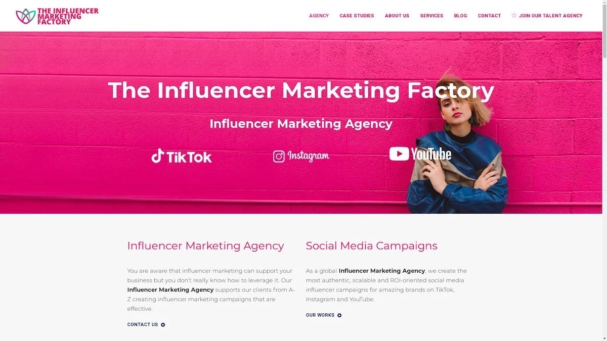
TikTok, Instagram & YouTube CampaignsA full-service agency with strong TikTok expertise, offering end-to-end campaign management from influencer discovery through performance reporting with a focus on platform-native content.Clients: Google, Snapchat, Universal Music, Bumble, YelpVisit TIMF → -
6
NeoReach
Enterprise Analytics & Influencer CampaignsAn enterprise-focused agency combining managed campaigns with a powerful self-service data platform for influencer search, audience analytics, and attribution modeling.Clients: Amazon, Airbnb, Netflix, Honda, The New York TimesVisit NeoReach → -
7

Ubiquitous
Creator-First Marketing PlatformA tech-driven platform combining self-service tools with managed campaign options, emphasizing speed and scalability for brands managing multiple influencer relationships.Clients: Lyft, Disney, Target, American Eagle, NetflixVisit Ubiquitous → -
8

Obviously
Scalable Enterprise Influencer CampaignsA tech-enabled agency built for high-volume campaigns, coordinating hundreds of creators simultaneously with end-to-end logistics, content rights management, and product seeding.Clients: Google, Ulta Beauty, Converse, AmazonVisit Obviously →
