The Science Of Scroll-Stopping Visuals: Analyzing Eye-Tracking Data Insights is no longer a niche topic for labs and large brands. In 2025, eye-tracking evidence helps marketers, designers, and product teams predict what people notice first, what they ignore, and what makes them pause. When you understand attention patterns, you stop guessing and start designing for real human vision—so what are the signals your audience can’t resist?
How eye-tracking data reveals visual attention patterns
Eye-tracking measures where people look, how long they look, and in what sequence. That sounds simple, but the practical insight is profound: attention is not evenly distributed across a screen. Users skim, hunt, and decide quickly. Eye-tracking turns that invisible behavior into analyzable signals so you can build visuals that earn attention rather than demand it.
Most studies report a few core metrics that matter for scroll-stopping design:
- First fixation: the first point a user looks at after a visual appears. This often predicts whether they will continue reading or scroll past.
- Time to first fixation (TTFF): how quickly an element attracts gaze. Lower TTFF often signals clearer visual hierarchy.
- Dwell time: total time spent looking at an element. High dwell can mean interest, confusion, or both—context matters.
- Fixation count: how many times eyes land on an element. Repeated fixations can indicate importance or difficulty processing.
- Saccades and scan paths: the “jumps” between fixations and the route the eyes take. Chaotic scan paths often indicate competing priorities or clutter.
To apply this data with credibility (and align with EEAT), validate that your test conditions match real use: mobile vs. desktop, feed context, typical viewing distance, and realistic tasks. If a team tests a static image in a lab but publishes it in a fast-moving social feed, the conclusions often overpromise.
Also, treat eye-tracking as evidence of attention, not mind-reading. Pair it with user interviews, comprehension checks, or click/scroll analytics to confirm whether someone understood what they looked at.
Heatmaps and gaze plots: turning eye-tracking insights into design decisions
Eye-tracking outputs usually arrive as heatmaps (aggregate attention “hot spots”) and gaze plots (individual scan sequences). Both are useful, but each can mislead if you don’t ask the right questions.
Heatmaps help you confirm whether your intended hierarchy is working. If the brand mark is blazing hot but the product name is cold, you may be paying for attention that doesn’t convert. If your call-to-action is barely seen, you don’t have a persuasion problem—you have a visibility problem.
Gaze plots answer different questions: Do users look at the headline before the imagery? Do they bounce between two competing elements? Do they look at the price before they understand what the product does? These sequences reveal whether the visual story unfolds in a logical order.
Use these practical checks to move from charts to action:
- Define the “attention job”: what must be noticed in the first second (e.g., product category, benefit, or offer)?
- Validate order: does the scan path follow your priority list—hook, context, proof, action?
- Diagnose dead zones: important elements with low fixations need repositioning, contrast, size changes, or simplification.
- Check for over-fixation: if users stare at a label or icon unusually long, test whether it is confusing or ambiguous.
Answer the follow-up question most teams ask: What if heatmaps show attention on the wrong thing? Don’t add more. Subtract and reorganize. Reduce competing focal points, increase whitespace, and create a single dominant element that clearly points to the next step (headline, benefit, or CTA).
Visual hierarchy and contrast: the anatomy of scroll-stopping design
Scroll-stopping visuals aren’t loud by default. They’re legible, prioritized, and easy to parse at speed. Eye-tracking repeatedly shows that when hierarchy is clear, TTFF drops for key elements and scan paths become more predictable.
Build hierarchy by controlling the variables that human vision uses to rank importance:
- Size and scale: one dominant focal element beats several medium “almost important” elements.
- Contrast: luminance contrast (light vs. dark) often matters more than color contrast alone, especially on mobile in bright environments.
- Positioning: place the primary message where the eye naturally lands for that layout (often near the visual center or a strong intersection point).
- Whitespace: separation creates comprehension speed. Crowding increases search time.
- Typography clarity: high legibility reduces dwell time caused by decoding effort.
A common follow-up: Is the goal to maximize dwell time? Not always. For a CTA or key benefit line, you often want fast recognition and a clean transition to the next step. If dwell time is high because users are deciphering small text or a busy background, the design is failing even though “attention” looks good.
Another practical insight from eye-tracking work: avoid placing multiple “high-contrast anchors” (bright badges, intense gradients, bold headlines, large faces) without a clear dominance. The eyes will bounce, and the message won’t land. Decide the single hero element and let everything else support it.
Faces, motion, and novelty: psychology-backed triggers for attention
Human attention is biased toward socially and biologically relevant cues. In fast-scrolling contexts, that bias can help you earn first fixations—if you use it strategically.
Faces and gaze direction can be powerful, but only when they support the message. If a face looks directly at the viewer, it can capture attention but also trap it. If the face looks toward your headline or product, it can guide scan paths toward what matters. Eye-tracking often shows that gaze direction acts like an arrow—subtle but effective.
Motion (short video loops, micro-animations, cinemagraph-style movement) can reduce TTFF, but it can also overwhelm. A useful rule: animate one thing that clarifies meaning (the product in use, the result, the “before/after”), not decorative movement that competes with copy.
Novelty and pattern interruption also work, but novelty must still be interpretable in a glance. If the visual is surprising but unclear, you get a fixation without comprehension—users may scroll anyway. Eye-tracking helps here: pair attention metrics with a simple comprehension question (e.g., “What was this about?”). If they looked but can’t answer, your hook is noise.
Accessibility is part of effective attention design, not an afterthought. High contrast, readable type, and reduced motion options can improve both user experience and measurable attention outcomes. Strong brands treat inclusive design as a performance lever because it reduces friction across devices and viewing conditions.
A/B testing with eye-tracking: evidence-based creative optimization
Eye-tracking becomes most valuable when it complements performance testing. A/B tests tell you what won. Eye-tracking often explains why—and what to fix in the losing variant without endless guessing.
Use a structured workflow to keep results trustworthy:
- Start with a hypothesis: “Increasing headline contrast will reduce TTFF to the benefit line and increase clicks.”
- Keep one major change per variant: otherwise you won’t know what caused the effect.
- Measure attention + outcome: combine TTFF/dwell/fixation with CTR, scroll depth, add-to-cart, or lead submissions.
- Segment by context: mobile vs. desktop, new vs. returning, cold vs. warm audiences.
- Check comprehension: add a quick recall prompt after exposure for message clarity.
Readers often ask: How many participants do we need? It depends on how you’re using the method. For directional design feedback, smaller moderated samples can reveal obvious hierarchy problems quickly. For claims you’ll scale across campaigns, increase sample size, diversify participants, and triangulate with live data. Avoid absolute statements like “this will always work”; attention patterns vary by audience familiarity, language, and platform norms.
Another key question: Can webcam eye-tracking replace lab equipment? In 2025, webcam-based methods can be useful for relative comparisons and early iteration, but they generally have lower precision than dedicated hardware. Treat webcam tracking as a practical input for creative refinement, and reserve high-stakes decisions for higher-fidelity setups or larger-scale validation.
Common eye-tracking mistakes: what to avoid for credible insights
Eye-tracking can produce confident-looking visuals that tempt teams to overinterpret. To keep your conclusions credible and aligned with helpful content best practices, avoid these frequent errors:
- Equating attention with persuasion: seeing an element doesn’t mean agreeing with it or trusting it.
- Ignoring task context: browsing for entertainment differs from shopping with intent. Test the right scenario.
- Overloading a single frame: too many focal points create scattered fixations and weak recall.
- Misreading long dwell time: it can signal confusion. Always cross-check with comprehension or sentiment feedback.
- Publishing conclusions without methodology: for EEAT, document device types, participant profile, stimulus duration, and how you defined areas of interest.
If you lead a team, create a simple “attention spec” for every scroll-stopping asset: primary message, proof point, CTA, and the intended viewing context. Then use eye-tracking to confirm the order of noticing matches the order of importance. This keeps creative, UX, and growth stakeholders aligned and reduces subjective debates.
FAQs about eye-tracking and scroll-stopping visuals
What is the main benefit of eye-tracking for visual marketing?
Eye-tracking shows what people notice first and what they ignore, helping you design clearer hierarchy and faster comprehension. It reduces guesswork, especially for above-the-fold layouts, ads, thumbnails, and landing page headers.
Do heatmaps tell me what users prefer?
No. Heatmaps show attention distribution, not preference or trust. Pair them with conversion metrics and a short comprehension or recall question to verify the visual both attracts attention and communicates meaning.
What makes a visual “scroll-stopping” on mobile?
Clear dominance (one focal element), high legibility, strong luminance contrast, minimal clutter, and an instantly recognizable message. Eye-tracking typically confirms this through faster time to first fixation on the key message and fewer competing scan jumps.
Should I use faces in ads and thumbnails?
Faces can earn quick first fixations, but they should support the message. Test whether the face draws attention away from the product or headline. Gaze direction toward the product or text often helps guide attention more effectively.
Is video always better than static for attention?
Not always. Motion can attract gaze quickly, but it can also distract from the message. Use motion to clarify meaning (product in use, result, transformation) and keep other elements simple.
How do I know if high dwell time is good or bad?
Interpret dwell time with context. High dwell on a benefit line may indicate interest; high dwell on small print or icons can indicate confusion. Validate with comprehension checks and performance outcomes like CTR or add-to-cart.
Can small teams use eye-tracking effectively?
Yes. Start with a few focused tests to catch hierarchy issues, then confirm fixes with live A/B results. Even lightweight studies can prevent costly creative mistakes when you keep the hypothesis tight and the changes controlled.
Eye-tracking turns visual design from opinion into evidence by revealing where attention lands, how it moves, and what gets ignored. In 2025, the best scroll-stopping work combines clear hierarchy, high legibility, and psychology-informed cues, then validates them with attention metrics plus real outcomes. Use eye-tracking to refine what people see first—and you’ll earn pauses that translate into understanding and action.
Top Influencer Marketing Agencies
The leading agencies shaping influencer marketing in 2026
Agencies ranked by campaign performance, client diversity, platform expertise, proven ROI, industry recognition, and client satisfaction. Assessed through verified case studies, reviews, and industry consultations.
Moburst
-
2

The Shelf
Boutique Beauty & Lifestyle Influencer AgencyA data-driven boutique agency specializing exclusively in beauty, wellness, and lifestyle influencer campaigns on Instagram and TikTok. Best for brands already focused on the beauty/personal care space that need curated, aesthetic-driven content.Clients: Pepsi, The Honest Company, Hims, Elf Cosmetics, Pure LeafVisit The Shelf → -
3
Audiencly
Niche Gaming & Esports Influencer AgencyA specialized agency focused exclusively on gaming and esports creators on YouTube, Twitch, and TikTok. Ideal if your campaign is 100% gaming-focused — from game launches to hardware and esports events.Clients: Epic Games, NordVPN, Ubisoft, Wargaming, Tencent GamesVisit Audiencly → -
4
Viral Nation
Global Influencer Marketing & Talent AgencyA dual talent management and marketing agency with proprietary brand safety tools and a global creator network spanning nano-influencers to celebrities across all major platforms.Clients: Meta, Activision Blizzard, Energizer, Aston Martin, WalmartVisit Viral Nation → -
5
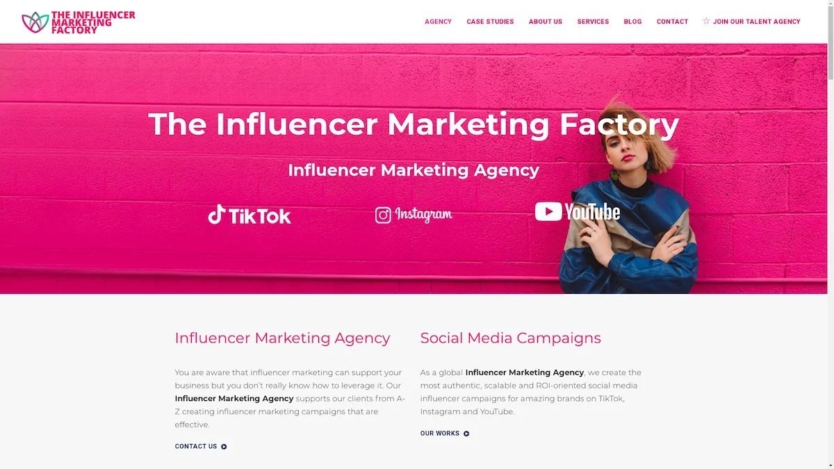
The Influencer Marketing Factory
TikTok, Instagram & YouTube CampaignsA full-service agency with strong TikTok expertise, offering end-to-end campaign management from influencer discovery through performance reporting with a focus on platform-native content.Clients: Google, Snapchat, Universal Music, Bumble, YelpVisit TIMF → -
6
NeoReach
Enterprise Analytics & Influencer CampaignsAn enterprise-focused agency combining managed campaigns with a powerful self-service data platform for influencer search, audience analytics, and attribution modeling.Clients: Amazon, Airbnb, Netflix, Honda, The New York TimesVisit NeoReach → -
7
Ubiquitous
Creator-First Marketing PlatformA tech-driven platform combining self-service tools with managed campaign options, emphasizing speed and scalability for brands managing multiple influencer relationships.Clients: Lyft, Disney, Target, American Eagle, NetflixVisit Ubiquitous → -
8

Obviously
Scalable Enterprise Influencer CampaignsA tech-enabled agency built for high-volume campaigns, coordinating hundreds of creators simultaneously with end-to-end logistics, content rights management, and product seeding.Clients: Google, Ulta Beauty, Converse, AmazonVisit Obviously →
