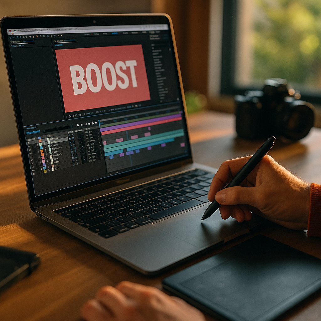
In 2025, audiences decide within seconds whether a clip deserves their attention. The Power Of Kinetic Typography In Enhancing Short-Form Video Completion lies in making meaning instantly clear, even on mute, while guiding the eye through the story. When text moves with purpose, it becomes a visual narrator that reduces confusion and boosts retention—so viewers stay longer and act sooner. Ready to keep thumbs from scrolling?
Why kinetic typography boosts short-form video completion rates
Kinetic typography is animated text designed to reinforce what’s being said (or what should be understood) through timing, motion, and hierarchy. In short-form video, completion rate depends on clarity, pacing, and perceived value. Text that appears at the right moment can solve all three.
It improves comprehension in low-attention environments. Most short-form viewing happens while multitasking, in public spaces, or with audio off. When key phrases land as readable, well-timed captions or emphasized words, viewers don’t need to “work” to follow the message. Less effort means fewer drop-offs.
It creates micro-payoffs that encourage continued viewing. A sequence of animated headings, punchy callouts, and progressive reveals gives viewers small rewards every second or two. That rhythm can replace slow exposition and keep momentum high, especially in videos under 30 seconds.
It sets expectations and reduces uncertainty. Viewers abandon content when they can’t quickly tell what they’re getting. A kinetic title card like “3 fixes in 15 seconds” or “Watch until the end for the template” makes the promise explicit and gives people a reason to stay.
It supports memory and recall. Humans encode information better when it’s presented through multiple channels. When animated text mirrors the spoken message, it strengthens recall, helping viewers retain takeaways and recognize your brand in later feeds.
Animated text overlays that improve mobile readability
Great kinetic typography starts with legibility. If viewers struggle to read, the “enhancement” becomes friction. Since most short-form video is consumed on phones, design for small screens first.
Use a clear hierarchy. Decide what must be read versus what’s optional. Keep the primary idea in a larger weight and size, then add secondary phrases as smaller supporting elements. Avoid making everything shout.
Respect safe areas and UI overlays. Platforms place captions, buttons, and descriptions over the video. Keep important text away from the bottom and far right edges where interface elements commonly sit. Place headlines near the upper third or center-left region, and test across devices.
Design for “glance readability.” Aim for phrases that can be read in under one second. Replace long sentences with short clauses. If you need detail, reveal it in stages across shots or beats.
Choose typefaces for speed, not personality first. Clean sans-serifs typically perform well on small screens. If you use a display font, reserve it for 1–3 words and pair it with a simpler body font. Maintain consistent letter spacing and avoid thin weights that break up on compression.
Use contrast that survives compression. Short-form platforms often compress video. To keep text readable, use strong contrast between text and background. Consider subtle shadows or semi-transparent backing shapes. Avoid relying solely on color differences that disappear in bright environments.
Caption strategy: verbatim is not always best. For completion, focus on meaning. Condense spoken lines into readable captions while keeping key terms intact. If accuracy matters (medical, legal, financial), keep full captions but highlight the essential phrase with kinetic emphasis.
- Do: “Stop doing this in interviews” → then reveal the “this.”
- Don’t: Place an entire paragraph on screen and animate it for style.
Motion design principles for engaging kinetic typography
Kinetic typography works because motion directs attention. But motion can also overwhelm. The goal is controlled energy that matches the story and makes viewing effortless.
Sync motion to speech and beats. Time text entrances to natural pauses, stressed words, or beat hits. When motion aligns with audio (even if viewers can’t hear it), the pacing feels “right.” If you’re editing to trending sounds, anchor text changes to the same rhythmic grid.
Prioritize one motion idea per moment. Mixing spins, bounces, wipes, and warps in a single sentence reads as noise. Pick a primary behavior (slide-in, scale-up, type-on, pop) and repeat it as a signature style.
Use easing to feel human. Linear motion looks mechanical. Ease-in and ease-out make text feel intentional and reduce visual stress. Keep transitions short; long swoops can delay comprehension.
Guide the eye with directional cues. Use movement to lead viewers to the next idea: left-to-right motion suggests progression; vertical stacking suggests a list; scaling can signal importance. If your message is “Step 1, Step 2, Step 3,” animate steps consistently so viewers anticipate what’s next.
Limit simultaneous elements. Short-form screens are small. If three text blocks move at once, viewers don’t know what to read. One moving element plus one static element is often enough.
Build a loop-friendly ending. Many short-form clips auto-loop. End with a clean final frame that also serves as a beginning: a summary title, a question, or a promise. This can raise average watch time because viewers may rewatch from the top.
Short-form video retention strategies using on-screen captions
Kinetic typography is most powerful when it supports a retention plan. Instead of “adding captions,” structure text as a retention tool across the entire timeline.
Open with an immediate premise. In the first second, show a headline that states the payoff: “Fix your lighting in 10 seconds,” “3 ways to cut editing time,” or “The mistake that tanks conversions.” This reduces uncertainty and prevents early exits.
Create a text-based roadmap. For list-style content, show a progress indicator: “1/3,” “2/3,” “3/3.” Viewers are more likely to finish when they see the end approaching. This is a simple behavioral cue that answers the silent question: “How long will this take?”
Use pattern breaks every 2–4 seconds. A pattern break is a controlled change in visual rhythm: a new text style, a quick zoom, a background shift, or a bold keyword. The point is not chaos; it’s renewed attention. Text offers a clean pattern break without needing more footage.
Turn key phrases into anchors. Identify the “must-remember” words and animate them differently: larger size, different color, or a quick emphasis. This keeps the viewer oriented even if they missed a sentence.
Answer follow-up questions inside the video. Many viewers drop off because they anticipate missing context. Use text to pre-empt common objections: “No expensive gear,” “Works on iPhone,” “Template at the end,” or “Takes 2 minutes.” These phrases reduce doubt and keep viewers watching.
End with a clear next step. Completion is valuable, but the business outcome often depends on what happens next. Use kinetic typography to deliver a single action: “Save this,” “Follow for part 2,” or “Comment ‘guide’ and I’ll send it.” Keep it specific and aligned with the content promise.
A/B testing kinetic typography for higher watch time
If you want reliable gains, treat kinetic typography as a testable variable. You don’t need a massive team; you need a repeatable process and clean comparisons.
Define success metrics clearly. For completion-focused work, track average watch time, completion rate, and rewatch rate. If the goal is conversion, also track profile visits, link clicks, saves, and comments. Tie each test to one primary KPI so results are interpretable.
Test one change at a time. Common variables include:
- Hook text: Question vs. statement vs. bold claim
- Caption density: Minimal highlights vs. full captions with emphasis
- Typography style: Clean and consistent vs. more expressive treatments
- Motion intensity: Subtle entrances vs. energetic pops
- Progress cues: Step counters and timelines vs. none
Build a “baseline version” you can reuse. Create a template with standard font sizes, placement, and motion presets. Then produce a single variation for testing. This reduces noise and helps you learn faster across different topics.
Segment by content type. What works for tutorials may not work for storytelling or product demos. Maintain separate baselines for each format so you’re not comparing mismatched videos.
Use qualitative review alongside analytics. Watch your own videos with the sound off, then at 1.5x speed, then on a smaller phone. Note where comprehension drops. Combine that with audience retention graphs to identify exact timestamps where viewers leave, then adjust typography timing or clarity at those moments.
Keep accessibility in scope. Ensure captions are readable, avoid flashing effects, and don’t rely on color alone to convey meaning. Accessible design improves completion because it removes barriers for more viewers, not just those with disabilities.
Brand storytelling with kinetic typography in vertical video
Completion improves when viewers recognize your style and trust the value they’ll get. Kinetic typography can become a brand asset that signals credibility while keeping content fast and digestible.
Develop a consistent visual language. Choose a small set of fonts, weights, colors, and motion behaviors. Consistency helps viewers process information faster because they learn your patterns. Over time, your captions become recognizable without logos.
Match typography to brand personality, not trends. Trendy effects can work, but they age quickly and may distract from the message. If you’re a finance creator, crisp and restrained motion suggests confidence. If you’re in entertainment, more playful motion can fit. The key is alignment.
Use text to establish authority without slowing down. EEAT-friendly signals can appear on screen briefly and still matter: “Designer, 10 years,” “Trainer-certified,” “Case study results,” or “Sources in caption.” Keep claims specific and avoid exaggeration. If you reference data, summarize the insight and offer a place to verify it (for example, “link in bio” or “sources listed”).
Respect accuracy in sensitive niches. In health, legal, or financial content, kinetic typography should clarify, not oversimplify. Use on-screen qualifiers like “general info,” “depends on jurisdiction,” or “talk to a professional” when appropriate. This builds trust and reduces backlash that can hurt distribution.
Create “signature sequences.” Repeating a short animated intro (under one second) or a consistent outro frame can increase familiarity and rewatch behavior. Keep it short so it doesn’t consume the hook window.
FAQs about kinetic typography and short-form video completion
What is kinetic typography in short-form video?
Kinetic typography is animated text that appears on screen to reinforce narration or key ideas through motion, timing, and hierarchy. In short-form video, it typically takes the form of dynamic captions, emphasized keywords, and animated headlines designed for quick mobile comprehension.
Does kinetic typography help when viewers watch with sound off?
Yes. Well-designed animated text overlays can carry the core message without audio by summarizing intent, highlighting key steps, and guiding viewers through the sequence. This often improves completion because the viewer doesn’t need to turn sound on to understand what’s happening.
How much text should I put on screen at once?
Keep it to one main idea per beat. A good rule is a short phrase that can be read in under a second. If you need more detail, reveal it in stages or use a list structure with step counters to maintain clarity.
Will too much animation hurt retention?
It can. Excessive motion competes with the content and makes reading harder, especially on small screens. Use consistent motion presets, limit simultaneous moving elements, and prioritize readability over novelty.
What’s the fastest way to test if my typography improves completion?
Publish two versions of the same video with one controlled change, such as a stronger hook headline or step counter. Compare completion rate, average watch time, and retention dips at specific timestamps. Keep the footage and length as similar as possible to isolate typography’s impact.
How do I keep kinetic typography on-brand across many videos?
Create a template system: 2–3 font styles, a defined color palette, standard placements that avoid UI overlays, and a small set of motion behaviors. Apply the system consistently, then iterate through testing rather than redesigning every video from scratch.
Completion doesn’t happen by accident; it’s engineered through clarity, rhythm, and trust. Kinetic typography raises short-form performance by making the promise obvious, the message easy to follow, and each second feel purposeful. Design for mobile readability, animate with restraint, and test variations against watch-time metrics. When your text becomes a guided story instead of decoration, viewers keep watching—and your results compound.
Top Influencer Marketing Agencies
The leading agencies shaping influencer marketing in 2026
Agencies ranked by campaign performance, client diversity, platform expertise, proven ROI, industry recognition, and client satisfaction. Assessed through verified case studies, reviews, and industry consultations.
Moburst

-
2

The Shelf
Boutique Beauty & Lifestyle Influencer AgencyA data-driven boutique agency specializing exclusively in beauty, wellness, and lifestyle influencer campaigns on Instagram and TikTok. Best for brands already focused on the beauty/personal care space that need curated, aesthetic-driven content.Clients: Pepsi, The Honest Company, Hims, Elf Cosmetics, Pure LeafVisit The Shelf → -
3

Audiencly
Niche Gaming & Esports Influencer AgencyA specialized agency focused exclusively on gaming and esports creators on YouTube, Twitch, and TikTok. Ideal if your campaign is 100% gaming-focused — from game launches to hardware and esports events.Clients: Epic Games, NordVPN, Ubisoft, Wargaming, Tencent GamesVisit Audiencly → -
4

Viral Nation
Global Influencer Marketing & Talent AgencyA dual talent management and marketing agency with proprietary brand safety tools and a global creator network spanning nano-influencers to celebrities across all major platforms.Clients: Meta, Activision Blizzard, Energizer, Aston Martin, WalmartVisit Viral Nation → -
5

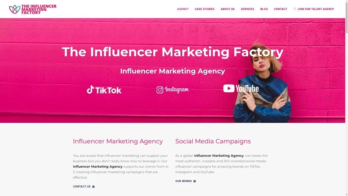
The Influencer Marketing Factory
TikTok, Instagram & YouTube CampaignsA full-service agency with strong TikTok expertise, offering end-to-end campaign management from influencer discovery through performance reporting with a focus on platform-native content.Clients: Google, Snapchat, Universal Music, Bumble, YelpVisit TIMF → -
6

NeoReach
Enterprise Analytics & Influencer CampaignsAn enterprise-focused agency combining managed campaigns with a powerful self-service data platform for influencer search, audience analytics, and attribution modeling.Clients: Amazon, Airbnb, Netflix, Honda, The New York TimesVisit NeoReach → -
7

Ubiquitous
Creator-First Marketing PlatformA tech-driven platform combining self-service tools with managed campaign options, emphasizing speed and scalability for brands managing multiple influencer relationships.Clients: Lyft, Disney, Target, American Eagle, NetflixVisit Ubiquitous → -
8

Obviously
Scalable Enterprise Influencer CampaignsA tech-enabled agency built for high-volume campaigns, coordinating hundreds of creators simultaneously with end-to-end logistics, content rights management, and product seeding.Clients: Google, Ulta Beauty, Converse, AmazonVisit Obviously →
