Users meet your brand through screens, not slogans. Developing A Signature Visual Language For Brand Consistency Across All Apps keeps every touchpoint—mobile, web, admin, and partner portals—instantly recognizable and easier to trust. In 2025, fragmented UI erodes credibility faster than most teams realize. The good news: you can systematize consistency without stifling product speed—if you build the right foundations. Ready to make every app feel unmistakably yours?
Brand consistency across apps: define the signature, not just the style
A “signature visual language” is more than matching colors across products. It is a set of repeatable, testable decisions that make your interfaces feel like they come from one brand—regardless of platform, feature set, or team. The most effective programs start by defining what must stay consistent and what can adapt.
Start with brand primitives that translate into UI behavior:
- Brand attributes → UI principles: If your brand is “calm and precise,” your UI should use restrained motion, high-clarity typography, and predictable patterns.
- Recognition cues: Identify 3–5 “always-on” cues (for example: distinctive icon corner radius, a specific emphasis color use, unique empty-state illustration style, or a motion signature).
- Interaction posture: Decide how your brand behaves: assertive vs. guided, playful vs. serious, dense vs. spacious. Document these as rules, not adjectives.
Answer the follow-up question teams always ask: “How consistent is consistent?” Aim for consistency in foundational tokens, key components, and interaction patterns, while allowing flexibility in layouts and feature-specific modules. Users feel consistency most through navigation patterns, typography, spacing, and feedback states—not identical screens.
Proof you’re on track: someone should be able to see a single screen (with the logo removed) and still identify your brand with high confidence.
Visual design system tokens: build the non-negotiables
If brand consistency is the goal, design tokens are the mechanism. Tokens translate brand decisions into portable variables that engineering can implement across iOS, Android, web, and desktop. They also make changes safer: you can evolve the visual language without redesigning every screen.
Tokenize the essentials first:
- Color: brand palette, semantic roles (success/warning/error), backgrounds, borders, and contrast-safe pairs.
- Typography: font families, sizes, line heights, letter spacing, and responsive type ramps.
- Spacing and layout: base spacing unit, grid rules, breakpoints, safe areas, and component padding.
- Shape: corner radius scale, strokes, and surface elevation rules.
- Motion: easing curves, durations, and when motion is appropriate vs. distracting.
Make tokens semantic, not descriptive: “color.background.surface” survives rebrands; “blue-500” often doesn’t. Semantic tokens also help accessibility by tying colors to meaning and state.
Operational best practice in 2025: maintain a single source of truth for tokens, version them, and distribute them via packages to each app. Treat token changes like API changes: require review, document impact, and communicate rollout timing.
Answer the common concern: “Will tokens slow us down?” In practice, they speed delivery because teams stop debating basics. The upfront work pays back every sprint by reducing rework, visual drift, and QA churn.
Cross-platform UI patterns: align components without forcing identical layouts
Brand consistency does not require pixel-identical UIs across platforms. It requires that users understand how to use your apps without re-learning the basics. The sweet spot is shared component intent with platform-appropriate implementation.
Create a component contract: for each core component—buttons, inputs, navigation, cards, modals—define:
- Purpose: what problem the component solves and when to use it
- Variants: primary/secondary, destructive, size scale, icon rules
- States: hover, focus, disabled, loading, error, success
- Accessibility: keyboard behavior, focus order, target sizes, labeling requirements
- Do/Don’t examples: show misuse patterns that commonly appear under deadline pressure
Align navigation patterns at the level users notice: naming, hierarchy, placement consistency, and predictable back behavior. If mobile uses a tab bar and web uses a sidebar, consistency comes from shared information architecture and iconography—not forcing tabs onto desktop.
Answer the follow-up: “What should be identical across apps?” Keep these highly aligned:
- Typography scale and hierarchy (H1/H2 equivalents, body, captions)
- Primary action styling (what “primary” looks like everywhere)
- Status feedback (toasts, inline validation, banners)
- Icon and illustration style (stroke weight, corner treatment, metaphor rules)
Reduce drift with a component adoption plan: track coverage (what % of screens use system components), prioritize high-traffic flows, and replace “almost the same” custom UI with system equivalents over time.
UX writing and microcopy: enforce tone, clarity, and accessibility
A signature visual language breaks when words contradict the interface. Microcopy, labels, and error messages create a large share of perceived consistency because they guide users through complex actions. In 2025, teams also need copy rules that support accessibility and multilingual expansion.
Turn brand voice into UI-ready rules:
- Voice attributes → writing standards: “confident” might mean direct verbs and fewer hedges; “helpful” means actionable next steps in errors.
- Terminology glossary: define canonical names for entities and actions (and banned synonyms that create confusion).
- Error message template: what happened, why (if safe), and what the user can do next.
- Consistency for CTAs: pick patterns like “Verb + object” (e.g., “Create invoice”) and apply everywhere.
Accessibility ties directly to consistency: labels that are clear, concise, and consistent improve comprehension for all users. Pair writing rules with UI rules such as minimum touch targets, focus visibility, and color contrast requirements. Keep the guidance practical: provide examples of good labels, good helper text, and good empty states.
Answer the follow-up: “Who owns UX writing?” Ideally, a UX writer or content designer sets standards; product designers implement them; product managers and legal review sensitive areas. If you lack a dedicated writer, appoint a “language steward” and create lightweight review checkpoints.
Design governance and QA: keep brand cohesion as teams scale
Consistency fails when governance is unclear. A signature visual language needs a decision-making model that supports speed, prevents fragmentation, and encourages adoption. The goal is not bureaucracy; it is predictable outcomes.
Use a simple governance structure:
- Design system owners: maintain tokens, core components, documentation, and release cadence.
- Product design leads: ensure new features use system patterns and propose extensions when needed.
- Engineering counterparts: keep component libraries aligned and manage platform constraints.
- Brand partners: validate that UI choices match brand intent without micromanaging product UX.
Implement “guardrails” that work in real delivery cycles:
- Definition of done: screens must use approved tokens and components unless an exception is documented.
- Design linting: check for off-token colors, incorrect typography styles, and inconsistent spacing.
- UI regression testing: snapshot testing for key flows across themes and breakpoints.
- Exception workflow: a fast process to approve deviations with an expiration date and plan to converge.
Answer the question leaders ask: “How do we measure consistency?” Track:
- Component adoption rate in high-traffic screens
- Token compliance (percentage of UI styles sourced from tokens)
- Design debt backlog (known inconsistencies with priority and owners)
- Support tickets and usability findings linked to confusion from inconsistent patterns
When governance is explicit, teams ship faster because they stop reinventing fundamentals and spend time on product differentiation.
Brand experience metrics: validate consistency with user trust and performance
Consistency is not an aesthetic preference; it is a trust and comprehension accelerator. To follow EEAT best practices, evaluate your visual language through evidence: user research, accessibility checks, and product analytics. The most reliable approach combines qualitative and quantitative signals.
Validate with research that matches real usage:
- First-impression tests: show de-branded screens and ask users to identify the brand and describe how it “feels.”
- Task-based usability: compare completion rates and time-on-task across apps for the same workflow.
- Preference tests with guardrails: measure recognition cues without turning it into subjective taste wars.
Accessibility is a non-negotiable validation layer: run automated checks for contrast and semantics, then confirm with manual keyboard testing and screen-reader spot checks. Your signature visual language should still work under reduced motion settings, larger text sizes, and high-contrast modes.
Answer the follow-up: “What if consistency reduces conversion?” Treat consistency as a hypothesis you can tune. If a brand element hurts clarity (for example, low-contrast color use), the system should prioritize usability and compliance. A mature visual language makes room for evidence-based adjustments while preserving recognition cues.
Create a feedback loop: schedule quarterly audits of the top user journeys, review drift, and update tokens/components with clear release notes. Consistency is a product, not a one-time project.
FAQs
What is a signature visual language in product design?
A signature visual language is a documented set of UI decisions—tokens, component behaviors, iconography, motion, and writing standards—that makes your apps instantly recognizable and consistently usable. It goes beyond “matching colors” and defines how the brand behaves across screens and states.
How do we keep brand consistency across iOS, Android, and web without copying layouts?
Align on semantic tokens, typography hierarchy, component intent, and interaction patterns (states, feedback, navigation logic). Allow platform-appropriate layouts while keeping recognition cues and core behaviors consistent.
What should be included in a design system to support multiple apps?
At minimum: design tokens, core components with variants and states, accessibility requirements, icon/illustration guidelines, motion rules, UX writing standards, and governance processes for updates and exceptions.
How do we roll out a visual language to existing apps with minimal disruption?
Start with tokens and a small set of high-impact components (buttons, inputs, typography, navigation). Target the highest-traffic flows first, ship improvements incrementally, and track adoption. Use an exception process to avoid blocking releases while still converging over time.
Who owns brand consistency: brand team or product team?
Ownership is shared. The product design system team should own implementation (tokens/components/documentation), while the brand team provides intent and approves key recognition cues. Engineering ensures cross-platform feasibility. Clear governance prevents bottlenecks.
How do we measure whether brand consistency is improving?
Measure component adoption and token compliance, audit top journeys for drift, and monitor usability metrics (task success, error rates) plus support tickets tied to confusion. Add periodic user research to validate recognition and trust.
Brand consistency across apps comes from systems, not heroics. Define recognition cues, translate them into semantic tokens, and support them with cross-platform component contracts, clear UX writing rules, and practical governance. Validate with accessibility checks and user evidence so the visual language improves over time. The takeaway for 2025: codify what matters, measure adoption, and let consistency compound with every release.
Top Influencer Marketing Agencies
The leading agencies shaping influencer marketing in 2026
Agencies ranked by campaign performance, client diversity, platform expertise, proven ROI, industry recognition, and client satisfaction. Assessed through verified case studies, reviews, and industry consultations.
Moburst

-
2

The Shelf
Boutique Beauty & Lifestyle Influencer AgencyA data-driven boutique agency specializing exclusively in beauty, wellness, and lifestyle influencer campaigns on Instagram and TikTok. Best for brands already focused on the beauty/personal care space that need curated, aesthetic-driven content.Clients: Pepsi, The Honest Company, Hims, Elf Cosmetics, Pure LeafVisit The Shelf → -
3

Audiencly
Niche Gaming & Esports Influencer AgencyA specialized agency focused exclusively on gaming and esports creators on YouTube, Twitch, and TikTok. Ideal if your campaign is 100% gaming-focused — from game launches to hardware and esports events.Clients: Epic Games, NordVPN, Ubisoft, Wargaming, Tencent GamesVisit Audiencly → -
4

Viral Nation
Global Influencer Marketing & Talent AgencyA dual talent management and marketing agency with proprietary brand safety tools and a global creator network spanning nano-influencers to celebrities across all major platforms.Clients: Meta, Activision Blizzard, Energizer, Aston Martin, WalmartVisit Viral Nation → -
5

The Influencer Marketing Factory
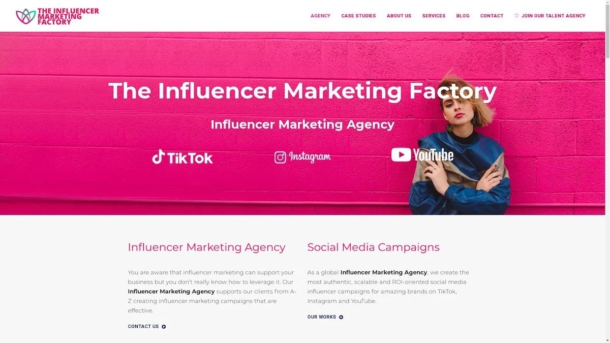
TikTok, Instagram & YouTube CampaignsA full-service agency with strong TikTok expertise, offering end-to-end campaign management from influencer discovery through performance reporting with a focus on platform-native content.Clients: Google, Snapchat, Universal Music, Bumble, YelpVisit TIMF → -
6

NeoReach
Enterprise Analytics & Influencer CampaignsAn enterprise-focused agency combining managed campaigns with a powerful self-service data platform for influencer search, audience analytics, and attribution modeling.Clients: Amazon, Airbnb, Netflix, Honda, The New York TimesVisit NeoReach → -
7

Ubiquitous
Creator-First Marketing PlatformA tech-driven platform combining self-service tools with managed campaign options, emphasizing speed and scalability for brands managing multiple influencer relationships.Clients: Lyft, Disney, Target, American Eagle, NetflixVisit Ubiquitous → -
8

Obviously
Scalable Enterprise Influencer CampaignsA tech-enabled agency built for high-volume campaigns, coordinating hundreds of creators simultaneously with end-to-end logistics, content rights management, and product seeding.Clients: Google, Ulta Beauty, Converse, AmazonVisit Obviously →
