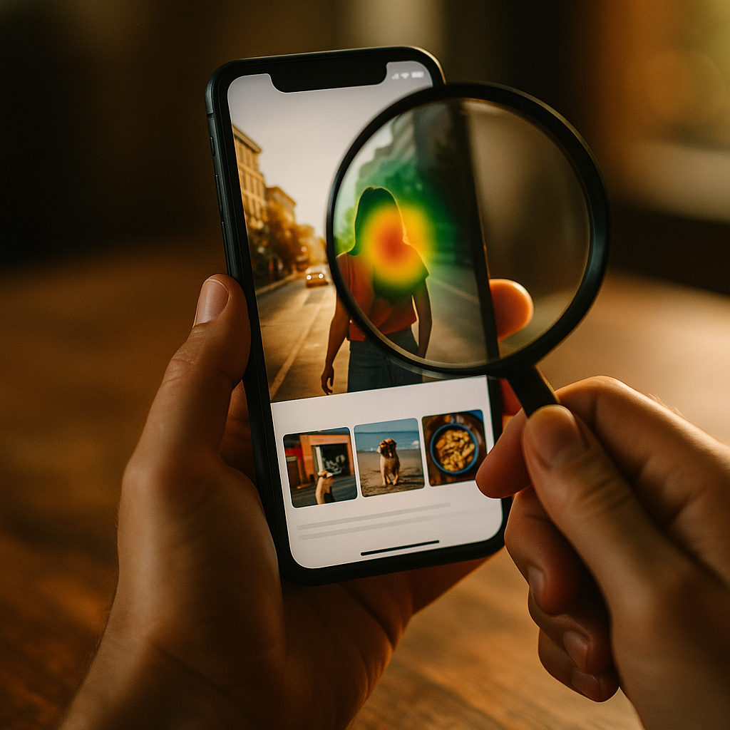
In 2025, attention is the scarcest resource in digital marketing, and brands compete in a fraction of a second. New eye-tracking studies now show exactly how people scan feeds, ads, and landing pages—and why some images stop thumbs while others blur past. This guide explains the Science Of Scroll-Stopping Visuals using fresh gaze-pattern insights, practical design moves, and testable rules you can apply today—will your next creative earn the first fixation?
Eye-tracking data insights: what new gaze patterns reveal
Eye-tracking turns “I like it” into measurable behavior. Modern studies capture first fixation (where the eye lands first), time to first fixation (how fast it lands), dwell time (how long viewers look), and scan paths (the order of attention). When combined with scroll and click data, eye-tracking clarifies a core truth: people do not read feeds; they hunt for meaning.
Newer, remote eye-tracking setups (webcam-based models calibrated with brief tasks) have made larger sample sizes feasible. While webcam methods are less precise than lab-grade hardware, they’re often directionally reliable for creative decisions when you validate with A/B outcomes. The most actionable findings typically converge on three behavioral patterns:
- Attention is front-loaded. Viewers decide whether to engage almost immediately, so the first fixation matters more than average view time.
- Faces and text compete. If a face draws the first fixation but doesn’t point toward the message, the copy can be missed.
- Clarity beats novelty. People stop for visuals they can interpret quickly, not necessarily the most artistic ones.
For marketers, designers, and creators, the implication is straightforward: you can design for predictable gaze. But you must also respect context. A TikTok-style vertical feed produces different scan paths than a product detail page, and mobile viewing compresses the time available for comprehension. The right question becomes: What do you want the first fixation to land on, and what should the second fixation confirm?
Visual attention triggers: the fastest routes to first fixation
Eye-tracking repeatedly shows that people orient toward specific visual cues. These cues function like “attention triggers,” pulling the first fixation before the brain has fully processed the content. Use them intentionally, because triggers can either support your message or hijack it.
High-contrast edges and sharpness attract gaze first—especially on mobile screens where small elements blur. If your product is mid-tone on a mid-tone background, you force viewers to work too hard to interpret what they’re seeing. Strong figure–ground separation (subject distinct from background) consistently speeds comprehension.
Human faces are powerful attention magnets. Eye-tracking often finds initial fixations on eyes and facial features even when they are not the most important element for conversion. Faces work best when they reinforce the story: showing an emotion that matches the offer, or using a gaze direction that leads toward the product or headline. If the model’s eyes look off-frame, you may lose the viewer’s second fixation.
Motion and implied motion matter in scrolling environments. Even in static images, diagonal lines, action poses, and directional lighting create “motion cues” that can pull attention. The key is to use motion cues to guide, not distract. For example, a hand holding the product and angled toward the value statement can create a natural scan path: hand → product → text.
Novelty must stay readable. Unusual color palettes or unexpected compositions can earn attention, but eye-tracking frequently shows that confusing imagery shortens dwell time. The thumb wins when the brain can’t label the visual quickly. If your creative uses metaphor, keep the metaphor instantly decodable.
Follow-up question you’ll likely have: Should I always use faces and high contrast? Not always. If your goal is product recognition (packaging, UI screen, feature close-up), a face can steal the first fixation from the product. In those cases, prioritize product scale, crisp edges, and a clean background, then use human elements only if they guide attention back to the offer.
Conversion-focused design: building scan paths that lead to action
Scroll-stopping is useless if attention doesn’t convert. Eye-tracking helps you design intentional scan paths—a predictable sequence of fixations that moves from attraction to understanding to decision.
Start by defining the “attention ladder” for your creative:
- Step 1: Anchor (first fixation): the element most likely to win the initial glance (often a face, bold product shot, or strong contrast shape).
- Step 2: Meaning (second fixation): the offer or value (headline, benefit badge, or key feature).
- Step 3: Proof (third fixation): credibility cues (rating, testimonial snippet, recognizable logo, before/after, certification when legitimate).
- Step 4: Action (final fixation): a clear call-to-action or next step (button, “Shop,” “Learn,” price, or limited-time detail).
Design choices that strengthen that ladder:
Text placement near the first fixation. If eye-tracking shows first fixation on the subject, place your primary message adjacent—within a short eye movement—so the second fixation lands where you want it. On mobile, this often means keeping the headline in the upper-middle region and avoiding tiny captions at the bottom edge.
One message per frame. When a visual contains multiple competing claims, eye-tracking can show scattered fixations and weak dwell on the value prop. Consolidate. Put the primary benefit in one short line; push details to the landing page or the next slide.
Use “visual punctuation.” Badges, pill shapes, subtle outlines, and spacing act like punctuation that groups meaning. Eye-tracking frequently shows smoother scan paths when information is chunked into two or three clear blocks instead of many small elements.
Design for the thumb, not the mouse. On mobile, viewers often hold phones one-handed. Place the action element where it’s comfortable to tap, but also where eyes naturally end their scan path. If your CTA is too close to screen edges or visually weak, it may be skipped even if the offer is strong.
Follow-up question: Is a longer dwell time always better? Not necessarily. For direct-response ads, you may want a fast path to action: quick comprehension, quick click. Longer dwell can signal confusion. Eye-tracking is most useful when paired with outcomes (CTR, conversion rate, add-to-cart) to interpret whether attention equals clarity.
Mobile-first creative strategy: optimizing for fast scrolling feeds
Most scrolling happens on phones, and mobile changes the rules. The screen is small, the environment is distracting, and the viewer is often multitasking. Eye-tracking in mobile contexts tends to show tighter clusters of fixations and shorter windows to deliver meaning.
Make the subject large. A frequent reason creatives fail is simple: the product or key scene is too small. If your subject takes up less than about a third of the frame, you risk losing the first fixation to background clutter. Favor close-ups that communicate instantly, then use subsequent frames (carousel/video) for detail.
Respect safe zones. UI overlays, captions, and platform buttons can block key content. Keep critical text and identifiers away from bottom and side overlays. If your message sits behind interface elements, eye-tracking may show fixations that never reach it.
Prioritize legible typography. Thin fonts, low contrast, and dense copy collapse on mobile. Choose weight, spacing, and contrast that remain readable at a glance. If your headline requires effort, viewers scroll. Use short benefit-led phrases and avoid stacking multiple lines of equal visual weight.
Use “micro-context.” In feeds, users often lack context for what they’re seeing. Add a small label that frames the content quickly: “New,” “How to,” “Before/After,” “3 steps,” or “For oily skin.” Eye-tracking often shows that these small anchors can accelerate comprehension when placed near the initial fixation point.
Sequence information across frames. If you have more than one idea, don’t cram it into one visual. Use a carousel or short video to move viewers through: hook → benefit → proof → CTA. Eye-tracking can then be interpreted per frame, making optimization clearer.
Follow-up question: What about video—do the same rules apply? Yes, with an extra constraint: you must win attention in the opening moment. Make the first frame readable as a standalone image. If the story only makes sense after several seconds, many viewers will never see it.
Experimental methodology: how to interpret eye-tracking without fooling yourself
Eye-tracking is powerful, but it’s easy to overclaim. Use it like a diagnostic tool, not a final verdict. Google’s helpful content expectations reward clarity, accuracy, and real-world validation—so your process must connect gaze data to outcomes.
1) Start with a hypothesis. Example: “If we move the benefit badge next to the product, time to first fixation on the value prop will drop and CTR will rise.” Without a hypothesis, heatmaps become decoration.
2) Use consistent tasks and contexts. Eye behavior changes based on intent. Someone “browsing for inspiration” scans differently than someone “shopping for a solution.” Define the scenario in your test instructions. Compare like with like: same platform, same placement, same device type where possible.
3) Treat heatmaps as directional, not absolute. Aggregated heatmaps can hide subgroups. Segment results by device, familiarity with the category, and whether participants are likely buyers. If your audience includes both novices and experts, their scan paths can diverge.
4) Pair attention metrics with business metrics. A creative can “look good” in eye-tracking while failing in-market. Always validate with A/B tests, holdout groups, or controlled experiments in your ad platform. Eye-tracking should explain why a variant performed differently, not replace performance data.
5) Watch for false positives. A large logo may attract fixations but reduce conversions if it crowds out the benefit. A shocking image may spike first fixation but harm trust. Your goal is qualified attention: attention that supports comprehension and intent.
6) Document limitations for credibility. EEAT improves when you state what the data can and cannot prove. Webcam-based eye tracking has lower spatial precision; lab studies can have smaller samples; and results vary by culture and platform norms. Responsible interpretation builds trust with stakeholders and audiences.
Creative testing framework: practical steps to build scroll-stopping visuals
Turn science into a repeatable workflow. The highest-performing teams treat creative like product development: research, prototype, test, iterate. Here is a practical framework grounded in eye-tracking principles and performance validation.
Step A: Build a “first fixation plan.” Before designing, decide what must win the first glance (product, face, transformation, or outcome). Then remove competing magnets (busy backgrounds, extra props, irrelevant text).
Step B: Create three distinct concept routes. Don’t A/B tiny tweaks only. Build variants that differ in attention strategy:
- Route 1: Product-first close-up with benefit badge.
- Route 2: Human-first emotion with gaze toward product and headline.
- Route 3: Outcome-first (before/after, result screenshot, metric) with quick proof.
Step C: Use a checklist for scan-path integrity.
- Can someone name what it is in under a second?
- Is the primary benefit readable without zooming?
- Does the composition guide eyes from anchor → meaning → proof → action?
- Is there exactly one primary CTA or next step?
- Are trust cues present and legitimate (ratings, certifications, or testimonials you can substantiate)?
Step D: Run fast tests, then diagnose with eye-tracking. Start with platform A/B tests for real-world signal. Use eye-tracking to explain weak variants: Did viewers fixate on the wrong element? Did they miss the benefit? Did the proof appear too late or too small?
Step E: Iterate with purpose. Change one strategic variable at a time: reposition the headline, simplify the background, increase product scale, or rework gaze direction. Then re-test. You’re building a learning system, not chasing a lucky hit.
Follow-up question: How many participants do I need for eye-tracking? It depends on the method and the decision risk. For directional creative insights, smaller samples can reveal obvious attention failures. For high-stakes redesigns, use larger, segmented samples and confirm with conversion experiments. The safest approach is always triangulation: eye-tracking + A/B performance + qualitative feedback.
FAQs
What is the most important eye-tracking metric for scroll-stopping visuals?
Time to first fixation on the intended anchor (product, headline, or outcome) is often the most useful early signal. If viewers don’t quickly fixate on what matters, they rarely reach your value prop before scrolling.
Do faces always improve ad performance?
No. Faces can capture attention but may pull fixations away from the product or message. Use faces when they add meaning (emotion, demonstration) and direct gaze toward the offer.
How do I design for both attention and trust?
Lead with a clear benefit, then add credible proof close to where eyes travel next: ratings, concise testimonials, recognizable brand assets, or substantiated claims. Avoid exaggerated promises that may earn attention but damage credibility.
Is webcam eye-tracking reliable enough for marketing decisions?
It can be reliable for directional insights like “people are missing the headline” or “attention is stuck on the wrong element,” especially when paired with real A/B results. For fine-grained layout decisions, lab-grade methods are more precise.
What makes text readable in fast-scrolling feeds?
High contrast, sufficient font weight, short phrasing, and spacing that separates the headline from other elements. Place key text near the expected first fixation point and keep it out of UI overlay areas.
How can I apply eye-tracking insights without running a study?
Use the attention ladder (anchor → meaning → proof → action) as a design rule, then validate with A/B tests. Watch where viewers likely fixate first (faces, high contrast) and ensure the next fixation naturally lands on your value statement.
Eye-tracking has moved scroll-stopping from guesswork to a discipline: design for the first fixation, guide the second toward meaning, and earn the third with proof. In 2025, the best visuals don’t just look good; they create a clean scan path that matches how people actually browse on mobile. Build creative with hypotheses, validate with experiments, and iterate toward qualified attention that converts.
Top Influencer Marketing Agencies
The leading agencies shaping influencer marketing in 2026
Agencies ranked by campaign performance, client diversity, platform expertise, proven ROI, industry recognition, and client satisfaction. Assessed through verified case studies, reviews, and industry consultations.
Moburst
-
2
The Shelf
Boutique Beauty & Lifestyle Influencer AgencyA data-driven boutique agency specializing exclusively in beauty, wellness, and lifestyle influencer campaigns on Instagram and TikTok. Best for brands already focused on the beauty/personal care space that need curated, aesthetic-driven content.Clients: Pepsi, The Honest Company, Hims, Elf Cosmetics, Pure LeafVisit The Shelf → -
3
Audiencly
Niche Gaming & Esports Influencer AgencyA specialized agency focused exclusively on gaming and esports creators on YouTube, Twitch, and TikTok. Ideal if your campaign is 100% gaming-focused — from game launches to hardware and esports events.Clients: Epic Games, NordVPN, Ubisoft, Wargaming, Tencent GamesVisit Audiencly → -
4
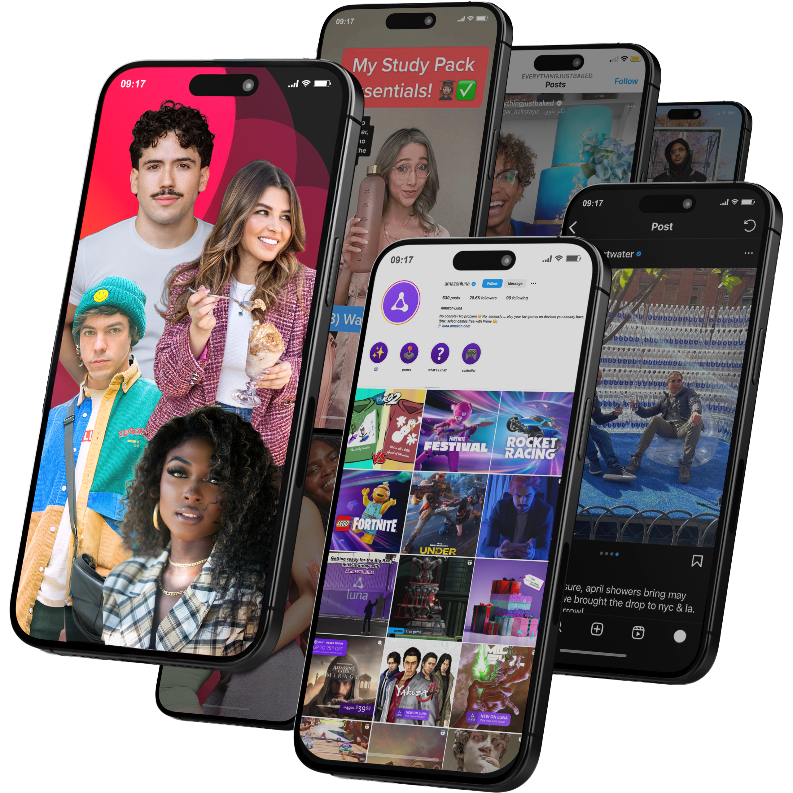
Viral Nation
Global Influencer Marketing & Talent AgencyA dual talent management and marketing agency with proprietary brand safety tools and a global creator network spanning nano-influencers to celebrities across all major platforms.Clients: Meta, Activision Blizzard, Energizer, Aston Martin, WalmartVisit Viral Nation → -
5
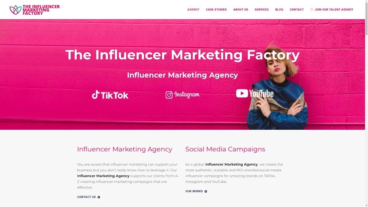
The Influencer Marketing Factory
TikTok, Instagram & YouTube CampaignsA full-service agency with strong TikTok expertise, offering end-to-end campaign management from influencer discovery through performance reporting with a focus on platform-native content.Clients: Google, Snapchat, Universal Music, Bumble, YelpVisit TIMF → -
6
NeoReach
Enterprise Analytics & Influencer CampaignsAn enterprise-focused agency combining managed campaigns with a powerful self-service data platform for influencer search, audience analytics, and attribution modeling.Clients: Amazon, Airbnb, Netflix, Honda, The New York TimesVisit NeoReach → -
7
Ubiquitous
Creator-First Marketing PlatformA tech-driven platform combining self-service tools with managed campaign options, emphasizing speed and scalability for brands managing multiple influencer relationships.Clients: Lyft, Disney, Target, American Eagle, NetflixVisit Ubiquitous → -
8
Obviously
Scalable Enterprise Influencer CampaignsA tech-enabled agency built for high-volume campaigns, coordinating hundreds of creators simultaneously with end-to-end logistics, content rights management, and product seeding.Clients: Google, Ulta Beauty, Converse, AmazonVisit Obviously →
