The Power Of Micro-Copy can transform small moments in a customer journey into decisive actions. In 2025, users scan faster, trust less, and abandon more readily, which makes every label, hint, and button text carry real weight. When you design these tiny words with intent, you reduce friction, increase confidence, and lift conversions without redesigning whole pages. Ready to make your smallest text your biggest advantage?
Microcopy examples that change user behavior
Microcopy is the short, functional text that guides decisions: button labels, form helper text, error messages, consent notices, checkout reassurance, tooltips, empty states, and even placeholder text. It sits at the intersection of UX, marketing, and product clarity. Done well, it makes the next step obvious and safe; done poorly, it creates doubt, confusion, and drop-offs.
High-impact microcopy often shows up in:
- Calls to action: “Start free trial” versus “Create account” (intent clarity)
- Forms: inline hints like “Use a work email for faster approval” (reduces back-and-forth)
- Errors: “Password must include 8+ characters” (actionable fix) rather than “Invalid password”
- Checkout: “Secure checkout” plus brief delivery/returns reassurance (risk reduction)
- Permissions/consent: “We use cookies to remember your cart” (purpose and benefit)
- Empty states: “No saved items yet. Save products to compare later.” (next step)
The reason microcopy moves behavior is simple: it answers the user’s silent questions at the point of decision. “What happens next?” “Is this safe?” “How long will it take?” “Will I be charged?” “Can I undo this?” If your page doesn’t answer those questions instantly, users create their own answers, and they often choose “leave.”
Conversion microcopy principles for high-intent moments
Conversion-focused microcopy isn’t about being clever; it’s about removing uncertainty. Use these principles where users hesitate: signup, pricing, checkout, and sensitive data entry.
1) Be specific about the outcome. Replace vague CTAs (“Submit”) with outcome-based language (“Get my quote,” “Save changes,” “Continue to delivery”). Users want to know what the click does and what they get.
2) Reduce perceived risk. Add short reassurance near irreversible actions. Examples: “Cancel anytime,” “No credit card required,” “You can edit later,” “We never post without permission.” Place it where doubt spikes, not buried in a footer.
3) Match user intent and stage. Top-of-funnel users respond to low-commitment steps (“Explore plans”), while high-intent users want speed (“Checkout,” “Book now”). If you ask for commitment too early, you force an internal debate.
4) Keep it scannable. Microcopy competes with the page. Use short sentences, common words, and front-load meaning. If it needs explanation, it’s no longer microcopy.
5) Use “because” when justifying friction. If you request a phone number, add a reason: “Used only for delivery updates.” This directly answers the user’s “why” and improves completion.
6) Handle objections proactively. If shipping cost is a common objection, preview it: “Calculate shipping at the next step” or “Free shipping over $50.” When users feel surprised, trust drops and cart abandonment rises.
If you’re wondering where to start, audit the steps that create the most drop-off in analytics (form abandonments, checkout exits, pricing page bounces) and prioritize microcopy there first.
UX writing microcopy for forms, errors, and onboarding
Forms and onboarding are where microcopy earns its keep. Users are doing work; your words should make that work predictable and recoverable.
Form field labels and helper text:
- Prefer explicit labels over placeholders. Placeholders disappear, which increases mistakes on mobile and for accessibility tools.
- Tell users what “good” looks like. “Company size (1–10, 11–50, 51–200)” reduces parsing effort.
- Explain sensitive requests. “Tax ID (required for invoices)” is better than silence.
Error messages: Great error microcopy has three parts: what happened, why it happened (if helpful), and how to fix it. Keep blame out of it.
- Weak: “Invalid email.”
- Better: “Enter a valid email address, like [email protected].”
- Best: “That email looks incomplete. Add a domain, like [email protected].”
Onboarding and setup: Use microcopy to reduce the fear of getting it wrong. Examples: “You can change this later,” “Takes about 2 minutes,” and “We’ll guide you step by step.” If a step is optional, say so. If it’s required, say why.
Empty states and confirmations: An empty state should answer “What now?” A confirmation should answer “What changed?” and “What’s next?” For example: “Saved. Your settings apply to all new orders.” This prevents users from second-guessing and repeating actions.
Follow-up question you might have: Should microcopy be consistent across product and marketing pages? Yes. Use the same terms for the same concepts (plan names, trial rules, refund windows). Inconsistency forces users to re-learn, and re-learning kills momentum.
Trust-building microcopy that boosts credibility and EEAT
EEAT (Experience, Expertise, Authoritativeness, Trustworthiness) shows up in microcopy as clarity, restraint, and verifiable assurances. Trust-building microcopy doesn’t overpromise; it clarifies what’s true and what the user can expect.
Show experience through details users care about. “Ships in 2–3 business days” beats “Fast shipping.” “Speak to a specialist in under 2 minutes” beats “24/7 support,” unless you can validate it.
Use precise, defensible claims. Avoid inflated language like “best,” “guaranteed,” or “perfect.” If you mention outcomes, tie them to a measurable commitment: “30-day returns,” “Price lock for 12 months,” “SOC 2 report available on request,” or “We encrypt data in transit.” Only include assurances you can back up operationally.
Place trust cues at the moment of anxiety. Users worry when entering payment info, choosing a plan, or granting permissions. Put microcopy there, not in an “About” page they’ll never open.
Make policies readable. You don’t need a legal essay next to a button. Provide a short summary and link to full terms. Example: “Free trial, then billed monthly. Cancel anytime before renewal.” This reduces support tickets and improves conversion quality.
Respect privacy with plain language. If you track behavior, say what and why: “We use analytics to improve checkout performance.” People don’t need a lecture; they need honesty.
If you’re thinking, Will adding trust microcopy reduce conversions by reminding users of risk? In practice, clear reassurance often increases conversions because it replaces imagined risks with known rules. The key is brevity and placement.
A/B testing microcopy: a data-backed process
Microcopy is measurable, but only if you test it responsibly. Treat it like any other conversion lever: define a hypothesis, isolate variables, and measure the right outcomes.
Step 1: Identify the decision point. Look for high-traffic steps with meaningful drop-off: signup forms, plan selection, checkout, lead forms, or activation screens.
Step 2: Write a hypothesis tied to a user concern. Example: “If we clarify that the trial doesn’t require a credit card, more visitors will start the trial because perceived risk drops.”
Step 3: Change one thing at a time. Don’t rewrite the whole block. Test a single CTA label, a single reassurance line, or a single helper sentence. If you change multiple elements, you won’t know what worked.
Step 4: Measure quality, not just clicks. For lead gen, track qualified submissions and downstream conversion, not only form completion. For ecommerce, track revenue per visitor and refund/return rates. Microcopy can increase conversion but decrease quality if it misleads.
Step 5: Segment results. New versus returning users, mobile versus desktop, and geo differences matter. Microcopy that works on desktop might fail on mobile because screen constraints change what users notice.
Step 6: Document learnings. Build a microcopy library: winning CTA patterns, proven reassurance lines, tone guidance, and terms glossary. This improves consistency across teams and reduces rework.
Practical testing targets that often deliver fast wins include:
- CTA verbs: “Get,” “Start,” “Continue,” “Save,” “Reserve”
- Commitment cues: “No credit card,” “Cancel anytime,” “Takes 2 minutes”
- Friction explanations: why you need phone number, address, or verification
- Error recovery: clearer guidance reduces rage clicks and abandonment
Microcopy checklist for CTAs, pricing, and checkout flows
Use this checklist to rewrite microcopy quickly without losing rigor. It’s designed for the pages that drive revenue: pricing, checkout, and lead capture.
- CTA clarity: Does the button describe the outcome (not the action)?
- One primary action: Is the main CTA visually and verbally dominant, with secondary actions de-emphasized?
- Commitment transparency: Are billing, renewal timing, and cancellation rules stated in plain language near the decision?
- Cost visibility: Are fees, shipping, taxes, and minimums explained before the final step?
- Risk reducers: Are returns, refunds, guarantees, or support access stated briefly at the point of purchase?
- Objection handling: Do you answer “Why do you need this?” beside sensitive fields?
- Error prevention: Do you show input formats (date, phone, password rules) before users fail?
- Accessibility: Is microcopy readable, specific, and compatible with assistive tech (labels, not just placeholders)?
- Voice consistency: Do terms match across marketing pages, product UI, emails, and receipts?
- Truthfulness: Can every reassurance be supported operationally and legally?
If you want a simple starting point: rewrite your top three CTAs to be outcome-based, add one line of honest reassurance at checkout, and fix your top five error messages to be actionable. Those changes usually improve both conversion rate and user satisfaction without any redesign.
FAQs about microcopy and conversions
What is microcopy in UX and marketing?
Microcopy is short, functional text that helps users complete tasks and make decisions. It includes button labels, form hints, error messages, confirmations, and small reassurance statements across key funnel steps.
How does microcopy increase conversions?
It reduces uncertainty and friction at the exact moment users decide whether to continue. Clear microcopy answers common objections (cost, time, privacy, reversibility) and makes next steps predictable, which improves completion and purchase rates.
Where should I focus first for the biggest impact?
Start with high-intent, high-drop-off areas: pricing pages, checkout steps, signup/lead forms, and payment screens. Next, fix error messages and empty states because they directly affect task completion.
Should CTA microcopy be short or descriptive?
Both. Keep it short, but ensure it describes the outcome. “Get my estimate” can outperform “Submit” because it stays concise while clarifying what the user receives.
Is microcopy the same as brand voice?
No. Brand voice influences tone, but microcopy is primarily functional. You can keep your brand personality while prioritizing clarity, consistency, and user guidance.
How do I A/B test microcopy without misleading users?
Test only truthful, supportable statements and avoid hiding key terms. Measure downstream outcomes (qualified leads, revenue, churn, refunds) so wins reflect real value, not just more clicks.
Can microcopy help with accessibility?
Yes. Clear labels, specific instructions, and actionable errors support screen readers and reduce cognitive load. Avoid relying on placeholder-only instructions and keep language direct and unambiguous.
How long should microcopy be?
As short as possible while still answering the user’s question. If users still hesitate or make predictable mistakes, add one sentence of clarification and re-test.
Microcopy is a small lever with outsized influence because it lives where decisions happen. In 2025, users expect clarity, honesty, and speed, especially during signup and checkout. Audit your funnel for hesitation points, then rewrite CTAs, helper text, and errors to be specific, reassuring, and actionable. Test changes against real business outcomes. The takeaway: improve tiny text to earn trust and drive measurable conversions.
Top Influencer Marketing Agencies
The leading agencies shaping influencer marketing in 2026
Agencies ranked by campaign performance, client diversity, platform expertise, proven ROI, industry recognition, and client satisfaction. Assessed through verified case studies, reviews, and industry consultations.
Moburst
-
2

The Shelf
Boutique Beauty & Lifestyle Influencer AgencyA data-driven boutique agency specializing exclusively in beauty, wellness, and lifestyle influencer campaigns on Instagram and TikTok. Best for brands already focused on the beauty/personal care space that need curated, aesthetic-driven content.Clients: Pepsi, The Honest Company, Hims, Elf Cosmetics, Pure LeafVisit The Shelf → -
3
Audiencly
Niche Gaming & Esports Influencer AgencyA specialized agency focused exclusively on gaming and esports creators on YouTube, Twitch, and TikTok. Ideal if your campaign is 100% gaming-focused — from game launches to hardware and esports events.Clients: Epic Games, NordVPN, Ubisoft, Wargaming, Tencent GamesVisit Audiencly → -
4
Viral Nation
Global Influencer Marketing & Talent AgencyA dual talent management and marketing agency with proprietary brand safety tools and a global creator network spanning nano-influencers to celebrities across all major platforms.Clients: Meta, Activision Blizzard, Energizer, Aston Martin, WalmartVisit Viral Nation → -
5
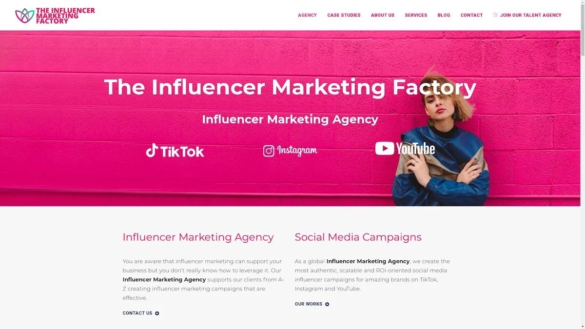
The Influencer Marketing Factory
TikTok, Instagram & YouTube CampaignsA full-service agency with strong TikTok expertise, offering end-to-end campaign management from influencer discovery through performance reporting with a focus on platform-native content.Clients: Google, Snapchat, Universal Music, Bumble, YelpVisit TIMF → -
6

NeoReach
Enterprise Analytics & Influencer CampaignsAn enterprise-focused agency combining managed campaigns with a powerful self-service data platform for influencer search, audience analytics, and attribution modeling.Clients: Amazon, Airbnb, Netflix, Honda, The New York TimesVisit NeoReach → -
7
Ubiquitous
Creator-First Marketing PlatformA tech-driven platform combining self-service tools with managed campaign options, emphasizing speed and scalability for brands managing multiple influencer relationships.Clients: Lyft, Disney, Target, American Eagle, NetflixVisit Ubiquitous → -
8

Obviously
Scalable Enterprise Influencer CampaignsA tech-enabled agency built for high-volume campaigns, coordinating hundreds of creators simultaneously with end-to-end logistics, content rights management, and product seeding.Clients: Google, Ulta Beauty, Converse, AmazonVisit Obviously →
