The science of visual hierarchy in mobile landing page design determines what users notice first, what they ignore, and what makes them act. In 2025, attention is scarce and thumbs are impatient, so every pixel must earn its place. When hierarchy matches human perception, pages feel effortless, trustworthy, and fast. When it doesn’t, conversions disappear. Here’s how to build hierarchy that performs—starting now.
Mobile visual hierarchy principles: how the brain scans a small screen
Visual hierarchy is the intentional ordering of elements so the user’s eye follows a path that supports understanding and decision-making. On mobile, that path is constrained by smaller viewports, touch interaction, and frequent interruptions. Your job is to reduce cognitive load while preserving clarity.
Key perception drivers that shape mobile scanning:
- Salience: Users notice contrast, motion, size, and isolated elements first. A single high-contrast button can outperform several competing highlights.
- Gestalt grouping: People interpret items close together as related. Tight spacing signals one idea; extra spacing signals a new section.
- Reading patterns: Mobile scanning often becomes a quick vertical sweep. Users look for anchors: headline, proof, and a clear next step.
- Working memory limits: Too many competing cues increase decision friction. Fewer choices often lead to more action.
What this means for landing pages: don’t “decorate” important information. Make it structurally obvious. If your offer is strong, hierarchy should expose it quickly: value proposition first, credibility next, and the call-to-action (CTA) positioned where it becomes the easiest next action.
Practical rule: if a user sees only the top half of the first screen and can’t explain what you do and what to do next, hierarchy is failing.
Mobile typography hierarchy: headlines, subheads, and readable rhythm
Typography is the backbone of hierarchy because it shapes meaning before users read every word. On mobile, type choices also determine speed: users must be able to scan, pause, and commit without effort.
Build a clear type scale that creates predictable levels:
- Primary headline: one idea, one promise. Keep it compact so it doesn’t wrap into an unreadable block.
- Subhead: adds specificity (who it’s for, what outcome, what differentiator). It should feel like a continuation, not a second headline.
- Body text: short paragraphs, plain language, minimal jargon. Users scroll; they don’t study.
- Microcopy (form help, trust notes, button labels): small but critical. Microcopy resolves objections at the decision point.
Make hierarchy visible through contrast, not just size. Use weight, line height, and spacing so the eye can distinguish levels quickly. Avoid stacking multiple bold treatments; if everything is emphasized, nothing is.
Answering a common follow-up: “Should I use centered text?” Use it sparingly. Centered text slows scanning because it removes a stable starting edge. Keep long-form content left-aligned, and reserve centered alignment for short headlines or short value statements.
CTA clarity starts with words. Buttons should describe outcomes, not UI actions. “Get my demo” or “See pricing” usually outperforms “Submit” because it reduces uncertainty.
Color contrast and CTA prominence: guiding attention without overwhelming
Color is a high-impact hierarchy tool because it signals priority instantly. But on mobile, color mistakes are expensive: insufficient contrast hurts readability, while overuse creates noise and distrust.
Use color to rank actions:
- One primary CTA: make it the strongest color accent on the screen.
- Secondary actions: visually quieter (outline style or neutral tone) so they don’t compete.
- Link styling: make links recognizable and consistent to prevent accidental taps and frustration.
Contrast must serve usability. Ensure text is readable in real conditions: bright outdoor light, low brightness settings, and imperfect screens. High contrast also supports trust because it signals care and professionalism.
Use “isolation” to boost prominence: a CTA with breathing room often performs better than a larger CTA squeezed between other elements. White space is not wasted space; it is a directional cue that tells the user, “this is the next step.”
Answering a likely question: “Should the CTA be above the fold?” Put a primary CTA early, but don’t rely on a single placement. Mobile users scroll, especially if the message is strong. Repeat the CTA after key proof points and after pricing or plan information, so users can act at the moment they feel convinced.
Layout and spacing for thumb-friendly scanning: grids, cards, and touch targets
Mobile layout is hierarchy in motion. As the user scrolls, your page is effectively a sequence of decisions. Good layout makes those decisions feel obvious: what is this, why should I care, can I trust it, what do I do next?
Design for the thumb, not the mouse. If interaction feels difficult, users interpret the product as difficult. Prioritize:
- Touch target sizing: buttons, toggles, and form controls must be easy to hit without precision.
- Vertical rhythm: consistent spacing patterns help users predict what comes next.
- Chunking: break complex ideas into scannable blocks (cards, bullet lists, short sections).
- Sticky elements (used carefully): a sticky CTA can help, but only if it doesn’t cover content or feel aggressive.
Keep the first screen simple. The top of a mobile landing page should typically include: a short headline, a supporting line, a primary CTA, and one strong trust cue (rating, customer count, recognizable logo, or a short testimonial). Anything else should earn its placement.
Avoid layout traps: carousels that hide content, dense multi-column comparisons that collapse badly on mobile, and large decorative images that push the offer below the fold. If you need a comparison, convert it to a vertical list that highlights the user’s most common decision criteria.
Trust signals and cognitive fluency: building credibility in the first scroll
Hierarchy isn’t only about getting attention; it’s about sustaining confidence. Mobile visitors decide quickly whether a page feels safe and legitimate. This is where Google’s helpful content expectations and EEAT principles intersect with design: expertise and trustworthiness should be visible, not buried.
Place credibility where doubt appears. Common friction points include pricing, form submission, and claims that sound too broad. Support them with:
- Specific proof: short testimonials with identifiable context (role, company type, use case) rather than vague praise.
- Verifiable signals: security notes for payments, privacy statements near forms, and clear policies linked in plain language.
- Authority cues: relevant certifications, partner badges, or press mentions that match your audience’s expectations.
- Concrete details: timelines, deliverables, what happens after signup, and what the user receives.
Cognitive fluency is the feeling that something is easy to understand. Fluent pages convert better because they reduce mental effort and perceived risk. Improve fluency by using familiar patterns (headline → benefits → proof → CTA), minimizing novelty in navigation, and writing in direct, testable claims.
Answering a common follow-up: “Do I need an author bio on a landing page?” Not always, but you do need credibility. For health, finance, or high-stakes decisions, add clear sourcing, review notes, or “reviewed by” information in a concise way, and ensure supporting pages explain who is behind the offer.
A/B testing visual hierarchy: measuring attention, scroll depth, and conversion
Hierarchy is a hypothesis until data confirms it. The most reliable way to improve mobile landing pages is to test changes that isolate one hierarchy variable at a time.
What to measure beyond raw conversion rate:
- Scroll depth and drop-off: where users stop tells you which sections lack clarity or trust.
- CTA engagement: clicks, tap rate, and repeated taps (which may indicate frustration).
- Form completion rate: especially field-level abandonment, which reveals where uncertainty spikes.
- Time to first action: how quickly users move from arrival to meaningful interaction.
High-leverage tests for hierarchy:
- Headline specificity: broad promise vs. specific outcome. Specific usually wins when it matches intent.
- CTA label: “Get started” vs. outcome-based labels. Reduce ambiguity and see lifts.
- Proof placement: testimonial above vs. below first CTA. Many pages perform better when proof appears before asking for commitment.
- Visual competition: remove secondary links or reduce hero imagery to see if attention shifts to the CTA.
Keep tests honest: run them long enough to avoid day-of-week bias, segment by device and traffic source, and confirm that performance improvements don’t come from misleading users. A higher click rate is not a win if it lowers qualified leads or increases refunds.
FAQs
-
What is visual hierarchy in mobile landing page design?
It is the deliberate ordering of elements—text, images, buttons, spacing, and color—so users notice and understand the most important information first, then move naturally toward a desired action like signup, purchase, or booking.
-
What should appear first on a mobile landing page?
Lead with a clear value proposition (headline + short support), a primary CTA, and one trust signal. This combination answers “What is this?”, “Why should I care?”, and “What do I do next?” within the first screen.
-
How many CTAs should a mobile landing page have?
Use one primary CTA style and repeat it at key decision points. You can include secondary actions, but they should be visually quieter so they don’t split attention or reduce commitment to the main conversion goal.
-
Does adding more content hurt conversions on mobile?
Not if the hierarchy is strong. Mobile users will scroll when each section earns attention and reduces uncertainty. Long pages fail when they repeat themselves, hide key details, or overload the user with competing elements.
-
What are the most common visual hierarchy mistakes?
Common problems include multiple competing CTAs, low-contrast text, oversized hero images that push the offer down, dense paragraphs, inconsistent spacing, and trust signals placed too late—after users have already formed doubt.
-
How do I know if my hierarchy is working?
Combine qualitative and quantitative signals: fast comprehension in user tests, healthy scroll depth, strong CTA tap rate without rage-taps, solid form completion, and A/B test wins tied to clearer messaging or reduced friction.
Conclusion: Visual hierarchy on mobile is not decoration; it’s applied perception. When you control typographic levels, color emphasis, spacing, and proof placement, users understand your offer faster and feel safer acting on it. In 2025, the best landing pages guide attention with restraint and validate claims with clear credibility. Treat every section as a decision step, test relentlessly, and let clarity drive conversion.
Top Influencer Marketing Agencies
The leading agencies shaping influencer marketing in 2026
Agencies ranked by campaign performance, client diversity, platform expertise, proven ROI, industry recognition, and client satisfaction. Assessed through verified case studies, reviews, and industry consultations.
Moburst
-
2

The Shelf
Boutique Beauty & Lifestyle Influencer AgencyA data-driven boutique agency specializing exclusively in beauty, wellness, and lifestyle influencer campaigns on Instagram and TikTok. Best for brands already focused on the beauty/personal care space that need curated, aesthetic-driven content.Clients: Pepsi, The Honest Company, Hims, Elf Cosmetics, Pure LeafVisit The Shelf → -
3
Audiencly
Niche Gaming & Esports Influencer AgencyA specialized agency focused exclusively on gaming and esports creators on YouTube, Twitch, and TikTok. Ideal if your campaign is 100% gaming-focused — from game launches to hardware and esports events.Clients: Epic Games, NordVPN, Ubisoft, Wargaming, Tencent GamesVisit Audiencly → -
4
Viral Nation
Global Influencer Marketing & Talent AgencyA dual talent management and marketing agency with proprietary brand safety tools and a global creator network spanning nano-influencers to celebrities across all major platforms.Clients: Meta, Activision Blizzard, Energizer, Aston Martin, WalmartVisit Viral Nation → -
5
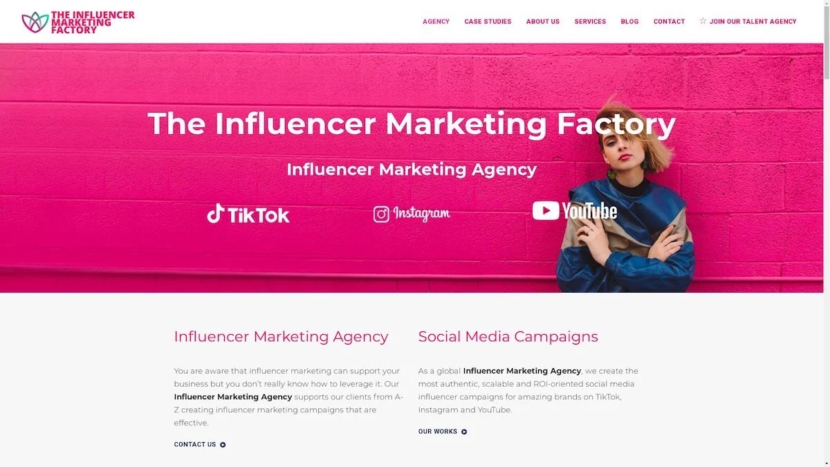
The Influencer Marketing Factory
TikTok, Instagram & YouTube CampaignsA full-service agency with strong TikTok expertise, offering end-to-end campaign management from influencer discovery through performance reporting with a focus on platform-native content.Clients: Google, Snapchat, Universal Music, Bumble, YelpVisit TIMF → -
6
NeoReach
Enterprise Analytics & Influencer CampaignsAn enterprise-focused agency combining managed campaigns with a powerful self-service data platform for influencer search, audience analytics, and attribution modeling.Clients: Amazon, Airbnb, Netflix, Honda, The New York TimesVisit NeoReach → -
7

Ubiquitous
Creator-First Marketing PlatformA tech-driven platform combining self-service tools with managed campaign options, emphasizing speed and scalability for brands managing multiple influencer relationships.Clients: Lyft, Disney, Target, American Eagle, NetflixVisit Ubiquitous → -
8

Obviously
Scalable Enterprise Influencer CampaignsA tech-enabled agency built for high-volume campaigns, coordinating hundreds of creators simultaneously with end-to-end logistics, content rights management, and product seeding.Clients: Google, Ulta Beauty, Converse, AmazonVisit Obviously →
