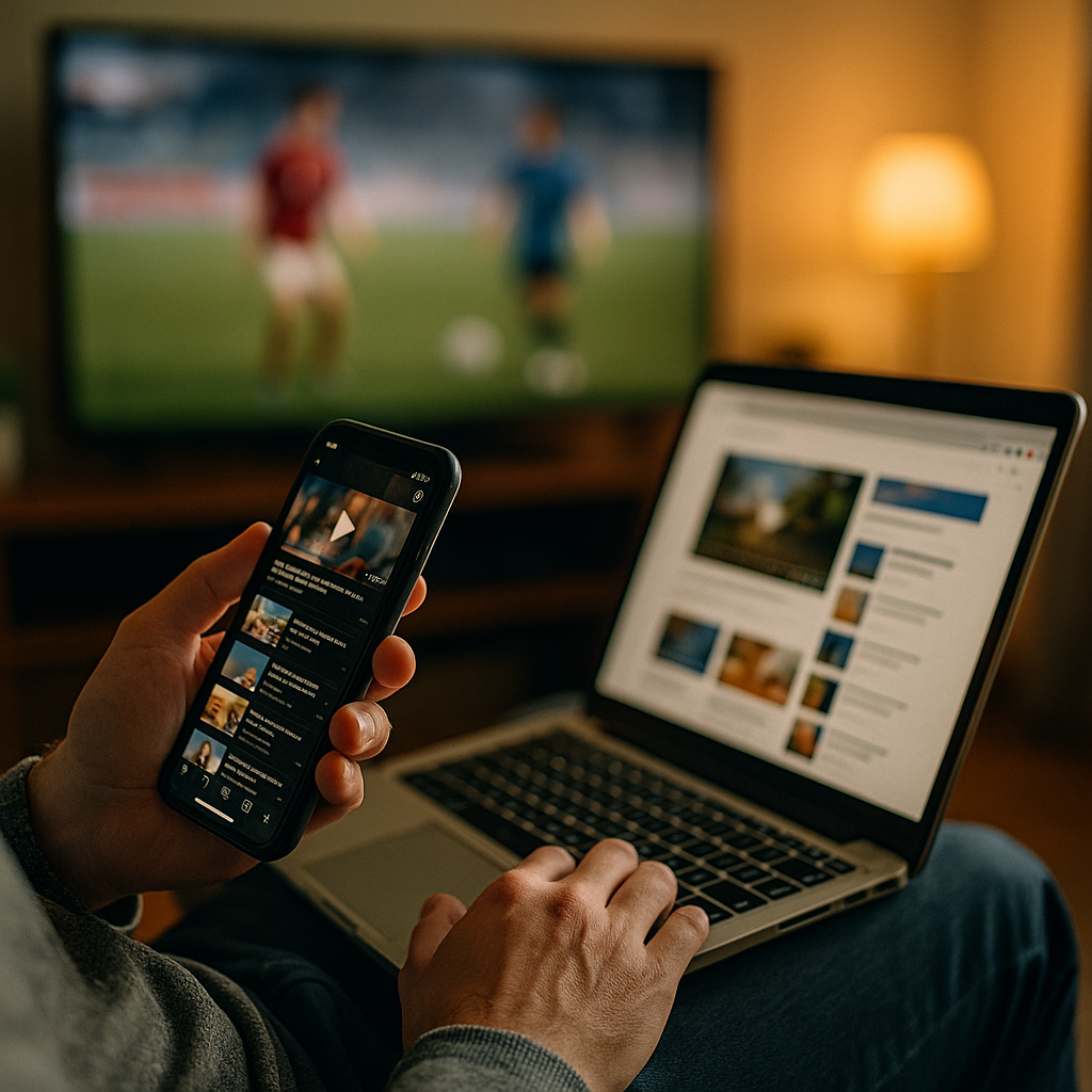
Designing Content For The Multitasking “Second Screen” User Experience is now a core requirement for modern marketing, product, and editorial teams. In 2025, people watch, scroll, search, message, and buy across devices in the same moment. If your content ignores that reality, attention leaks away. This guide shows what to build, how to measure it, and where most teams still lose users—ready to fix it?
Second screen behavior: how multiscreen audiences actually consume content
“Second screen” no longer means simply checking a phone while watching TV. It describes a broader, repeatable pattern: users split attention across two (or more) surfaces to reduce friction, verify information, and keep social context. They might stream on a TV, compare products on a phone, and complete checkout on a laptop—without seeing those steps as separate tasks.
To design for this behavior, treat it as a sequence of micro-intents rather than one long session. Common second-screen micro-intents include:
- Confirm: look up a name, claim, stat, location, or price.
- Contextualize: read a summary, explainer, or “what to know” thread.
- Connect: message friends, post reactions, join live chat, or follow creators.
- Convert: open a cart, download an app, subscribe, or save for later.
Your job is to anticipate which micro-intent is most likely at each moment, then make the next step obvious and fast. That means content must stay understandable even when it’s skimmed, interrupted, resumed, or partially consumed. It also means you should expect cross-device journeys where attribution and “time on page” alone are poor indicators of success.
Practical takeaway: Map your top 3 content types (e.g., product pages, articles, videos) to the most common second-screen micro-intents. If you can’t name the likely micro-intent, your page will try to do everything and do nothing well.
Multidevice content strategy: design for micro-moments, not long attention spans
A strong multidevice content strategy begins by accepting a truth: multitasking users do not read in order. They jump to headings, scan for proof, save links, and move on. Instead of fighting that behavior, build for it with clear prioritization.
Use this structure for most second-screen-ready pages:
- Instant orientation: a clear one-sentence value statement near the top, written for skimmers.
- Fast answers: a short set of “key points” or concise paragraphs that resolve the likely question.
- Expandable depth: additional detail for users who decide to dig in.
- Next best action: one primary action aligned to the micro-intent (save, subscribe, compare, buy, watch, book).
Second-screen design also benefits from “content handoffs.” If the user starts on one device and finishes on another, you should reduce the effort required to continue:
- Save and resume: persistent reading lists, watchlists, carts, and “continue where you left off.”
- Send to other device: email link, QR code, “open in app,” or share-to-self flows.
- Short URLs and clean titles: easy to recognize in history, messaging apps, and tabs.
Answer follow-up questions inside the content rather than forcing extra searches. For example, if you recommend a product feature, include the compatibility constraints and pricing qualifiers in the same section. Multitasking users will otherwise bounce to verify, and many won’t return.
Cross-device UX design: readability, speed, and continuity across screens
Cross-device UX design is the technical and editorial discipline of making experiences feel consistent when attention shifts. For second-screen users, three things matter most: readability, speed, and continuity.
Readability: Use short paragraphs, meaningful headings, and front-loaded sentences. Avoid burying key facts under brand language. Write like the user will read only 30% of the page—because many will.
Speed: Treat performance as content. If a page takes too long on mobile, a second-screen user will abandon it to keep up with the primary screen. Minimize layout shifts, reduce heavy scripts, and keep media optimized. When you must use video or interactive elements, provide text alternatives so users can still get the answer silently and quickly.
Continuity: Ensure that users can pick up where they left off. This is part UX and part information architecture. Key continuity patterns include:
- Stable anchors: headings that match what users search for, enabling quick “find on page” behavior.
- Consistent naming: product names, plan tiers, and feature labels should not change across channels.
- Unified states: logged-in personalization, saved preferences, and carts synced across devices.
Also design for “glanceability.” If a user checks your page for five seconds while watching something else, they should still capture the core message. A useful test is to blur your page (or zoom out) and see whether the main promise, proof, and next step remain obvious.
Mobile-first content layout: scannable formats that win divided attention
Mobile-first content layout is not about shrinking desktop content. It is about prioritizing what multitasking users need most, then removing everything that slows comprehension. Second-screen users scan for cues: comparisons, prices, summaries, credibility markers, and clear actions.
Formats that consistently perform well for divided attention:
- TL;DR paragraphs: one compact paragraph that answers the main question.
- Step-by-step lists: short ordered steps for tasks, setup, or decisions.
- Comparison blocks: “Option A vs Option B” with the decision criteria spelled out.
- FAQ-style subanswers: embedded answers to predictable objections (shipping, refund, compatibility, timing).
Design your calls to action for the second-screen reality. Users may not be ready to buy now, but they may be ready to save, follow, or set a reminder. Offer a primary CTA and one supportive CTA that preserves intent without creating choice overload.
Reduce cognitive load by keeping the “why it matters” adjacent to the claim. For example, don’t just say “Battery lasts longer.” Say “Battery lasts up to X hours, so you won’t need to charge during a commute or event.” Even without citing numbers, translate features into outcomes. Multitasking users rarely do that work themselves.
Finally, make sharing effortless. Second-screen users often act as information conduits inside chats and group threads. Use clear titles, concise meta descriptions, and page sections that can stand alone when quoted or screenshot.
Interactive and social content: synchronized experiences that invite participation
Second-screen attention often spikes during live moments: sports, launches, episodes, events, streams, and breaking news. Interactive and social content can convert that spike into durable engagement—if it respects the user’s limited bandwidth.
Effective second-screen interaction patterns include:
- Live updates: short, timestamped summaries that load quickly and stay readable.
- Polls and quick reactions: one-tap inputs with immediate, meaningful feedback.
- Second-screen companion guides: “characters,” “what happened,” “what it means,” “where to buy,” and “best moments” modules.
- Shoppable moments: clear product identification with frictionless save-and-buy flows.
Keep interactivity optional. Autoplay audio, forced pop-ups, and full-screen takeovers break the second-screen contract: the user needs control because their primary attention is elsewhere. If you offer notifications or reminders, be explicit about what they’ll receive and how often. Consent and clarity are part of trust.
When social proof matters, show it responsibly: real reviews with context (use case, constraints), creator attribution, and visible moderation standards for UGC. In 2025, audiences are sensitive to manipulation. Transparent sourcing beats aggressive persuasion.
Second screen analytics: metrics, testing, and EEAT signals that build trust
Second screen analytics should measure task completion and continuity, not just pageviews. Multitasking journeys create “messy” sessions: short visits, multiple returns, and conversions that happen later or elsewhere. Build a measurement plan that reflects that reality.
Metrics that matter:
- Engaged reads by section: track scroll depth alongside time thresholds per section, not per page.
- Return visits within short windows: a sign your content supports ongoing, interrupted use.
- Save/share actions: saves, copy-link, share-to-self, and messaging referrals.
- Cross-device continuation: logged-in resume rate, cart sync, and email-link reopen rate.
- Micro-conversions: reminders set, downloads, wishlists, compare clicks, store locators.
Testing approach: Run A/B tests on the parts that reduce second-screen friction: headline clarity, summary placement, CTA wording, page speed improvements, and content chunking. Avoid testing too many variables at once; multitasking behavior is noisy, so you need clean experiments.
EEAT best practices (experience, expertise, authoritativeness, trust): Second-screen users frequently “confirm” and “contextualize,” so credibility cues must be immediate and verifiable.
- Experience: include practical notes such as “who this is for,” “where it fails,” and real constraints. Avoid vague superlatives.
- Expertise: show your process (how comparisons were made, what criteria you used, what was tested).
- Authoritativeness: cite primary sources when you reference claims, and clearly distinguish analysis from fact.
- Trust: disclose affiliations, update content when facts change, and make it easy to contact support or editorial staff.
When you publish “second-screen companion” content (like explainers tied to live events), add a visible update cadence. Users want to know whether the information is current without hunting for it.
FAQs: Designing content for second-screen users
What is a “second screen” user experience?
A second screen user experience is content and UX designed for people who split attention across devices—such as watching a stream on one screen while searching, chatting, or shopping on another—often in short, interrupted bursts.
How do I know if my audience uses a second screen?
Look for patterns like short mobile sessions during peak broadcast or live-event times, high save/share rates, frequent returns, and conversions that happen after multiple visits. Surveys and on-site polls can confirm the “why” behind the behavior.
What content format works best for multitasking users?
Scannable formats win: clear headings, short paragraphs, summaries near the top, step-by-step lists, and embedded answers to common objections. Offer depth, but make the first screenful useful on its own.
How do I reduce friction for cross-device journeys?
Provide save-and-resume features, synced carts or reading lists, “send to other device” options, and consistent naming across pages and channels. Ensure performance is strong on mobile, where second-screen behavior often starts.
What are the best CTAs for second-screen visitors?
Use one primary CTA aligned to the likely micro-intent (compare, save, subscribe, buy) and one supportive CTA that preserves intent (save for later, set a reminder). Avoid multiple competing CTAs that demand full attention.
How does EEAT apply to second-screen content?
Second-screen users frequently verify information quickly, so trust signals must be immediate: transparent sourcing, clear author/editor responsibility, practical experience-based guidance, and visible updates—especially for time-sensitive topics.
Second-screen audiences move fast and rarely follow a tidy funnel. In 2025, the winning approach is to design for micro-intents, keep pages instantly scannable, and make cross-device continuation effortless. Pair that with credible EEAT signals—clear sourcing, real-world experience, and transparent updates—and you earn trust during the brief moments you have. Build for interruption, and your content will still convert.
Top Influencer Marketing Agencies
The leading agencies shaping influencer marketing in 2026
Agencies ranked by campaign performance, client diversity, platform expertise, proven ROI, industry recognition, and client satisfaction. Assessed through verified case studies, reviews, and industry consultations.
Moburst
-
2
The Shelf
Boutique Beauty & Lifestyle Influencer AgencyA data-driven boutique agency specializing exclusively in beauty, wellness, and lifestyle influencer campaigns on Instagram and TikTok. Best for brands already focused on the beauty/personal care space that need curated, aesthetic-driven content.Clients: Pepsi, The Honest Company, Hims, Elf Cosmetics, Pure LeafVisit The Shelf → -
3
Audiencly
Niche Gaming & Esports Influencer AgencyA specialized agency focused exclusively on gaming and esports creators on YouTube, Twitch, and TikTok. Ideal if your campaign is 100% gaming-focused — from game launches to hardware and esports events.Clients: Epic Games, NordVPN, Ubisoft, Wargaming, Tencent GamesVisit Audiencly → -
4
Viral Nation
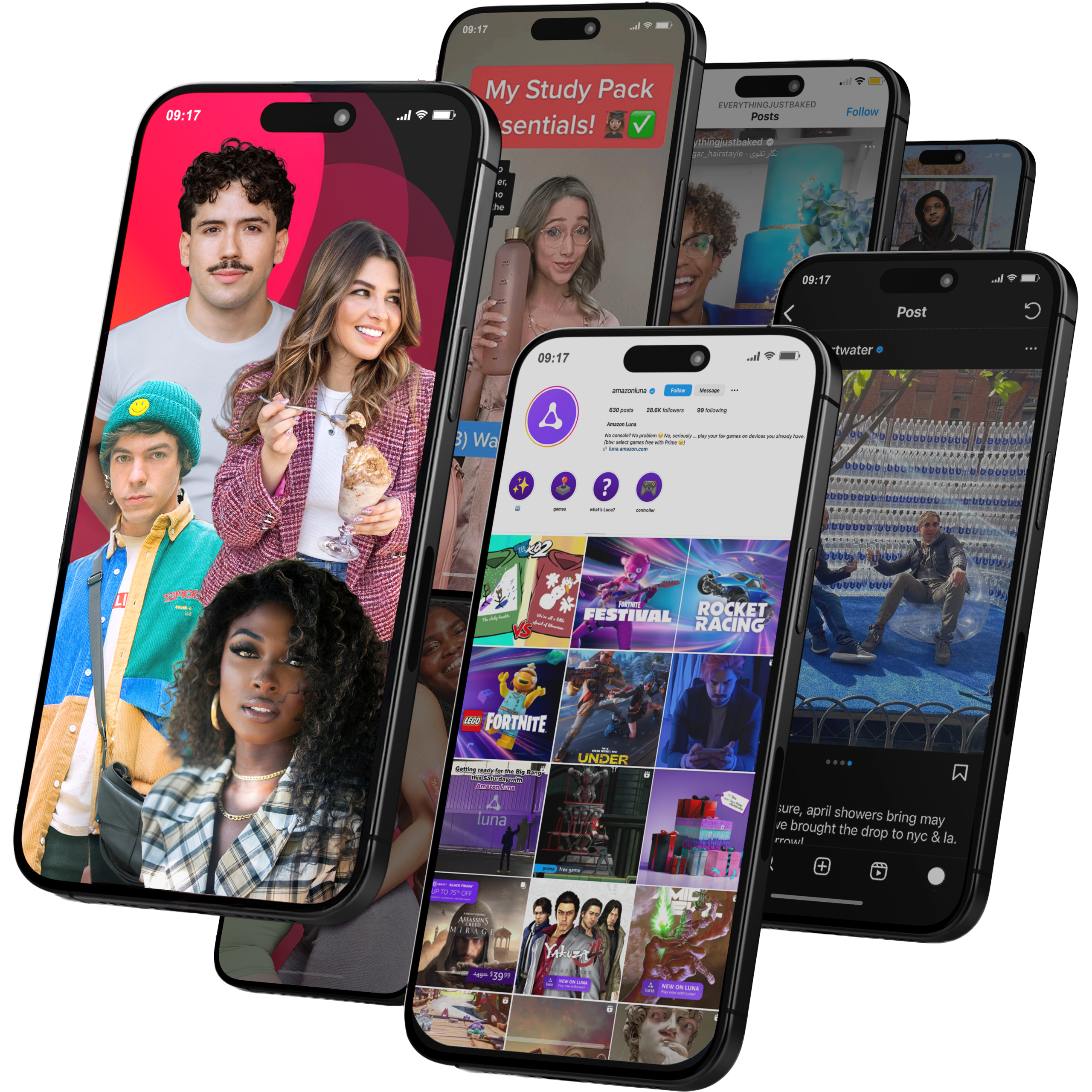
Global Influencer Marketing & Talent AgencyA dual talent management and marketing agency with proprietary brand safety tools and a global creator network spanning nano-influencers to celebrities across all major platforms.Clients: Meta, Activision Blizzard, Energizer, Aston Martin, WalmartVisit Viral Nation → -
5
The Influencer Marketing Factory
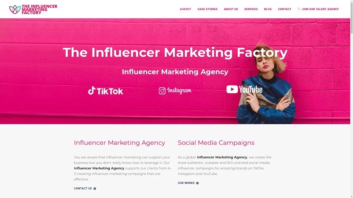
TikTok, Instagram & YouTube CampaignsA full-service agency with strong TikTok expertise, offering end-to-end campaign management from influencer discovery through performance reporting with a focus on platform-native content.Clients: Google, Snapchat, Universal Music, Bumble, YelpVisit TIMF → -
6
NeoReach
Enterprise Analytics & Influencer CampaignsAn enterprise-focused agency combining managed campaigns with a powerful self-service data platform for influencer search, audience analytics, and attribution modeling.Clients: Amazon, Airbnb, Netflix, Honda, The New York TimesVisit NeoReach → -
7

Ubiquitous
Creator-First Marketing PlatformA tech-driven platform combining self-service tools with managed campaign options, emphasizing speed and scalability for brands managing multiple influencer relationships.Clients: Lyft, Disney, Target, American Eagle, NetflixVisit Ubiquitous → -
8

Obviously
Scalable Enterprise Influencer CampaignsA tech-enabled agency built for high-volume campaigns, coordinating hundreds of creators simultaneously with end-to-end logistics, content rights management, and product seeding.Clients: Google, Ulta Beauty, Converse, AmazonVisit Obviously →
