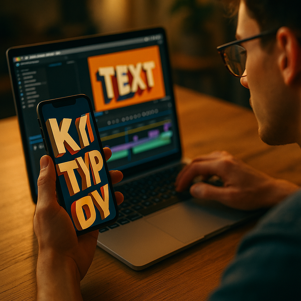
In 2025, short-form video wins attention in seconds, and clarity often beats cinematic polish. Using Kinetic Typography To Enhance Short-Form Video Performance is one of the fastest ways to make messages instantly understandable, even on mute. When text moves with intention, it guides eyes, reinforces meaning, and elevates retention without extra filming. Ready to make your next 15 seconds work harder?
Why kinetic typography boosts short-form video engagement
Kinetic typography is animated text that changes position, scale, timing, or style to support what’s being said on screen. In short-form video, it’s not decoration; it’s a conversion tool. Most viewers scroll quickly and often watch without sound, so your typography becomes the narrator.
It improves comprehension at speed. Motion can establish hierarchy instantly: a single keyword pops, supporting phrases follow, and the viewer understands the point before they swipe away. This matters because short-form platforms reward signals like watch time, replays, and completion rates. When your text clarifies the message faster, fewer viewers abandon early.
It supports silent viewing. Captions help, but kinetic typography goes further by emphasizing intent. A “Wait—don’t do this” warning can hit harder when “don’t” slams into frame and holds for a beat.
It creates pattern interrupts. In a feed of similar talking-head clips, dynamic text acts as a visual reset. Used sparingly, it can trigger a micro “pause” moment that increases the chance of a full view.
It makes your content more accessible. Readable, well-timed text supports viewers with hearing impairments, non-native speakers, or anyone watching in noisy environments. Accessibility also improves performance indirectly: more people can follow along, so more people stay.
Short-form video captions vs. animated text: what to use and when
Creators often ask whether kinetic typography replaces captions. It shouldn’t. Think of these as two different layers with different jobs.
Use standard captions when your goal is complete coverage of speech, especially in dialogue-heavy videos or tutorials. Captions should be consistent, easy to read, and present most of the time.
Use animated text when your goal is emphasis, structure, and persuasion. Kinetic typography works best for:
- Hooks: reinforcing the first claim or question in the opening seconds
- Key benefits: turning features into memorable phrases
- Steps: signaling progress in lists (“Step 1,” “Step 2,” “Step 3”)
- Constraints: highlighting “only,” “never,” “before,” “after,” or “today” without overexplaining
- CTAs: making the action unmistakable (“Save this,” “Try this,” “Comment ‘guide’”)
Combine them intentionally. A practical workflow is to keep base captions steady and introduce kinetic typography as an overlay for 5–20% of your total words. That ratio protects readability while still delivering impact.
Answering the common follow-up: “Will platforms reduce reach if I add text?” No. Platforms don’t penalize text overlays by default; they reward viewer satisfaction. The risk is not text itself—it’s clutter, illegibility, and poor pacing that drives drop-offs.
Kinetic typography best practices for retention and watch time
To improve retention, kinetic typography must serve the viewer’s understanding. Use these principles to keep motion persuasive instead of noisy.
1) Time text to meaning, not to every word. Animating every syllable feels frantic. Instead, animate the “idea words”: the claim, the contrast, the number, the promise, the warning. Let the rest stay still or appear in simpler fades.
2) Match motion to emotion. Motion language communicates tone:
- Snap-in / punch scale: urgency, confidence, strong claims
- Slide-in with easing: calm clarity, explanation, education
- Type-on effect: suspense or “reveal,” but keep it short
- Staggered lines: step-by-step teaching and pacing control
3) Protect readability with a “two-line rule.” For most mobile screens, keep animated phrases to one or two lines. If you need more, break the thought into beats. Long animated sentences cause rereads and drop-offs.
4) Use strong hierarchy. Define a primary style (your main emphasis) and a secondary style (support). Examples include bold weight for the keyword and regular weight for the explanation, or a highlighted background for the main claim.
5) Design for thumbs and UI overlays. Place important text away from platform UI. Keep critical copy centered or upper-mid frame. Avoid bottom corners where captions, buttons, and descriptions often sit.
6) Keep contrast high. If your background changes, add a subtle shadow, stroke, or semi-transparent box behind text. The goal is fast reading, not aesthetic minimalism.
7) Repeat strategically. Repetition increases recall. Reintroduce the main phrase near the end to reinforce the takeaway and CTA. Viewers often decide to like, save, or comment in the last seconds.
Typography design for mobile-first vertical video performance
Mobile-first typography is a performance lever because it reduces cognitive load. When viewers can read instantly, they can focus on the message. That’s good for completion rate and saves.
Choose fonts that survive compression. Many short-form videos are re-encoded by platforms. Thin strokes can blur. Use a typeface with sturdy letterforms and clear counters (the “holes” in letters like O and P). If your brand font is delicate, reserve it for large headings only.
Set a consistent type scale. Create 3 sizes:
- Headline: hooks and key claims
- Subhead: short explanations
- Micro labels: step numbers, “pro tip,” “mistake,” “fix”
Use safe margins. Keep text comfortably inside the frame. A practical rule is to avoid placing critical text within the outer edge area where UI elements can overlap. Test on multiple devices if possible.
Color should encode meaning. Use one accent color for emphasis. Overusing multiple bright colors weakens hierarchy. If you highlight everything, nothing stands out.
Don’t fight the footage. Kinetic typography performs best when it complements the visual story. If the background is busy, simplify the motion and increase text backing. If the background is clean, you can use slightly more movement while maintaining readability.
Answering the follow-up: “Should I use all caps?” Use it for short emphasis (1–3 words). For longer phrases, mixed case is easier to read at speed and feels less aggressive.
Workflow and tools for motion typography in short-form content
A repeatable workflow keeps your output consistent and improves team collaboration. Whether you’re a solo creator or a brand team, the goal is to build a system that produces high-performing text quickly.
Step 1: Script with typography in mind. Write your hook, three key points, and CTA. Then identify “type moments”: 5–8 phrases that deserve emphasis. If you can’t pick them, your script may be too dense.
Step 2: Build a motion style kit. Define reusable presets:
- Entrance: pop, slide, fade, or type-on
- Emphasis: scale punch, underline draw, highlight swipe
- Exit: quick fade or slide out
- Timing: consistent durations and easing
Step 3: Edit for pacing first, then add text. Tighten pauses, remove filler, and align cut points. After pacing is locked, add kinetic typography so it lands on the strongest beats.
Step 4: Quality control for EEAT. EEAT isn’t only for written pages. In video, it shows up as clarity and credibility:
- Experience: show the result, the process, or the before/after
- Expertise: explain the “why,” not just the “what”
- Authoritativeness: use consistent branding and avoid exaggerated claims
- Trust: ensure disclaimers when needed and keep text accurate
Step 5: Export and test on-phone. Watch with sound off and then with sound on. If you can’t understand the message silently, your typography isn’t doing its job.
Tools note: Many editors support kinetic typography via keyframes, text templates, and motion presets. Choose the tool that fits your volume and turnaround needs, then standardize your templates so your team can produce consistent output.
Measuring results: KPIs and A/B tests for animated captions
Kinetic typography should earn its place by improving measurable outcomes. In 2025, the most useful approach is to test creative variations quickly and keep what reliably lifts retention and action.
Track these core KPIs:
- 3-second hold: are viewers staying past the initial scroll moment?
- Average watch time: does text pacing keep attention through the body?
- Completion rate: are more viewers reaching the final CTA?
- Rewatches: does the typography create “I need to see that again” moments?
- Saves and shares: are viewers treating it as reference-worthy?
Run controlled A/B tests. Change one variable at a time:
- Hook typography: static caption vs. kinetic emphasis on the keyword
- Density: base captions only vs. captions plus 5–8 animated moments
- Style: highlight bar vs. punch scale vs. slide-in
- Placement: mid-frame vs. upper-mid safe zone
Interpret results with intent. If watch time rises but shares drop, your typography may be entertaining without being actionable. If saves rise but completion falls, your first half may be clearer than your ending CTA. Adjust the script and type moments accordingly.
Answering the follow-up: “How many videos should I test?” For most creators, testing 6–12 variations across a month provides enough signal to pick a style kit. Focus on consistency, not endless tweaking.
FAQs about kinetic typography for short-form video
What is the difference between kinetic typography and subtitles?
Subtitles aim to transcribe spoken words accurately and consistently. Kinetic typography selectively animates key phrases to emphasize meaning, guide attention, and shape pacing. Many high-performing videos use both: steady captions plus occasional animated emphasis.
How much animated text is too much?
When viewers have to reread or when motion competes with the speaker, it’s too much. A practical guideline is to animate only the most important 5–20% of words, keeping the rest as stable captions or minimal fades.
Does kinetic typography work for every niche?
Yes, but the style should match the niche. Finance, health, and legal content typically needs calmer motion and high readability to maintain trust. Entertainment and lifestyle can handle bolder motion as long as clarity remains strong.
Will kinetic typography increase conversions?
It can, if it clarifies the offer and makes the CTA unmistakable. Animated text is most effective when it highlights the outcome, the proof, and the action step without exaggeration or confusion.
What are the most common mistakes?
Over-animating every word, using low-contrast text, placing copy under platform UI, choosing thin fonts that blur after compression, and ignoring pacing. Another common issue is emphasizing the wrong phrase instead of the true decision driver.
How do I keep typography on-brand while staying readable?
Use your brand font for headlines if it remains legible, but prioritize readability for body text. Standardize a limited palette, one accent color, and a consistent set of motion presets. Brand consistency comes more from repetition and hierarchy than from complex styling.
Strong kinetic typography improves short-form video by making messages readable on mute, guiding attention, and reinforcing key ideas at the exact moment they matter. In 2025, the best results come from restraint: animate only the phrases that carry meaning, keep contrast high, and protect mobile-safe placement. Build a reusable style kit, test against retention and saves, and iterate fast.
Top Influencer Marketing Agencies
The leading agencies shaping influencer marketing in 2026
Agencies ranked by campaign performance, client diversity, platform expertise, proven ROI, industry recognition, and client satisfaction. Assessed through verified case studies, reviews, and industry consultations.
Moburst

-
2

The Shelf
Boutique Beauty & Lifestyle Influencer AgencyA data-driven boutique agency specializing exclusively in beauty, wellness, and lifestyle influencer campaigns on Instagram and TikTok. Best for brands already focused on the beauty/personal care space that need curated, aesthetic-driven content.Clients: Pepsi, The Honest Company, Hims, Elf Cosmetics, Pure LeafVisit The Shelf → -
3

Audiencly
Niche Gaming & Esports Influencer AgencyA specialized agency focused exclusively on gaming and esports creators on YouTube, Twitch, and TikTok. Ideal if your campaign is 100% gaming-focused — from game launches to hardware and esports events.Clients: Epic Games, NordVPN, Ubisoft, Wargaming, Tencent GamesVisit Audiencly → -
4

Viral Nation
Global Influencer Marketing & Talent AgencyA dual talent management and marketing agency with proprietary brand safety tools and a global creator network spanning nano-influencers to celebrities across all major platforms.Clients: Meta, Activision Blizzard, Energizer, Aston Martin, WalmartVisit Viral Nation → -
5

The Influencer Marketing Factory
TikTok, Instagram & YouTube CampaignsA full-service agency with strong TikTok expertise, offering end-to-end campaign management from influencer discovery through performance reporting with a focus on platform-native content.Clients: Google, Snapchat, Universal Music, Bumble, YelpVisit TIMF → -
6

NeoReach
Enterprise Analytics & Influencer CampaignsAn enterprise-focused agency combining managed campaigns with a powerful self-service data platform for influencer search, audience analytics, and attribution modeling.Clients: Amazon, Airbnb, Netflix, Honda, The New York TimesVisit NeoReach → -
7

Ubiquitous
Creator-First Marketing PlatformA tech-driven platform combining self-service tools with managed campaign options, emphasizing speed and scalability for brands managing multiple influencer relationships.Clients: Lyft, Disney, Target, American Eagle, NetflixVisit Ubiquitous → -
8

Obviously
Scalable Enterprise Influencer CampaignsA tech-enabled agency built for high-volume campaigns, coordinating hundreds of creators simultaneously with end-to-end logistics, content rights management, and product seeding.Clients: Google, Ulta Beauty, Converse, AmazonVisit Obviously →
