In 2025, short-form video feeds move fast, and viewers decide in seconds whether to stay or swipe. Using Kinetic Typography To Enhance Short-Form Video Performance turns captions into motion cues that guide attention, clarify meaning, and reinforce brand voice without relying on sound. When done well, it raises watch time and comprehension while keeping edits tight. Here’s how to make it work.
Why kinetic typography boosts short-form video engagement
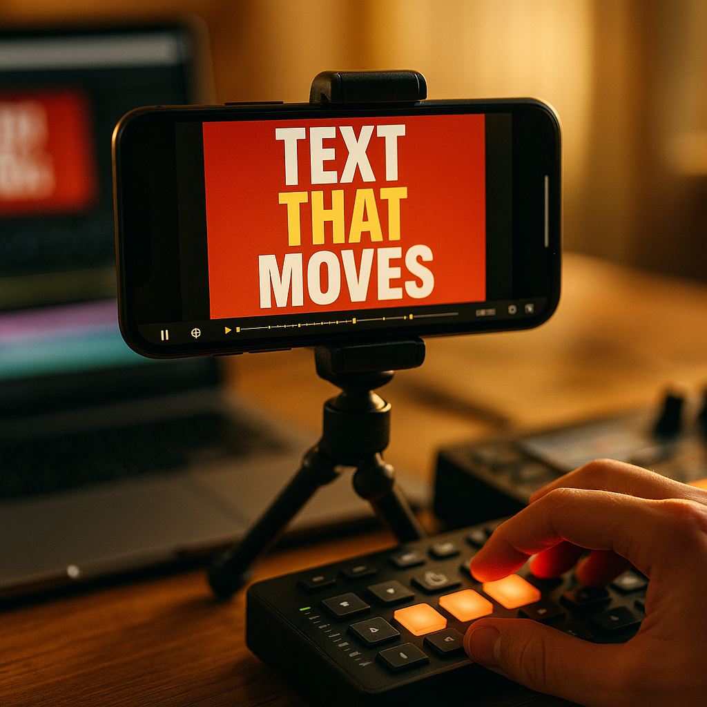
Kinetic typography is animated text that responds to timing, emphasis, and on-screen action. It works because it matches how people scan short videos: quickly, visually, and often silently. In 2025, many viewers watch on mute in public spaces or while multitasking, so text isn’t a nice-to-have; it is a parallel information channel.
It improves retention by reducing cognitive load. When key phrases appear exactly as they are spoken, viewers spend less effort decoding audio or guessing context. This “dual-channel” support (audio + visual text) helps comprehension and makes the message feel faster without actually speeding it up.
It creates micro-pattern interrupts. Subtle motion in text (a pop, slide, or bounce) can re-capture attention at moments where drop-off commonly happens: the first 1–2 seconds, the transition into the value, and the call to action. This is particularly effective on vertical feeds where competing videos are one swipe away.
It communicates emotion and tone. Typography is a design language. Tight kerning and sharp moves can feel urgent; rounded fonts with softer easing can feel friendly; staggered word reveals can build suspense. Done consistently, this becomes part of your recognizable brand system, not just decoration.
It makes clips more searchable and reusable. Clear on-screen text helps viewers remember what the video was “about,” which supports saves and shares. It also makes it easier to repurpose the same edit for different contexts (ads, organic posts, landing pages) by swapping lines without re-shooting.
Short-form video captions that increase watch time
Captions are the foundation of kinetic typography. Treat them as a performance layer, not a transcript. The goal is not to display every word; it is to keep viewers oriented and curious while the story advances.
Start with a “reason to stay” caption. In the first second, display a promise, problem, or surprising claim. Keep it short enough to read instantly. If your hook needs more detail, split it into two beats rather than one dense line.
- Beat 1 (0–1s): the punch (“Stop doing this in Reels.”)
- Beat 2 (1–2s): the context (“It kills retention in the first 3 seconds.”)
Use phrase-based captions, not word-by-word. Word-by-word “karaoke” captions can work for comedy or high-energy edits, but they often create visual noise and fatigue. Phrase-based captions keep the eye stable and preserve hierarchy. If you do animate per word, reserve it for 1–2 highlighted words at a time.
Design for thumb-stopping readability. In vertical video, the safe reading zone is narrower than you think. Keep captions away from platform UI and avoid placing important text at the very bottom. Use strong contrast: light text on a dark shadow/plate or dark text on a light plate. If the background is busy, add a semi-opaque bar behind text.
Time captions to meaning, not syllables. A practical editing rule: let the text appear a fraction of a second before the spoken phrase lands, so the viewer’s brain is already primed. Then remove it quickly once the point is made to keep the screen clean.
Answer common follow-ups inside the captions. Short-form viewers often think: “What is this?” “Is it for me?” “How do I do it?” Add tiny clarifiers as secondary lines, such as “for creators,” “no paid ads,” or “3 steps.” This reduces comments that ask for basic context and increases qualified engagement.
Motion typography design principles for mobile-first viewing
Kinetic typography succeeds when it feels intentional and easy to parse. Use a small set of rules so your edits stay consistent across a series and your audience learns how to “read” your style.
1) Establish a clear hierarchy. Choose three levels:
- Primary: 3–6 words max, largest size, appears for hooks and key claims.
- Secondary: supporting detail, smaller size, often on a plate.
- Micro: labels like “Step 1,” “Example,” “Don’t,” used sparingly.
2) Limit fonts and effects. Two typefaces is usually enough: one for headlines and one for body/labels. Over-styling hurts comprehension and feels less trustworthy. Prefer clean sans-serif faces for small sizes and avoid ultra-thin weights that disappear on compressed video.
3) Choose motion that matches the message. Motion should express meaning:
- Reveal: use a simple fade/slide for instructional content.
- Impact: use a quick scale “pop” for punchlines or key stats.
- Flow: use tracking changes or subtle drift to suggest continuity.
4) Control easing and speed. Snappy motion reads as confident; overly elastic bounces can look unserious unless the brand is playful. Keep most text animations under half a second. When in doubt, reduce motion amplitude and rely on timing instead of flashy transforms.
5) Protect legibility with spacing. Add generous line spacing and padding around text plates. Avoid long lines; break text into shorter chunks so the eye can return to the video action. If you must show longer information (like steps), consider an anchored sidebar layout rather than center-screen blocks.
6) Respect accessibility. Ensure strong contrast, avoid rapid flashing, and keep text on screen long enough to read. If you use color to categorize information, pair it with labels so viewers aren’t forced to interpret color alone.
Kinetic text animations for hooks, pacing, and retention
Performance is largely about pacing. Kinetic typography lets you shape pacing without changing the footage. The best approach is to plan a “text rhythm” that aligns with your narrative arc.
Hooks (0–2 seconds): Use one bold line and one emphasized word. Make the emphasized word move (pop, underline draw-on, or a quick color change). Avoid multiple lines competing for attention.
Value delivery (2–12 seconds): Switch to calmer animation: slide-in phrases, minimal movement, stable placement. Viewers should focus on comprehension here. Add occasional emphasis bursts at key takeaways to prevent drop-off.
Pattern interrupt (midpoint): At the midpoint, introduce a different layout (e.g., move text from bottom to center, or add a “quick example” label). This creates novelty without restarting the story.
CTA (final 2–4 seconds): The call to action should be visually dominant and unambiguous. Use one action verb and one benefit. If you add motion, make it directional: an arrow, a subtle bounce on the button area, or a highlight sweep across the key phrase.
Use kinetic typography to clarify “who/what/why.” Short-form viewers often abandon videos that feel vague. Use small kinetic tags to remove ambiguity:
- Who it’s for: “For coaches,” “For SaaS founders,” “For students.”
- What it is: “3-second hook formula,” “Edit checklist,” “Pricing tip.”
- Why it matters: “Boosts saves,” “Cuts drop-off,” “Faster onboarding.”
Keep the screen “single-purpose.” If the viewer can’t tell what to look at, retention suffers. Don’t animate text while also changing shots rapidly unless you reduce the complexity of one of those layers. A clean edit with purposeful text often outperforms visually chaotic edits.
Workflow and tools for kinetic typography in 2025
Efficient workflow matters because short-form success requires volume and consistency. You can produce high-quality kinetic typography without turning every video into a motion-design project.
Step 1: Write for motion. Before you edit, convert your script into “caption beats.” Mark the 5–8 moments where text should hit: hook, key claim, steps, proof, objection handling, CTA. This prevents over-captioning and keeps motion intentional.
Step 2: Build a reusable caption system. Create templates for:
- Hook layout (headline + highlighted word)
- Step layout (Step label + short instruction)
- Proof layout (metric or testimonial snippet)
- CTA layout (action + benefit)
Use consistent font sizes, colors, and animation presets so every new video starts from a proven baseline. This supports brand recognition and reduces editing time.
Step 3: Pick tools that match your volume. In 2025, creators commonly use a mix of mobile and desktop tools depending on complexity:
- Fast templated captions: Great for daily posting and simple kinetic emphasis.
- Desktop NLEs (non-linear editors): Better for precise timing, advanced easing, and versioning for ads.
- Motion graphics software: Best for custom typography rigs, advanced transitions, and scalable brand systems.
Step 4: Quality control for trust. EEAT is not just for blogs; it applies to video credibility too. Review every cut for:
- Accuracy: ensure on-screen text matches what’s said and avoids misleading claims.
- Consistency: terminology, capitalization, and numbers follow a style guide.
- Proof: if you reference performance, show the context briefly (e.g., “organic,” “30-day average”) or avoid precise numbers you can’t substantiate.
- Brand safety: avoid aggressive flashing, cluttered overlays, or tiny disclaimers.
Step 5: Version and test quickly. Create 2–3 caption variants for the same footage: different hook text, different highlighted word, and different CTA phrasing. Then publish or run ads to learn what improves retention and conversions. Keep a simple log: hook line, typography style, average view duration, rewatches, saves, and click-through rate if applicable.
Measuring short-form video performance with typography A/B tests
To improve results, connect typography choices to measurable outcomes. Track a few metrics consistently so you can learn what your audience responds to.
Key metrics to monitor:
- 3-second hold rate: indicates whether your hook text and first motion beat work.
- Average watch time / retention curve: shows where text pacing loses people.
- Rewatches: often increase when kinetic text is crisp and information-dense.
- Saves and shares: rise when text makes the content easy to revisit or send.
- CTR or profile actions: reflects clarity and strength of the CTA treatment.
What to A/B test (one variable at a time):
- Hook structure: question vs. statement; promise vs. warning.
- Emphasis method: color highlight vs. scale pop vs. underline draw.
- Caption density: fewer lines with stronger hierarchy vs. more detailed guidance.
- Placement: bottom anchored vs. mid-screen for key claims.
- Animation tempo: calmer reveals vs. punchier cuts at emphasis moments.
How to interpret results without overfitting. Look for patterns across at least several posts rather than chasing a single outlier. If a typography change improves the first seconds but hurts mid-video retention, adjust: keep the punchy hook, then switch to calmer motion for the instructional section. This “fast then steady” rhythm often produces the best overall watch time.
Keep trust signals visible. If you teach, show steps clearly. If you claim results, add a brief qualifier in text such as “example,” “case study,” or “client result.” Viewers reward clarity and honesty with saves and follows, which supports long-term performance.
FAQs about kinetic typography in short-form video
What is kinetic typography in short-form video?
Kinetic typography is animated on-screen text that appears, moves, and changes in sync with narration or music. In short-form video, it commonly replaces or enhances captions by emphasizing key words, structuring steps, and guiding attention.
Does kinetic typography work better than standard captions?
It often performs better when your content depends on timing, persuasion, or instruction. Standard captions improve accessibility; kinetic typography can additionally increase emphasis and pacing. The best approach is a readable caption base with selective motion on the most important words.
How much animation is too much?
If viewers struggle to read comfortably or can’t tell where to look, it’s too much. Limit motion to moments of emphasis, keep most animations under half a second, and maintain a stable placement for the majority of the video.
What fonts are best for vertical video typography?
Choose highly legible sans-serif fonts with strong x-height and multiple weights. Use heavier weights for small sizes and avoid thin styles. Keep to one or two fonts across your channel to build recognition.
How do I make kinetic typography accessible?
Use high contrast, avoid rapid flashing, keep text on screen long enough to read, and don’t rely on color alone to convey meaning. Also keep key information away from platform UI zones and ensure captions remain readable on smaller screens.
What should I test first to improve performance?
Test the hook typography first: the first line, one emphasized word, and the timing of the first animation beat. Improvements there usually lift 3-second hold rate, which then gives the rest of the video a chance to perform.
Short-form videos win in 2025 when viewers understand your message instantly and feel guided from hook to payoff. Kinetic typography strengthens that path by making captions readable, purposeful, and emotionally aligned with your content. Build a consistent text system, animate only what matters, and test hooks and pacing with real metrics. Make your words move with intent, and performance follows.
Top Influencer Marketing Agencies
The leading agencies shaping influencer marketing in 2026
Agencies ranked by campaign performance, client diversity, platform expertise, proven ROI, industry recognition, and client satisfaction. Assessed through verified case studies, reviews, and industry consultations.
Moburst

-
2

The Shelf
Boutique Beauty & Lifestyle Influencer AgencyA data-driven boutique agency specializing exclusively in beauty, wellness, and lifestyle influencer campaigns on Instagram and TikTok. Best for brands already focused on the beauty/personal care space that need curated, aesthetic-driven content.Clients: Pepsi, The Honest Company, Hims, Elf Cosmetics, Pure LeafVisit The Shelf → -
3

Audiencly
Niche Gaming & Esports Influencer AgencyA specialized agency focused exclusively on gaming and esports creators on YouTube, Twitch, and TikTok. Ideal if your campaign is 100% gaming-focused — from game launches to hardware and esports events.Clients: Epic Games, NordVPN, Ubisoft, Wargaming, Tencent GamesVisit Audiencly → -
4

Viral Nation
Global Influencer Marketing & Talent AgencyA dual talent management and marketing agency with proprietary brand safety tools and a global creator network spanning nano-influencers to celebrities across all major platforms.Clients: Meta, Activision Blizzard, Energizer, Aston Martin, WalmartVisit Viral Nation → -
5

The Influencer Marketing Factory
TikTok, Instagram & YouTube CampaignsA full-service agency with strong TikTok expertise, offering end-to-end campaign management from influencer discovery through performance reporting with a focus on platform-native content.Clients: Google, Snapchat, Universal Music, Bumble, YelpVisit TIMF → -
6

NeoReach
Enterprise Analytics & Influencer CampaignsAn enterprise-focused agency combining managed campaigns with a powerful self-service data platform for influencer search, audience analytics, and attribution modeling.Clients: Amazon, Airbnb, Netflix, Honda, The New York TimesVisit NeoReach → -
7

Ubiquitous
Creator-First Marketing PlatformA tech-driven platform combining self-service tools with managed campaign options, emphasizing speed and scalability for brands managing multiple influencer relationships.Clients: Lyft, Disney, Target, American Eagle, NetflixVisit Ubiquitous → -
8

Obviously
Scalable Enterprise Influencer CampaignsA tech-enabled agency built for high-volume campaigns, coordinating hundreds of creators simultaneously with end-to-end logistics, content rights management, and product seeding.Clients: Google, Ulta Beauty, Converse, AmazonVisit Obviously →
