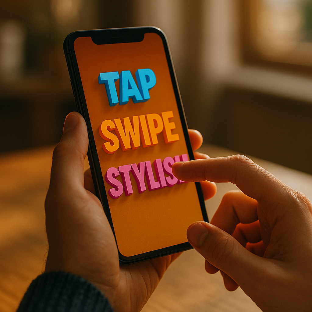
On mobile, every extra second and every unclear instruction reduces the odds that users finish what they started. The Power Of Kinetic Typography In Enhancing Mobile Completion Rates comes from turning key words into guided motion—so users understand, decide, and act faster on small screens. Used well, animated text becomes a micro-guide that reinforces meaning without adding clutter. Want to lift completions without redesigning everything?
Why kinetic typography boosts mobile completion rates
Kinetic typography is animated text designed to communicate meaning through timing, motion, scale, and emphasis. On mobile, where attention is fragmented and screen real estate is limited, it can directly support task completion by improving comprehension and reducing cognitive load.
Completion rate is a practical metric: the percentage of users who successfully finish a key flow (signup, checkout, onboarding, form submission, lesson completion, etc.). When users abandon, the cause is often not “lack of interest” but friction—unclear next steps, uncertainty, or effort that feels larger than the reward.
Kinetic typography helps because it:
- Prioritizes information in time (not just space). Instead of cramming text into a small screen, you reveal what matters when it matters.
- Signals what to do next through motion cues that feel intuitive, especially for scanning behavior.
- Improves perceived speed by keeping users oriented during short waits (verification, loading, permission prompts).
- Reduces rereading by emphasizing the decisive words (“Free,” “2 minutes,” “No card,” “Continue”).
In 2025, many product teams already use microinteractions, but animated text is often underused. The opportunity is to apply it deliberately to the moments where users hesitate—then validate impact with controlled experiments.
Applying kinetic typography to mobile UX design moments that decide success
Not every screen needs animated text. The best results come from using it in high-leverage “decision points” where users typically drop off. Focus on flows where clarity beats decoration.
1) Onboarding and first-run setup
Onboarding fails when it feels long or confusing. Use kinetic typography to deliver one instruction at a time and reinforce the action the UI expects. Example: animate “Turn on notifications” so “Turn on” enters first, then “notifications” locks onto the permission button location. This reduces the mental step of mapping text to UI.
2) Form completion and error recovery
Most mobile abandonment happens inside forms. Animated text can:
- Explain formatting rules at the moment of need (“Use 8+ characters”) rather than in a long static block.
- Turn errors into guided fixes: animate the specific field name (“Card number”) and the required change (“Check digits”) rather than a generic “Invalid input.”
3) Checkout reassurance and trust cues
When users worry about price, security, or returns, they pause. Use subtle kinetic typography to highlight high-trust statements without screaming. Example: a short slide-in “Secure payment” or “Free returns” aligned near the final CTA, timed to appear after users review totals.
4) Short waits and background actions
If a process takes more than a beat, users need a clear explanation. Animated text that changes state (“Verifying,” “Almost done,” “Confirmed”) reduces uncertainty and prevents back-navigation.
5) Education and habit loops
For learning apps, fitness, and productivity tools, kinetic typography can reinforce micro-goals: “One more set,” “Finish today’s lesson,” “Save your streak.” The goal is to encourage the next action without adding another modal.
The follow-up question is usually: “Will this annoy users?” It will if it’s constant, flashy, or delays interaction. Use motion as a guide, not as entertainment.
Proven motion design principles that improve clarity on small screens
Effective kinetic typography follows the same discipline as good UX writing: fewer words, stronger verbs, and clear intent. Motion adds a second layer: timing. These principles keep it helpful, not noisy.
- Animate meaning, not decoration. Motion should reveal hierarchy (what matters most) or relationship (cause → effect). If the motion doesn’t change understanding, remove it.
- Use a single emphasis per line. On mobile, over-emphasis looks chaotic. Choose one word to animate strongly and keep the rest stable.
- Keep durations short. Use quick transitions that never block tapping. If the user can’t act until the animation finishes, it’s probably hurting completion.
- Match motion to intent. Slide-in can suggest “next,” scale-up can suggest “important,” and fade-in can suggest “supporting detail.” Avoid bouncing or elastic motion for serious tasks like payments or identity verification.
- Respect reading patterns. Left-to-right languages benefit from motion that follows reading direction. Don’t force the eye to zigzag.
- Maintain typographic discipline. Strong contrast, adequate size, and consistent line length matter more than animation. Motion cannot fix illegible type.
Practical pattern: Use “progressive disclosure text.” Show a short headline immediately, then animate in one clarifying phrase after 200–400 ms. Users who need more context get it; users who are ready can act instantly.
Practical anti-pattern: Long animated sentences. Mobile users skim; long kinetic copy often increases perceived effort and reduces trust.
A/B testing kinetic typography for completion-rate lift (without false wins)
To follow EEAT best practices, treat kinetic typography as a testable UX intervention, not a creative preference. The goal is measurable improvement in completion, not “engagement” that doesn’t translate into finished tasks.
Step 1: Choose one critical flow and one drop-off point
Examples: “Email verification screen,” “Address form,” “Payment confirmation,” “First task creation.” Pick the step where analytics show hesitation (time-on-step spike) or abandonment.
Step 2: Define primary and guardrail metrics
- Primary: completion rate of the flow.
- Secondary: time to complete, error rate, back-navigation, support contact rate.
- Guardrails: crash rate, page performance, accessibility settings usage, refund/chargeback indicators (for commerce).
Step 3: Run a clean experiment
Keep everything identical except the text motion. If you change copy and motion simultaneously, you won’t know what caused the lift. Also segment by device class; low-end phones can magnify performance impacts.
Step 4: Interpret results like a product team, not a studio
- If completion rises but time-to-complete also rises, check whether the animation delayed interaction.
- If time falls but errors rise, the motion may be pushing users too fast without comprehension.
- If overall results are flat, analyze subsegments: new users vs returning, small screens vs large, slow networks vs fast.
Step 5: Iterate with intent
Common improvements that often increase completion:
- Shorten the animated phrase to 3–6 words.
- Move emphasis to the decision word (“Confirm,” “Continue,” “Skip”).
- Delay supportive text slightly so it doesn’t compete with the CTA.
If your team asks, “How much lift is realistic?” It depends on baseline friction. Kinetic typography rarely rescues a broken funnel alone, but it can meaningfully improve clarity in otherwise solid flows—especially when paired with better microcopy.
Accessibility and performance: making kinetic text helpful for everyone
EEAT-aligned content must address safety and usability. Animated text can exclude users if it ignores motion sensitivity, readability, or device constraints. In 2025, accessibility is not optional; it’s part of quality.
Respect reduced motion preferences
Support system settings that reduce motion. Provide a static equivalent that keeps the same hierarchy and meaning. Don’t hide essential instructions only inside animation.
Protect readability
- Maintain adequate contrast and avoid thin weights over complex backgrounds.
- Keep text stable long enough to read; avoid rapid flashes or fast cycling words.
- Do not animate letter-by-letter in critical instructions; it slows reading and can feel like a loading delay.
Prevent performance regressions
Dropped frames and jank reduce trust and can directly reduce completion. Optimize by:
- Limiting simultaneous animated elements (ideally one text group per screen moment).
- Using GPU-friendly transforms (translate/scale/opacity) rather than expensive layout-thrashing animations.
- Preloading fonts and avoiding font swaps during animation.
Avoid manipulative patterns
Kinetic typography should clarify and reassure, not pressure. If motion is used to rush consent, hide pricing details, or nudge users away from decline options, you’ll see long-term trust damage—even if short-term conversions rise.
The follow-up question here is: “Can we still be expressive?” Yes—use brand motion in supportive moments (celebration, confirmation) while keeping decision moments calm and clear.
Storytelling on mobile: using kinetic typography to build trust and momentum
Completion improves when users feel oriented and confident. Kinetic typography can create a lightweight narrative that keeps users moving through a flow.
Use a three-beat structure
- Beat 1 (Orient): A clear headline appears instantly (“Set up your account”).
- Beat 2 (Reassure): A short animated qualifier reduces fear (“Takes 2 minutes”).
- Beat 3 (Commit): The CTA and next step are reinforced (“Continue”).
Align text motion with user intent
Users open a finance app to move money, not to watch animations. Users open a wellness app to complete a routine, not to decode a slogan. Map the kinetic emphasis to the user’s goal:
- Speed intent: emphasize “Fast,” “Instant,” “Quick scan.”
- Safety intent: emphasize “Secure,” “Encrypted,” “You’re in control.”
- Effort intent: emphasize “One step,” “No paperwork,” “Skip for now.”
Handle uncertainty explicitly
Users abandon when they don’t know what happens next. Kinetic typography can preview the next step in a single phrase: “Next: verify email” or “Next: choose a plan.” This reduces surprise and makes the flow feel shorter.
Where it works best
- Short onboarding sequences
- Verification and confirmation moments
- Micro-learning prompts
- Checkout reassurance
Where it often fails
- Dense legal or policy text
- Complex settings screens
- Any screen where users need to compare multiple options at once
When you treat kinetic typography as structured storytelling—not decoration—you gain a scalable method for guiding attention across your most valuable mobile flows.
FAQs about kinetic typography and mobile completion
What is kinetic typography in mobile apps?
Kinetic typography is animated text that uses timing, motion, and emphasis to communicate meaning. In mobile apps, it’s often used to guide attention, clarify next steps, and reduce hesitation during onboarding, forms, and checkout.
How does kinetic typography improve completion rates?
It improves completion rates by making instructions easier to scan, reducing uncertainty during waits, highlighting the decisive words near CTAs, and presenting information progressively so users process less at once on small screens.
Will animated text slow down the user?
Only if it blocks interaction or runs too long. Well-designed kinetic typography appears quickly, supports immediate tapping, and avoids long sequences. A good rule: never require users to “watch” text before they can proceed.
Where should I use kinetic typography first for the biggest impact?
Start at the highest drop-off step in a critical flow—commonly email/phone verification, a difficult form step, or the final checkout confirmation. Test one screen at a time to isolate impact.
How do I keep kinetic typography accessible?
Respect reduced-motion settings, ensure strong contrast and readable sizing, avoid rapid flashing or letter-by-letter animation for key instructions, and never place essential information only inside motion.
What metrics should I track besides completion rate?
Track time-to-complete, error rate, back-navigation, rage taps, support contacts, and performance indicators (frame drops, load time). These guardrails confirm that any completion lift isn’t driven by confusion or pressure.
In 2025, the best mobile teams treat animated text as a precision tool, not a visual flourish. Kinetic typography can increase completions when it reduces uncertainty, highlights the next action, and preserves readability on small screens. Focus on one high-friction step, design motion that reinforces meaning, and validate results with A/B testing and accessibility guardrails. Done right, users feel guided—not pushed—and more of them finish the journey.
Top Influencer Marketing Agencies
The leading agencies shaping influencer marketing in 2026
Agencies ranked by campaign performance, client diversity, platform expertise, proven ROI, industry recognition, and client satisfaction. Assessed through verified case studies, reviews, and industry consultations.
Moburst
-
2

The Shelf
Boutique Beauty & Lifestyle Influencer AgencyA data-driven boutique agency specializing exclusively in beauty, wellness, and lifestyle influencer campaigns on Instagram and TikTok. Best for brands already focused on the beauty/personal care space that need curated, aesthetic-driven content.Clients: Pepsi, The Honest Company, Hims, Elf Cosmetics, Pure LeafVisit The Shelf → -
3
Audiencly
Niche Gaming & Esports Influencer AgencyA specialized agency focused exclusively on gaming and esports creators on YouTube, Twitch, and TikTok. Ideal if your campaign is 100% gaming-focused — from game launches to hardware and esports events.Clients: Epic Games, NordVPN, Ubisoft, Wargaming, Tencent GamesVisit Audiencly → -
4
Viral Nation
Global Influencer Marketing & Talent AgencyA dual talent management and marketing agency with proprietary brand safety tools and a global creator network spanning nano-influencers to celebrities across all major platforms.Clients: Meta, Activision Blizzard, Energizer, Aston Martin, WalmartVisit Viral Nation → -
5
The Influencer Marketing Factory
TikTok, Instagram & YouTube CampaignsA full-service agency with strong TikTok expertise, offering end-to-end campaign management from influencer discovery through performance reporting with a focus on platform-native content.Clients: Google, Snapchat, Universal Music, Bumble, YelpVisit TIMF → -
6

NeoReach
Enterprise Analytics & Influencer CampaignsAn enterprise-focused agency combining managed campaigns with a powerful self-service data platform for influencer search, audience analytics, and attribution modeling.Clients: Amazon, Airbnb, Netflix, Honda, The New York TimesVisit NeoReach → -
7
Ubiquitous
Creator-First Marketing PlatformA tech-driven platform combining self-service tools with managed campaign options, emphasizing speed and scalability for brands managing multiple influencer relationships.Clients: Lyft, Disney, Target, American Eagle, NetflixVisit Ubiquitous → -
8

Obviously
Scalable Enterprise Influencer CampaignsA tech-enabled agency built for high-volume campaigns, coordinating hundreds of creators simultaneously with end-to-end logistics, content rights management, and product seeding.Clients: Google, Ulta Beauty, Converse, AmazonVisit Obviously →
