Designing For Cognitive Load is now a competitive advantage in B2B, where buyers compare complex offerings under time pressure. The challenge is not choosing between “simple” and “detailed,” but delivering the right density at the right moment. When information feels heavy, users miss signals, lose confidence, and abandon. Get density wrong and you pay in churn, sales cycles, and support tickets—so how do you balance it?
Understanding cognitive load in B2B UX
Cognitive load is the mental effort required to understand, decide, and act. In B2B information design, the load is often high because users must evaluate risk, compliance, cost, integration, and organizational impact—not just features. A helpful approach is to think in three types of load:
- Intrinsic load: the inherent complexity of the domain (for example, identity management policies or supply chain forecasting).
- Extraneous load: effort caused by the design (unclear labels, scattered controls, dense paragraphs, inconsistent patterns).
- Germane load: effort that supports learning and decision-making (clear comparisons, progressive disclosure, meaningful summaries).
Your goal is not to eliminate load. In B2B, some complexity is unavoidable and even necessary for trust. The goal is to reduce extraneous load and invest in germane load so users can understand what matters, verify details, and proceed confidently.
In 2025, most B2B journeys span multiple roles: practitioners, managers, procurement, security, and finance. Each has different questions and tolerances for density. That means “one-page clarity” must coexist with “audit-grade depth.” Designing for cognitive load is essentially designing for role-based comprehension across the decision chain.
Information density strategy for complex products
Information density is not just “more text” or “more fields.” It is the ratio of meaningful information to screen real estate and the effort required to interpret it. A strong information density strategy begins with intent:
- Decision screens: optimize for comparability and confidence (key metrics, constraints, trade-offs, and next steps).
- Execution screens: optimize for accuracy and speed (defaults, validation, inline guidance, predictable layouts).
- Review screens: optimize for verification (summaries, diffs, audit trails, and exportable artifacts).
Next, decide what “dense” should mean in your product. Density can be healthy when it reduces navigation, keeps related elements together, and supports expert workflows. It becomes harmful when it forces users to scan too many competing signals at once.
Use these practical density levers:
- Progressive disclosure: show a clear default view; reveal advanced options only when needed, but keep them easy to reach.
- Chunking: group related fields and ideas into small, labeled sections so users can process one concept at a time.
- Visual hierarchy: make the “what matters now” unmistakable through typography, spacing, and alignment.
- Comparative framing: present differences, not just descriptions (for example, “Standard vs. Enterprise” with implications).
- Contextual help: place definitions and examples near the decision point, not in distant documentation.
A common follow-up question is whether density should differ between marketing pages and product UI. Yes, but the principle stays constant: marketing should reduce ambiguity and speed qualification, while the product should reduce errors and support sustained work. Both need credible detail, but they deliver it in different rhythms.
Visual hierarchy and content structure for enterprise interfaces
In enterprise interfaces, hierarchy is the difference between “I can operate this” and “I don’t trust this.” Establishing hierarchy is not about decoration. It is about making relationships and priorities obvious.
Start with a predictable page anatomy:
- Purpose header: what this page is for, with the minimum required context (system, workspace, account, or project).
- Primary action zone: the most likely next action, placed consistently.
- Core content region: the main table, form, or dashboard with stable layout and scanning aids.
- Supporting panel: details, explanations, or history that should not compete with the core task.
Then apply structure that respects how B2B users scan:
- Lead with meaning: start paragraphs and labels with the key concept (for example, “Data retention period” instead of “Period”).
- Prefer short, specific labels: reduce interpretation time and limit overlap between terms.
- Use consistent units and formats: dates, currencies, and percentages should follow one system throughout.
- Design for comparison: align numbers, fix column order, and keep key fields in stable positions.
Balance density with whitespace intentionally. Whitespace is not “wasted space” when it improves grouping, error detection, and reading speed. In practice, you can increase density safely by increasing alignment, reducing visual noise, and eliminating redundant elements rather than shrinking everything.
Answering a common concern: “Will hierarchy slow experts down?” It should not. Experts benefit from hierarchy when it remains consistent, supports keyboard navigation, and offers compact modes. The trick is to keep hierarchy stable while enabling optional compression.
Progressive disclosure patterns for decision-making
Progressive disclosure is your best tool for balancing novice clarity and expert depth without splitting the experience into separate products. The key is to reveal complexity in response to user intent, not as an obstacle course.
High-performing disclosure patterns in B2B include:
- Tiered summaries: show an executive summary first, then let users expand into assumptions, methodology, and raw data.
- Inline “why this matters”: brief explanations that connect fields to outcomes (cost, risk, compliance), with deeper links when needed.
- Advanced settings drawers: keep defaults visible; open advanced settings in a predictable side panel.
- Expandable table rows: show core columns by default; expand a row for full details, logs, or configuration.
- Step-by-step wizards with escape hatches: guide new users, but allow experts to jump to the full form.
To keep disclosure trustworthy, avoid “mystery meat” interactions. Make expand/collapse controls explicit, show how many hidden items exist, and preserve state so users do not lose their place. If a user expands details to verify a decision, the interface should respect that choice across the workflow.
Another follow-up question: “Should we hide pricing, limits, or security details behind disclosure?” Only if the summary still communicates the implications. In B2B, hiding constraints can damage trust. Summarize constraints upfront and disclose the full policy text, tables, or legal language as needed.
Measuring usability and reducing errors in B2B design
You cannot manage cognitive load by taste alone. Treat it as an engineering and research problem with observable outcomes: time-to-understand, error rate, task completion, and confidence.
Combine qualitative and quantitative signals:
- Task-based usability tests: measure whether users can complete critical flows (configure, approve, export, audit) without assistance.
- First-click and path analysis: validate whether the interface makes the next step obvious.
- Support and success tickets: categorize questions that indicate confusion (terminology, permissions, setup steps, reporting definitions).
- Product analytics: track abandonment on forms, repeated toggling, excessive backtracking, and repeated visits to help content.
- Error telemetry: monitor validation errors, permission failures, and configuration mistakes tied to specific UI areas.
When you see friction, diagnose whether the cause is missing information (users cannot decide) or excessive information (users cannot focus). Then adjust density accordingly. For example:
- If users abandon a configuration step, add a one-sentence decision rule and show a default recommended value.
- If users misconfigure settings, add guardrails: constrained inputs, sensible defaults, and preview-of-impact summaries.
- If users keep exporting to spreadsheets, improve in-product comparison and add filtered views that match the spreadsheet use case.
EEAT matters here because you are asking users to trust the system. Support cognitive ease with clear ownership (who maintains content and rules), transparent definitions (what metrics mean), and verifiable traces (logs, timestamps, and sources).
EEAT-driven content design for trustworthy B2B experiences
B2B buyers and operators look for credibility signals before they commit. In 2025, helpful content is not just educational; it is operational. It helps users predict outcomes, avoid risk, and explain decisions to stakeholders.
Apply EEAT principles directly to information design:
- Experience: use examples, templates, and “recommended for” guidance grounded in real workflows (migration, onboarding, renewal, compliance checks).
- Expertise: define terms precisely and consistently; include advanced details where they matter (rate limits, permissions, encryption scope, data residency).
- Authoritativeness: reference internal governance (reviewed by security, legal, finance) and show where policies originate.
- Trust: surface constraints and trade-offs clearly; provide audit trails, version history, and change logs for critical settings.
Practical techniques that improve trust without bloating screens:
- Definition-on-demand: concise tooltips or inline definitions, with a deeper “learn more” path.
- Evidence panels: a dedicated area for sources, assumptions, and last-updated timestamps.
- Decision summaries: after a configuration or approval, show what changed, why it matters, and who can roll it back.
This approach answers a frequent stakeholder question: “How do we provide all required details without overwhelming the UI?” You separate decision-critical content from verification content, and you make verification content fast to access, credible, and persistent.
FAQs
-
What is cognitive load in B2B information design?
It is the mental effort users spend to understand complex information, make decisions, and complete tasks. In B2B, cognitive load includes evaluating risk, compliance, cost, and operational impact, not just usability basics.
-
Is higher information density always bad for enterprise users?
No. Many expert users prefer dense screens when the layout is consistent, scanning is easy, and related information stays together. Density becomes harmful when it increases interpretation effort, hides priorities, or creates preventable errors.
-
How do I decide what to show first and what to hide?
Show what is required to make the next decision safely: the main options, key constraints, and the primary action. Hide supporting details behind progressive disclosure, but keep them one step away for verification and audits.
-
What patterns work best for progressive disclosure in B2B products?
Tiered summaries, advanced settings drawers, expandable table rows, and wizards with expert escape hatches perform well because they preserve clarity while keeping depth accessible.
-
How can we measure whether cognitive load is hurting conversion or adoption?
Use task-based usability testing, first-click analysis, analytics on abandonment and backtracking, support ticket categorization, and error telemetry. Look for signals that users cannot decide, cannot find information, or frequently misconfigure settings.
-
How does EEAT relate to UX for enterprise software?
EEAT strengthens trust. Clear definitions, transparent constraints, evidence of governance, and audit-ready traces reduce uncertainty and help users justify decisions to stakeholders, which is essential in B2B buying and operations.
Balancing density in B2B design means protecting focus without withholding facts. Reduce extraneous load through structure, hierarchy, and consistent patterns, then add depth with progressive disclosure that supports verification and trust. Measure friction with real tasks, errors, and support signals, not opinions. The takeaway: design screens that make the next decision easy and the full justification effortless to access.
Top Influencer Marketing Agencies
The leading agencies shaping influencer marketing in 2026
Agencies ranked by campaign performance, client diversity, platform expertise, proven ROI, industry recognition, and client satisfaction. Assessed through verified case studies, reviews, and industry consultations.
Moburst
-
2

The Shelf
Boutique Beauty & Lifestyle Influencer AgencyA data-driven boutique agency specializing exclusively in beauty, wellness, and lifestyle influencer campaigns on Instagram and TikTok. Best for brands already focused on the beauty/personal care space that need curated, aesthetic-driven content.Clients: Pepsi, The Honest Company, Hims, Elf Cosmetics, Pure LeafVisit The Shelf → -
3
Audiencly
Niche Gaming & Esports Influencer AgencyA specialized agency focused exclusively on gaming and esports creators on YouTube, Twitch, and TikTok. Ideal if your campaign is 100% gaming-focused — from game launches to hardware and esports events.Clients: Epic Games, NordVPN, Ubisoft, Wargaming, Tencent GamesVisit Audiencly → -
4

Viral Nation
Global Influencer Marketing & Talent AgencyA dual talent management and marketing agency with proprietary brand safety tools and a global creator network spanning nano-influencers to celebrities across all major platforms.Clients: Meta, Activision Blizzard, Energizer, Aston Martin, WalmartVisit Viral Nation → -
5
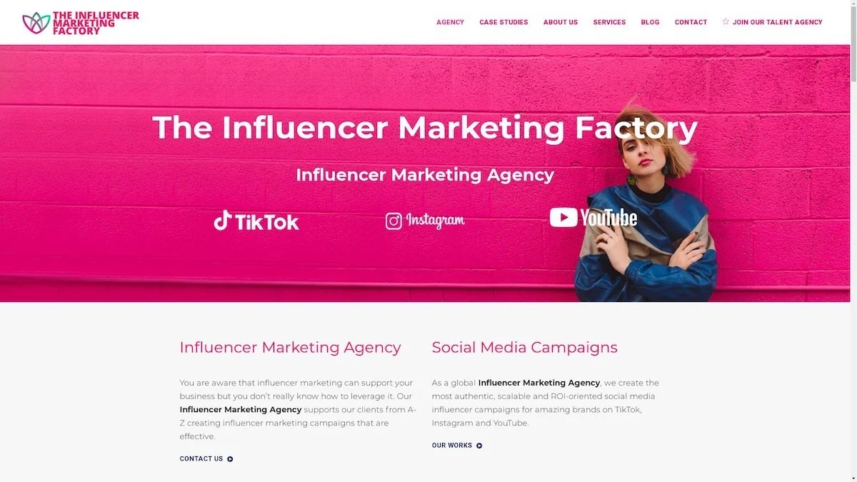
The Influencer Marketing Factory
TikTok, Instagram & YouTube CampaignsA full-service agency with strong TikTok expertise, offering end-to-end campaign management from influencer discovery through performance reporting with a focus on platform-native content.Clients: Google, Snapchat, Universal Music, Bumble, YelpVisit TIMF → -
6

NeoReach
Enterprise Analytics & Influencer CampaignsAn enterprise-focused agency combining managed campaigns with a powerful self-service data platform for influencer search, audience analytics, and attribution modeling.Clients: Amazon, Airbnb, Netflix, Honda, The New York TimesVisit NeoReach → -
7

Ubiquitous
Creator-First Marketing PlatformA tech-driven platform combining self-service tools with managed campaign options, emphasizing speed and scalability for brands managing multiple influencer relationships.Clients: Lyft, Disney, Target, American Eagle, NetflixVisit Ubiquitous → -
8

Obviously
Scalable Enterprise Influencer CampaignsA tech-enabled agency built for high-volume campaigns, coordinating hundreds of creators simultaneously with end-to-end logistics, content rights management, and product seeding.Clients: Google, Ulta Beauty, Converse, AmazonVisit Obviously →
