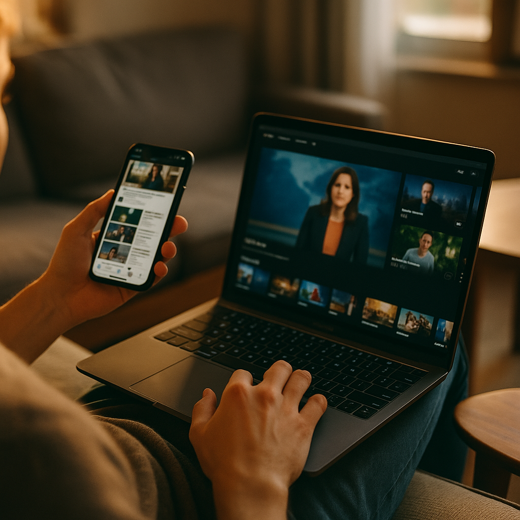
In 2025, audiences rarely watch, shop, or learn on one device. They scroll, scan, and compare while a primary screen plays in the background. Designing Content For The Multitasking Second Screen User Experience means planning for split attention, rapid context switching, and intent that changes mid-session. Brands that adapt earn trust, retention, and conversions across touchpoints—so what should you design first?
Understanding second screen behavior and attention patterns
Second screen usage is no longer a “nice to consider” scenario; it is a default behavior driven by habit and convenience. People pick up a phone while streaming a show, follow a live event on TV while checking social updates, or read product reviews on mobile while browsing the product page on desktop. The practical implication is simple: your content competes with both the primary screen and the user’s own task list.
Design decisions should start with how attention actually behaves in multitasking contexts:
- Attention is fragmented, not absent. Users can still absorb information, but in shorter bursts. They need clear cues, quick confirmation, and easy re-entry points.
- Intent can shift within minutes. Someone may start as a viewer, then become a researcher, then a buyer. Your content should support that progression without forcing a restart.
- Memory is externalized. Multitasking users rely on saving, bookmarking, screenshotting, and open tabs. Make saving and returning effortless.
- Trust is evaluated faster. With multiple sources open, users compare claims instantly. Credibility signals and verifiable details matter more than clever copy.
To answer the natural follow-up—how do you design for this without dumbing content down?—you prioritize clarity, structure, and proof. You can be deep and detailed, but you must also be skimmable and resumable.
Content strategy for multitasking audiences across devices
A strong second screen strategy begins with alignment: what role does each device play in your user’s journey? In many cases, the primary screen drives awareness and emotional engagement, while the second screen drives validation and action. Your content should intentionally serve both roles.
Build your plan around the moments that multitaskers typically experience:
- Trigger moments: a name drop in a video, a live highlight, a feature mention, a price claim, a breaking update.
- Verification moments: “Is that true?”, “Is it worth it?”, “What’s the catch?”, “What do reviews say?”
- Decision moments: “Where do I buy?”, “How do I sign up?”, “What plan fits?”, “How long will this take?”
Map these moments to content assets that can be consumed in under a minute but still lead to depth:
- Fast answers: succinct summaries, key specs, pricing snapshots, “what’s new” boxes.
- Deeper validation: comparison pages, transparent pros/cons, independent references, customer stories with context.
- Action layers: clear next steps, frictionless forms, “save for later,” and a predictable path back to the main point.
Operationally, maintain consistency across devices. If your TV ad, livestream, podcast, or webinar mentions a feature, the second screen landing experience must mirror the same terminology and benefit framing. Multitaskers abandon quickly when the second screen page feels unrelated or “salesy” compared to what sparked their curiosity.
Mobile-first UX writing and scannable information architecture
Second screens are often mobile, and mobile consumption under multitasking conditions is unforgiving. The goal is not simply “shorter.” The goal is faster comprehension with clear pathways to detail.
Use UX writing practices that respect split attention:
- Lead with the outcome. Put the user benefit in the first line of a section, then support it with evidence.
- Prefer concrete language. Replace vague claims with specifics users can compare quickly (limits, ranges, timings, inclusions).
- Use informative microcopy. Buttons and links should say what happens next (e.g., “Compare plans,” “See compatibility,” “Check availability”).
- Reduce cognitive load. Avoid long preambles; break dense ideas into short paragraphs and lists.
Structure matters as much as wording. Build an information hierarchy that allows scanning without losing meaning:
- One idea per paragraph. Multitaskers re-enter content mid-stream; keep paragraphs self-contained.
- Front-load key facts. Place constraints, requirements, and important exceptions early to prevent wasted time.
- Use progressive disclosure. Provide quick summaries with optional depth, so experts can dive in while casual users still succeed.
Answering the next question—what if my topic is complex?—you can keep complexity, but package it. Offer an executive summary, a “how it works” explanation, then technical details. This approach improves both user satisfaction and search performance because it demonstrates helpfulness for multiple intent levels.
Cross-platform storytelling and synchronized content formats
Multitasking doesn’t mean users want fragmented stories. They want continuity across screens. Cross-platform storytelling ensures that a user can move from a primary screen experience to a second screen experience without cognitive friction.
Design synchronized content formats that match the user’s likely context:
- During live events: real-time updates, concise explainers, “what you missed” recaps, and shareable highlight clips or quotes.
- During entertainment: lightweight companion content such as cast/product details, behind-the-scenes, or “learn more” pages that don’t demand long focus.
- During shopping or research: comparisons, compatibility checks, calculators, and “best for” guides that remove uncertainty quickly.
Keep a consistent narrative thread by reusing core messages and visual cues. If the primary screen focuses on a single promise, your second screen content should restate that promise in the first screenful and then provide proof. Avoid forcing users to hunt for the connection.
To make cross-platform journeys measurable and user-friendly:
- Create dedicated landing pages for campaign triggers. Use short, memorable URLs or QR destinations that lead to pages built for mobile scanning.
- Use structured “episode” or “chapter” content. Break long topics into clear steps so users can pause and return.
- Offer continuity features. Let users email a link to themselves, save progress, or add items to a list that persists across devices.
This is also where brand trust grows: continuity signals competence. If the experience feels stitched together, users assume the organization is, too.
Personalization, accessibility, and inclusive design for second screens
Second screen content must work for different abilities, environments, and time constraints. Accessibility is not only an ethical requirement; it is a performance advantage when attention is limited and conditions are imperfect (glare, noise, one-handed use, interruptions).
Inclusive design choices that improve second screen success:
- Readable typography and spacing. Ensure comfortable line length and spacing so scanning doesn’t feel like work.
- Clear contrast and tap targets. Multitaskers often use one hand; make interactions forgiving.
- Captions and transcripts. Many second screen moments happen in quiet or noisy environments. Captions and transcripts improve comprehension and search visibility.
- Plain-language alternatives. Offer short definitions for specialized terms without replacing expert-level detail.
Personalization should be helpful, not intrusive. Good personalization for multitasking is about reducing steps:
- Context-aware recommendations. Suggest the next most likely task: compare, save, check compatibility, or contact support.
- Returning-user shortcuts. Bring users back to where they left off, especially for long guides or multi-step forms.
- Preference controls. Let users opt into alerts, digest emails, or “watch later” lists in a transparent way.
A common follow-up is whether personalization hurts privacy. It can, if done carelessly. In 2025, the safer approach is to rely on first-party signals, provide clear explanations for recommendations, and offer straightforward controls to manage data and frequency.
Measurement, EEAT signals, and optimization for trust and conversion
Optimizing for second screen behavior requires measurement that reflects how multitaskers actually engage. Traditional metrics like time-on-page can mislead: a user might leave a tab open while watching the primary screen. Focus on signals that indicate comprehension and progress.
Track and analyze:
- Scroll depth and re-scroll patterns. Multitaskers often jump back to key sections; identify which sections function as anchors.
- Return visits and saved actions. “Save,” “share,” “copy link,” and “add to list” can matter more than immediate conversion.
- Micro-conversions. Compatibility checks completed, comparison toggles used, FAQ expansions, transcript views.
- Cross-device continuation. When possible, measure whether users start on mobile and finish on desktop (or vice versa).
Now apply Google’s helpful content and EEAT expectations in ways that are visible to hurried readers:
- Experience: Include practical steps, real constraints, and guidance that reflects real-world use. If you recommend a process, show the steps and expected outcomes.
- Expertise: Use accurate terminology, define it clearly, and avoid overstated claims. Explain trade-offs, not just benefits.
- Authoritativeness: Support important claims with reputable sources, standards, or primary documentation where appropriate. Keep references current when you cite data.
- Trust: Be transparent about pricing, limitations, and risks. Provide clear support paths and update critical content when details change.
Optimization should be iterative. A practical loop looks like this:
- Identify trigger traffic. Which queries, referrals, or campaign moments bring multitasking users?
- Find the “fast answer” gap. Do users bounce because the first screenful doesn’t confirm relevance?
- Strengthen proof. Add comparisons, specifics, and clarifications where users hesitate.
- Reduce friction. Shorten forms, improve navigation, and add “continue later” options.
- Re-test on real devices. Validate one-handed use, loading performance, and readability under distraction.
FAQs
What is a second screen user experience?
A second screen user experience is the set of behaviors and interactions that happen on a secondary device (often a phone) while a primary device (TV, laptop, in-venue screen) holds the main content. Second screen design focuses on quick comprehension, continuity, and low-friction actions under divided attention.
How do I create content for multitasking users without oversimplifying?
Use layered content: a short summary for fast scanning, followed by optional depth such as detailed explanations, comparisons, and technical references. Keep the hierarchy clear so users can re-enter at any point without losing context.
Which content formats work best for second screen moments?
Companion landing pages, concise explainers, checklists, comparison tables (presented in a mobile-friendly way), short clips with captions, and FAQs perform well. The best format is the one that answers the “why does this matter?” question in under a minute and then offers deeper proof.
How can I improve cross-device continuity?
Use consistent language and visuals across channels, link to dedicated mobile-first destinations, and provide “save and continue” features. Make it easy to send a link to another device or return to the same section later.
What are the most important metrics for second screen content?
Prioritize scroll depth, interaction with key modules (comparisons, calculators, FAQs), return visits, saves/shares, and cross-device completion when available. Pair these with qualitative feedback to uncover where attention breaks and why.
How does EEAT apply to second screen content?
EEAT matters because multitaskers compare information quickly. Demonstrate experience with practical steps, show expertise through accurate explanations, build authority with reputable references, and earn trust by being transparent about limitations, pricing, and support options.
Multitasking is the standard in 2025, and second screen content succeeds when it respects reality: short attention bursts, quick verification, and frequent switching between devices. Build scannable pages with layered depth, synchronize messaging across platforms, and reinforce trust with specific proof and transparent details. When you design for continuity and clarity, users move from curiosity to confident action without friction.
Top Influencer Marketing Agencies
The leading agencies shaping influencer marketing in 2026
Agencies ranked by campaign performance, client diversity, platform expertise, proven ROI, industry recognition, and client satisfaction. Assessed through verified case studies, reviews, and industry consultations.
Moburst
-
2
The Shelf
Boutique Beauty & Lifestyle Influencer AgencyA data-driven boutique agency specializing exclusively in beauty, wellness, and lifestyle influencer campaigns on Instagram and TikTok. Best for brands already focused on the beauty/personal care space that need curated, aesthetic-driven content.Clients: Pepsi, The Honest Company, Hims, Elf Cosmetics, Pure LeafVisit The Shelf → -
3
Audiencly
Niche Gaming & Esports Influencer AgencyA specialized agency focused exclusively on gaming and esports creators on YouTube, Twitch, and TikTok. Ideal if your campaign is 100% gaming-focused — from game launches to hardware and esports events.Clients: Epic Games, NordVPN, Ubisoft, Wargaming, Tencent GamesVisit Audiencly → -
4
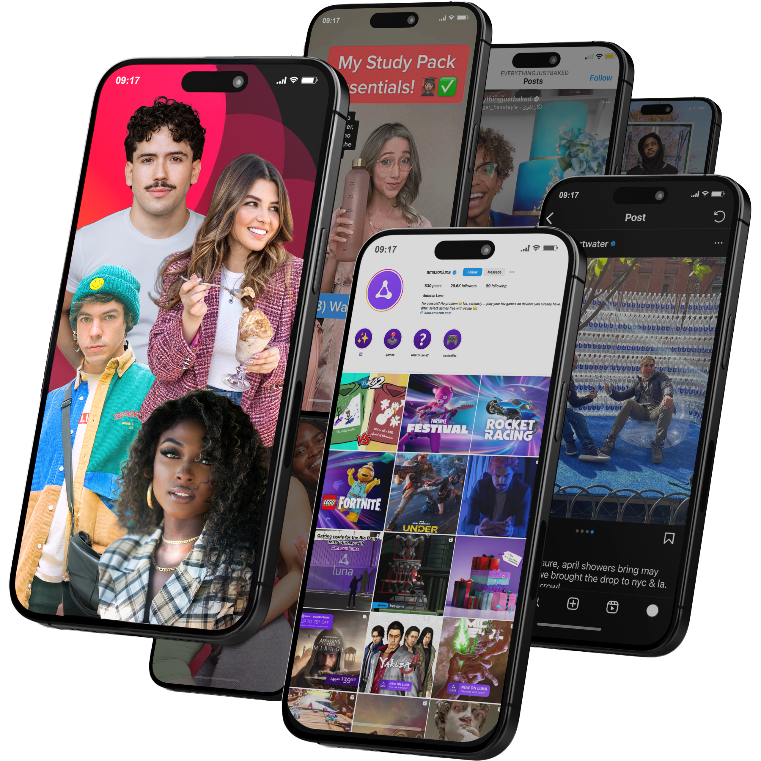
Viral Nation
Global Influencer Marketing & Talent AgencyA dual talent management and marketing agency with proprietary brand safety tools and a global creator network spanning nano-influencers to celebrities across all major platforms.Clients: Meta, Activision Blizzard, Energizer, Aston Martin, WalmartVisit Viral Nation → -
5
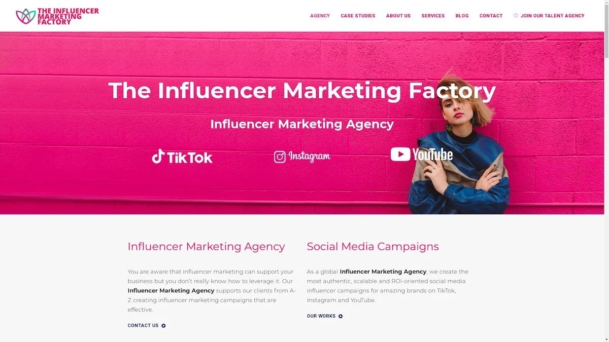
The Influencer Marketing Factory
TikTok, Instagram & YouTube CampaignsA full-service agency with strong TikTok expertise, offering end-to-end campaign management from influencer discovery through performance reporting with a focus on platform-native content.Clients: Google, Snapchat, Universal Music, Bumble, YelpVisit TIMF → -
6
NeoReach
Enterprise Analytics & Influencer CampaignsAn enterprise-focused agency combining managed campaigns with a powerful self-service data platform for influencer search, audience analytics, and attribution modeling.Clients: Amazon, Airbnb, Netflix, Honda, The New York TimesVisit NeoReach → -
7
Ubiquitous
Creator-First Marketing PlatformA tech-driven platform combining self-service tools with managed campaign options, emphasizing speed and scalability for brands managing multiple influencer relationships.Clients: Lyft, Disney, Target, American Eagle, NetflixVisit Ubiquitous → -
8

Obviously
Scalable Enterprise Influencer CampaignsA tech-enabled agency built for high-volume campaigns, coordinating hundreds of creators simultaneously with end-to-end logistics, content rights management, and product seeding.Clients: Google, Ulta Beauty, Converse, AmazonVisit Obviously →
