Short-form video now wins attention in seconds, not minutes. Using kinetic typography to enhance short-form video performance helps you land your message before viewers swipe away, by turning key phrases into motion-led, readable moments that reinforce voice, pacing, and brand. Done well, it improves clarity, retention, and conversions without feeling like an overlay. Want to make every word work?
Why kinetic typography improves retention in short-form video
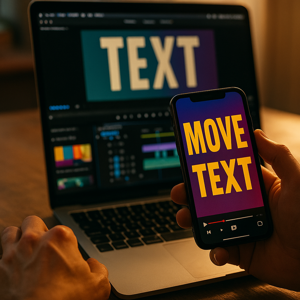
Kinetic typography is animated text designed to move with intent: it can enter, exit, bounce, track, scale, blur, snap, or morph to mirror speech, emotion, and rhythm. In short-form formats, viewers often watch in noisy environments or with sound off, which makes text a primary channel for comprehension. When you animate that text to match spoken emphasis, it becomes a second layer of storytelling instead of a caption afterthought.
In 2025, short-form success depends on two fundamentals: instant comprehension and consistent pacing. Kinetic typography supports both. It can:
- Raise message clarity by surfacing key words at the exact moment they matter.
- Reduce cognitive load by chunking long statements into short, readable beats.
- Increase perceived production quality without requiring complex shoots or VFX.
- Guide attention to your hook, proof, offer, and call to action (CTA).
A common misconception is that more motion always means more engagement. In practice, short-form viewers punish clutter. The goal is not “more animation,” but more meaning. If text movement reinforces the narration and visual story, you keep viewers oriented. If it competes with the subject, you create friction and drop-offs.
Follow-up question most creators ask: “Should I just use auto-captions?” Auto-captions help accessibility, but kinetic typography goes further by editing the message—highlighting, timing, and hierarchy—so viewers understand faster and remember more.
Short-form video performance metrics kinetic typography can lift
To apply kinetic typography strategically, tie it to measurable outcomes. Short-form platforms reward content that holds attention and triggers action; kinetic typography can support both if it’s aligned to the viewer journey.
Key metrics it can influence:
- Hook retention (first 1–3 seconds): Put the outcome or contradiction on screen immediately, and animate it in a single, decisive move.
- Average watch time: Use kinetic beats to maintain pacing and prevent “dead air” moments between ideas.
- Completion rate: Add on-screen progress cues (e.g., “Step 1/3”) with subtle motion to keep viewers committed.
- Rewatches: Animate dense tips so viewers can re-parse them quickly; purposeful micro-motions can make viewers replay.
- CTR and conversions: Animate the CTA and the proof point (price, benefit, guarantee) so viewers don’t miss it.
- Saves and shares: Tip-based videos perform better when text turns the content into a “saveable” checklist.
How do you know it’s working? Set a baseline by posting two comparable videos: one with clean, static captions and one with kinetic hierarchy (same script, same length). Track retention curves, completion rate, and CTA clicks. If retention improves but conversions do not, the issue is often CTA visibility (too late, too small, or too vague), not the typography itself.
One more practical point: kinetic typography can also reduce the need for constant visual scene changes. When your text does some of the pacing work, you can keep shots calmer, which improves comprehension and brand consistency.
Motion design principles that keep typography readable and persuasive
Effective kinetic typography follows motion design principles that protect readability. Viewers should never have to “chase” your message. Use these rules to keep motion persuasive instead of distracting:
- Prioritize hierarchy: One primary phrase on screen at a time. Secondary details can appear smaller or later, not simultaneously.
- Match motion to meaning: Use sharp, quick movement for urgency; smooth easing for reassurance; subtle scale for emphasis.
- Limit animation types: Pick 2–3 signature moves per brand (e.g., slide + scale + highlight) and reuse them.
- Use consistent timing: Keep most text beats within a predictable rhythm (often 8–14 frames per beat at 30 fps, adjusted for reading speed).
- Protect contrast: Text should pass a quick “glance test.” Use solid backplates, shadows, or blur behind text when footage is busy.
- Respect safe areas: Avoid placing key words near UI elements, captions, or platform buttons.
Reading speed matters. If the viewer can’t finish reading before the text changes, you create frustration. A helpful internal benchmark is to display crucial phrases long enough for a silent viewer to read them comfortably, then add motion as an accent, not a substitute for time on screen.
Also, avoid “per-character chaos” unless it serves a clear purpose. Per-word animation can feel premium and still readable; per-letter animation often becomes visual noise in fast scrolling feeds.
Caption style and brand consistency for scroll-stopping videos
Kinetic typography works best when it behaves like part of your brand system, not a one-off effect. Consistency increases recognition, which compounds performance over time. Build a caption style system that balances distinctiveness with restraint.
Define these brand caption elements:
- Typeface: Choose a font that remains legible at small sizes. Use one primary font and one accent weight or style.
- Color rules: Set one highlight color for key words and keep it consistent across videos.
- Stroke/shadow/backplate: Standardize how you maintain contrast on complex footage.
- Emphasis logic: Decide what gets highlighted: outcomes, numbers, verbs, objections, or steps.
- Animation signature: Two to three repeatable moves that feel native to your content.
Common follow-up question: “Should I animate every line?” No. Reserve kinetic emphasis for:
- The hook (what they get, what’s surprising, what’s at stake)
- The proof (numbers, demos, before/after, testimonials)
- The turning point (the “here’s the real reason” moment)
- The CTA (what to do next and why now)
For the rest, keep captions clean and stable. This contrast makes the kinetic moments feel intentional—and more persuasive.
Accessibility is part of EEAT in practice: include accurate captions, avoid flashing effects that could trigger discomfort, and keep text large enough to read on small screens. If you use slang or technical terms, animate them more slowly and consider adding a short on-screen definition.
Editing workflow: how to create kinetic typography fast without sacrificing quality
Speed matters in short-form production, but speed without a system creates inconsistency. A repeatable workflow lets you publish frequently while maintaining quality. Here’s a practical approach used by performance-focused teams:
- Script for on-screen readability: Write in short phrases. If a sentence can’t fit comfortably on screen, split it into beats.
- Mark emphasis in the script: Bold or tag the 5–8 words that must be remembered. Those become your kinetic moments.
- Build reusable templates: Create a few caption layouts (single-line, two-line, step list, CTA card) and reuse them.
- Time to the voice first: Lock your narration and cuts before you animate. Typography should follow the edit, not dictate it.
- Animate with constraints: Limit to a small set of transitions and easing curves. Constraints keep quality high and style consistent.
- Quality check on a phone: Watch on a small screen at normal brightness, with sound off, then with sound on.
If you’re using auto-captions, treat them as a draft. Clean the text, remove filler words, and rewrite for clarity. Then apply hierarchy: highlight a few words, enlarge the key outcome, and add motion only where it improves understanding.
Another likely question: “How long should it take?” For a mature template system, a 20–40 second video can often be captioned and kinetically emphasized in under an hour, depending on complexity and revision cycles. The time savings come from templates and preset motion—not from rushing readability.
A/B testing kinetic typography: experiments that actually improve results
To make kinetic typography an advantage rather than a stylistic guess, test it like any performance lever. Keep your experiments simple so you can attribute results to the change you made.
High-signal tests to run:
- Hook text vs. no hook text: Add an animated outcome statement in the first second and compare retention.
- Highlight strategy: Test highlighting numbers and verbs vs. highlighting nouns and adjectives.
- Caption density: Compare fewer, larger phrases vs. more frequent, smaller phrases.
- CTA card timing: Test CTA appearing at 70% vs. 90% of the video, with subtle motion.
- Backplate vs. shadow: On busy footage, test whether a semi-opaque backplate improves reading and watch time.
How to interpret outcomes:
- If retention rises but comments drop, your text may be too directive and not conversational.
- If completion rises but CTR stays flat, your CTA likely lacks a clear benefit or urgency.
- If CTR rises but watch time falls, your hook may be strong but your mid-video pacing needs clearer beat structure.
EEAT reminder: if you’re making claims (especially in health, finance, or safety), kinetic typography can amplify them—so verify accuracy and show supporting evidence on screen. Use language that reflects what you can genuinely deliver, and avoid animating exaggerations that could erode trust.
FAQs
What is kinetic typography in short-form video?
Kinetic typography is text that moves intentionally—through timing, scale, position, and effects—to match narration and guide attention. In short-form video, it’s used to make key points understandable within seconds and to keep pacing tight.
Is kinetic typography better than standard captions?
Standard captions improve accessibility and comprehension, especially for silent viewing. Kinetic typography can outperform standard captions when it adds hierarchy and emphasis—highlighting the words that drive retention and action—without making the screen feel busy.
How do I choose which words to animate?
Animate the words that change decisions: the outcome (“save 2 hours”), the proof (numbers, results, demo moments), the objection (“no editing experience”), and the CTA (“download,” “book,” “try”). Keep everything else stable for readability.
Can kinetic typography hurt performance?
Yes. Too much motion, low contrast, tiny text, or text that changes faster than viewers can read will reduce retention. If viewers need to work to understand the message, they swipe.
What typography style works best for mobile viewing?
Use a highly legible font, large size, strong contrast, and short phrases. Add a backplate or shadow on busy footage. Keep key text away from platform UI areas and avoid per-letter effects that reduce readability.
How do I measure whether kinetic typography is working?
Compare baseline videos to variants with kinetic hierarchy and track hook retention, average watch time, completion rate, rewatch rate, saves/shares, and CTA clicks. Test one change at a time so results are attributable.
In 2025, short-form winners make their message effortless to grasp and hard to forget. Kinetic typography strengthens that advantage by turning captions into a structured, animated narrative that supports your hook, proof, and CTA. Keep motion purposeful, protect readability, and standardize a repeatable style system. Test variations against retention and conversions, then scale what works across your content library.
Top Influencer Marketing Agencies
The leading agencies shaping influencer marketing in 2026
Agencies ranked by campaign performance, client diversity, platform expertise, proven ROI, industry recognition, and client satisfaction. Assessed through verified case studies, reviews, and industry consultations.
Moburst

-
2

The Shelf
Boutique Beauty & Lifestyle Influencer AgencyA data-driven boutique agency specializing exclusively in beauty, wellness, and lifestyle influencer campaigns on Instagram and TikTok. Best for brands already focused on the beauty/personal care space that need curated, aesthetic-driven content.Clients: Pepsi, The Honest Company, Hims, Elf Cosmetics, Pure LeafVisit The Shelf → -
3

Audiencly
Niche Gaming & Esports Influencer AgencyA specialized agency focused exclusively on gaming and esports creators on YouTube, Twitch, and TikTok. Ideal if your campaign is 100% gaming-focused — from game launches to hardware and esports events.Clients: Epic Games, NordVPN, Ubisoft, Wargaming, Tencent GamesVisit Audiencly → -
4

Viral Nation
Global Influencer Marketing & Talent AgencyA dual talent management and marketing agency with proprietary brand safety tools and a global creator network spanning nano-influencers to celebrities across all major platforms.Clients: Meta, Activision Blizzard, Energizer, Aston Martin, WalmartVisit Viral Nation → -
5

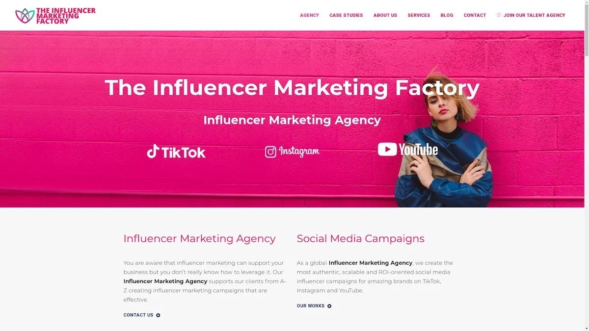
The Influencer Marketing Factory
TikTok, Instagram & YouTube CampaignsA full-service agency with strong TikTok expertise, offering end-to-end campaign management from influencer discovery through performance reporting with a focus on platform-native content.Clients: Google, Snapchat, Universal Music, Bumble, YelpVisit TIMF → -
6

NeoReach
Enterprise Analytics & Influencer CampaignsAn enterprise-focused agency combining managed campaigns with a powerful self-service data platform for influencer search, audience analytics, and attribution modeling.Clients: Amazon, Airbnb, Netflix, Honda, The New York TimesVisit NeoReach → -
7

Ubiquitous
Creator-First Marketing PlatformA tech-driven platform combining self-service tools with managed campaign options, emphasizing speed and scalability for brands managing multiple influencer relationships.Clients: Lyft, Disney, Target, American Eagle, NetflixVisit Ubiquitous → -
8

Obviously
Scalable Enterprise Influencer CampaignsA tech-enabled agency built for high-volume campaigns, coordinating hundreds of creators simultaneously with end-to-end logistics, content rights management, and product seeding.Clients: Google, Ulta Beauty, Converse, AmazonVisit Obviously →
