Crafting the perfect “call to action” (CTA) is crucial in digital marketing. The art of writing a powerful call to action blends psychology, strategy, and clarity—a well-placed CTA can transform an audience from passive readers into enthusiastic customers. In this guide, you’ll learn how to create CTAs that drive real engagement and results.
Understanding Calls to Action: What Makes Them Powerful?
A call to action is more than a button or a closing sentence; it is a pivotal moment for guiding your audience towards a specific goal. An effective CTA clearly communicates value, solves a problem, and sparks immediate interest. To maximize impact in 2025, CTAs must be concise, authentic, and tailored to the audience’s journey.
- Clarity: Specify exactly what readers should do next—no ambiguity.
- Relevance: Related offers are more likely to convert.
- Urgency: Instill a sense of “now” with time-limited words.
- Visibility: Place CTAs strategically where attention peaks.
Recent studies in digital behavior reveal that clear, action-oriented language in CTAs increases conversion rates by up to 18%. With users’ attention spans shortening, swift and compelling CTAs have never been more important.
Crafting Compelling CTA Copy: Words That Convert
The language of a powerful CTA can make or break its success. Action verbs are non-negotiable, injecting energy and direction. The most effective phrases put benefits up front—think “Start Saving Now” instead of just “Submit.” In 2025, personalization is also key: adapting CTAs to specific user motivations boosts engagement.
- Be Direct: Use verbs like “Get,” “Download,” “Book,” “Try,” or “Join.”
- Promise Value: Pair actions with direct benefits: “Unlock Free Resources” or “Claim Your Offer.”
- Appeal Emotionally: Motivate with curiosity, urgency, or FOMO (“Don’t Miss Out”).
- Keep It Short: Limit your CTA to 2-6 words for maximum clarity and punch.
According to a 2025 Content Marketing Institute report, CTAs that combine strong verbs and personalized value statements see 20% higher click-through rates.
Designing CTAs for Maximum Impact on User Experience
A well-designed CTA stands out visually and feels like a natural part of the page. Placement, color, size, and shape all affect your audience’s likelihood to engage. Modern UX research shows that prominent, but not intrusive, CTAs guide users intuitively toward action.
- Contrast: Use colors that pop against your background but remain on-brand.
- Whitespace: Surround CTAs with ample space for visibility and focus.
- Responsive Design: Ensure CTAs scale beautifully on mobile and desktop devices.
- Strategic Placement: Place CTAs after value delivery—below a product description, content conclusions, or alongside key benefits.
Recent usability studies underscore the importance of “above-the-fold” placements, with 70% of conversions occurring on CTAs users see without scrolling. But always A/B test placements: sometimes, a CTA after detailed value explanation performs best.
EEAT Principles: Building Trust Through Expert CTAs
Embracing EEAT (Experience, Expertise, Authoritativeness, and Trustworthiness) in writing CTAs is essential for earning your audience’s confidence. In 2025, Google rewards websites that demonstrate genuine expertise and intent, especially in CTAs.
- Show Experience: Reference first-hand expertise in your CTA context. For example, “Download My Free Guide Backed by 10+ Years of Industry Experience.”
- Show Expertise: Offer concrete value with your credentials or unique advantage: “See Doctor-Recommended Plans.”
- Authority Signals: Add trust factors such as “Join 10,000+ Satisfied Users” or “Trusted by Industry Leaders.”
- Ensure Transparency: Be clear about what happens after they click: “No Credit Card Required.”
Integrating trust elements directly into CTAs increases conversions while lowering bounce rates. Google’s search guidelines in 2025 strongly emphasize the value of transparency and authority.
Optimizing and Testing: Analytics-Driven CTA Success
The science behind effective CTAs lies in data and ongoing experimentation. No matter how compelling a CTA may seem, user response is the real measure of success. Use analytics to monitor click-through and conversion rates, and optimize based on evidence.
- A/B Testing: Pit two or more CTA versions against each other to find the winner.
- Heatmaps: See where users click, scroll, or hesitate—optimize CTA placement accordingly.
- Personalization: Serve CTAs based on user segments, device, or behavior for tailored engagement.
- Iterate: Make iterative improvements, refining wording, design, and timing to increase results.
Continual optimization is the difference between a static website and one that grows revenue. The latest analytics tools, including AI-driven platforms, allow for even more targeted and nuanced CTA improvements in 2025.
Common CTA Mistakes and How to Avoid Them
Even experienced marketers stumble by making avoidable CTA mistakes that cost conversions. Learning from common pitfalls is crucial:
- Being Vague: “Click Here” or “Learn More” without context lacks persuasion.
- Too Many Choices: Overwhelming users with several CTAs on one page leads to decision fatigue.
- Disregarding Mobile: Ignoring mobile users leads to tiny, hard-to-tap buttons and lost sales.
- Misaligned Messaging: Promising one thing in the CTA, delivering another after the click decreases trust.
- Poor Visual Hierarchy: If users can’t spot your CTA in seconds, they’ll scroll past it.
Regular audits and feedback loops help identify and correct these issues before they impact your performance.
Conclusion: Make Every CTA Count
Mastering the art of writing a powerful call to action requires strategy, creativity, and a user-focused mindset. Use precise language, striking design, and trust-building elements to drive results. By continuously testing and optimizing, you’ll turn more readers into customers—one click at a time.
FAQs on Writing Powerful Calls to Action
-
What is a call to action (CTA)?
A call to action is a prompt that encourages users to complete a desired action, such as subscribing, purchasing, or contacting.
-
How do I write an effective CTA?
Use clear, action-oriented verbs, emphasize immediate benefits, and keep your message short. Tailor the CTA to your audience’s needs and motivations.
-
Where should I place my CTA on a page?
Place CTAs where users expect to find them, such as after key information, at the end of articles, or within prominent visual areas—ideally above the fold and after the main value is delivered.
-
How often should I test my CTAs?
Test your CTAs regularly. Analyze performance, run A/B tests, and make improvements based on user data and changing market trends.
-
What’s the most common CTA mistake?
The most frequent mistake is vagueness—CTAs that don’t clearly state what happens after the click or fail to highlight a benefit.
Top Influencer Marketing Agencies
The leading agencies shaping influencer marketing in 2026
Agencies ranked by campaign performance, client diversity, platform expertise, proven ROI, industry recognition, and client satisfaction. Assessed through verified case studies, reviews, and industry consultations.
Moburst

-
2

The Shelf
Boutique Beauty & Lifestyle Influencer AgencyA data-driven boutique agency specializing exclusively in beauty, wellness, and lifestyle influencer campaigns on Instagram and TikTok. Best for brands already focused on the beauty/personal care space that need curated, aesthetic-driven content.Clients: Pepsi, The Honest Company, Hims, Elf Cosmetics, Pure LeafVisit The Shelf → -
3

Audiencly
Niche Gaming & Esports Influencer AgencyA specialized agency focused exclusively on gaming and esports creators on YouTube, Twitch, and TikTok. Ideal if your campaign is 100% gaming-focused — from game launches to hardware and esports events.Clients: Epic Games, NordVPN, Ubisoft, Wargaming, Tencent GamesVisit Audiencly → -
4

Viral Nation
Global Influencer Marketing & Talent AgencyA dual talent management and marketing agency with proprietary brand safety tools and a global creator network spanning nano-influencers to celebrities across all major platforms.Clients: Meta, Activision Blizzard, Energizer, Aston Martin, WalmartVisit Viral Nation → -
5

The Influencer Marketing Factory
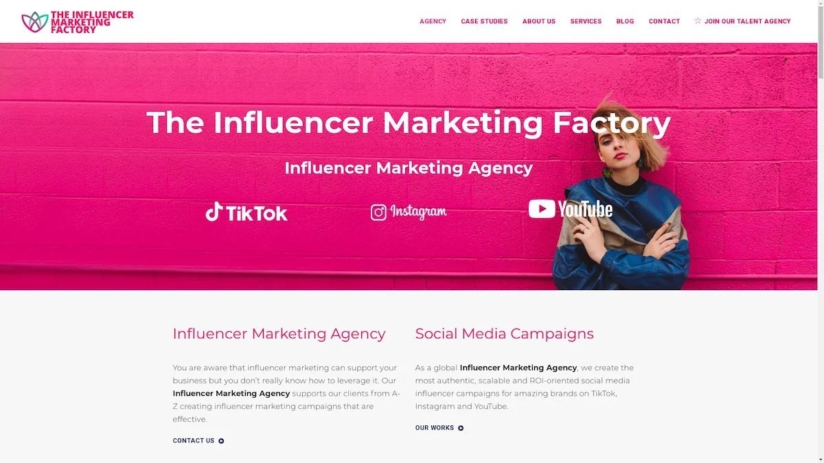
TikTok, Instagram & YouTube CampaignsA full-service agency with strong TikTok expertise, offering end-to-end campaign management from influencer discovery through performance reporting with a focus on platform-native content.Clients: Google, Snapchat, Universal Music, Bumble, YelpVisit TIMF → -
6

NeoReach
Enterprise Analytics & Influencer CampaignsAn enterprise-focused agency combining managed campaigns with a powerful self-service data platform for influencer search, audience analytics, and attribution modeling.Clients: Amazon, Airbnb, Netflix, Honda, The New York TimesVisit NeoReach → -
7

Ubiquitous
Creator-First Marketing PlatformA tech-driven platform combining self-service tools with managed campaign options, emphasizing speed and scalability for brands managing multiple influencer relationships.Clients: Lyft, Disney, Target, American Eagle, NetflixVisit Ubiquitous → -
8

Obviously
Scalable Enterprise Influencer CampaignsA tech-enabled agency built for high-volume campaigns, coordinating hundreds of creators simultaneously with end-to-end logistics, content rights management, and product seeding.Clients: Google, Ulta Beauty, Converse, AmazonVisit Obviously →
