In 2025, attention is scarce, sound-off viewing is common, and brand messages must land in seconds. The Power Of Kinetic Typography In Short-Form Branded Video Content lies in making words move with purpose—turning copy into a visual performance that viewers can read, feel, and remember. When designed well, it boosts comprehension, brand recall, and conversions across social feeds. Ready to make text do more than sit still?
Why kinetic typography matters for short-form branded video
Kinetic typography is animated text designed to communicate meaning through motion, timing, hierarchy, and visual rhythm. In short-form branded video (typically 6–30 seconds), it works because it compresses clarity into tiny windows of attention. Instead of relying on narration or a long setup, kinetic type puts the message on-screen, exactly when the viewer needs it.
Short-form environments reward immediate comprehension. Viewers scroll fast, often with sound off, and they decide in a fraction of a second whether to keep watching. Kinetic typography meets that reality by:
- Front-loading clarity: Key claims, benefits, prices, or offers can appear within the first seconds without waiting for a voiceover to catch up.
- Guiding attention: Motion creates priority. The right words move, scale, or snap into place so the viewer knows what matters now.
- Making “silent-first” videos effective: Text-driven storytelling maintains comprehension even when audio is muted.
- Improving recall: Distinct typographic motion becomes part of brand memory—like a micro-signature that repeats across posts.
It also solves a common production constraint: brands often need to iterate quickly. Updating typography is typically faster and cheaper than reshooting footage. That makes kinetic typography a practical choice for performance marketing teams running weekly or even daily creative tests.
How motion typography boosts attention and retention
Motion typography works when it follows how people read and how the brain prioritizes change. In short-form, you’re not only writing copy—you’re choreographing it.
Use these mechanisms intentionally:
- Temporal hierarchy: Show one primary idea at a time. If three ideas appear at once, the viewer reads none of them well.
- Rhythm and pacing: Fast cuts can still be readable when the type timing matches speech cadence or beat structure. If there’s no voiceover, match the viewer’s natural scanning speed.
- Contrast for instant parsing: Weight, size, and color can separate headline from proof points. The viewer should understand the structure in one glance.
- Meaningful motion: Motion should add semantics (e.g., “save” slides down like a price drop; “fast” snaps in quickly) rather than decorative movement.
Design for retention, not just the first second. A strong pattern is to reveal the value proposition early, reinforce it midway with a proof point (testimonial snippet, number, or guarantee), then close with a clear call-to-action. Kinetic typography excels at that three-beat structure because it can “restate” the message without feeling repetitive.
Answering a frequent follow-up: Does kinetic typography replace video footage? It can, but it doesn’t have to. Many top-performing short-form ads use simple product clips paired with bold type. The best approach is often hybrid: footage provides credibility and context; kinetic type provides speed, clarity, and structure.
Brand storytelling with kinetic typography: voice, tone, and trust
Short-form branded video is still brand storytelling—even when it’s performance-led. Kinetic typography becomes your brand voice on-screen. In 2025, where audiences scrutinize authenticity, trust signals matter. Typography can communicate confidence or uncertainty, premium quality or bargain energy, seriousness or play.
To align kinetic typography with brand storytelling, focus on:
- Typographic identity: Use a consistent type family (or controlled set), weights, and spacing rules. Consistency across posts builds recognition even before the logo appears.
- Tone through motion: Smooth easing can feel premium and calm. Snappy motion can feel bold and energetic. Pick motion principles that match your positioning.
- Claim discipline: Don’t animate exaggerated promises. Viewers notice overreach faster than ever. If you claim “fastest,” specify the context or replace it with a verifiable benefit.
- Credibility overlays: When appropriate, animate proof: “4.8★ average,” “Free returns,” “Derm-tested,” “Ships in 24h.” Keep it readable, not buried.
EEAT in practice means your content should show evidence of expertise and avoid vague assertions. In kinetic typography, that translates to clear sourcing and precise language. If you reference customer ratings, state the source platform in a small but legible line. If you reference a test, name the test type. If you reference pricing, keep it current and avoid bait-and-switch formatting.
A common question: Will kinetic typography make my brand feel “too ad-like”? Not if the writing is helpful and the motion is restrained. Many viewers actually prefer on-screen text because it respects their time and helps them understand the offer without needing audio.
Design principles for kinetic typography in social video ads
Strong kinetic typography is more than picking a bold font and animating it. It’s a system: grid, timing, hierarchy, and accessibility. Use these principles as a practical checklist for short-form branded video content.
1) Build a reading-first layout
- Design for vertical formats by default (9:16) unless the platform requires otherwise.
- Keep key text away from UI overlays (captions area, buttons, usernames). Leave generous safe margins.
- Use 1–2 lines for the main message; avoid dense paragraphs.
2) Enforce a hierarchy that survives scrolling
- One headline idea per scene. Support it with a short subline or proof point.
- Use weight and size before adding extra colors or effects.
- Keep emphasis consistent: if you bold benefits, don’t suddenly bold disclaimers unless required.
3) Make motion serve comprehension
- Prefer simple transitions: slide, scale, fade, wipe, or track. Overly complex motion can reduce readability.
- Use easing intentionally. Abrupt movement can feel aggressive; slow movement can feel sluggish.
- Respect dwell time: give viewers time to read. If the text is longer, it needs longer screen time.
4) Prioritize accessibility and inclusion
- Maintain strong color contrast between text and background.
- Avoid flashing effects that can be uncomfortable.
- Do not rely on color alone to indicate meaning; use icons or labels when needed.
5) Keep your CTA unmistakable
- Place the CTA near the end, but preview the outcome early (what happens after they click?).
- Use direct verbs: “Shop,” “Get,” “Try,” “Book.”
- Pair the CTA with one final reason to act (shipping, limited offer, guarantee), but keep it truthful and readable.
Follow-up question: What’s the biggest mistake brands make? Treating kinetic typography as decoration. When motion doesn’t clarify, it becomes noise. Your goal is to reduce effort for the viewer—every movement should help them understand or feel the message.
Workflow and tools for kinetic typography production at scale
Short-form branded video moves fast. To benefit from kinetic typography, you need a workflow that supports iteration without breaking brand consistency. A scalable system often includes templates, a motion style guide, and a review process that catches readability issues before publishing.
Step-by-step workflow
- Script for the screen: Write the message as it will appear, not as a long voiceover. Keep each on-screen text unit short.
- Create a typographic kit: Define fonts, sizes for headline/subhead/legal, line spacing, and brand colors.
- Define motion rules: Specify transition types, durations, and easing. Decide how emphasis appears (scale up? underline? color shift?).
- Build reusable templates: Make variants for common structures: problem/solution, feature/benefit, testimonial, offer, FAQ-style.
- QA for legibility: Watch on a phone, with sound off, at normal scrolling distance. If it’s hard to read, it won’t perform.
- Test and iterate: Swap hooks, reorder benefits, and adjust pacing. Kinetic typography makes A/B testing faster because copy changes don’t require new footage.
Tooling considerations
- Choose tools that support templates, brand libraries, and collaboration. The specific software matters less than repeatability and export reliability.
- Ensure exports match platform specs and preserve crisp text (avoid overly compressed settings that blur letterforms).
- Maintain a versioning system so teams can track which motion/wording combinations correlate with performance.
Answering another common question: Should you animate captions separately from kinetic typography? If your kinetic type carries the core message, you can keep captions minimal or use platform-native captions for spoken audio. If the video has heavy voiceover, captions remain useful, but avoid duplicating the same words in two competing text layers.
Measuring performance: KPIs for kinetic typography in short-form video marketing
Kinetic typography should improve outcomes, not just aesthetics. To evaluate it, measure both attention and comprehension signals, then connect them to action.
Primary KPIs to track
- Hook retention (first seconds): If kinetic typography is working, early drop-off should decrease because viewers understand the premise faster.
- Average watch time and completion rate: Clear pacing and readable text often increase completion, especially on silent viewing.
- Click-through rate (CTR) and cost per click (CPC): Strong on-screen value props and CTAs should lift CTR without misleading claims.
- Conversion rate and cost per acquisition (CPA): When typography clarifies offer terms and reduces confusion, downstream conversion improves.
- Thumbstop and engagement quality: Saves, shares, and meaningful comments often indicate the message felt useful, not just flashy.
What to test (and how)
- Hook variants: Test three different first-line messages with the same footage and motion style.
- Hierarchy changes: Promote one benefit to headline and demote others to sublines; measure lift.
- Pacing: Keep wording identical, adjust dwell time and transitions, and compare retention.
- Proof placement: Add a credibility line earlier vs. later and measure CTR and conversion changes.
Guardrails for trust
- Don’t optimize with misleading urgency or hidden conditions. Short-form audiences penalize brands that feel deceptive.
- Ensure any “before/after” or performance claim is properly qualified and not exaggerated in motion.
If you want a fast diagnostic: play the video with sound off and cover the visuals with your hand, leaving only the text visible. If the viewer can still understand the offer and reason to act, your kinetic typography is doing its job.
FAQs about kinetic typography in short-form branded video
What is kinetic typography in video marketing?
Kinetic typography is animated text used to communicate a message through movement, timing, and visual hierarchy. In video marketing, it helps viewers understand key points quickly, especially on mobile and in sound-off environments.
Does kinetic typography work without voiceover?
Yes. Many short-form branded videos rely on on-screen text as the primary storyteller. If you design readable scenes with clear sequencing, viewers can follow the message without audio.
How long should on-screen text stay visible in short-form ads?
Long enough to read comfortably on a phone. As a practical rule, keep text short and extend screen time for longer phrases. Always review on mobile and slow the pacing if you find yourself rereading.
What fonts are best for kinetic typography?
Use highly legible fonts with strong weight options and clean shapes. Prioritize readability over novelty, and limit your font set to maintain brand consistency and speed up production.
How do you keep kinetic typography on-brand across many videos?
Create a motion and typography style guide: fonts, sizes, color rules, transitions, easing, and safe-area spacing. Build templates for common ad structures so every video feels cohesive even when the message changes.
Can kinetic typography improve ad performance?
It can, when it increases clarity and reduces viewer effort. Measure retention, completion rate, CTR, and conversions, and run controlled tests where only the typography or pacing changes.
What are common mistakes with kinetic typography?
Over-animating, showing too many words at once, using low-contrast colors, placing text under platform UI elements, and animating claims that are vague or hard to substantiate.
In 2025, short-form branded video succeeds when it communicates fast, earns trust, and stays readable on mobile. Kinetic typography delivers that by turning copy into a structured, visual narrative—one that works with or without sound. Build a consistent typographic system, animate with meaning, and measure outcomes with clear KPIs. When text moves with intent, your message stops scrolling and starts converting.
Top Influencer Marketing Agencies
The leading agencies shaping influencer marketing in 2026
Agencies ranked by campaign performance, client diversity, platform expertise, proven ROI, industry recognition, and client satisfaction. Assessed through verified case studies, reviews, and industry consultations.
Moburst

-
2

The Shelf
Boutique Beauty & Lifestyle Influencer AgencyA data-driven boutique agency specializing exclusively in beauty, wellness, and lifestyle influencer campaigns on Instagram and TikTok. Best for brands already focused on the beauty/personal care space that need curated, aesthetic-driven content.Clients: Pepsi, The Honest Company, Hims, Elf Cosmetics, Pure LeafVisit The Shelf → -
3

Audiencly
Niche Gaming & Esports Influencer AgencyA specialized agency focused exclusively on gaming and esports creators on YouTube, Twitch, and TikTok. Ideal if your campaign is 100% gaming-focused — from game launches to hardware and esports events.Clients: Epic Games, NordVPN, Ubisoft, Wargaming, Tencent GamesVisit Audiencly → -
4

Viral Nation
Global Influencer Marketing & Talent AgencyA dual talent management and marketing agency with proprietary brand safety tools and a global creator network spanning nano-influencers to celebrities across all major platforms.Clients: Meta, Activision Blizzard, Energizer, Aston Martin, WalmartVisit Viral Nation → -
5

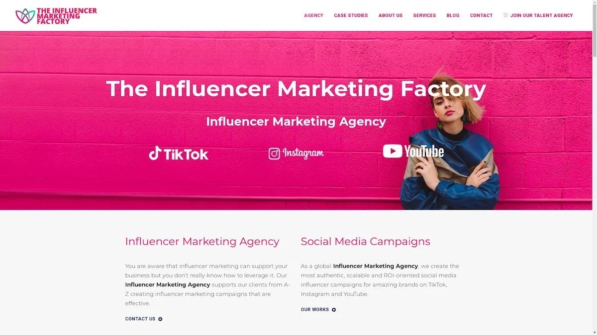
The Influencer Marketing Factory
TikTok, Instagram & YouTube CampaignsA full-service agency with strong TikTok expertise, offering end-to-end campaign management from influencer discovery through performance reporting with a focus on platform-native content.Clients: Google, Snapchat, Universal Music, Bumble, YelpVisit TIMF → -
6

NeoReach
Enterprise Analytics & Influencer CampaignsAn enterprise-focused agency combining managed campaigns with a powerful self-service data platform for influencer search, audience analytics, and attribution modeling.Clients: Amazon, Airbnb, Netflix, Honda, The New York TimesVisit NeoReach → -
7

Ubiquitous
Creator-First Marketing PlatformA tech-driven platform combining self-service tools with managed campaign options, emphasizing speed and scalability for brands managing multiple influencer relationships.Clients: Lyft, Disney, Target, American Eagle, NetflixVisit Ubiquitous → -
8

Obviously
Scalable Enterprise Influencer CampaignsA tech-enabled agency built for high-volume campaigns, coordinating hundreds of creators simultaneously with end-to-end logistics, content rights management, and product seeding.Clients: Google, Ulta Beauty, Converse, AmazonVisit Obviously →
