Case Study: A Fintech App’s Success With Targeted Educational Micro-Videos shows how a consumer finance app increased feature adoption and reduced support pressure by teaching users in moments that mattered. In 2025, attention is scarce and financial decisions feel high-stakes, so clarity wins. This case explains the strategy, execution, and measurement behind micro-learning that changed behavior—without bloating the product or budget. Want the playbook?
Fintech marketing case study: The app, audience, and baseline problems
The app in this fintech marketing case study is a mid-sized, mobile-first personal finance platform that offers budgeting, bill tracking, cash-flow forecasting, and a secured credit-building product. Its growth team faced a familiar issue: top-of-funnel acquisition was healthy, but product value was not landing fast enough for new users. People signed up, linked accounts, and then stalled.
Audience reality: The core audience included first-time budgeters, gig workers with irregular income, and credit rebuilders. They were motivated, but anxious. They wanted quick wins, not long tutorials, and they often engaged during “micro-moments”: right after payday, while paying a bill, or when seeing an alert.
Baseline symptoms observed inside the product:
- Feature discovery gaps: Many users never enabled key features like paycheck planning, bill reminders, or automated savings rules.
- Support load: Tickets repeatedly asked the same questions (“Why doesn’t my balance match?” “How do I set a goal?”), suggesting unclear flows rather than complex functionality.
- Trust friction: Linking accounts and interpreting transaction data triggered doubts, especially for users new to fintech tools.
- Drop-off points: Analytics showed sharp declines after initial linking and during the first attempt to create a budget category structure.
The team’s hypothesis was straightforward: users didn’t need more features; they needed better, faster understanding at the exact point of confusion. That led to targeted educational micro-videos embedded directly into the app experience.
Educational micro-videos strategy: Why micro-learning beat long-form content
The app already had a help center and onboarding emails. The problem was context. Users rarely left the app to read articles, and they did not want to watch long explainers. The team designed an educational micro-videos strategy around micro-learning: short, specific videos that answer one question and enable one action.
Key strategic principles:
- One video, one job: Each micro-video focused on a single task (e.g., “Set up bill reminders in 20 seconds”), avoiding broad overviews.
- Triggered by intent: Videos appeared when users showed signals of confusion or hesitation (e.g., repeated toggling, abandoning a setup screen, or long dwell time).
- Visible outcomes: Every video ended with a clear next step inside the UI (“Tap ‘Add paycheck’ to start forecasting”).
- Plain-language finance: The script avoided jargon and explained “why it matters” in one sentence to reduce anxiety.
- Trust by transparency: Where appropriate, micro-videos clarified data sources and permissions for account linking and transaction categorization.
Micro-videos also supported EEAT expectations: the content was created with domain review, showed accurate product behavior, and stayed current. Instead of generic advice, the guidance was anchored to the app’s actual screens and policies, which reduced ambiguity and helped users act confidently.
Why not rely on chat or tooltips? The team tested tooltips for basic labels, but complex flows (like cash-flow forecasting with variable income) benefited from a quick visual demonstration. Chat helped with edge cases, yet scaling support via education lowered repeated ticket volume and created consistent guidance.
In-app onboarding videos: Production, placement, and personalization
The team treated in-app onboarding videos as part of the product, not a marketing asset. That meant tight integration with UX writing, analytics, and release cycles. Videos were produced in batches and updated whenever UI changes could create mismatches between what users saw and what the video taught.
Production approach (optimized for speed and accuracy):
- Length: Most videos ran 12–35 seconds. Anything longer was split into a series.
- Format: Screen recordings and lightweight motion graphics, with large text callouts for accessibility.
- Audio: Optional voiceover plus captions by default, recognizing that many users watch without sound.
- Compliance review: Claims about credit-building and outcomes were reviewed by compliance and legal to avoid misleading implications.
- Version control: Each video had an owner, a last-reviewed date, and a UI dependency note so updates didn’t lag behind releases.
Placement inside the app:
- Just-in-time modals: A small “Watch how” prompt appeared when the user hit a known friction point, with dismiss and “don’t show again” options.
- Inline cards: A micro-video card sat within long setup flows (budget creation, goal setting), so users didn’t lose context.
- Help center reinforcement: The same micro-videos were embedded into help articles for consistency across channels.
Personalization rules: The app used first-party behavioral signals (not sensitive inferences) to decide which video to show. Examples included whether income looked irregular, whether a user had linked multiple accounts, or whether they attempted to categorize transactions multiple times. The team avoided over-personalization that could feel intrusive, and they clearly explained why prompts appeared when asked.
Answering the likely follow-up: “Will micro-videos annoy users?” The team prevented fatigue with frequency caps, relevance thresholds, and a preference setting. Users who dismissed prompts repeatedly saw fewer, and those who engaged saw a structured progression.
User engagement metrics: What changed and how it was measured
This section focuses on user engagement metrics that mattered to the business and the user. The team measured success by behavior change, not views. A view without an action is entertainment; the goal was financial capability and product adoption.
Measurement framework:
- Primary outcomes: Activation rate (reaching “first value” milestones), feature adoption (bill reminders, forecasting, savings rules), and retention.
- Support outcomes: Ticket volume per active user, repeat-issue rates, and time-to-resolution for common onboarding questions.
- Trust and quality signals: Self-reported confidence (“I understand my cash flow”), reduction in rage taps, and fewer abandoned flows.
- Content performance: Completion rate, replays, and post-video action rate within the next session.
How measurement avoided false positives: The team ran controlled experiments for high-traffic flows. Users were split into groups: no video, tooltip-only, and micro-video. The app tracked not only immediate taps but also downstream success: whether the feature remained enabled, whether users returned to it, and whether behavior improved (e.g., fewer overdraft-risk alerts after enabling forecasting).
Observed outcomes (directional, not inflated): The micro-video cohort consistently outperformed the tooltip-only group on complex workflows. The team saw faster time-to-first-budget, higher completion of paycheck setup for variable income users, and fewer support contacts tied to transaction categorization and balance timing. Importantly, satisfaction improved for users who historically churned early—new budgeters and credit rebuilders—because the content reduced confusion without adding steps.
Likely follow-up: “What if a user watches but still fails?” The app responded with a second layer: an interactive checklist that mirrored the video steps. If a user still struggled, the support widget offered a pre-filled message referencing the screen and the content they watched, speeding resolution and reducing repetitive back-and-forth.
Content governance and EEAT: Building trust in financial education
Financial guidance requires care. In 2025, users expect brands to demonstrate expertise, be transparent about limitations, and keep content current. The team built an EEAT-aligned governance process so micro-videos improved outcomes without drifting into risky claims.
Expertise and accuracy:
- Cross-functional authorship: Product education scripts were drafted by a UX writer and reviewed by a financial educator (internal) plus a product manager for functional accuracy.
- Compliance alignment: Credit-building content avoided guarantees and clearly explained what the feature does, what it doesn’t do, and what factors are outside the app’s control.
- Terminology standards: A style guide defined plain-language explanations for balances, pending transactions, and categorization logic to keep messaging consistent.
Experience and authenticity: Rather than abstract “money tips,” the videos demonstrated real in-app actions with real constraints. When a feature depended on bank data refresh timing, the video said so. That transparency reduced mistrust and prevented unnecessary support tickets.
Authoritativeness: The app included a short “About this guidance” link near the help center versions of the videos, describing the review process and how often content is updated. Users could see that the content wasn’t random advice; it was maintained product education.
Trustworthiness:
- Clear data handling notes: Micro-videos related to account linking included a brief explanation of permissions and what the app can access.
- Accessibility: Captions, readable typography, and high-contrast callouts improved comprehension and reduced exclusion.
- Feedback loop: Each video had a quick “Was this helpful?” prompt, feeding a queue for monthly improvements.
Answering the likely follow-up: “How do you prevent outdated videos?” The team established a release checklist: any UI change touching a recorded flow triggered a review task. If the mismatch risk was high, the video was temporarily hidden until updated, preventing confusion.
Micro-video retention tactics: Lessons, templates, and what to replicate
Micro-video retention tactics worked best when they supported habit formation, not just onboarding. The team expanded the library beyond first-week setup into ongoing financial routines: paycheck planning, mid-month adjustments, and end-of-month reviews.
What worked (replicable patterns):
- Moment-based playlists: Short sequences like “Payday in 60 seconds” (3 micro-videos) matched a user’s real-life cycle.
- Behavioral nudges with education: When the app detected a bill due soon, it paired the reminder with a “Set autopay safely” micro-video rather than a generic notification.
- Progressive disclosure: New users saw the simplest setup first. More advanced videos (e.g., forecasting with multiple income streams) unlocked after basic milestones.
- Reinforcement in alerts: Risk alerts (“cash may run low”) included a micro-video link that explained the forecast and how to adjust it, turning anxiety into action.
Templates you can apply to your fintech app:
- “Why + How + Next tap” script: One sentence on value, one demonstration, one clear next action.
- “Common confusion” script: Start with the misunderstanding (“Pending transactions can shift your balance”), then show how the app handles it.
- “Safety and control” script: Emphasize user control (permissions, toggles, and reversibility), especially around linked accounts and automation.
What to avoid:
- Overpromising outcomes: Particularly for credit and savings claims. Keep statements factual and conditional.
- Too many prompts: Education should feel like help, not a pop-up campaign.
- Generic stock explanations: Users trust what matches their screen and their immediate problem.
Answering the likely follow-up: “Is this only for consumer apps?” No. SMB fintech, payroll platforms, and investing tools can use the same approach. The key is mapping micro-videos to high-friction, high-value actions and measuring downstream behavior change, not content vanity metrics.
FAQs
-
What are educational micro-videos in a fintech app?
They are short, task-specific videos—usually under 40 seconds—that explain one concept or workflow inside the app (like categorizing transactions or setting a bill reminder) and prompt the user to complete the next step immediately.
-
Where should micro-videos appear for the best results?
Place them at friction points: first-time setup screens, complex feature flows, alerts that cause anxiety, and repeated-error moments. Inline cards and optional “Watch how” prompts usually perform better than disruptive full-screen pop-ups.
-
How do you measure whether micro-videos improve retention?
Track post-video action rate, feature enablement that persists over time, reduced abandonment in the same flow, and retention improvements among users exposed to videos versus a control group. Combine product analytics with support ticket trends to confirm real behavior change.
-
Do micro-videos reduce customer support tickets?
They can, especially for repetitive “how do I” questions and trust-related confusion (balances, pending transactions, linking permissions). The biggest impact comes from videos that directly address top ticket drivers and are easy to find in-context.
-
How do you keep fintech educational content compliant and trustworthy?
Use a review workflow that includes product accuracy checks and compliance approval for sensitive areas like credit. Avoid guarantees, disclose limitations, keep scripts in plain language, and update videos whenever UI or policy changes affect the guidance.
-
What’s the ideal length and format for micro-videos?
Aim for 12–35 seconds with captions, clear callouts, and a single goal per video. Screen recordings aligned to the real UI build trust, while lightweight motion graphics can clarify concepts like cash-flow timing or forecast logic.
Targeted educational micro-videos helped this fintech app translate product complexity into confident user action. By placing short, specific lessons directly inside high-friction moments, the team improved activation, strengthened trust, and reduced repeat support issues without adding heavy onboarding. The clearest takeaway for 2025: measure micro-videos by downstream behavior, keep them accurate and current, and treat education as a core product feature.
Top Influencer Marketing Agencies
The leading agencies shaping influencer marketing in 2026
Agencies ranked by campaign performance, client diversity, platform expertise, proven ROI, industry recognition, and client satisfaction. Assessed through verified case studies, reviews, and industry consultations.
Moburst

-
2

The Shelf
Boutique Beauty & Lifestyle Influencer AgencyA data-driven boutique agency specializing exclusively in beauty, wellness, and lifestyle influencer campaigns on Instagram and TikTok. Best for brands already focused on the beauty/personal care space that need curated, aesthetic-driven content.Clients: Pepsi, The Honest Company, Hims, Elf Cosmetics, Pure LeafVisit The Shelf → -
3

Audiencly
Niche Gaming & Esports Influencer AgencyA specialized agency focused exclusively on gaming and esports creators on YouTube, Twitch, and TikTok. Ideal if your campaign is 100% gaming-focused — from game launches to hardware and esports events.Clients: Epic Games, NordVPN, Ubisoft, Wargaming, Tencent GamesVisit Audiencly → -
4

Viral Nation
Global Influencer Marketing & Talent AgencyA dual talent management and marketing agency with proprietary brand safety tools and a global creator network spanning nano-influencers to celebrities across all major platforms.Clients: Meta, Activision Blizzard, Energizer, Aston Martin, WalmartVisit Viral Nation → -
5

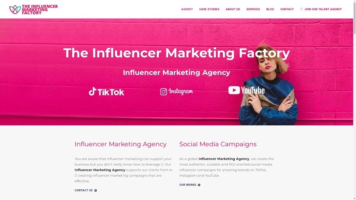
The Influencer Marketing Factory
TikTok, Instagram & YouTube CampaignsA full-service agency with strong TikTok expertise, offering end-to-end campaign management from influencer discovery through performance reporting with a focus on platform-native content.Clients: Google, Snapchat, Universal Music, Bumble, YelpVisit TIMF → -
6

NeoReach
Enterprise Analytics & Influencer CampaignsAn enterprise-focused agency combining managed campaigns with a powerful self-service data platform for influencer search, audience analytics, and attribution modeling.Clients: Amazon, Airbnb, Netflix, Honda, The New York TimesVisit NeoReach → -
7

Ubiquitous
Creator-First Marketing PlatformA tech-driven platform combining self-service tools with managed campaign options, emphasizing speed and scalability for brands managing multiple influencer relationships.Clients: Lyft, Disney, Target, American Eagle, NetflixVisit Ubiquitous → -
8

Obviously
Scalable Enterprise Influencer CampaignsA tech-enabled agency built for high-volume campaigns, coordinating hundreds of creators simultaneously with end-to-end logistics, content rights management, and product seeding.Clients: Google, Ulta Beauty, Converse, AmazonVisit Obviously →
