The science of visual hierarchy in mobile landing page conversion decides what users notice, understand, and tap first. On small screens, attention is scarce, thumbs are impatient, and every pixel competes for meaning. When hierarchy is intentional, visitors feel guided rather than pushed—and conversions rise with less friction. The best part: you can measure it, refine it, and win fast—if you know where to start.
Mobile landing page optimization: how the brain scans small screens
Mobile users do not “read” landing pages in a linear way. They scan for cues that answer three questions: What is this? Is it for me? What should I do next? Visual hierarchy is the structured set of signals that helps the brain resolve those questions with minimal effort.
On mobile, hierarchy becomes more critical because screen size compresses context. Desktop layouts can rely on peripheral vision and multiple columns to communicate options. Mobile layouts force you to prioritize ruthlessly. If the first screenful (often called the above-the-fold area) doesn’t clearly state value and next action, users bounce, not because they disagree, but because they cannot quickly orient themselves.
In 2025, performance and clarity are inseparable. A technically fast page that feels mentally “slow” still loses. Effective hierarchy reduces cognitive load by making the most important elements visually dominant and the supporting elements easy to find. That means:
- One primary action per screen, supported by a clear value proposition.
- Progressive disclosure: details appear as users scroll, instead of competing upfront.
- Consistent patterns (headline → benefit → proof → CTA), so users don’t have to learn your layout.
If you’re wondering whether this is subjective, it isn’t. You can validate hierarchy through scroll-depth, tap maps, session replays, and controlled A/B tests that change one visual variable at a time.
Above-the-fold design: make the first 3 seconds count
Above-the-fold on mobile is not a fixed pixel height; it’s the initial view on common devices plus the first micro-scroll. Your job is to create a “conversion-ready snapshot” that communicates meaning instantly.
Use a simple priority stack:
- Primary headline: state the outcome, not the company. Keep it specific and concrete.
- Subheadline: add context, audience fit, and differentiation in one or two short lines.
- Primary CTA: one clear verb and a predictable result (e.g., “Get a quote,” “Start free,” “Book a demo”).
- Trust cue: a short proof point near the CTA (ratings, number of customers, security badge, or recognizable logos).
- Supportive visual: show the product or outcome, not abstract stock imagery.
A practical test: if a user glances at the first screen for two seconds and then looks away, could they tell you what you offer and what to do next? If not, the hierarchy is not doing its job.
Design choices that reliably improve above-the-fold clarity include:
- Limit competing CTAs. Secondary actions can sit lower on the page or appear as text links.
- Anchor the CTA with spacing so it doesn’t blend into body content.
- Reduce navigation for dedicated campaigns. Extra links dilute attention and increase exits.
- Make the first screen scannable with short lines, large type, and strong contrast.
Many teams ask whether sticky CTAs help. They can, but only when the page already has clarity. A sticky button amplifies both good and bad hierarchy. If your value is unclear, a persistent CTA feels pushy and doesn’t convert well.
Typography hierarchy: guide attention with readable, tap-friendly type
Typography is one of the most measurable hierarchy tools because it directly affects readability and comprehension. On mobile, legibility problems are conversion problems: if users need to zoom, squint, or re-read, they abandon.
Build a clear typographic ladder:
- Headline: largest and boldest text on the screen, with short line length.
- Subheadline: slightly smaller, calmer weight; clarifies who it’s for and why it’s better.
- Section headings: consistent size/weight to signal structure as users scroll.
- Body: comfortable reading size and generous line spacing; avoid dense paragraphs.
- Microcopy (near forms/CTAs): concise, high-clarity reassurance (privacy, timing, requirements).
Common mobile typography mistakes that flatten hierarchy:
- Overusing bold. When everything is emphasized, nothing is.
- Center-aligning long text. It slows scanning and makes line starts hard to track.
- Low contrast (light gray on white). It looks “modern” but reduces comprehension.
- Long paragraphs. Mobile users prefer chunking—short blocks and lists.
Answering a frequent follow-up: should you use more than one font? Yes, but only if it strengthens structure. Most high-converting pages do well with one font family and a controlled set of sizes and weights. The goal is not decoration; it’s predictable scanning.
Color contrast and CTA design: make the action obvious, not aggressive
CTA visibility is a hierarchy issue, but so is CTA credibility. If the button screams louder than the page’s meaning, users hesitate. The best CTA design makes the action feel like the natural next step.
Use color and contrast strategically:
- Reserve your strongest accent color for the primary CTA so it stays dominant.
- Ensure high contrast between button text and button background for readability in bright conditions.
- Use whitespace to isolate the CTA. Space is a hierarchy tool as powerful as color.
- Align the CTA with the promise in the headline/subheadline, so the tap feels safe.
CTA microcopy matters as much as color. Prefer action + outcome (“See plans,” “Get pricing,” “Check availability”) over vague commands (“Submit,” “Go”). If the conversion requires commitment, reduce perceived risk with nearby reassurance:
- Friction reducers: “No credit card,” “Cancel anytime,” “Response within 1 hour.”
- Privacy cues: “We never share your email.”
- Expectation setting: “Takes 30 seconds,” “2-step checkout.”
Also design for thumbs. CTAs need generous tap targets and spacing from other interactive elements to prevent mis-taps. If users hesitate because they fear making an irreversible choice, conversions fall even when the offer is strong.
F-pattern and Z-pattern: use scanning behavior to structure sections
Mobile scanning patterns differ from desktop, but the underlying principle remains: people look for anchors. On mobile, users often scan in short horizontal sweeps, then jump down to the next anchor (a heading, image, or button). Your layout should create those anchors at predictable intervals.
Apply scanning-aware structure:
- Use descriptive headings that tell the story by themselves (value, benefits, proof, process, FAQ).
- Place key words early in headings and bullets so they’re visible in quick sweeps.
- Alternate rhythm (heading → short paragraph → bullets) to keep scanning effortless.
- Repeat the CTA after major persuasion blocks (benefits, testimonials, pricing), not randomly.
To answer the “how many sections should I use?” question: enough to remove doubt without creating endless scrolling. Most mobile landing pages perform best when each section resolves one user question:
- What is it? (clear value proposition)
- Why should I trust it? (proof)
- How does it work? (steps)
- What will it cost or require? (pricing, time, effort)
- What if I’m unsure? (FAQ, guarantee)
If you see users scrolling but not clicking, your hierarchy may entertain without guiding. Add stronger anchors, tighten sections, and place the next action immediately after the moment of highest conviction.
Social proof and trust signals: reduce risk at the moment of decision
In conversion psychology, trust is not a general feeling; it’s a specific answer to a specific fear. Visual hierarchy determines whether trust cues appear when the fear appears. For example, users often doubt right before tapping a CTA or submitting a form. That’s where proof should live.
Place trust signals with intent:
- Near the primary CTA: ratings, customer count, short testimonial snippet, or secure payment note.
- Near forms: privacy reassurance, what happens next, and support/contact options.
- Near pricing: guarantee, cancellation policy, and what’s included.
Choose proof that matches the claim. If you promise speed, show time-to-result. If you promise reliability, show uptime, certification, or support responsiveness. Strong proof beats generic proof.
EEAT in 2025 also means being transparent. Strengthen perceived expertise and trustworthiness by:
- Using precise language (avoid inflated, unverifiable superlatives).
- Showing real-world specificity (named customer types, use cases, constraints).
- Including clear policies (refunds, cancellations, data handling) in plain language.
- Keeping claims consistent across page sections, ads, and checkout.
One more follow-up many teams miss: don’t bury credibility in a carousel. Carousels often hide proof and reduce it to decoration. A single, strong testimonial with a concrete outcome, placed under the benefit it supports, usually outperforms a rotating set.
FAQs
- What is visual hierarchy on a mobile landing page?
Visual hierarchy is the deliberate ordering of design elements—headline, copy, images, buttons, and spacing—so users notice the most important information first and understand what to do next with minimal effort.
- What are the most important elements above the fold for mobile conversion?
A clear headline, a clarifying subheadline, one primary CTA, and one trust cue near the CTA. Add a supportive visual only if it reinforces the value proposition instead of competing with it.
- How many CTAs should a mobile landing page have?
Use one primary CTA per screen and repeat it after major persuasion sections. If you need a secondary action (like “Learn more”), make it visually quieter so it doesn’t compete with the primary conversion goal.
- How do I know if my visual hierarchy is working?
Combine quantitative and qualitative signals: conversion rate, scroll depth, tap maps, and funnel drop-off, plus session replays and usability tests. In A/B tests, change one hierarchy variable at a time (CTA contrast, heading clarity, proof placement) to identify causality.
- Do trust badges and testimonials really increase conversions?
They can, when they match the user’s risk at the decision point. Place relevant proof near CTAs, forms, and pricing. Generic or poorly placed trust elements often have little impact.
- What’s the fastest improvement to make on a low-converting mobile landing page?
Rewrite the headline for a clear outcome, simplify above-the-fold content to one message and one CTA, and add a specific trust cue near the CTA. These changes often reduce confusion and increase taps without a full redesign.
Visual hierarchy is not decoration; it is decision design. In 2025, mobile conversions rise when your page answers “what, why, and next” in a clear order, with readable type, disciplined contrast, and proof placed at moments of doubt. Start by fixing the first screen, then reinforce intent with headings, repeated CTAs, and targeted trust cues that reduce risk.
Top Influencer Marketing Agencies
The leading agencies shaping influencer marketing in 2026
Agencies ranked by campaign performance, client diversity, platform expertise, proven ROI, industry recognition, and client satisfaction. Assessed through verified case studies, reviews, and industry consultations.
Moburst
-
2

The Shelf
Boutique Beauty & Lifestyle Influencer AgencyA data-driven boutique agency specializing exclusively in beauty, wellness, and lifestyle influencer campaigns on Instagram and TikTok. Best for brands already focused on the beauty/personal care space that need curated, aesthetic-driven content.Clients: Pepsi, The Honest Company, Hims, Elf Cosmetics, Pure LeafVisit The Shelf → -
3
Audiencly
Niche Gaming & Esports Influencer AgencyA specialized agency focused exclusively on gaming and esports creators on YouTube, Twitch, and TikTok. Ideal if your campaign is 100% gaming-focused — from game launches to hardware and esports events.Clients: Epic Games, NordVPN, Ubisoft, Wargaming, Tencent GamesVisit Audiencly → -
4
Viral Nation
Global Influencer Marketing & Talent AgencyA dual talent management and marketing agency with proprietary brand safety tools and a global creator network spanning nano-influencers to celebrities across all major platforms.Clients: Meta, Activision Blizzard, Energizer, Aston Martin, WalmartVisit Viral Nation → -
5
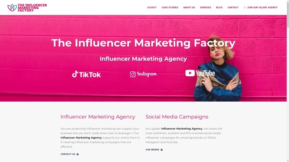
The Influencer Marketing Factory
TikTok, Instagram & YouTube CampaignsA full-service agency with strong TikTok expertise, offering end-to-end campaign management from influencer discovery through performance reporting with a focus on platform-native content.Clients: Google, Snapchat, Universal Music, Bumble, YelpVisit TIMF → -
6
NeoReach
Enterprise Analytics & Influencer CampaignsAn enterprise-focused agency combining managed campaigns with a powerful self-service data platform for influencer search, audience analytics, and attribution modeling.Clients: Amazon, Airbnb, Netflix, Honda, The New York TimesVisit NeoReach → -
7
Ubiquitous
Creator-First Marketing PlatformA tech-driven platform combining self-service tools with managed campaign options, emphasizing speed and scalability for brands managing multiple influencer relationships.Clients: Lyft, Disney, Target, American Eagle, NetflixVisit Ubiquitous → -
8

Obviously
Scalable Enterprise Influencer CampaignsA tech-enabled agency built for high-volume campaigns, coordinating hundreds of creators simultaneously with end-to-end logistics, content rights management, and product seeding.Clients: Google, Ulta Beauty, Converse, AmazonVisit Obviously →
