


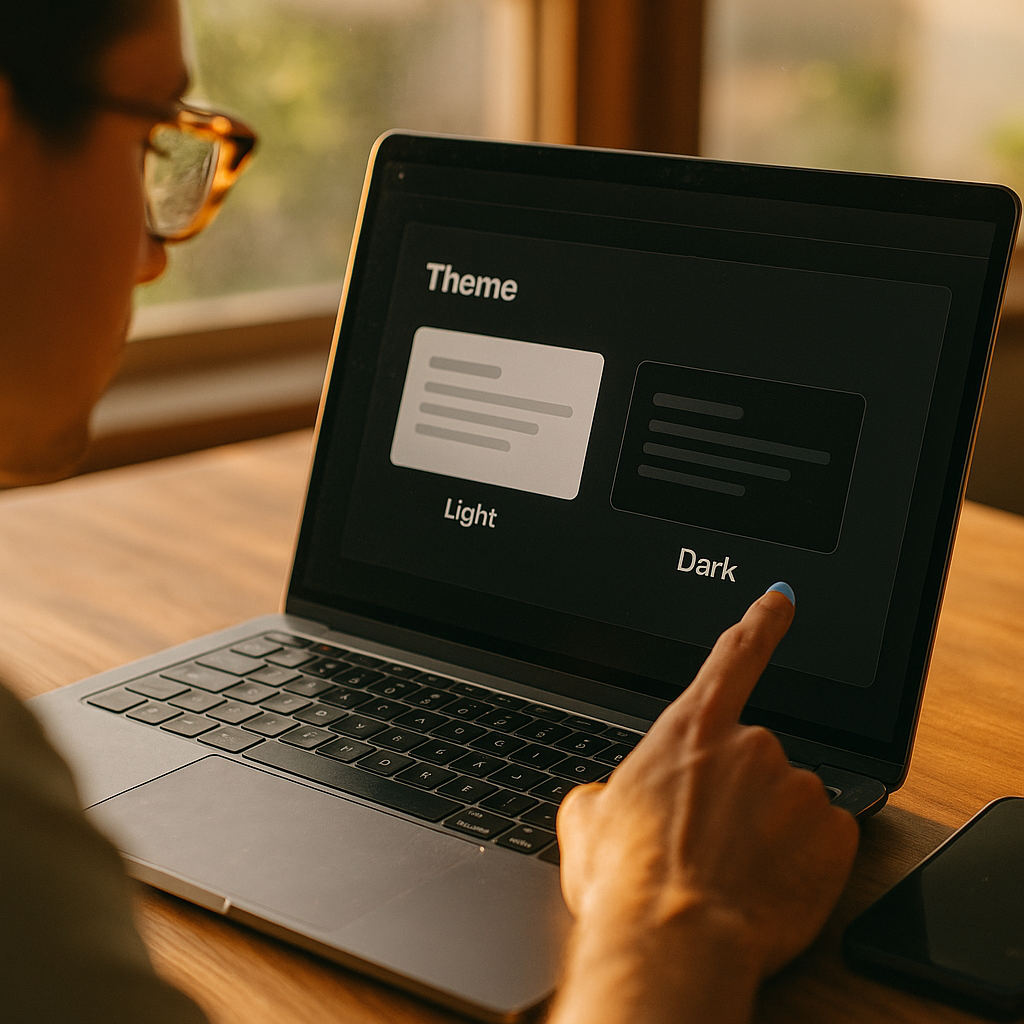
Designing For Dark Mode Beyond Aesthetics to Cognitive Psychology has become a product requirement in 2025, not a visual trend. Users choose dark interfaces for comfort, focus, and battery savings, but those outcomes depend on how the brain interprets contrast, motion, and hierarchy in low-light contexts. When you design dark mode with cognitive intent, you reduce errors and fatigue while improving comprehension. Are you designing for preference—or perception?
Dark mode UX principles that reduce cognitive load
Dark mode succeeds when it makes information easier to process, not when it merely looks sleek. The core cognitive goal is lowering cognitive load: the mental effort needed to perceive, understand, and act. In dark environments, the visual system behaves differently—pupils dilate, contrast sensitivity shifts, and small visual flaws become harder to ignore.
Apply these dark mode UX principles to support faster, more accurate reading and decision-making:
- Preserve hierarchy through contrast steps, not extremes. Avoid pure white text on pure black backgrounds for long-form content; it can create halation (a glow effect) that reduces legibility. Use “near-black” surfaces and “near-white” text to keep edges stable.
- Make primary actions unmistakable. In dark UI, secondary elements can visually collapse into the background. Reserve higher luminance and saturation for primary buttons and current states, and reduce emphasis elsewhere.
- Use spacing and grouping to replace lost shadows. Drop shadows often become muddy in dark themes. Increase padding, alignment consistency, and section spacing to show structure without relying on depth effects that may not render well.
- Optimize scannability. Users scan before they read. Strengthen headings, lists, and key-value layouts with consistent type scale and clear, restrained accent color use.
- Control motion and shimmer. Subtle gradients, blur, and micro-animations can flicker or shimmer against dark surfaces, increasing mental effort. Prefer stable, low-frequency animation and test on OLED and LCD screens.
A practical rule: if your dark mode requires the user to “work harder” to distinguish sections, identify actions, or read comfortably, it is decorative rather than usable.
Color contrast in dark themes for readability and accessibility
Dark mode introduces a common misunderstanding: higher contrast is not always better. For accessibility and clarity, you need balanced contrast that supports legibility without creating visual artifacts. The right approach depends on content type (body text vs. UI labels), environment (low light vs. office lighting), and user needs (e.g., low vision).
Key practices for color contrast in dark themes:
- Target comfortable text luminance. Use off-white text (not full white) for paragraphs. Keep line length moderate and increase line-height slightly to reduce crowding effects.
- Differentiate surfaces with subtle elevation cues. Instead of bright borders, use small shifts in background luminance (e.g., panels slightly lighter than the page) and consistent radii to communicate containment.
- Ensure state contrast, not just static contrast. Hover, focus, selected, disabled, and error states must remain distinct in dark mode. Many teams pass a contrast check for default text but fail for interactive states.
- Use color as a redundant signal. Errors and warnings should not rely on red/orange alone. Pair color with iconography, labels, or pattern cues so meaning survives color-vision differences.
- Design for focus visibility. Keyboard focus rings often vanish on dark surfaces. Use a high-visibility focus indicator that contrasts with both the component and background.
For trust and compliance, align with recognized accessibility guidance and document your decisions. In 2025, “we have dark mode” is not persuasive; “our dark mode is readable, navigable, and test-validated” is.
Cognitive psychology of light-on-dark interfaces and visual perception
Dark mode changes how users perceive edges, depth, and text. Cognitive psychology helps explain why some dark themes feel calming while others feel tiring. Two practical concepts matter most: perceptual stability and attention control.
Perceptual stability is the brain’s ability to maintain a clear interpretation of shapes and boundaries. In dark mode, overly bright text and thin fonts can create edge glow that blurs letterforms, especially at small sizes. This increases the chance of misreading and slows comprehension. Designers can counter this by:
- Using slightly thicker font weights for small text and avoiding ultra-thin typography.
- Reducing maximum contrast for long passages and avoiding pure black (#000) backgrounds when reading is central.
- Favoring crisp rendering (avoid excessive blur and low-contrast gradients behind text).
Attention control describes how the interface guides the user’s focus. In dark themes, saturated colors and bright accents feel even brighter, so they pull attention strongly. That can help in alerting scenarios, but it can also create distraction and decision fatigue. Keep accents meaningful:
- One accent color, many values. Use one main accent and vary its brightness for states (default, hover, selected) rather than introducing multiple competing accents.
- Limit bright elements above the fold. Too many bright chips, badges, or cards can fragment attention.
- Use progressive disclosure. Show essential controls first; reveal advanced settings when needed. Dark mode often attracts “power users,” but they still benefit from reduced clutter.
This psychology-driven approach answers a frequent stakeholder question: “Why can’t we just invert colors?” Because inversion changes perception nonlinearly; it can break hierarchy, increase glare, and push attention to the wrong places.
Dark mode typography and information hierarchy for comprehension
Typography carries more of the hierarchy burden in dark mode because shadows and borders lose subtlety. If your type system is weak, users will feel “lost” even if your palette is technically correct.
Strengthen comprehension with these dark mode typography strategies:
- Increase type scale contrast, not just color contrast. Make headings clearly larger and heavier than body text. Avoid relying on color alone to distinguish headings from paragraphs.
- Choose fonts with robust counters and clear forms. Letterforms with open counters (e.g., “e,” “a”) remain readable at lower luminance and smaller sizes.
- Use fewer weights, more consistency. Too many weights can create noise in dark mode. A disciplined system (e.g., regular + semibold) often reads cleaner than a wide range of subtle weights.
- Control line length and spacing. Comfortable reading in dark mode usually needs slightly more line-height and adequate paragraph spacing to prevent the “wall of text” effect.
- Design with real content. Placeholder text hides hierarchy problems. Test with long titles, localization expansion, dense tables, and edge-case numbers.
For information hierarchy, treat brightness like volume: the louder it is, the more it dominates. Use brightness intentionally—primary headlines, key metrics, and active navigation should earn the brightest values. Everything else should step down in a predictable scale.
User research for dark mode preferences, contexts, and wellbeing
Dark mode is context-sensitive. People switch themes based on lighting, task type, fatigue, and even emotional preference. To design responsibly, you need research that separates “I like it” from “I perform better with it.” This is where EEAT matters: you build credibility by showing your work through testing, not taste.
Run user research for dark mode with methods that reveal cognition and behavior:
- Context interviews. Ask when users enable dark mode: commuting, night reading, office work, gaming, prolonged sessions. Capture device types and ambient light conditions.
- Task-based usability tests. Measure completion time, error rate, and confidence for core flows (search, form entry, checkout, dashboards). Compare light vs. dark without framing one as “better.”
- Readability and comprehension checks. For content-heavy products, test reading speed and recall on realistic passages.
- Accessibility reviews with assistive tech. Verify focus order, visible focus, screen reader labels, and interactive state clarity in dark mode specifically. Many defects appear only after theming.
- Wellbeing signals. Capture self-reported eye strain and fatigue, but also observe behavior: increased zooming, repeated taps, missed fields, or abandoned tasks can signal readability issues.
Anticipate common follow-up questions from teams and stakeholders:
- Should dark mode be the default? Default to the system setting for trust and predictability. Offer an in-app override for control.
- Should we build a separate design system? Build one system with theme tokens. Maintain shared spacing, typography, and component behaviors while swapping semantic color tokens.
- How do we avoid doubling QA? Automate snapshot testing for themes, standardize tokens, and define a short list of “critical surfaces” that must be manually checked on real devices.
Document findings and decisions. In 2025, product teams are expected to justify UI choices with user impact, accessibility outcomes, and measurable performance—not vibes.
Implementing dark mode design systems with tokens and QA
Dark mode quality depends on implementation discipline. Without a token-based system, teams tend to “patch” dark mode with one-off hex values, leading to inconsistent hierarchy and broken states. A reliable approach uses semantic tokens mapped to theme values.
Implementation guidelines that support consistency and maintainability:
- Use semantic color tokens. Define tokens like background/surface/text-primary/text-secondary/border/primary-action/danger rather than naming tokens after colors. This keeps meaning stable when the theme changes.
- Design for elevation with tokens. Create surface levels (e.g., base, raised, overlay) with predictable luminance steps. Avoid arbitrary “card colors.”
- Standardize interactive states. Define hover, pressed, selected, focus, and disabled tokens per component category. Don’t let each team invent their own.
- Plan for media and data viz. Images, charts, and maps often look wrong in dark mode. Provide guidance: when to invert, when to add a subtle container, and when to offer alternate assets.
- QA on real devices. Test on OLED and LCD, in low and bright ambient light. Check banding, contrast shifts, and text rendering differences.
A practical sign your system is mature: a new component can be built once, themed automatically, and still passes accessibility checks and usability expectations without manual recoloring.
FAQs about designing dark mode with cognitive psychology
Is pure black (#000) best for dark mode?
Not for most reading-heavy interfaces. Pure black can increase perceived glare around bright text and exaggerate edge glow. Near-black backgrounds often improve comfort while maintaining the “dark” feel.
How do I choose the right contrast for body text in dark mode?
Aim for strong readability without maximal contrast. Use off-white text, adequate font size, and slightly increased line-height. Validate with accessibility contrast checks and user testing because perception varies by device and environment.
Should I use the same accent color in dark mode as in light mode?
Usually yes, but adjust brightness and saturation to prevent the accent from overpowering the layout. Keep the hue consistent for brand recognition and use tokenized values for different UI states.
Does dark mode reduce eye strain?
Sometimes, especially in low-light environments, but not universally. Eye strain depends on contrast balance, typography, glare, and task type. Test with real tasks and watch for behaviors like zooming or repeated mis-taps.
What are the biggest dark mode accessibility mistakes?
Common failures include invisible focus indicators, low-contrast secondary text, unclear disabled states, color-only error signals, and unreadable charts. Treat dark mode as a first-class accessibility target, not a skin.
How can I ensure my dark mode feels “calm” rather than “muddy”?
Use clear surface separation with small luminance steps, limit competing accents, maintain strong typographic hierarchy, and avoid heavy blur or gradients behind text. Calmness comes from predictable structure and stable readability.
Designing for dark mode works best when you treat it as a perception problem, not a paint job. In 2025, users expect dark themes to be readable, accessible, and consistent across devices and contexts. Use cognitive psychology to control attention, reduce visual artifacts, and strengthen hierarchy through typography and semantic contrast. Build with tokens, validate with research, and ship a dark mode that improves performance—not just appearance.
Top Influencer Marketing Agencies
The leading agencies shaping influencer marketing in 2026
Agencies ranked by campaign performance, client diversity, platform expertise, proven ROI, industry recognition, and client satisfaction. Assessed through verified case studies, reviews, and industry consultations.
Moburst
-
2
The Shelf
Boutique Beauty & Lifestyle Influencer AgencyA data-driven boutique agency specializing exclusively in beauty, wellness, and lifestyle influencer campaigns on Instagram and TikTok. Best for brands already focused on the beauty/personal care space that need curated, aesthetic-driven content.Clients: Pepsi, The Honest Company, Hims, Elf Cosmetics, Pure LeafVisit The Shelf → -
3

Audiencly
Niche Gaming & Esports Influencer AgencyA specialized agency focused exclusively on gaming and esports creators on YouTube, Twitch, and TikTok. Ideal if your campaign is 100% gaming-focused — from game launches to hardware and esports events.Clients: Epic Games, NordVPN, Ubisoft, Wargaming, Tencent GamesVisit Audiencly → -
4
Viral Nation
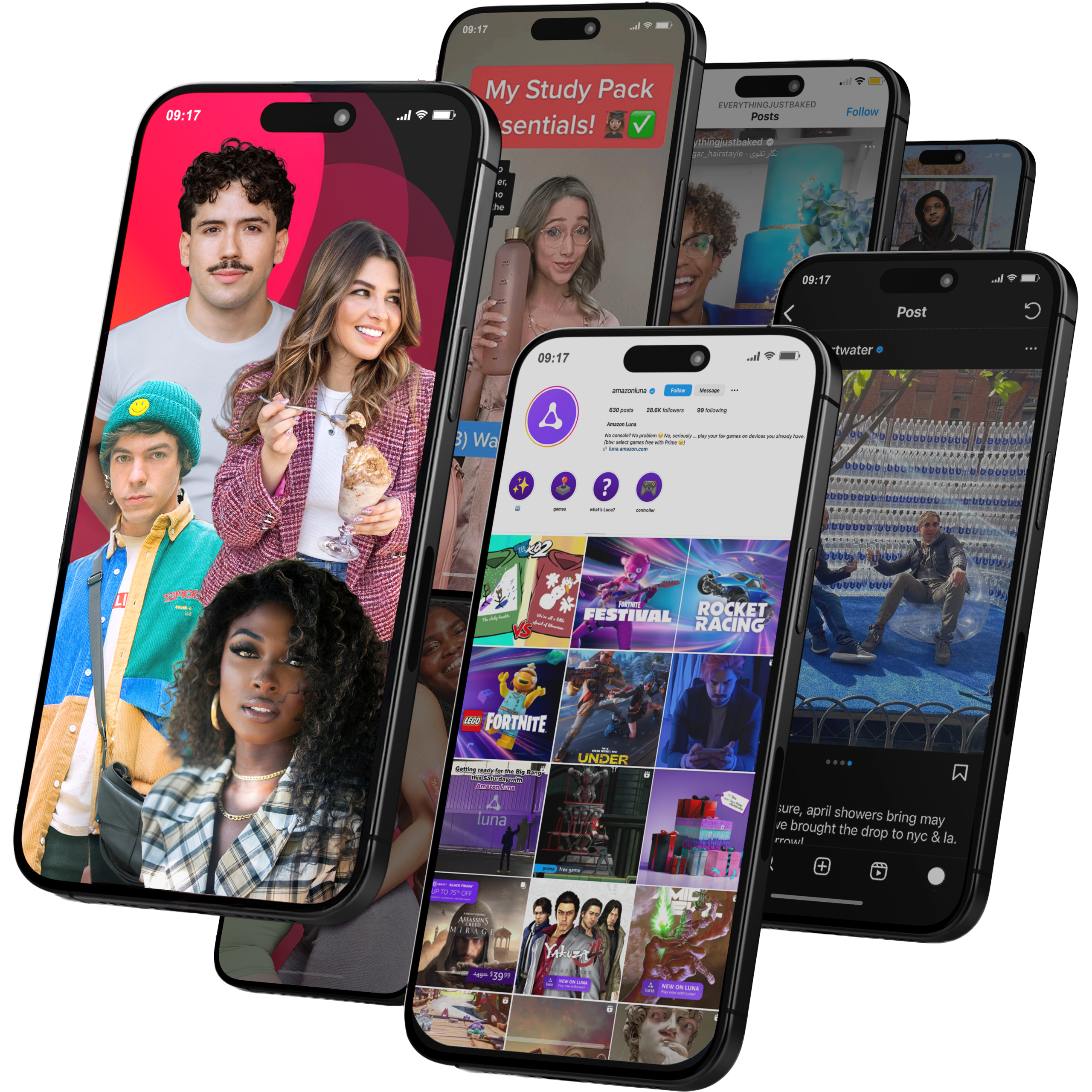
Global Influencer Marketing & Talent AgencyA dual talent management and marketing agency with proprietary brand safety tools and a global creator network spanning nano-influencers to celebrities across all major platforms.Clients: Meta, Activision Blizzard, Energizer, Aston Martin, WalmartVisit Viral Nation → -
5
The Influencer Marketing Factory
TikTok, Instagram & YouTube CampaignsA full-service agency with strong TikTok expertise, offering end-to-end campaign management from influencer discovery through performance reporting with a focus on platform-native content.Clients: Google, Snapchat, Universal Music, Bumble, YelpVisit TIMF → -
6
NeoReach
Enterprise Analytics & Influencer CampaignsAn enterprise-focused agency combining managed campaigns with a powerful self-service data platform for influencer search, audience analytics, and attribution modeling.Clients: Amazon, Airbnb, Netflix, Honda, The New York TimesVisit NeoReach → -
7

Ubiquitous
Creator-First Marketing PlatformA tech-driven platform combining self-service tools with managed campaign options, emphasizing speed and scalability for brands managing multiple influencer relationships.Clients: Lyft, Disney, Target, American Eagle, NetflixVisit Ubiquitous → -
8

Obviously
Scalable Enterprise Influencer CampaignsA tech-enabled agency built for high-volume campaigns, coordinating hundreds of creators simultaneously with end-to-end logistics, content rights management, and product seeding.Clients: Google, Ulta Beauty, Converse, AmazonVisit Obviously →