


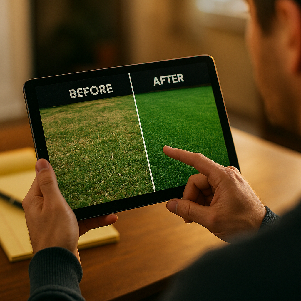
Split screen comparison ads outperform standard before and after content by up to 30% in click-through rate, according to internal benchmarks shared by several performance agencies running direct response creative on Meta and TikTok. Why? Because the format does something static testimonials can’t: it lets viewers judge the proof themselves, in real time, side by side. But here’s the catch. The same structure that builds trust can also torch it instantly if the “after” looks staged. So how do you script split screen comparison ads that read as credible rather than cooked?
This piece breaks down the scripting mechanics, the proof point sequencing, and the compliance landmines that trip up even experienced brand teams.
Why Split Screen Format Works Harder Than Standard Before/After
A traditional before and after ad asks viewers to trust a sequence. First this, then that, trust me. Split screen removes the sequence problem entirely. Both states exist on screen at once, which mimics how humans actually evaluate comparisons: side by side, not in memory. That’s a meaningful psychological shift, and it’s why split screen formats consistently show up in top-performing UGC libraries for skincare, home organization, fitness, and software demos.
There’s also a practical production advantage. Split screen ads can be built from a single take using phone-based screen recording or basic editing apps like CapCut, which keeps production costs low while still delivering a format that reads as polished. That efficiency matters when you’re running creative at scale across multiple creators and testing dozens of variants per campaign.
The format’s power comes from simultaneity, not sequence. Viewers trust what they can compare in real time more than what they’re told happened over time.
The Script Skeleton: Four Beats That Carry the Proof
Good split screen scripts aren’t improvised. They follow a tight structural beat sheet, usually under 20 seconds, because the comparison itself does the persuasive work. You don’t need a long voiceover explaining the difference. You need the right sequencing so the eye finds the contrast fast.
- Beat 1: Frame the stakes (0 to 3 seconds). A quick line or on-screen text establishing what problem is being solved. “Two loads of laundry, same detergent amount, different machine.” No hype, just context.
- Beat 2: Reveal the split (3 to 6 seconds). The screen divides. Both sides should start from a visually similar baseline so the only variable is the product or method being tested.
- Beat 3: Let the gap widen (6 to 15 seconds). This is the proof window. Resist the urge to cut away or add commentary. Let the visual divergence carry itself, maybe with light captions calling out the moment the gap becomes obvious.
- Beat 4: Land the claim with a qualifier (15 to 20 seconds). State the result plainly, and attach a condition if one exists. “Under standard wash settings” or “results after one use” protects you legally and reads as more honest to viewers who’ve learned to distrust absolute claims.
Notice what’s missing: a hard sell CTA baked into the comparison itself. Split screen ads work better when the CTA lives in the caption or a final static frame, not jammed into the proof sequence. Mixing persuasion with proof dilutes both.
Scripting the “Before” Side Without Looking Manipulative
This is where most brands get sloppy. An exaggerated “before” state, think theatrically dirty dishes or absurdly tangled hair, signals manufactured contrast immediately. Viewers who’ve grown up on ad-skeptical platforms spot staged “before” shots within seconds, and the comment section will call it out before your ad spend even clears review.
The fix is proportionality. Script the before state to reflect a realistic, common version of the problem, not the worst-case version. If you’re demoing a stain remover, use a stain that looks like something that actually happens during a normal week, not a crime scene. Realistic baselines make the after state more believable, which ironically makes the proof point stronger even though the contrast looks smaller.
Platform reviewers increasingly flag exaggerated comparisons too. Meta’s ad policies and TikTok’s creative standards both scrutinize before and after formats for misleading implied outcomes, particularly in health, beauty, and financial categories. For teams building comparison libraries at scale, it’s worth reviewing Meta’s advertising standards and TikTok’s ad policies before greenlighting scripts, not after a batch gets rejected.
Proof Points Need Evidence, Not Just Visuals
A split screen is a visual claim. Visual claims still count as claims under advertising law, and that means they need substantiation behind them even if the script never says a specific number out loud. If your “after” side implies a 50% improvement, you’d better have data that supports something close to that, because regulators and savvy audiences both treat implied claims the same as stated ones.
The FTC’s endorsement guidelines are explicit that testimonials and demonstrations must reflect typical results, not best-case outlier performance. If your split screen ad shows the single best result from a hundred tests, you’re required to disclose that it’s not typical, or risk the kind of enforcement action that costs far more than the ad spend saved by skipping the caveat.
This is where documentation discipline matters. Keep a simple internal record for every comparison ad: what was tested, under what conditions, how many trials were run, and whether the featured result was average or exceptional. It takes ten minutes per asset and saves weeks of legal cleanup later.
Casting Creators Who Can Sell the Comparison Honestly
Not every creator can pull off split screen comparison content convincingly. The format rewards creators with strong on-camera timing and a flat, matter-of-fact delivery style, because overacting the reveal undercuts credibility. Creators who already run product demo skits tend to adapt well, since they understand pacing around proof moments.
Brief creators specifically on restraint. The instinct for most creators is to react big to the “after” side, gasping, laughing, pointing excitedly. That’s fine occasionally, but if every comparison ad in your library has the same exaggerated reaction, audiences start pattern-matching it as performance rather than genuine surprise. Mix in some creators who deliver the comparison with almost clinical calm. The contrast in tone across your creator roster actually strengthens overall trust in the format.
Where This Format Breaks: Common Scripting Mistakes
Split screen comparisons fail for predictable reasons, and most of them trace back to rushed scripting rather than bad creators or weak products.
- Mismatched lighting or camera angles between the two sides. If the “before” is shot in warm light and the “after” in cool light, viewers subconsciously register the difference as a camera trick, not a product result.
- Too much time between the split and the payoff. If the gap doesn’t widen within the first ten seconds, attention drops off a cliff. Split screen formats live or die on pacing.
- Overlapping audio that favors one side. If background noise or music swells only on the “after” side, it reads as manipulated even if it was accidental.
- No qualifier on the claim. Absolute statements without conditions (“instantly removes” or “guaranteed results”) invite both regulatory risk and audience skepticism.
- Identical creators playing both roles unconvincingly. If one creator plays “before me” and “after me” with an obvious costume change, the artifice becomes the story instead of the product.
Brands that catch these issues at the script stage, rather than during editing, save real production budget. It’s far cheaper to rewrite a beat sheet than to reshoot a batch of ten creator videos because the lighting setup didn’t match across takes.
Scaling the Format Without Losing Authenticity
Once a split screen comparison script works, the temptation is to clone it across every creator in your program. Resist that. Identical scripts delivered by multiple creators start to look coordinated, which is the opposite of what makes UGC-style comparisons trustworthy in the first place.
Instead, lock the structural beats (frame, split, widen, land) and let creators bring their own context to the “before” state. One creator’s messy desk, another’s cluttered car trunk, a third’s overgrown garden bed. Same proof logic, different real-world framing. This approach borrows from the same diversification logic used in UGC style video ad production, where structural consistency matters more than scene-level sameness.
It’s also worth testing whether a POV creator ad framework can be layered onto the split screen format for certain categories, particularly where the “before” state involves an emotional frustration (bad skin day, cluttered inbox, disorganized closet) rather than a purely functional one. Combining formats like this often extends creative lifespan before audience fatigue sets in.
For teams managing creative at volume, tracking performance decay matters too. Split screen ads tend to have a shorter shelf life than evergreen testimonial content because the novelty of the reveal wears off faster. Platforms like Sprout Social and reporting tools from HubSpot can help flag when engagement on a comparison format starts dropping, signaling it’s time to refresh the script rather than keep spending against a tired creative.
Measuring What Actually Matters
Click-through rate tells you the comparison grabbed attention. It doesn’t tell you whether the proof point held up once someone landed on your product page. Pair split screen ad performance with post-click metrics, bounce rate on the landing page, time on page, and return rate if you’re in a category where returns are common. A high CTR with a high return rate usually means the “after” promised more than the product delivers, which is a scripting problem disguised as a product problem.
According to data referenced by eMarketer, comparison-style creative continues to show stronger scroll-stopping performance across short-form video platforms than static product shots, but the sustained conversion lift depends heavily on whether the proof claim matches actual customer experience post-purchase.
FAQs
Frequently Asked Questions
How long should a split screen comparison ad be?
Most effective split screen comparison ads run between 15 and 20 seconds. Longer formats dilute the impact of the reveal, since the visual comparison itself does most of the persuasive work and doesn’t need extended narration to land.
Do split screen comparison ads need a disclaimer?
Yes, if the results shown aren’t typical or if conditions were controlled in a way that wouldn’t match a normal customer’s experience. Reviewing FTC endorsement guidance before launch helps brands avoid claims that read as misleading once scaled across a campaign.
What’s the biggest mistake brands make with this format?
Exaggerating the “before” state to make the contrast look bigger. It backfires because audiences now recognize staged “before” shots quickly, and the inauthenticity undermines trust in the “after” claim too, even if that part is genuinely accurate.
Can split screen ads work for service businesses, not just physical products?
Yes, though the “before” and “after” states need to be reframed around outcomes rather than objects. A software demo might split screen a cluttered workflow against a streamlined one, or a consulting service might show a disorganized process timeline against a structured one.
How often should split screen creative be refreshed?
Most brands see performance decay within four to six weeks of heavy rotation, since the format’s novelty wears off. Refreshing the “before” scenario while keeping the same structural beats usually restores performance without a full creative overhaul.
Split screen comparison ads earn trust when the proof points are proportional, documented, and scripted with restraint rather than exaggeration. Start by auditing your current comparison creative against the four-beat structure above, then fix the weakest link, usually an overstaged “before” shot, before scaling any further spend.
Top Influencer Marketing Agencies
The leading agencies shaping influencer marketing in 2026
Agencies ranked by campaign performance, client diversity, platform expertise, proven ROI, industry recognition, and client satisfaction. Assessed through verified case studies, reviews, and industry consultations.
Moburst
-
2
The Shelf
Boutique Beauty & Lifestyle Influencer AgencyA data-driven boutique agency specializing exclusively in beauty, wellness, and lifestyle influencer campaigns on Instagram and TikTok. Best for brands already focused on the beauty/personal care space that need curated, aesthetic-driven content.Clients: Pepsi, The Honest Company, Hims, Elf Cosmetics, Pure LeafVisit The Shelf → -
3
Audiencly
Niche Gaming & Esports Influencer AgencyA specialized agency focused exclusively on gaming and esports creators on YouTube, Twitch, and TikTok. Ideal if your campaign is 100% gaming-focused — from game launches to hardware and esports events.Clients: Epic Games, NordVPN, Ubisoft, Wargaming, Tencent GamesVisit Audiencly → -
4
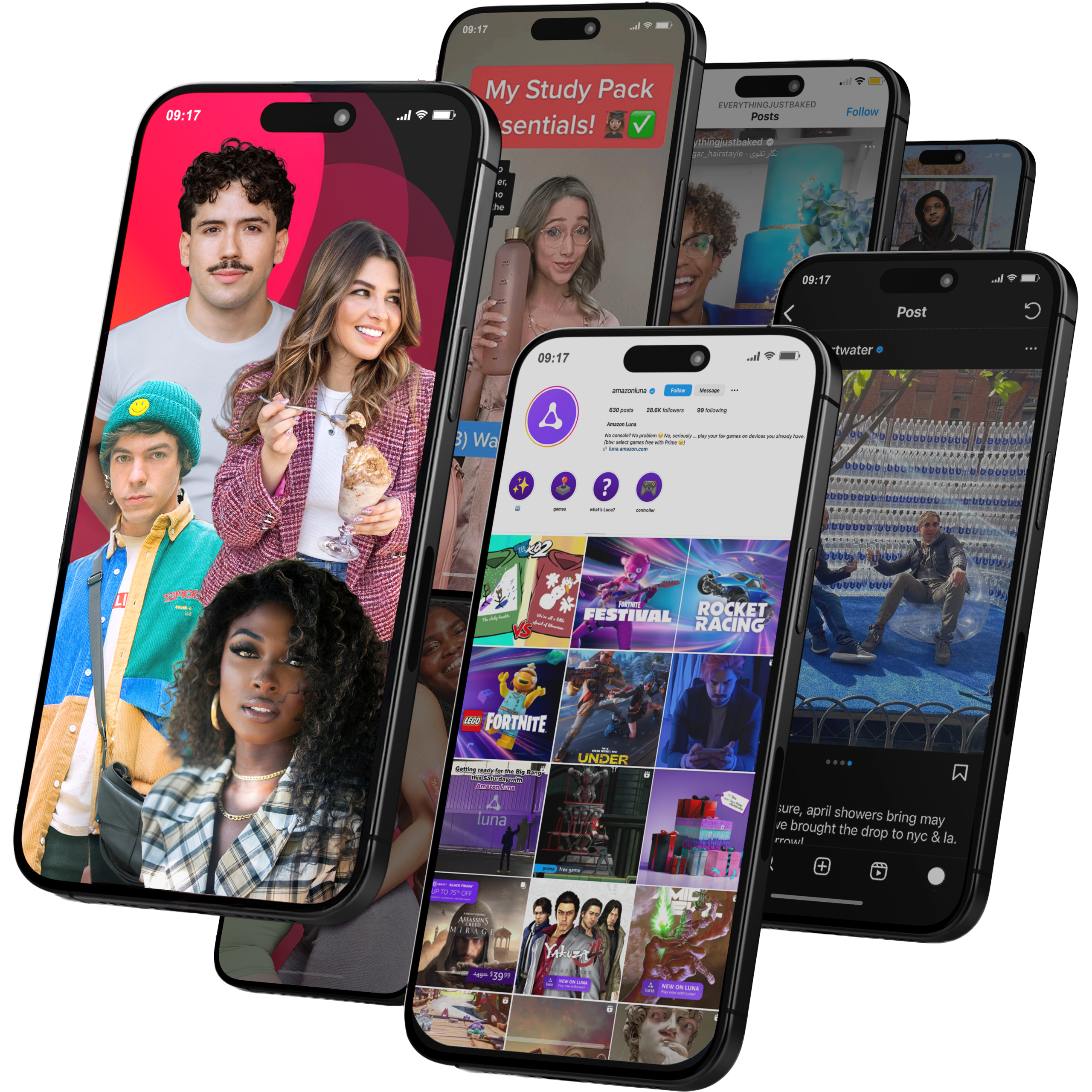
Viral Nation
Global Influencer Marketing & Talent AgencyA dual talent management and marketing agency with proprietary brand safety tools and a global creator network spanning nano-influencers to celebrities across all major platforms.Clients: Meta, Activision Blizzard, Energizer, Aston Martin, WalmartVisit Viral Nation → -
5
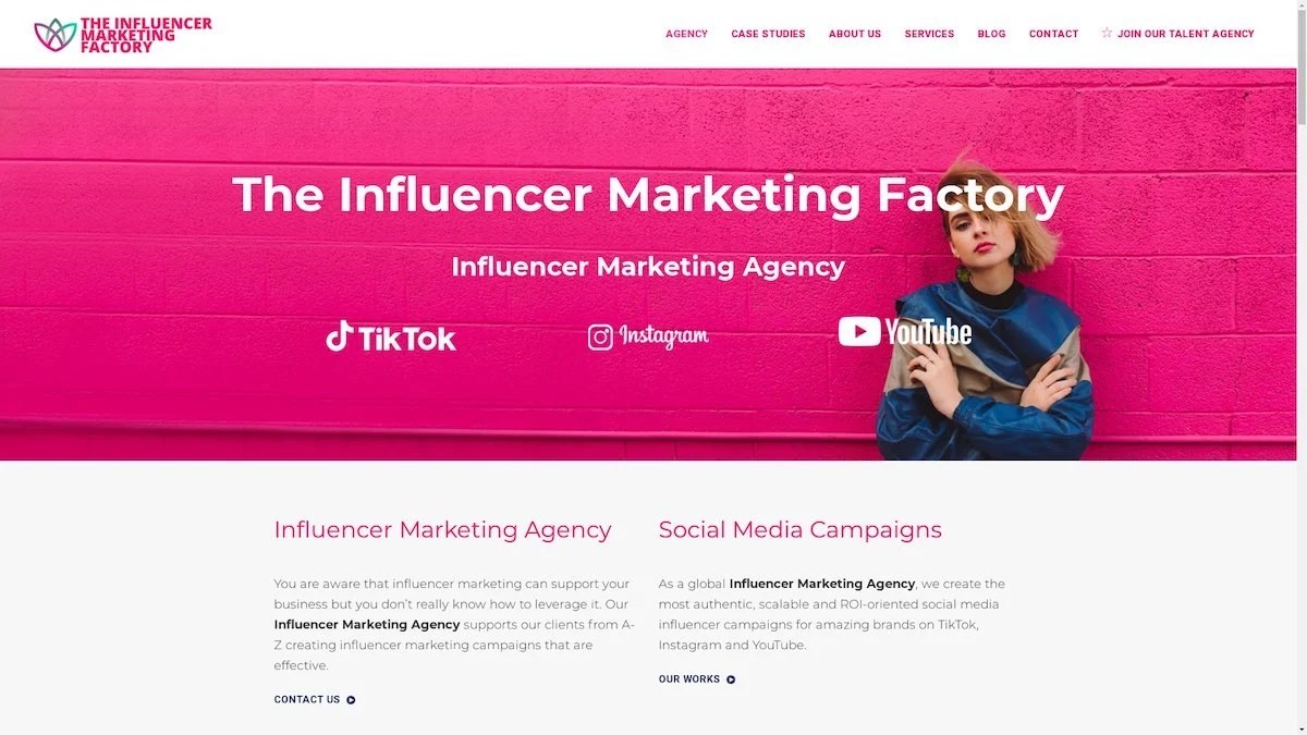
The Influencer Marketing Factory
TikTok, Instagram & YouTube CampaignsA full-service agency with strong TikTok expertise, offering end-to-end campaign management from influencer discovery through performance reporting with a focus on platform-native content.Clients: Google, Snapchat, Universal Music, Bumble, YelpVisit TIMF → -
6
NeoReach
Enterprise Analytics & Influencer CampaignsAn enterprise-focused agency combining managed campaigns with a powerful self-service data platform for influencer search, audience analytics, and attribution modeling.Clients: Amazon, Airbnb, Netflix, Honda, The New York TimesVisit NeoReach → -
7
Ubiquitous
Creator-First Marketing PlatformA tech-driven platform combining self-service tools with managed campaign options, emphasizing speed and scalability for brands managing multiple influencer relationships.Clients: Lyft, Disney, Target, American Eagle, NetflixVisit Ubiquitous → -
8
Obviously
Scalable Enterprise Influencer CampaignsA tech-enabled agency built for high-volume campaigns, coordinating hundreds of creators simultaneously with end-to-end logistics, content rights management, and product seeding.Clients: Google, Ulta Beauty, Converse, AmazonVisit Obviously →