



Designing Content for Foldable and Multi Surface Digital Interfaces has moved from niche experimentation to a practical requirement in 2025. Foldables, dual-screen devices, and large-screen phones change how people read, watch, browse, and shop across shifting layouts. Content teams now need patterns that stay clear through posture changes, spanning modes, and split views without losing intent. Ready to design for screens that don’t sit still?
Foldable UX design: Understand postures, spans, and split views
Foldables introduce interface states that traditional responsive design doesn’t fully cover. A single device can behave like a phone, a small tablet, or two coordinated screens. If your content strategy assumes one viewport at a time, readers can experience truncated headlines, broken reading order, or duplicated calls to action.
Start by mapping device postures to content goals. Most foldable ecosystems expose a small set of common states:
- Folded (phone-like): short sessions, quick scanning, high interruption.
- Unfolded (tablet-like): longer sessions, deeper reading, higher tolerance for context.
- Spanning mode: content can stretch across a fold/hinge area; poor placement can hide critical elements.
- Split view / multi-window: your experience shares space with another app; users compare, copy, reference, and decide.
Design implication: treat posture changes as state changes, not merely resize events. When a user unfolds the device, they often intend to switch from scanning to evaluating. Support that intent by progressively revealing context: expand summaries into detail, surface supporting evidence, and provide clear navigation to related sections.
Content placement rule: never place crucial meaning on a seam. In spanning layouts, keep headlines, prices, key images, and primary buttons away from hinge regions or screen gaps. If your design system supports “safe regions,” align critical components to those areas.
Follow-up question readers usually have: “Do I need separate content for folded vs. unfolded?” Generally, no. You need structured content that can reflow: modular headings, concise summaries, scannable lists, and media with flexible cropping. Create one source of truth; adapt presentation based on posture.
Responsive content strategy: Make structure survive reflow
Foldables punish content that depends on fixed layout. The solution is not more breakpoints; it’s more semantic structure. A resilient responsive content strategy makes every asset understandable in multiple densities: compact, comfortable, and expanded.
Build content in modules with clear hierarchy. For articles, product pages, and help content, aim for:
- One clear promise per page: a user should know what they’ll get within the first screen, even when folded.
- Short, descriptive headings: headings should work as a table of contents in unfolded mode and as scan targets in folded mode.
- Progressive disclosure: lead with a 1–2 sentence summary, then details, then advanced notes.
- List-friendly formatting: steps, requirements, and comparisons should be readable as lists without relying on columns.
Write for multiple reading widths. Very narrow screens can create awkward line breaks and “staircase” paragraphs. Use shorter sentences and avoid long compound phrases that break poorly. Keep key terms near the start of sentences so meaning survives truncation.
Design for “content density toggles” without rewriting. In unfolded mode, show supporting context: definitions, specs, citations, FAQs. In folded mode, collapse secondary modules behind clear labels like “Details,” “Specs,” or “Sources.” This reduces cognitive load while preserving depth for users who want it.
Answer the likely follow-up: “What about navigation?” Keep navigation consistent across states. If a sidebar appears in unfolded mode, ensure it doesn’t reorder content unexpectedly. Users should feel they expanded the view, not entered a different experience.
Multi-screen UI patterns: Coordinate surfaces without duplicating content
Multi-surface experiences are not only about foldables. They include dual-screen devices, large phones running split-screen, and continuity patterns where content moves between panes. The mistake teams make is duplicating content across surfaces, which creates inconsistency and maintenance burden.
Use a primary-secondary model. Treat one surface as the “focus” area and the other as support:
- Primary surface: the main narrative or task (reading, configuring, purchasing).
- Secondary surface: references, filters, comparison, notes, chat, or supporting media.
Examples that work well:
- Shopping: product details on the primary surface; reviews, shipping, and comparison on the secondary surface.
- Learning: lesson content on the primary surface; glossary, transcript, and quiz on the secondary surface.
- Travel planning: itinerary on the primary surface; map and booking policy on the secondary surface.
Avoid mirrored panes. Showing the same article twice wastes space and confuses users. Instead, show adjacent value—context that reduces backtracking. If the user scrolls the main content, keep the secondary pane stable or intentionally synchronized (for example, highlighting the section currently in view).
Design for “handoff moments.” When a device folds or unfolds, users should not lose their place. Preserve reading position, form inputs, and the user’s last meaningful state. If the layout changes from one column to two, keep anchors stable so a section header still maps to the same content.
Follow-up question: “Do I need two different editorial versions?” No. You need content that supports coordination: clear section IDs, predictable modules, and metadata (e.g., key points, definitions, citations) that a secondary pane can display.
Adaptive layout for foldables: Typography, media, and safe zones
Adaptive layout for foldables requires you to think beyond width and height. The fold line, rounded corners, camera cutouts, and app multi-window constraints all affect how content appears. Small errors become big friction when the device changes shape mid-task.
Typography that scales with posture.
- Use fluid type scales: increase line height and measure (line length) in unfolded mode for comfort.
- Protect readability: avoid ultra-wide text blocks; cap line length by using margins or a centered column.
- Prioritize headings: headings should remain visually distinct even when the UI adds panes.
Media that survives cropping and spanning.
- Use responsive images with focal points: ensure the subject remains visible when the aspect ratio changes.
- Avoid placing faces or text near edges: hinges and rounded corners can clip them.
- Caption consistently: captions add trust and context, especially when media appears smaller in split view.
Respect safe zones and interaction reach. Foldables can be heavy; users often hold them differently when unfolded. Keep primary actions within comfortable reach and away from hinge-adjacent dead zones. Make tap targets generous and avoid dense clusters of links that become hard to hit when the device is used one-handed.
What readers ask next: “How do I handle tables and comparisons?” Use stacked cards or collapsible rows in compact views; switch to side-by-side comparisons only when there’s enough stable width. Never rely on horizontal scrolling as the default for critical information.
Cross-device content testing: QA scenarios, analytics, and accessibility
Great multi-surface content comes from disciplined testing, not assumptions. Cross-device content testing should cover posture changes, multi-window behavior, and accessibility needs from the start. This is also where you build the credibility signals that align with Google’s helpful content expectations.
Test the moments that break intent. Add these scenarios to QA:
- Fold/unfold mid-task: during checkout, form entry, account creation, or reading.
- Rotate in both states: portrait folded, landscape folded, portrait unfolded, landscape unfolded.
- Enter split-screen: ensure your page still communicates its purpose when reduced to half width.
- Resume and app switching: confirm state persistence and scroll position restoration.
- Offline/poor network: confirm core text loads quickly and gracefully.
Instrument analytics around posture and layout changes. Track events such as “layout expanded,” “entered split view,” and “spanning mode.” Then correlate with completion rates, scroll depth, and error rates. If unfolds correlate with higher conversions, you can justify richer modules in expanded view. If split-screen correlates with drop-offs, simplify the core flow and reduce distractions.
Accessibility is non-negotiable.
- Reading order: ensure the DOM order matches the visual order in both one- and two-pane layouts.
- Focus management: when panes appear, keyboard focus should not jump unpredictably.
- Text resizing: verify that large font settings don’t cause overlapping or hidden buttons near hinges.
- Clear labels: in secondary panes (filters, glossaries), use explicit labels rather than icons alone.
EEAT in practice: publish content with clear authorship, editorial review, and update processes. For guidance and claims, cite primary sources and include a concise “how we know” explanation inside the content where it matters. In 2025, users notice when an interface adapts smoothly—and they also notice when it feels improvised.
EEAT for emerging interfaces: Build trust with evidence, clarity, and maintenance
Foldable experiences amplify trust signals because users often use them for higher-consideration tasks: reading long guides, comparing products, managing finances, or planning. EEAT is not an add-on; it’s the structure of your content operations.
Show real expertise. Use precise language, define technical terms, and provide actionable steps. Replace vague claims with verifiable details: what the user should do, what they should expect to see, and what to try if something fails in a multi-window setup.
Strengthen experience and authenticity.
- Include task-based guidance: “If you open split view to compare specs…” is more helpful than generic advice.
- Use screenshots sparingly and purposefully: focus on concepts that remain true across devices; annotate when needed.
- Document constraints: if a feature works best unfolded, say so and explain why.
Operationalize authoritativeness. Maintain a small set of canonical pages for key topics, then link to them consistently from secondary surfaces (glossary panels, help drawers, in-app tips). This reduces duplication and prevents stale versions drifting out of sync.
Earn trust through maintenance. For foldables, “last reviewed” is not cosmetic. Update when OS behavior changes, new spanning rules appear, or your own UI patterns shift. Users judge reliability by whether your guidance matches what they see on-screen.
FAQs
What is the biggest content mistake on foldable devices?
Relying on layout for meaning—such as placing key text across a hinge, using columns that collapse into an unreadable order, or hiding primary actions when the device changes posture. Structured, modular content prevents these failures.
Do I need separate pages for folded and unfolded views?
Usually not. Create one canonical content model and adapt presentation with progressive disclosure, safe-zone layout rules, and posture-aware modules. Separate pages increase inconsistency and maintenance risk.
How should I handle videos and images in spanning mode?
Use responsive media with clear focal points and avoid placing essential visual information near the center seam. Provide captions and transcripts so the content remains useful when media appears smaller in split view.
What multi-screen pattern works best for productivity and shopping?
A primary-secondary pattern: keep the main task (reading, configuring, checkout) on the primary surface and place supporting information (filters, comparisons, reviews, policies) on the secondary surface to reduce back-and-forth.
How do I test content for foldables without owning many devices?
Use emulators and responsive testing tools for layout logic, then validate on at least one real foldable for hinge behavior, ergonomics, and posture changes. Prioritize testing fold/unfold mid-task, split-screen entry, and accessibility reading order.
Does designing for foldables improve SEO?
Indirectly, yes. When your content stays readable, trustworthy, and easy to navigate across dynamic layouts, users engage longer, complete tasks more often, and bounce less—signals that align with helpful content outcomes and strong user experience.
Designing for foldables and multi-surface interfaces in 2025 means building content that keeps its meaning through posture changes, split views, and spanning layouts. Structure matters more than breakpoints: modular writing, safe-zone placement, adaptive typography, and coordinated panes protect comprehension. Test fold/unfold moments, instrument analytics, and apply EEAT through clear authorship and maintenance. Create one truth, adapt it everywhere, and users will follow.
Top Influencer Marketing Agencies
The leading agencies shaping influencer marketing in 2026
Agencies ranked by campaign performance, client diversity, platform expertise, proven ROI, industry recognition, and client satisfaction. Assessed through verified case studies, reviews, and industry consultations.
Moburst

-
2

The Shelf
Boutique Beauty & Lifestyle Influencer AgencyA data-driven boutique agency specializing exclusively in beauty, wellness, and lifestyle influencer campaigns on Instagram and TikTok. Best for brands already focused on the beauty/personal care space that need curated, aesthetic-driven content.Clients: Pepsi, The Honest Company, Hims, Elf Cosmetics, Pure LeafVisit The Shelf → -
3
Audiencly
Niche Gaming & Esports Influencer AgencyA specialized agency focused exclusively on gaming and esports creators on YouTube, Twitch, and TikTok. Ideal if your campaign is 100% gaming-focused — from game launches to hardware and esports events.Clients: Epic Games, NordVPN, Ubisoft, Wargaming, Tencent GamesVisit Audiencly → -
4
Viral Nation
Global Influencer Marketing & Talent AgencyA dual talent management and marketing agency with proprietary brand safety tools and a global creator network spanning nano-influencers to celebrities across all major platforms.Clients: Meta, Activision Blizzard, Energizer, Aston Martin, WalmartVisit Viral Nation → -
5
The Influencer Marketing Factory
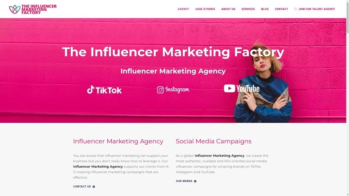
TikTok, Instagram & YouTube CampaignsA full-service agency with strong TikTok expertise, offering end-to-end campaign management from influencer discovery through performance reporting with a focus on platform-native content.Clients: Google, Snapchat, Universal Music, Bumble, YelpVisit TIMF → -
6

NeoReach
Enterprise Analytics & Influencer CampaignsAn enterprise-focused agency combining managed campaigns with a powerful self-service data platform for influencer search, audience analytics, and attribution modeling.Clients: Amazon, Airbnb, Netflix, Honda, The New York TimesVisit NeoReach → -
7

Ubiquitous
Creator-First Marketing PlatformA tech-driven platform combining self-service tools with managed campaign options, emphasizing speed and scalability for brands managing multiple influencer relationships.Clients: Lyft, Disney, Target, American Eagle, NetflixVisit Ubiquitous → -
8

Obviously
Scalable Enterprise Influencer CampaignsA tech-enabled agency built for high-volume campaigns, coordinating hundreds of creators simultaneously with end-to-end logistics, content rights management, and product seeding.Clients: Google, Ulta Beauty, Converse, AmazonVisit Obviously →