



In 2025, mobile users decide fast. The science of visual hierarchy in mobile landing page conversion explains why some pages feel instantly clear while others feel noisy. Visual hierarchy guides attention, reduces effort, and builds confidence to act. When you align layout, typography, and interaction design with human perception, conversion lifts follow naturally. Ready to engineer “obvious” in 3 seconds?
Mobile landing page conversion: how the brain scans and decides
Mobile visitors don’t read; they sample. In the first moments, the brain runs a rapid “gist” evaluation: What is this? Is it for me? Is it trustworthy? What should I do next? Your job is to make those answers visually unavoidable.
On small screens, attention is constrained by three realities:
- Limited viewport: only a fraction of the page is visible, so priority order matters more than completeness.
- High distraction: notifications and multitasking raise the cost of thinking, so pages must feel instantly navigable.
- Thumb-first interaction: ease and comfort influence whether users continue, scroll, or abandon.
Visual hierarchy is the mechanism that turns a page into a guided decision path. It uses contrast, size, position, whitespace, and motion cues to create a “most important → next” sequence. When hierarchy is strong, users can predict what will happen if they tap, which increases perceived control and reduces hesitation.
To check whether your hierarchy supports conversion, answer two questions from a cold start on a real phone:
- Can I state the offer and audience in under 5 seconds? If not, your top-level hierarchy is failing.
- Can I find the primary action without scrolling or hunting? If not, your action hierarchy is failing.
These aren’t aesthetic critiques; they’re cognitive load diagnostics. A landing page converts when it minimizes effort and maximizes certainty.
Visual hierarchy principles: contrast, size, spacing, and reading patterns
Hierarchy is not a single design choice; it’s a system. The most reliable systems rely on how people perceive salience and structure.
1) Contrast creates instant priority. High contrast elements pull attention first. Use it intentionally:
- Color contrast: reserve the strongest accent color for the primary CTA and key interactive elements.
- Value contrast: dark text on light backgrounds (or vice versa) for readability; avoid low-contrast “stylish” copy on mobile.
- Content contrast: short, bold value statements stand out against supporting details.
2) Size signals importance. The eye interprets bigger as more important. Apply size to create a clear ladder:
- Primary message: the largest typographic element should be your value proposition, not your brand name.
- Primary CTA: large enough to be easily tappable and visually “weighty,” but not competing with the headline.
- Supporting proof: smaller but scannable, using bullets and short lines.
3) Spacing is comprehension. Whitespace is not emptiness; it’s grouping. On mobile, spacing prevents mis-taps and makes scanning feel effortless:
- Group related items: keep headline, subhead, and CTA tightly grouped to communicate “this goes together.”
- Separate unrelated blocks: add generous padding between sections to signal a new topic.
4) Reading patterns adapt on mobile. Classic F-pattern scanning is less consistent on narrow screens. Mobile users often follow a top-down “layer cake” scan: headline, a few key lines, a button, then a scroll decision. Build for that:
- Use a strong first line: it acts as your visual anchor.
- Keep subheads informative: make them answer a question, not just label a section.
- Put one clear action in each screenful: don’t force users to remember where to tap.
A practical rule: if you blur your page (or squint), the first thing you notice should be the value proposition and the CTA. If you notice your logo, a decorative image, or a carousel first, your hierarchy is spending attention on the wrong asset.
Above-the-fold CTA design: directing action without friction
On mobile landing pages, the CTA is not just a button. It’s the visible commitment path. A high-converting CTA is easy to find, easy to understand, and low-risk to tap.
Place the CTA where attention lands. The hero area should contain:
- Value proposition: what you offer and why it matters.
- One primary CTA: the main conversion action.
- One secondary path (optional): “See pricing,” “Watch demo,” or “Learn more,” visually quieter than the primary CTA.
Write CTA microcopy that reduces uncertainty. Replace generic labels (“Submit,” “Get started”) with outcome-driven clarity:
- Good: “Get my quote,” “Check availability,” “Start free trial,” “Book a consult.”
- Risk reducers: “No credit card,” “Cancel anytime,” “Takes 2 minutes,” placed adjacent to the CTA.
Use shape and spacing for tappability. In 2025, users expect forgiving touch targets. Make the CTA feel physically easy to hit:
- Large tap area: adequate height, padding, and separation from other links.
- Visual affordance: button styling that clearly reads as tappable, not a flat text label.
Avoid competing CTAs. Multiple primary buttons split attention and create decision friction. If you must present two options (for example, “For teams” vs “For individuals”), make the user choose the path first, then show a single CTA per path.
Answer the follow-up question: “What happens after I tap?” Use hierarchy to preview the next step. For instance, a three-bullet “How it works” block below the hero reduces fear of a long form or a pushy sales process.
Mobile UX psychology: cognitive load, trust signals, and attention
Visual hierarchy boosts conversion most when it lowers cognitive load and increases perceived safety. Mobile visitors are especially sensitive to ambiguity, because small screens make it harder to “scan for reassurance.”
Reduce cognitive load by simplifying choices. Every extra field, option, or paragraph increases mental effort. Use progressive disclosure:
- Short forms first: ask for essentials, then collect details after commitment (when appropriate).
- Chunk information: convert dense paragraphs into bullets and short sections with clear subheads.
- Remove redundant navigation: landing pages usually don’t need full menus; keep focus on the conversion path.
Use trust signals where doubt occurs. Trust isn’t a footer badge; it’s a response to a specific fear. Place proof at the moment it matters:
- Near the CTA: rating summary, testimonial snippet, or “Trusted by” line to reduce “Is this legit?”
- Near forms: privacy assurance and secure handling statement to reduce “Will I get spammed?”
- Near pricing: refund policy or clear terms to reduce “What’s the catch?”
Make credibility legible. EEAT-friendly design supports perceived expertise and transparency:
- Identify the business clearly: name, what you do, and how to contact you.
- Show real evidence: specific results, verified reviews, recognizable clients only if accurate and permissioned.
- Avoid manipulative UI: fake countdowns, forced consent, or obscured fees can lift short-term clicks but harm trust and long-term performance.
Answer the follow-up question: “How much information is enough?” Give just enough to make the decision feel safe: value, differentiator, proof, and next step. Deeper details can live below the fold, structured so users can scroll to self-qualify.
Typography and color on small screens: readability, accessibility, and persuasion
Typography is hierarchy made visible. On mobile, readability is conversion. If users must zoom, squint, or re-read, you’re taxing the decision process.
Choose type scales that create a clear ladder. You want obvious distinction between headline, subhead, body, and captions. If everything looks similar, nothing feels important. Keep line lengths comfortable and avoid text blocks that feel like “walls.”
Prioritize legibility over brand flourish. Stylish fonts can work, but only when they remain readable on smaller devices. Use:
- High-contrast text: ensure clear separation from background.
- Comfortable line spacing: cramped lines slow reading and increase errors.
- Consistent emphasis: use bold for key phrases; avoid excessive italics and all caps for long text.
Use color to signal action and status, not decoration. In a conversion context:
- One primary accent color: reserved for primary actions.
- Neutral supporting palette: keeps the CTA dominant.
- Error and success states: clearly differentiated for form fields to reduce abandonment.
Design for accessibility as a conversion multiplier. Accessible pages usually convert better because they are easier for everyone to use. Ensure interactive elements are visually distinct, text is readable, and critical information isn’t communicated by color alone.
Answer the follow-up question: “Do accessibility improvements affect SEO?” They often support it indirectly by improving usability metrics and reducing bounce from frustrated users. They also reduce risk when your audience includes users with varied abilities and device settings.
A/B testing visual hierarchy: experiments, metrics, and iteration
Hierarchy decisions should be validated. But “test everything” is not a strategy. Tie tests to a hypothesis about attention and behavior.
Start with a hierarchy audit. Before running experiments, identify where attention should go in order:
- 1st: value proposition
- 2nd: primary CTA
- 3rd: key proof (review, stat, client logo, guarantee)
- 4th: supporting details and FAQs
If your current design doesn’t clearly express that order, your first tests should fix priority and clarity, not minor styling.
High-impact hierarchy tests to run.
- Hero restructuring: rewrite headline + subhead to be outcome-first; move the CTA closer; reduce competing elements.
- CTA contrast test: increase visual prominence through color, size, and surrounding whitespace.
- Proof placement test: add a concise trust signal near the CTA vs lower on the page.
- Information density test: swap long paragraphs for bullets and scannable subheads.
- Form friction test: reduce fields or split into steps, while measuring lead quality downstream.
Choose metrics that reflect intent, not vanity. For mobile landing pages, prioritize:
- Primary conversion rate: purchase, lead, signup, booking.
- CTA click-through rate: indicates whether hierarchy is directing action.
- Form start vs completion: reveals friction points.
- Scroll depth (contextual): useful for diagnosing whether users are missing key information.
Guardrails for EEAT in testing. Don’t optimize by hiding terms, exaggerating outcomes, or weakening consent. Sustainable conversion improvements come from clarity, relevance, and trustworthiness.
Answer the follow-up question: “How long should a test run?” Long enough to capture typical mobile traffic variability and avoid premature conclusions. Use your analytics to ensure sample size supports confidence, and keep tests focused: one primary change that affects hierarchy per experiment.
FAQs: visual hierarchy for mobile landing pages
What is visual hierarchy on a mobile landing page?
Visual hierarchy is the intentional ordering of elements so users notice and understand the most important information first. It uses contrast, size, spacing, position, and typography to guide attention toward the value proposition and the next action.
What should be above the fold on mobile?
At minimum: a clear value proposition, one primary CTA, and a short trust or risk-reduction cue. If the user must scroll to understand what you offer or how to act, conversion typically suffers.
How many CTAs should a mobile landing page have?
One primary CTA per screenful is a reliable pattern. You can repeat the same CTA as users scroll, but avoid multiple primary actions competing in the same view unless the page is explicitly a choice-based flow.
Do images improve mobile conversion?
They can, if they clarify the offer or build trust. Images that are decorative, slow to load, or visually louder than the value proposition often steal attention and reduce clarity.
How do I add trust signals without clutter?
Use compact proof near decision points: a short testimonial line, a rating summary, a simple guarantee, or a privacy assurance near forms. Keep it specific and verifiable, and avoid large badge stacks that overwhelm the layout.
What’s the fastest way to diagnose hierarchy problems?
Do a five-second test on a real phone: show the page briefly, then ask a user what the offer is and what they would do next. If they can’t answer both confidently, the hierarchy needs work.
Visual hierarchy turns mobile attention into action by making meaning and next steps obvious. Prioritize the value proposition, then the primary CTA, then proof, using contrast, size, and spacing to reduce cognitive load. Design typography and color for readability and trust, not decoration. Validate with focused A/B tests tied to behavior. Build a page that feels effortless to understand, and conversion follows.
Top Influencer Marketing Agencies
The leading agencies shaping influencer marketing in 2026
Agencies ranked by campaign performance, client diversity, platform expertise, proven ROI, industry recognition, and client satisfaction. Assessed through verified case studies, reviews, and industry consultations.
Moburst
-
2

The Shelf
Boutique Beauty & Lifestyle Influencer AgencyA data-driven boutique agency specializing exclusively in beauty, wellness, and lifestyle influencer campaigns on Instagram and TikTok. Best for brands already focused on the beauty/personal care space that need curated, aesthetic-driven content.Clients: Pepsi, The Honest Company, Hims, Elf Cosmetics, Pure LeafVisit The Shelf → -
3
Audiencly
Niche Gaming & Esports Influencer AgencyA specialized agency focused exclusively on gaming and esports creators on YouTube, Twitch, and TikTok. Ideal if your campaign is 100% gaming-focused — from game launches to hardware and esports events.Clients: Epic Games, NordVPN, Ubisoft, Wargaming, Tencent GamesVisit Audiencly → -
4
Viral Nation
Global Influencer Marketing & Talent AgencyA dual talent management and marketing agency with proprietary brand safety tools and a global creator network spanning nano-influencers to celebrities across all major platforms.Clients: Meta, Activision Blizzard, Energizer, Aston Martin, WalmartVisit Viral Nation → -
5
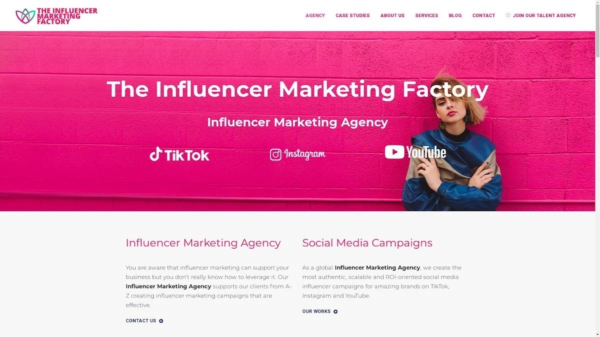
The Influencer Marketing Factory
TikTok, Instagram & YouTube CampaignsA full-service agency with strong TikTok expertise, offering end-to-end campaign management from influencer discovery through performance reporting with a focus on platform-native content.Clients: Google, Snapchat, Universal Music, Bumble, YelpVisit TIMF → -
6
NeoReach
Enterprise Analytics & Influencer CampaignsAn enterprise-focused agency combining managed campaigns with a powerful self-service data platform for influencer search, audience analytics, and attribution modeling.Clients: Amazon, Airbnb, Netflix, Honda, The New York TimesVisit NeoReach → -
7

Ubiquitous
Creator-First Marketing PlatformA tech-driven platform combining self-service tools with managed campaign options, emphasizing speed and scalability for brands managing multiple influencer relationships.Clients: Lyft, Disney, Target, American Eagle, NetflixVisit Ubiquitous → -
8

Obviously
Scalable Enterprise Influencer CampaignsA tech-enabled agency built for high-volume campaigns, coordinating hundreds of creators simultaneously with end-to-end logistics, content rights management, and product seeding.Clients: Google, Ulta Beauty, Converse, AmazonVisit Obviously →