


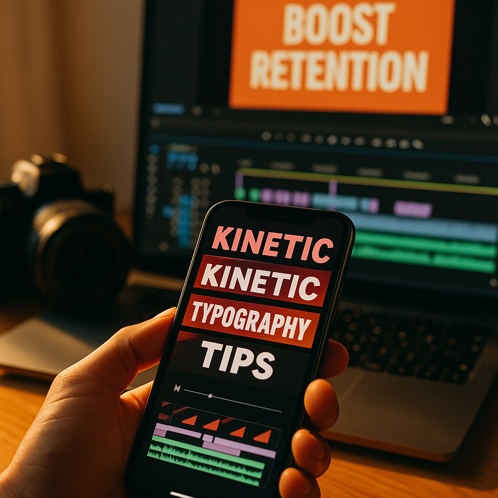
In 2025, short-form video competes in milliseconds, not minutes. Viewers decide to stay or swipe based on clarity, pace, and instant relevance. Using kinetic typography turns key words into motion-led cues that guide attention, reinforce meaning, and improve comprehension without relying on sound. Done well, it boosts retention while strengthening brand recall—so how do you start without overdoing it?
Why kinetic typography improves short-form video retention
Kinetic typography is animated text designed to move with intent—revealing, emphasizing, or pacing language so the viewer can follow the message quickly. In short-form feeds, that matters because many viewers watch with the sound off or in noisy environments. When your text carries the narrative, you reduce friction and keep people oriented.
Retention typically improves for three practical reasons:
- Instant clarity: On-screen text can state the premise within the first second, preventing confusion that triggers a swipe.
- Attention steering: Motion pulls the eye. When motion aligns with meaning (a “drop” word dropping, a “fast” word snapping in), viewers track the story more easily.
- Cognitive scaffolding: Short lines of animated text chunk information into readable beats, helping viewers process faster than dense captions.
This is not about adding “more text.” It’s about making the right words unavoidable at the exact moment they matter: the promise, the proof, the payoff, and the call to action. If your videos already have a strong script, kinetic typography becomes a multiplier. If your script is vague, typography will only make the weakness more visible—so start by tightening your message first.
Short-form video view rates: what drives scroll-stopping performance
Improving view rates is about earning the next second, repeatedly. Kinetic typography supports the core levers that platforms reward: early engagement, completion, and replays. But you should treat it as part of a full creative system that includes pacing, framing, and narrative structure.
Focus on these performance drivers, then decide where kinetic text fits:
- Hook precision: Your first line should answer “Why should I care?” Kinetic text can reinforce the hook by isolating the benefit in large, animated type while the visual establishes context.
- Information velocity: Short-form audiences accept fast edits, but not confusion. Animated text can bridge fast cuts by repeating the key phrase across transitions.
- Pattern breaks: A sudden change in scale, direction, or timing can reset attention mid-video. A well-timed kinetic emphasis at the 2–4 second mark often prevents drop-off.
- Silent comprehension: If a viewer can understand the story without audio, you expand your effective audience. Kinetic typography is more readable than default captions when designed intentionally.
Measure impact with platform-native analytics: three-second views, average watch time, completion rate, and rewatch signals where available. If kinetic typography is working, you’ll usually see higher completion and fewer steep drop-offs right after the hook. If results don’t move, audit your hook, pacing, and message hierarchy before assuming the animation is the issue.
Animated text design: principles for readability, pacing, and brand trust
In 2025, audiences are highly sensitive to “template” content. The goal is polish and clarity, not noise. Strong animated text design follows rules that protect readability and credibility.
1) Prioritize readability over style. Use high-contrast text with consistent sizing and safe margins. Keep line length short—typically 3–7 words per beat—so viewers can read instantly. If you need to explain something longer, split it into sequential beats instead of shrinking the font.
2) Match motion to meaning. Every animation should have a job: reveal, emphasize, label, or transition. If motion doesn’t add information, it adds distraction. A good test is to remove the animation—if the message stays clear, then motion should only enhance emphasis and pacing, not replace structure.
3) Keep timing human. Most viewers read faster than you think, but not at the speed of frantic “word confetti.” Use a consistent rhythm: introduce a phrase, hold it long enough to read, then transition cleanly. If you’re syncing to voiceover, avoid changing words mid-syllable; it feels chaotic and reduces perceived professionalism.
4) Protect brand voice. Choose one or two font families, a small color palette, and consistent text treatments (outline, shadow, highlight blocks). Consistency builds recognition and trust—key elements of EEAT—because viewers can quickly identify your content and style.
5) Avoid accessibility pitfalls. Don’t rely on color alone to convey meaning. Avoid rapid flashing, excessive shake, or strobing effects. Ensure text doesn’t cover faces or key visuals, and keep important words away from typical UI overlays (platform buttons and captions areas).
If you sell a product or give advice, credibility matters. Use kinetic text to present specifics: numbers, constraints, and proof points. Clear, verifiable claims feel more trustworthy than vague hype—especially when the text makes them unmistakable.
Motion captions workflow: tools, templates, and production best practices
You don’t need a huge team to implement motion captions, but you do need a repeatable workflow. Consistency is the difference between “nice effect” and scalable performance improvement.
Step 1: Script for text beats. Write your hook and key points as short, punchy lines. Identify which words deserve emphasis (benefit, outcome, contrast, numbers). If your script includes a list, plan a beat per item rather than showing everything at once.
Step 2: Build a style system. Create a mini “text kit” you reuse:
- Primary font for body beats and a bold font for emphasis
- Two highlight colors max (one for benefits, one for warnings or contrasts)
- Two animation types: one for reveals and one for emphasis
- Position rules (center for hooks, lower-third for explanations, side labels for steps)
Step 3: Choose the right tool for your speed. Many creators use mobile-first editors for turnaround and desktop tools for control. The tool matters less than the system. Look for features like auto-captions, keyframe control, motion presets, and reusable templates. If you’re collaborating, prioritize tools that support shared brand assets and easy versioning.
Step 4: Sync motion to structure, not just audio. Align text changes to edits, gestures, or on-screen demonstrations. Viewers read the whole frame; if your text changes while the visual is stable, it can feel disconnected. Conversely, matching text reveals to visual cues increases perceived coherence.
Step 5: Export for platform realities. Maintain safe margins for UI overlays. Keep text large enough to read on small screens. Avoid ultra-thin fonts that break under compression. Check your video on a phone before posting.
Step 6: Create variants quickly. Make two to three versions of the same video with different hooks and early text emphasis. This is one of the fastest ways to learn what actually improves view rates for your niche.
To protect trust, keep your process transparent when relevant: if you quote data, name the source on-screen in a small, stable label. If you make a claim, show a quick proof element (screen recording, before/after, or a simple visual indicator) while the kinetic text highlights the takeaway.
Audience engagement strategy: where kinetic typography fits in your content funnel
Kinetic typography works best when it supports a broader engagement strategy. Different video types need different text behaviors; a single “one-size” template often underperforms.
For top-of-funnel discovery: Use bold, minimal kinetic text to communicate the promise fast. Keep it benefit-led and specific. Example structure:
- Beat 1 (0–1s): the outcome
- Beat 2 (1–3s): the surprising constraint or insight
- Beat 3 (3–6s): the first actionable step
For tutorials and demos: Use kinetic labels and step markers. Viewers stay when they can track progress. Add “Step 1/3” or “Do this, not that” as stable anchors, then animate only the key terms to reduce overload.
For credibility and authority building: Use calmer motion and more stable typography. Fast, aggressive animation can feel salesy. If you’re explaining professional advice, let the message breathe. Highlight evidence-based points with clean emphasis rather than constant movement.
For conversions: Use kinetic typography to reduce decision friction: show price, guarantee, deadline, or next step clearly. Place the CTA as a readable, repeated beat near the end and again as an on-screen persistent label for the final second.
Expect follow-up questions from the audience and answer them visually. If viewers commonly ask “Does this work for beginners?” or “What tool did you use?” bake those answers into kinetic side-notes. This increases comments and saves while reducing confusion—both of which tend to correlate with stronger distribution.
A/B testing video hooks: metrics and experiments that raise completion rates
To use kinetic typography responsibly, treat it like a hypothesis you can test. Your goal is not “more animation.” Your goal is better retention and clearer communication.
Start with controlled experiments. Change one variable at a time:
- Hook wording: Same visuals, different first-line text (“Stop doing X” vs “Do Y to get Z”).
- Emphasis placement: Animate the benefit word vs animate the pain point.
- Text density: Fewer, larger beats vs more frequent smaller beats.
- Motion intensity: Subtle slides/fades vs punchy pops/scale.
Track the right metrics. View rates alone can be misleading if the platform counts a view quickly. Pair it with:
- Average watch time and retention curve shape
- Completion rate (and completion rate by traffic source where available)
- Rewatches or “loops” signals
- Saves and shares (often a proxy for usefulness)
Diagnose drop-off points. If viewers leave at 1–2 seconds, the hook is unclear or unconvincing. If they leave mid-video, your pacing or value delivery is weak. Kinetic typography can fix clarity, but it can’t replace substance. When you see drop-offs, rewrite the script to deliver the first actionable point earlier, then use kinetic text to spotlight it.
Build a learnings library. Keep a simple log: niche, hook type, text style, and performance. Over time you’ll identify patterns like “numbers in the first beat increase completion” or “step labels increase saves.” This is how creators turn design into a repeatable growth asset.
FAQs about kinetic typography for short-form video
What is kinetic typography in short-form video?
Kinetic typography is animated text that moves with purpose—revealing key words, emphasizing meaning, or pacing a message. In short-form video, it often replaces or upgrades standard captions to make the story understandable quickly, even without sound.
Does kinetic typography work better than regular captions?
It can, when your goal is retention and clarity. Regular captions are great for accessibility and full transcript coverage. Kinetic typography is better for highlighting the most important words and shaping attention. Many high-performing videos combine both: readable captions plus kinetic emphasis on key phrases.
How much animated text is too much?
Too much is when motion reduces readability, blocks the subject, or competes with the visuals. A practical rule: keep one primary text focus per moment. If viewers need to choose between reading and understanding the visual, simplify the text or slow the timing.
What fonts and colors are best for mobile readability?
Use bold, high-contrast fonts with clean shapes and avoid ultra-thin weights. Choose a small palette and ensure strong contrast against the background. If your footage varies, place text on subtle highlight blocks or add a soft shadow to maintain readability under compression.
How do I improve view rates with kinetic typography in the first second?
Show the benefit immediately in large, readable text, then animate only one emphasis (like a key outcome word or number). Pair it with a visual that matches the promise. Avoid introducing multiple ideas at once; clarity beats cleverness in the opening beat.
Should I add sources when using stats on-screen?
Yes, especially for health, finance, or professional claims. A small, stable source label improves trust and aligns with EEAT expectations. If the claim is central to your message, consider showing the source briefly on-screen or in the caption text.
Can kinetic typography help if my content is mostly talking-head?
Yes. Talking-head videos often lose viewers when the message feels abstract. Kinetic typography can surface the structure—hook, key point, step, result—so viewers can follow the logic. Keep the motion subtle to maintain a professional tone.
In 2025, the creators who win short-form attention don’t rely on louder edits—they deliver clearer messages faster. Kinetic typography works when it highlights meaning, guides the eye, and supports a strong script instead of masking weak ideas. Build a simple text style system, test hook variations, and optimize for readability on phones. Make your words move with purpose, and viewers will stay longer.
Top Influencer Marketing Agencies
The leading agencies shaping influencer marketing in 2026
Agencies ranked by campaign performance, client diversity, platform expertise, proven ROI, industry recognition, and client satisfaction. Assessed through verified case studies, reviews, and industry consultations.
Moburst
-
2
The Shelf
Boutique Beauty & Lifestyle Influencer AgencyA data-driven boutique agency specializing exclusively in beauty, wellness, and lifestyle influencer campaigns on Instagram and TikTok. Best for brands already focused on the beauty/personal care space that need curated, aesthetic-driven content.Clients: Pepsi, The Honest Company, Hims, Elf Cosmetics, Pure LeafVisit The Shelf → -
3
Audiencly
Niche Gaming & Esports Influencer AgencyA specialized agency focused exclusively on gaming and esports creators on YouTube, Twitch, and TikTok. Ideal if your campaign is 100% gaming-focused — from game launches to hardware and esports events.Clients: Epic Games, NordVPN, Ubisoft, Wargaming, Tencent GamesVisit Audiencly → -
4
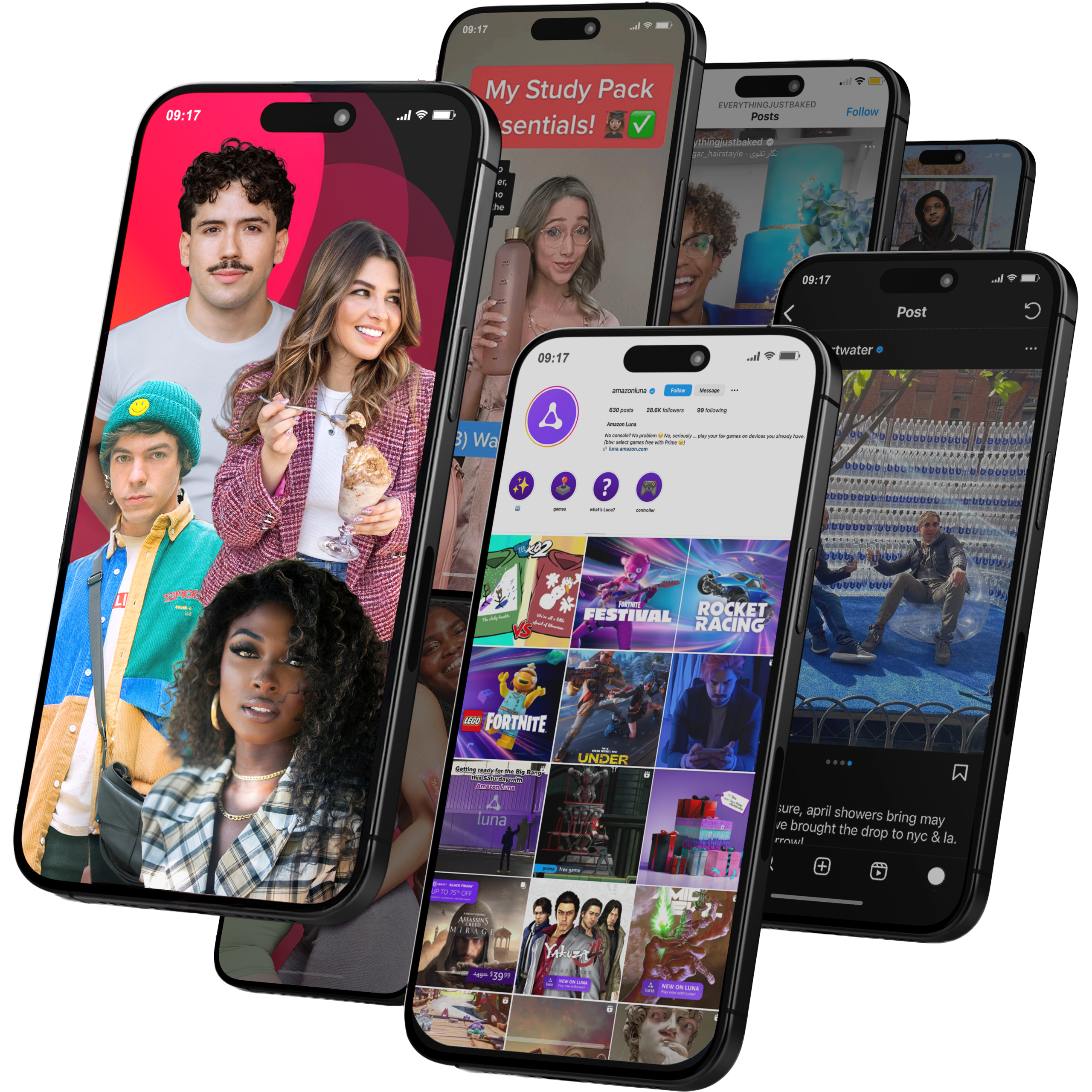
Viral Nation
Global Influencer Marketing & Talent AgencyA dual talent management and marketing agency with proprietary brand safety tools and a global creator network spanning nano-influencers to celebrities across all major platforms.Clients: Meta, Activision Blizzard, Energizer, Aston Martin, WalmartVisit Viral Nation → -
5
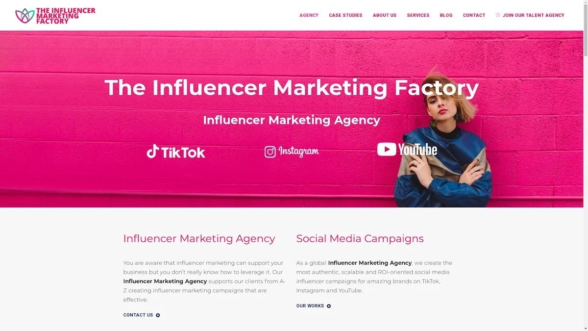
The Influencer Marketing Factory
TikTok, Instagram & YouTube CampaignsA full-service agency with strong TikTok expertise, offering end-to-end campaign management from influencer discovery through performance reporting with a focus on platform-native content.Clients: Google, Snapchat, Universal Music, Bumble, YelpVisit TIMF → -
6
NeoReach
Enterprise Analytics & Influencer CampaignsAn enterprise-focused agency combining managed campaigns with a powerful self-service data platform for influencer search, audience analytics, and attribution modeling.Clients: Amazon, Airbnb, Netflix, Honda, The New York TimesVisit NeoReach → -
7
Ubiquitous
Creator-First Marketing PlatformA tech-driven platform combining self-service tools with managed campaign options, emphasizing speed and scalability for brands managing multiple influencer relationships.Clients: Lyft, Disney, Target, American Eagle, NetflixVisit Ubiquitous → -
8
Obviously
Scalable Enterprise Influencer CampaignsA tech-enabled agency built for high-volume campaigns, coordinating hundreds of creators simultaneously with end-to-end logistics, content rights management, and product seeding.Clients: Google, Ulta Beauty, Converse, AmazonVisit Obviously →