


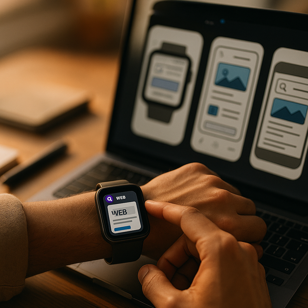
Designing for the Wearable Web is no longer experimental in 2025; it’s a practical requirement as watches and glasses become everyday interfaces for search, messaging, navigation, and payments. Wearables force teams to rethink content, interaction, and performance under strict constraints—tiny displays, short attention windows, and intermittent connectivity. Get these decisions right and users stay confident, fast, and safe—so what should you design first?
Wearable UX design principles for glanceable experiences
Wearables succeed when they respect the “glance-and-go” reality. People use watches and smart glasses while walking, commuting, exercising, working, or caring for others. That means you’re designing for divided attention, short sessions, and minimal tolerance for confusion.
Prioritize one intent per screen. On a phone, you can present multiple pathways. On a watch or in a heads-up display, multiple calls to action become noise. Treat each view as a single decision: confirm, dismiss, start, stop, or get directions.
Use progressive disclosure. Put the most important information first (status, next step, critical alert), then allow optional expansion. A good mental model is: glance → tap/voice → details on demand. If the user needs a tutorial to understand the first view, you’ve already lost the moment.
Design for interruptions. Wearables are used in bursts. A user may look away mid-task. Build resumable flows that preserve state: show what happened, what’s next, and what was last confirmed.
Reduce cognitive load with predictable patterns. Consistency beats novelty. Use familiar icons and verbs, keep language direct, and avoid ambiguous labels like “More” when the user must act quickly. Replace with explicit actions such as “Pay,” “Call,” “Open ticket,” or “Start navigation.”
Account for physical context and safety. For glasses in particular, avoid UI patterns that demand long reading or complex gestures during movement. Make confirmation steps clear for irreversible actions (payments, deleting, unlocking). Keep critical alerts unmissable but rare, so they retain meaning.
Follow-up question most teams ask: Should wearables replicate the mobile app? No. They should complement it. Wearables work best as a remote control for key moments: quick approvals, notifications, check-ins, tracking, and navigation.
Smartwatch content strategy: microcopy that drives action
Watch screens punish verbosity. A strong smartwatch content strategy relies on microcopy that is brief, specific, and actionable. Your goal is to communicate the what, why, and next step in as few words as possible.
Write in outcomes, not features. “Order confirmed” is better than “Your transaction has been processed.” “Train delayed 10 min” beats “Service disruption.” Outcome-first copy helps users decide instantly.
Use structured text. Make meaning scannable with a consistent hierarchy:
- Primary line: the key status or command (e.g., “Boarding pass ready”)
- Secondary line: one clarifier (e.g., “Gate C12 • 18:40”)
- Action: one verb (e.g., “Show code”)
Be strict about numbers, units, and time. Wearables are often used for time-sensitive decisions. Prefer “2.4 km” over “a short distance.” Use “in 7 min” rather than “soon.” If your product involves health or safety, keep units consistent and avoid jargon.
Plan notification copy as product copy. Notifications are not marketing banners. Each notification should answer:
- Is this urgent or informational?
- What changed since the last glance?
- What can the user do right now?
Provide user control. Give granular preferences: which alerts, what thresholds, quiet hours, and escalation rules. In 2025, users expect to manage attention the way they manage privacy—explicitly.
Localize for brevity. Translations can expand text length. Use character-aware UI that tolerates longer strings, and collaborate with localization early. When space is fixed, provide localized short strings instead of truncation that changes meaning.
Follow-up question: How do we decide what belongs on the watch? Put tasks there that benefit from immediacy, minimal input, and high frequency: authentication approvals, delivery updates, timers, boarding passes, quick replies, and health/fitness checkpoints.
Smart glasses interface patterns: voice, visual anchors, and environment
Smart glasses introduce a different interaction model: information appears in the user’s field of view, often layered over the real world. The experience must be fast to parse and safe to ignore when needed.
Anchor information to real-world goals. Glasses shine when they reduce context switching: navigation cues, checklists, translations, identification, and step-by-step guidance. Avoid long feeds. Think “next instruction” rather than “everything you could read.”
Prefer voice for input, keep visual for confirmation. Voice is ideal for hands-busy scenarios, but it’s not always socially acceptable or reliable in noisy environments. Design multimodal fallback: quick tap/gesture confirmations, minimal on-screen choices, and the ability to repeat the last instruction.
Use short-lived overlays. Persistent UI can become distracting. Show overlays only when relevant, then fade them out. If something must remain visible (like a timer or direction), keep it small and stable so the eye learns where to find it.
Make states unmistakable. On glasses, users must understand whether the system is listening, recording, or navigating. Use clear, consistent indicators for:
- Listening: visible cue plus short audio tone (when appropriate)
- Recording/capturing: explicit indicator and easy stop
- Connectivity: subtle but clear offline/limited status
Design for privacy in public spaces. Provide “privacy-first defaults”: avoid showing sensitive content when the device detects lock screen mode, nearby people, or public contexts (where platform APIs support it). At minimum, give users quick ways to hide details (“Hide preview,” “Show only title”).
Follow-up question: Should glasses experiences be web-based or native? The best answer is pragmatic: use the web for rapid iteration and broad reach when platform support is strong; use native when you need deeper sensors, camera pipelines, or low-latency rendering. Either way, keep content models consistent so features can move between surfaces.
Responsive web for wearables: layout, typography, and touch targets
Wearables expose weak responsive thinking. It’s not enough to “make it smaller.” You need intentional layouts, readable typography, and interaction targets that match real usage.
Start with a wearable breakpoint strategy. Define device classes by usable viewport and interaction style, not just pixel width. Watches often require a single-column, high-contrast, large-type layout. Glasses may require sparse overlays with stable positioning.
Typography must be readable at a glance. Use a strong type scale with generous line height and strict limits on line length. Avoid thin fonts and low-contrast text. If your brand palette is subtle, create a wearable variant optimized for contrast in bright outdoor conditions.
Touch targets: fewer, bigger, and spaced. Watches amplify fat-finger errors. Keep primary actions large and separate, minimize secondary actions, and avoid edge-only controls that conflict with system gestures. When in doubt, replace a cluster of buttons with a single “Open on phone” handoff.
Design for round and rectangular displays. Many watches use round screens. Keep essential content away from corners and edges where clipping occurs. Use centered layouts, avoid dense tables, and test with real masks (not just rectangular artboards).
Use content handoff intentionally. Wearables are often part of a device ecosystem. Provide explicit transitions:
- Continue on phone: for forms, browsing, account settings
- Continue on desktop: for complex management and long reads
- Save for later: when attention is limited
Respect platform conventions. Users expect the crown, side button, and standard gestures to behave consistently. Let the OS handle navigation patterns where possible, and avoid reinventing controls that clash with system accessibility features.
Follow-up question: Do we need a separate wearable site? Usually no. A strong responsive approach plus device-specific templates for the smallest surfaces is enough. If your wearable use cases are truly distinct (like ticketing, authentication, or medical alerts), consider a dedicated lightweight experience with a narrow feature set.
Performance and accessibility on wearables: speed, battery, and inclusive design
Wearables magnify performance problems. Heavy pages drain battery, stutter, and increase abandonment. Accessibility is also non-negotiable: a wearable interface may be someone’s most convenient or only interface in a given moment.
Optimize for quick rendering. Keep payloads lean, minimize JavaScript, and prefer server-rendered or statically rendered content where it fits. Avoid large images and heavy animations. If an image is essential (like a QR code), generate it at the exact needed size and compress appropriately.
Treat battery as a core metric. Excessive background activity, constant sensor polling, and frequent network requests degrade user trust. Batch updates, use push only for high-value alerts, and respect low-power modes.
Design for offline and flaky connectivity. Watches often rely on a paired phone, and glasses may switch networks. Cache essentials, show last-known status with timestamps, and provide honest error states that suggest the next step.
Accessibility: build it into the content model. Use plain language, strong contrast, and clear focus states. Ensure controls have descriptive labels, not just icons. Consider:
- Screen readers: concise labels and meaningful order
- Color blindness: never rely on color alone for status
- Motion sensitivity: reduce motion by default and respect OS preferences
- Haptics and audio: provide optional tactile/audio confirmations for key actions
Trust signals and EEAT for wearable content. Wearables often deliver health, financial, or location-related information. Support Google’s helpful content expectations by showing:
- Clear source and ownership: identify your organization and purpose in-app where feasible
- Expert review: for medical, safety, or finance content, add visible “reviewed by” or “data from” references within the experience or companion page
- Freshness cues: timestamps for readings, alerts, and account status
- Transparent limits: explain when data may be delayed, estimated, or incomplete
Follow-up question: How do we measure success on wearables? Track time-to-value (how fast users complete the core action), error rates (mis-taps, cancellations), notification opt-outs, battery impact (where measurable), and handoff completion rates to phone/desktop.
Testing wearable experiences: devices, analytics, and content QA
Wearable testing fails when teams rely on desktop previews. You need real-device validation, scenario-based QA, and analytics that reflect wearable realities.
Test in real contexts. Validate outdoors, in motion, with one hand, with gloves (where relevant), and under time pressure. For glasses, test in bright light and noisy environments. Include situations where users should safely ignore the interface.
Create a wearable scenario checklist. Build repeatable test scripts:
- Glance comprehension in under 2 seconds
- One-action completion without scrolling
- Interrupt and resume mid-flow
- Offline/low-signal behavior
- Notification relevance and frequency controls
Instrument the right analytics events. Avoid drowning in mobile-style funnels. Wearables benefit from a small set of events tied to the primary job-to-be-done: received alert, viewed, acted, dismissed, handed off, completed on companion device.
Run content QA as seriously as UI QA. Wearable microcopy has less room for ambiguity, and truncation can change meaning. Test long names, long locations, different languages, and accessibility settings. Confirm that critical units (mg/dL, bpm, km) remain visible and accurate.
Establish governance for alerts. Over-notifying is one of the fastest ways to lose trust. Define who can create wearable notifications, what qualifies as urgent, and how to sunset outdated alerts. Treat notifications as part of your product’s editorial system.
Follow-up question: What’s the fastest way to improve an existing wearable experience? Audit your top three wearable use cases, cut each to a single screen with one primary action, tighten copy to outcome-first language, and add a clear handoff path for anything complex.
FAQs about designing for watches and smart glasses
What content works best on a smartwatch?
Content that is time-sensitive, high-frequency, and actionable: authentication prompts, tickets and passes, delivery updates, timers, quick replies, and status checks. If it requires typing, comparing many options, or reading long text, route it to a phone handoff.
How is designing for smart glasses different from mobile design?
Glasses design is context-first and interruption-tolerant. You prioritize minimal overlays, fast comprehension, and safety. Voice and multimodal inputs matter more, and you must clearly indicate states like listening or recording.
Do I need a separate design system for wearables?
You usually need wearable extensions to your existing system: type scales, spacing, color contrast, icon clarity, and component variants optimized for glanceability. Keep tokens consistent across devices while allowing wearable-specific components.
How do I keep wearable notifications from annoying users?
Send fewer, higher-value alerts; default to informational summaries rather than repeated pings; provide granular controls (types, thresholds, quiet hours); and ensure each notification states what changed and what action is possible now.
What are the biggest performance mistakes on the wearable web?
Shipping heavy JavaScript, loading large images, frequent background refreshes, and failing to handle flaky connectivity. On wearables, these mistakes show up as lag, battery drain, and user opt-outs.
How can wearable content support EEAT and user trust?
Show clear timestamps, data sources, and review ownership for sensitive topics; avoid overclaiming; provide transparent error states; and keep experiences consistent across devices so users can verify details on a larger screen when needed.
Designing for wearable web experiences in 2025 means delivering clarity under constraints: one intent per screen, microcopy that drives immediate action, and interfaces that stay readable, fast, and respectful of attention. Build wearable-first patterns, then add deliberate handoffs for complex tasks. When you optimize for glanceability, accessibility, and trust, watches and glasses become reliable companions—not distractions.
Top Influencer Marketing Agencies
The leading agencies shaping influencer marketing in 2026
Agencies ranked by campaign performance, client diversity, platform expertise, proven ROI, industry recognition, and client satisfaction. Assessed through verified case studies, reviews, and industry consultations.
Moburst
-
2

The Shelf
Boutique Beauty & Lifestyle Influencer AgencyA data-driven boutique agency specializing exclusively in beauty, wellness, and lifestyle influencer campaigns on Instagram and TikTok. Best for brands already focused on the beauty/personal care space that need curated, aesthetic-driven content.Clients: Pepsi, The Honest Company, Hims, Elf Cosmetics, Pure LeafVisit The Shelf → -
3
Audiencly
Niche Gaming & Esports Influencer AgencyA specialized agency focused exclusively on gaming and esports creators on YouTube, Twitch, and TikTok. Ideal if your campaign is 100% gaming-focused — from game launches to hardware and esports events.Clients: Epic Games, NordVPN, Ubisoft, Wargaming, Tencent GamesVisit Audiencly → -
4
Viral Nation
Global Influencer Marketing & Talent AgencyA dual talent management and marketing agency with proprietary brand safety tools and a global creator network spanning nano-influencers to celebrities across all major platforms.Clients: Meta, Activision Blizzard, Energizer, Aston Martin, WalmartVisit Viral Nation → -
5
The Influencer Marketing Factory
TikTok, Instagram & YouTube CampaignsA full-service agency with strong TikTok expertise, offering end-to-end campaign management from influencer discovery through performance reporting with a focus on platform-native content.Clients: Google, Snapchat, Universal Music, Bumble, YelpVisit TIMF → -
6
NeoReach
Enterprise Analytics & Influencer CampaignsAn enterprise-focused agency combining managed campaigns with a powerful self-service data platform for influencer search, audience analytics, and attribution modeling.Clients: Amazon, Airbnb, Netflix, Honda, The New York TimesVisit NeoReach → -
7

Ubiquitous
Creator-First Marketing PlatformA tech-driven platform combining self-service tools with managed campaign options, emphasizing speed and scalability for brands managing multiple influencer relationships.Clients: Lyft, Disney, Target, American Eagle, NetflixVisit Ubiquitous → -
8

Obviously
Scalable Enterprise Influencer CampaignsA tech-enabled agency built for high-volume campaigns, coordinating hundreds of creators simultaneously with end-to-end logistics, content rights management, and product seeding.Clients: Google, Ulta Beauty, Converse, AmazonVisit Obviously →