


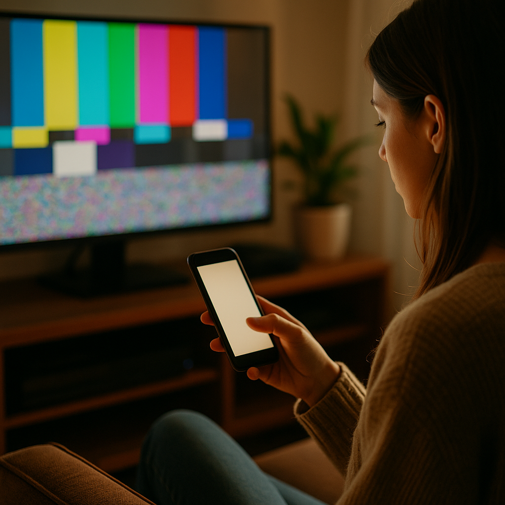
The Power of Low Stimulus Visuals in a High Noise Digital World is no longer a niche design idea—it’s a practical response to nonstop feeds, alerts, autoplay, and visual clutter. In 2025, attention is expensive and trust is fragile, so brands that communicate calmly often communicate more clearly. Low stimulus visuals reduce cognitive strain and sharpen meaning. The question is: will your design feel like relief?
Low stimulus visuals: what they are and why they work
Low stimulus visuals are design choices that intentionally lower sensory load: fewer competing elements, steadier rhythm, and clearer hierarchy. Think restrained color palettes, generous whitespace, minimal motion, legible typography, and focused imagery. They do not mean “boring” or “blank.” They mean intentional—every visual element earns its place.
They work because human attention has limits. When a screen contains too many signals at once, users spend more mental energy filtering than understanding. Low stimulus design reduces that filtering burden, making comprehension faster and decisions easier.
In practice, this approach helps answer the question most audiences silently ask: “What am I supposed to do here?” Clear hierarchy and calm layouts make the next step obvious, whether that step is reading, signing up, comparing, or buying.
For teams worried about losing impact, it helps to separate “stimulating” from “persuasive.” Persuasion is usually stronger when messages are easy to parse and feel trustworthy. Low stimulus visuals improve the conditions for persuasion by removing distractions that compete with the core story.
Digital noise and attention economy: why overstimulation backfires
Digital environments reward speed and volume: more posts, more ads, more formats, more motion. The result is digital noise—a background of competing cues that users adapt to by ignoring most of them. When everyone is loud, “louder” becomes less effective.
Overstimulation backfires in several predictable ways:
- Banner blindness: users learn to ignore visually “ad-like” areas and patterns.
- Decision fatigue: too many options or calls-to-action make users postpone action.
- Trust erosion: aggressive motion, clutter, and gimmicky layouts can signal low quality or manipulation.
- Lower comprehension: competing elements reduce reading depth and recall.
Low stimulus visuals counter these patterns by creating contrast where it matters: a single clear message, a single primary action, and a layout that feels stable. That stability is not just aesthetic. It is a trust signal: “We’re not trying to trick you. We’re making this easy.”
If you’re asking, “Will calm designs still perform in short-form environments?” the answer is yes, when they use strong content structure: an immediate headline, one key benefit, supportive proof, and a clean action. Calm does not mean slow; it means focused.
Minimalist design principles that reduce cognitive load
Minimalist design is most effective when it follows principles grounded in usability, not trends. The goal is to reduce cognitive load—the mental effort required to interpret what’s on screen—so users can spend their effort on the decision itself.
Use these proven principles:
- One primary message per screen: decide what success looks like for the page (read, compare, subscribe, purchase) and design toward that.
- Clear visual hierarchy: headline first, supporting line second, proof third, action last. Avoid equal-weight elements competing for attention.
- Whitespace as structure: spacing is not “empty”; it groups meaning and improves scanability.
- Restrained color system: limit accent colors so calls-to-action stand out without shouting.
- Typography for reading, not decoration: prioritize legibility, consistent sizes, and comfortable line length.
- Fewer components, better components: reduce UI variety (buttons, cards, badges) so users learn patterns quickly.
A useful test is the “10-second understanding check”: if a new visitor can’t answer “What is this?” and “What do I do next?” within 10 seconds, the design likely contains too many competing cues.
Another practical method is to remove friction in order: first remove distractions (extra CTAs, unnecessary banners), then simplify content (shorten copy, clarify benefits), then refine visuals (reduce colors, unify type). This sequence prevents you from polishing clutter.
Calm branding and trust signals: building authority without shouting
Calm branding communicates confidence. In 2025, users associate clarity with competence: clear explanations, consistent design, and transparent claims. Low stimulus visuals support this by giving proof and expertise room to be seen.
To align with Google’s EEAT expectations—Experience, Expertise, Authoritativeness, and Trustworthiness—low stimulus design should make credibility elements obvious and verifiable:
- Make claims specific and supportable: replace vague superlatives with concrete benefits, limits, and use cases.
- Show real-world experience: include practical examples, before/after outcomes, and implementation details that signal you’ve done the work.
- Highlight expertise cues: author names, role context, review processes, and references to recognized standards (for example, accessibility guidelines) where relevant.
- Use honest design patterns: avoid dark patterns, confusing toggles, hidden fees, or urgency tricks that undermine trust.
- Make help easy to find: clear navigation, straightforward policies, and accessible support options.
Many teams ask, “How do we maintain brand personality if we reduce visual intensity?” Personality doesn’t require chaos. It can come from a distinctive typeface used sparingly, a signature illustration style, consistent photography direction, or a memorable tone of voice—delivered in a layout that makes it easy to absorb.
Calm branding also improves shareability. People share things that make them look informed. A clean, well-structured visual makes your message easier to quote, screenshot, and re-tell.
Accessibility and inclusive design: low stimulus as a usability advantage
Accessibility and inclusive design are not optional in a high-noise digital world. Low stimulus visuals often align naturally with accessibility because they emphasize clarity, predictability, and readability—benefits for everyone, not only users with disabilities.
Design choices that typically improve accessibility and reduce sensory overload include:
- Motion restraint: minimize autoplay animations and parallax effects; provide user control for motion where possible.
- Readable contrast: ensure text stands out from backgrounds and avoid low-contrast “aesthetic” type that strains the eyes.
- Consistent navigation: predictable layout reduces effort and anxiety for users who rely on learned patterns.
- Chunked content: shorter paragraphs and clear grouping help scanning and comprehension.
- Clear focus states and tap targets: usability fundamentals matter more in calm designs because every element is prominent.
Low stimulus does not mean “low information.” It means you present information in layers. Put the core message up front, add optional detail beneath it, and reserve deep detail for those who want it. This supports different reading styles: scanning, skimming, and deep reading.
If you serve global audiences, low stimulus layouts also handle translation better. Simple structures are more resilient when words expand, line breaks change, or reading direction differs.
How to implement low stimulus visuals across web, social, and product
Implementation succeeds when you treat low stimulus as a system, not a one-off redesign. Start with a repeatable framework and measure outcomes that matter: comprehension, conversion, retention, and support volume.
Step 1: Audit where noise is coming from
- Count how many distinct actions appear above the fold.
- Identify simultaneous attention triggers: motion, pop-ups, competing badges, multiple accent colors.
- Review whether your content answers first-time visitor questions in order: what, who, why, how, proof, next step.
Step 2: Define a “calm hierarchy” template
- One primary headline that states the value plainly.
- One supporting line that clarifies audience and outcome.
- One primary CTA with a specific label (not “Submit”).
- One proof element (testimonial snippet, metric with context, certification, or case study link).
Step 3: Tune your visual system
- Limit your palette to a small set of neutrals plus one accent color for actions.
- Reduce type styles; rely on weight and size rather than many fonts.
- Replace decorative elements with structural spacing and consistent alignment.
Step 4: Apply channel-specific tactics
- Web: reduce sticky elements, avoid interruptive overlays, and prioritize fast loading for calmness and performance.
- Social: use quiet backgrounds, bold readable text, and a single focal image; avoid cramming multiple messages into one frame.
- Product UI: remove non-essential notifications, simplify empty states, and ensure each screen supports one key task.
Step 5: Validate with testing
- A/B test calmer layouts against current designs using clear success metrics (conversion, time to first action, error rate).
- Run short usability sessions and ask users to explain what they think the page does. Confusion points reveal where stimulus is replacing clarity.
- Monitor support tickets and chat transcripts; a drop in “Where do I…?” questions is a strong signal your hierarchy improved.
A common concern is that stakeholders equate “more stuff” with “more value.” Counter that with evidence: show that simplifying reduces drop-off and increases task completion. Present calm design as a performance strategy, not a style preference.
FAQs
What are low stimulus visuals in marketing and design?
They are visuals designed to reduce sensory overload by limiting competing elements, motion, and visual clutter. They emphasize clear hierarchy, legible typography, restrained color, and purposeful spacing so users can understand and act quickly.
Do low stimulus visuals reduce conversions?
Not when implemented with clear messaging and a strong primary call-to-action. Calm layouts often improve conversions by reducing decision fatigue, increasing trust, and making the next step easier to identify.
Is low stimulus the same as minimalist design?
They overlap, but they are not identical. Minimalist design is an aesthetic and structural approach; low stimulus design is a user-impact goal. A minimalist layout can still be high stimulus if it uses aggressive motion or confusing interactions.
How can I keep brand personality with a calmer visual style?
Use distinctive elements sparingly: a recognizable type treatment, a consistent photography style, a signature illustration approach, or a confident tone of voice. Personality comes from consistency and point of view, not visual noise.
What are quick wins to make a page feel less overwhelming?
Reduce above-the-fold choices to one primary CTA, remove autoplay motion, simplify the color palette, increase whitespace, and rewrite headings so they state benefits clearly. Then validate with a short usability test focused on “What is this?” and “What do I do next?”
How does low stimulus design support accessibility?
It often improves readability, navigation predictability, and motion control. These choices help users with attention differences, vestibular sensitivity, and low vision, while also making experiences easier for everyone in distracting environments.
Low stimulus visuals help brands earn attention instead of fighting for it. By reducing clutter, controlling motion, and clarifying hierarchy, you lower cognitive load and increase trust. In 2025’s noisy feeds and crowded interfaces, calm design becomes a competitive advantage because it supports comprehension and accessibility at the same time. Build a system, test outcomes, and let clarity do the persuasive work.
Top Influencer Marketing Agencies
The leading agencies shaping influencer marketing in 2026
Agencies ranked by campaign performance, client diversity, platform expertise, proven ROI, industry recognition, and client satisfaction. Assessed through verified case studies, reviews, and industry consultations.
Moburst
-
2
The Shelf
Boutique Beauty & Lifestyle Influencer AgencyA data-driven boutique agency specializing exclusively in beauty, wellness, and lifestyle influencer campaigns on Instagram and TikTok. Best for brands already focused on the beauty/personal care space that need curated, aesthetic-driven content.Clients: Pepsi, The Honest Company, Hims, Elf Cosmetics, Pure LeafVisit The Shelf → -
3
Audiencly
Niche Gaming & Esports Influencer AgencyA specialized agency focused exclusively on gaming and esports creators on YouTube, Twitch, and TikTok. Ideal if your campaign is 100% gaming-focused — from game launches to hardware and esports events.Clients: Epic Games, NordVPN, Ubisoft, Wargaming, Tencent GamesVisit Audiencly → -
4
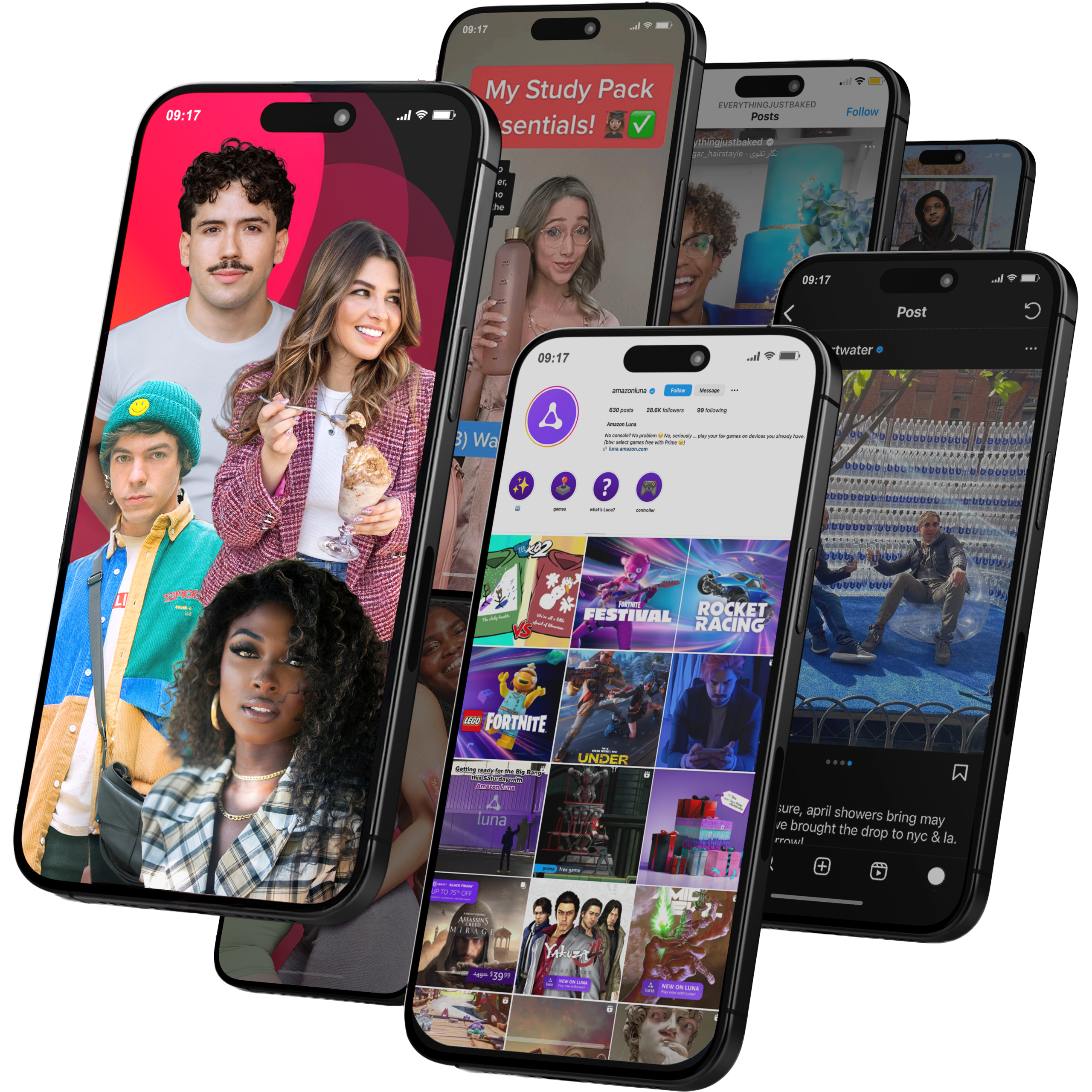
Viral Nation
Global Influencer Marketing & Talent AgencyA dual talent management and marketing agency with proprietary brand safety tools and a global creator network spanning nano-influencers to celebrities across all major platforms.Clients: Meta, Activision Blizzard, Energizer, Aston Martin, WalmartVisit Viral Nation → -
5
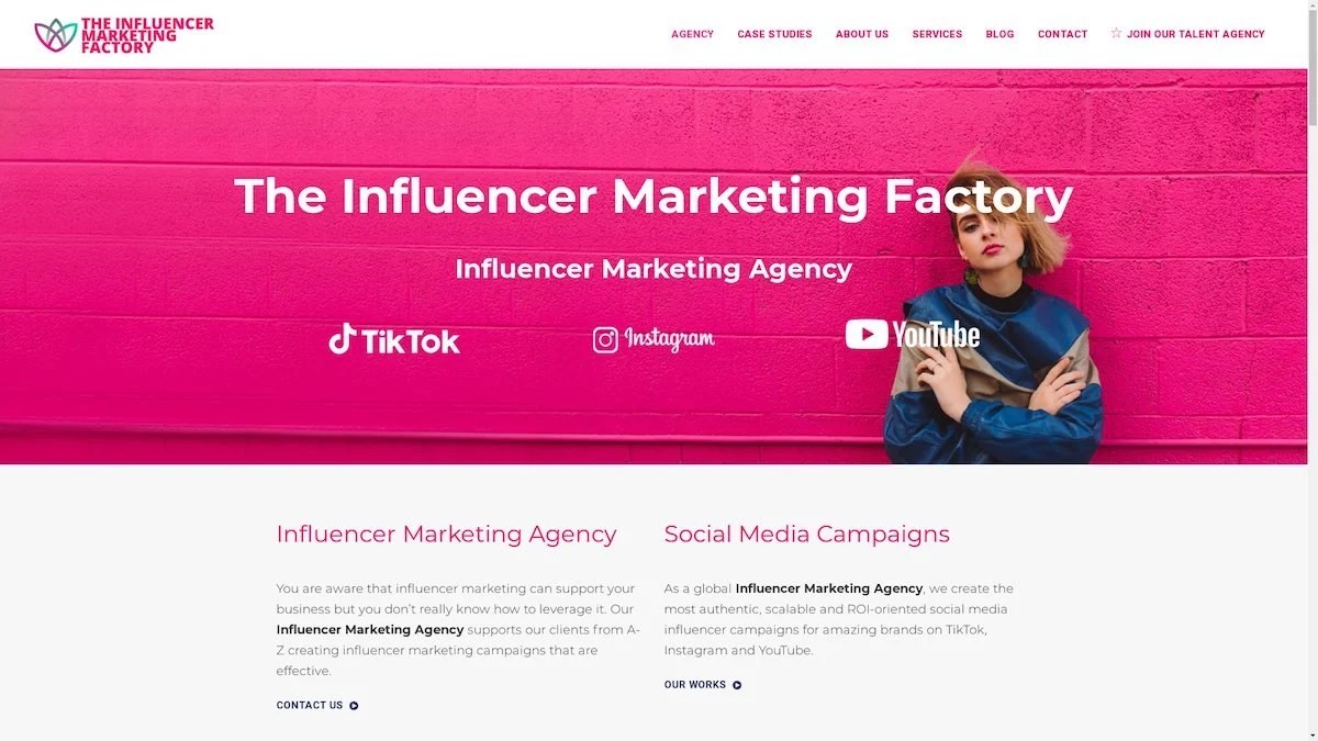
The Influencer Marketing Factory
TikTok, Instagram & YouTube CampaignsA full-service agency with strong TikTok expertise, offering end-to-end campaign management from influencer discovery through performance reporting with a focus on platform-native content.Clients: Google, Snapchat, Universal Music, Bumble, YelpVisit TIMF → -
6
NeoReach
Enterprise Analytics & Influencer CampaignsAn enterprise-focused agency combining managed campaigns with a powerful self-service data platform for influencer search, audience analytics, and attribution modeling.Clients: Amazon, Airbnb, Netflix, Honda, The New York TimesVisit NeoReach → -
7
Ubiquitous
Creator-First Marketing PlatformA tech-driven platform combining self-service tools with managed campaign options, emphasizing speed and scalability for brands managing multiple influencer relationships.Clients: Lyft, Disney, Target, American Eagle, NetflixVisit Ubiquitous → -
8

Obviously
Scalable Enterprise Influencer CampaignsA tech-enabled agency built for high-volume campaigns, coordinating hundreds of creators simultaneously with end-to-end logistics, content rights management, and product seeding.Clients: Google, Ulta Beauty, Converse, AmazonVisit Obviously →