



Saves outperform likes by a wide margin on conversion intent, yet most brands still script carousels for scroll stopping instead of bookmarking. A comparison grid carousel flips that priority. It lays two or more products side by side in a scannable grid, gives the viewer a reason to save it for later, and quietly does the sales job a product page can’t do in a crowded feed. If your influencer briefs still default to single product showcases, you’re leaving the highest intent engagement signal on the table.
Why Saves Matter More Than Likes Right Now
Every major platform has shifted its ranking logic toward signals that predict genuine utility. Instagram has said publicly that saves and shares carry more weight than likes when deciding what to push into Explore and suggested feeds. TikTok’s algorithm behaves similarly, rewarding content people return to. A like is a reflex. A save is a decision: “I need this information again.” That’s the behavior comparison grid carousels are built to trigger.
Think about how people actually shop. They don’t commit on the first view. They compare, they hesitate, they come back three days later when the paycheck clears or the discount code lands. A well-built comparison grid becomes the reference document they return to, right inside the app they already live in.
A save is a bookmark for a future purchase decision. If your content isn’t built to be revisited, you’re optimizing for the wrong metric entirely.
What a Comparison Grid Carousel Actually Is
Strip away the jargon and it’s simple: a multi-slide post where each frame (or a single dense frame) lays out two or more products against shared criteria. Price, ingredient list, battery life, shade range, whatever matters to the buyer. The format borrows from editorial “versus” journalism but compresses it into swipeable, mobile-first panels.
There are three common structures brands and creators use:
- Slide per criterion: Each carousel slide covers one comparison point (price, texture, longevity) across all products featured.
- Single grid slide: One dense infographic style slide with a full matrix, followed by slides that zoom into specific rows for detail.
- Product per slide, recap grid last: Individual products get their own hero slide, and the final slide compiles everything into a save worthy summary table.
That last structure tends to perform best for saves specifically, because the final slide becomes the shareable artifact. Viewers don’t need to rewatch the whole carousel. They screenshot or save slide six and move on.
The Format Brief Brands Should Be Sending Creators
Most influencer briefs are vague about structure and overly specific about brand messaging. Flip that ratio for comparison content. Creators need tight formatting guardrails and loose creative freedom on delivery. Here’s what a workable brief includes:
- A defined comparison axis (never more than four or five criteria, or the grid gets cluttered and unreadable on a phone screen).
- Consistent visual hierarchy across slides so the eye knows where to land each time.
- One slide explicitly designed as the “save this” recap, called out in the caption.
- Font size minimums. Grids die on mobile when text shrinks below readable thresholds.
- A disclosure placement that satisfies FTC endorsement guidelines without cluttering the comparison visual itself.
This is similar groundwork to what we outlined in swipe to reveal carousel scripting, where slide order determines whether a viewer finishes the sequence or bails after frame two. Comparison grids live or die on the same pacing logic, just with a data heavy payload instead of a reveal moment.
Where This Format Overlaps With Versus Content (and Where It Diverges)
If you’ve read our breakdown of versus content scripting, you already know the legal tightrope brands walk when comparing against named competitors. Comparison grid carousels inherit the same risk profile, maybe more so, because a visual grid makes discrepancies and unsubstantiated claims painfully obvious if challenged.
The divergence is in intent. Versus content scripts are built for persuasion, often brand versus competitor. Comparison grid carousels are more often brand versus brand’s own product line, or a curated “best of category” roundup featuring multiple brands a creator genuinely uses. That second use case, the multi-brand roundup, is where nano and micro creators generate disproportionate save rates, because audiences trust a real person’s side by side far more than a brand’s own claims about itself.
If your comparison grid does name a direct competitor, loop in legal review before publishing. A misstated spec or an outdated price point can turn a save worthy post into a takedown request.
Formatting Rules That Actually Drive Saves
Not every grid earns a save. The difference between a scroll-past and a bookmark usually comes down to five formatting decisions.
- Lead with the decision, not the products. Captions that open with “Which one should you actually buy?” outperform ones that open with product names. The question frames the save as useful future reference.
- Limit the grid to what fits one glance. Three products and four criteria is the sweet spot. Beyond that, legibility collapses on a 6 inch screen.
- Use consistent iconography. Checkmarks, stars, or simple color coding (green/yellow/red) let viewers parse the grid without reading every word.
- Caption the save explicitly. “Save this before you shop” is unsubtle, but it works. Direct instruction increases the save action more than any clever hook.
- Place pricing last. Price comparisons anchor decisions, but leading with price before establishing value differences cheapens the whole grid.
Three products, four criteria, one explicit save instruction in the caption. That’s the formula most comparison grids are missing.
Measuring What Actually Worked
Saves are a leading indicator, not a vanity metric, but brands still need to connect them to downstream behavior. Pull save rate alongside completion rate (how many viewers swipe through the full carousel) and profile visit rate. A grid that gets saved but never drives profile clicks or link taps might be informative without being commercially useful. Platforms like Sprout Social and native analytics dashboards on Instagram and TikTok both surface saves as a standalone metric now, so there’s no excuse for reporting on likes alone in a 2026 influencer recap deck.
Also worth tracking: how saves correlate with search behavior inside the app. Meta’s business tools have increasingly tied saved content to retargeting opportunities, meaning a high save comparison post can become a remarketing asset weeks after it first published. That’s a longer shelf life than almost any other influencer content format, and it changes how brands should think about content budgets. A single well-performing comparison grid might justify paid amplification months after it was shot.
Where Comparison Grids Fit Against Other Proof Formats
Comparison grids aren’t a replacement for other proof driven formats, they’re a complement. Before and after documentation proves a single product’s claim over time. Price breakdown videos build trust through transparency on one SKU. Comparison grids do something different: they shortcut the research phase entirely by putting the options next to each other, which is exactly the task a shopper would otherwise do manually across six open browser tabs.
That shortcut is the value proposition brands should be selling to creators when pitching the format. It’s not just “post about our product.” It’s “save your audience the research time,” which is a much easier ask for a creator to say yes to, because it serves their audience first and the brand second.
Common Mistakes That Kill Save Rates
A few recurring errors show up across underperforming comparison content:
- Overloading criteria. Seven comparison points across four products is a spreadsheet, not a carousel.
- Burying the recap slide. If the summary grid is slide eight of nine, most viewers never reach it. Put it at the end but keep total slide count under seven.
- Inconsistent fonts between slides. Creators sometimes build slides in different tools or on different days. Visual inconsistency reads as low effort and depresses saves.
- Skipping the explicit CTA. Assuming the audience will know to save it. They won’t. Say it.
- No disclosure strategy. Comparison content involving gifted or sponsored products needs clear disclosure per FTC guidance, and burying it in a wall of hashtags invites regulatory risk, not just audience distrust.
Scaling the Format Across a Creator Roster
Once a comparison grid template proves out with one creator, the temptation is to copy paste it across the entire roster. Resist the full copy paste. Keep the structural skeleton (criteria count, slide order, save CTA placement) consistent, but let each creator’s visual style and voice carry through. This is the same lesson we’ve covered in template seeding at scale: a rigid template that strips out creator personality tends to underperform a flexible template that preserves it.
For agencies managing multiple brand clients, a shared comparison grid template library (built in Canva or Figma, handed to creators as an editable asset) cuts production time significantly while keeping formatting consistent enough to benchmark performance across campaigns. That operational efficiency matters as much as the creative upside when you’re reporting back to a client on cost per save.
Next Step
Pick one upcoming product launch, brief a creator on a three product, four criteria comparison grid with an explicit “save this” CTA, and track save rate against your last five single product posts. The gap will tell you whether this format deserves a permanent slot in your content calendar.
Frequently Asked Questions
What makes a comparison grid carousel different from a regular product carousel?
A regular carousel typically showcases one product across multiple angles or use cases. A comparison grid carousel places two or more products side by side against shared criteria, giving viewers a reference tool rather than just a visual showcase.
How many products should appear in one comparison grid?
Three products is generally the sweet spot. Two can feel thin, and more than four tends to overcrowd the grid and hurt readability on mobile screens.
Do comparison grids featuring competitor products carry legal risk?
Yes, if claims are inaccurate or misleading. Any grid naming a specific competitor should go through legal review, and disclosure requirements still apply under FTC endorsement guidelines.
Which platforms reward saves the most in their algorithms?
Instagram and TikTok both weight saves and shares heavily when determining distribution to new audiences, more so than likes alone.
Can comparison grid carousels work for service based brands, not just physical products?
Yes. Service comparisons (pricing tiers, feature sets, turnaround times) follow the same grid logic and often perform well because service decisions involve even more research hesitation than product purchases.
Top Influencer Marketing Agencies
The leading agencies shaping influencer marketing in 2026
Agencies ranked by campaign performance, client diversity, platform expertise, proven ROI, industry recognition, and client satisfaction. Assessed through verified case studies, reviews, and industry consultations.
Moburst

-
2

The Shelf
Boutique Beauty & Lifestyle Influencer AgencyA data-driven boutique agency specializing exclusively in beauty, wellness, and lifestyle influencer campaigns on Instagram and TikTok. Best for brands already focused on the beauty/personal care space that need curated, aesthetic-driven content.Clients: Pepsi, The Honest Company, Hims, Elf Cosmetics, Pure LeafVisit The Shelf → -
3

Audiencly
Niche Gaming & Esports Influencer AgencyA specialized agency focused exclusively on gaming and esports creators on YouTube, Twitch, and TikTok. Ideal if your campaign is 100% gaming-focused — from game launches to hardware and esports events.Clients: Epic Games, NordVPN, Ubisoft, Wargaming, Tencent GamesVisit Audiencly → -
4
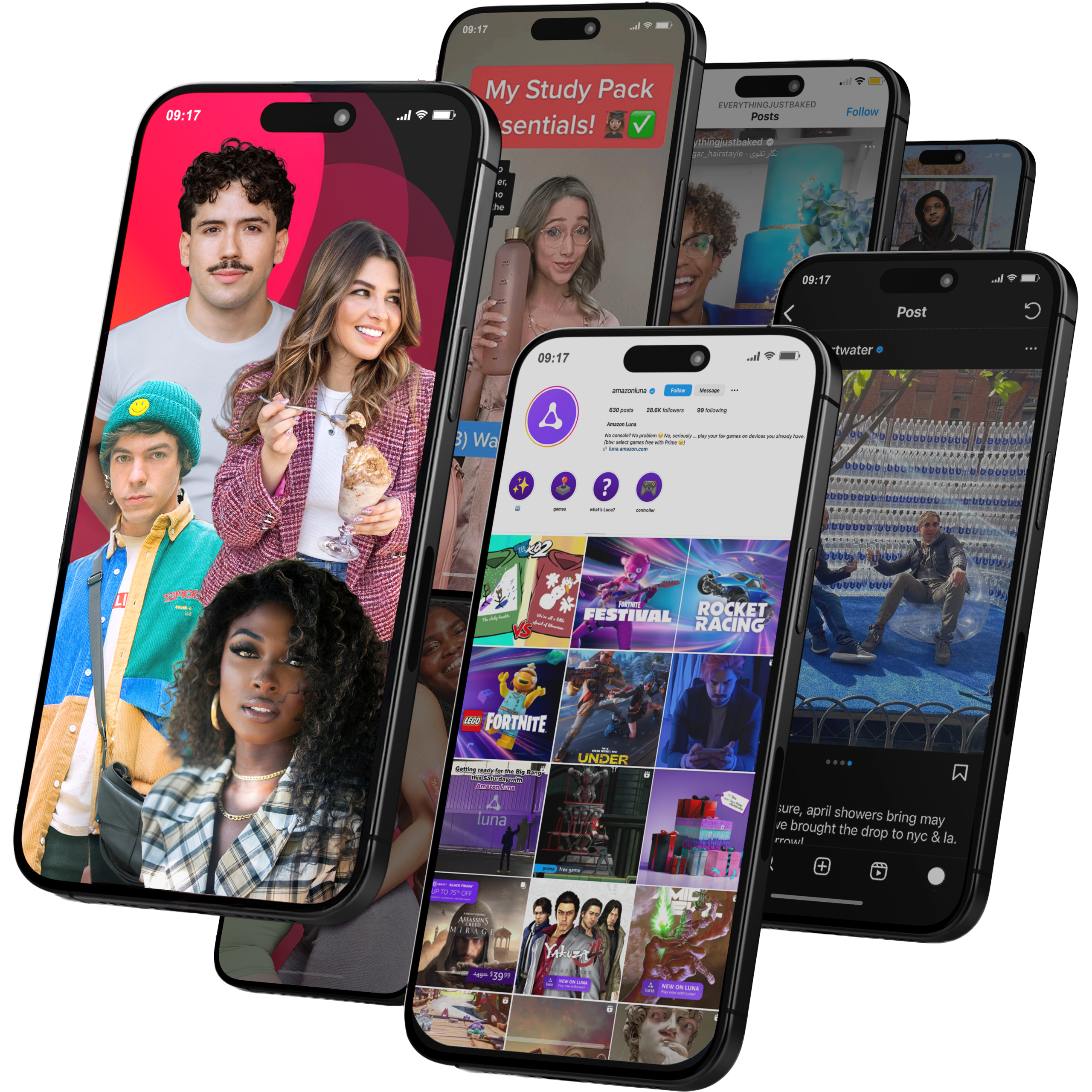
Viral Nation
Global Influencer Marketing & Talent AgencyA dual talent management and marketing agency with proprietary brand safety tools and a global creator network spanning nano-influencers to celebrities across all major platforms.Clients: Meta, Activision Blizzard, Energizer, Aston Martin, WalmartVisit Viral Nation → -
5
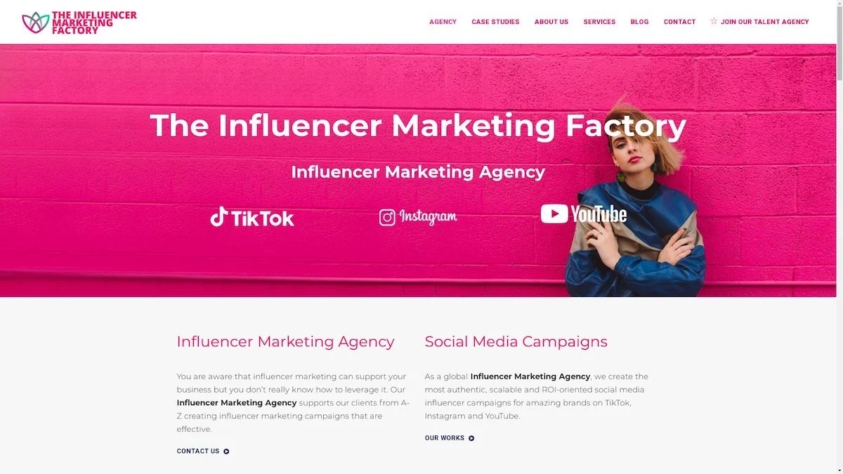
The Influencer Marketing Factory
TikTok, Instagram & YouTube CampaignsA full-service agency with strong TikTok expertise, offering end-to-end campaign management from influencer discovery through performance reporting with a focus on platform-native content.Clients: Google, Snapchat, Universal Music, Bumble, YelpVisit TIMF → -
6

NeoReach
Enterprise Analytics & Influencer CampaignsAn enterprise-focused agency combining managed campaigns with a powerful self-service data platform for influencer search, audience analytics, and attribution modeling.Clients: Amazon, Airbnb, Netflix, Honda, The New York TimesVisit NeoReach → -
7

Ubiquitous
Creator-First Marketing PlatformA tech-driven platform combining self-service tools with managed campaign options, emphasizing speed and scalability for brands managing multiple influencer relationships.Clients: Lyft, Disney, Target, American Eagle, NetflixVisit Ubiquitous → -
8

Obviously
Scalable Enterprise Influencer CampaignsA tech-enabled agency built for high-volume campaigns, coordinating hundreds of creators simultaneously with end-to-end logistics, content rights management, and product seeding.Clients: Google, Ulta Beauty, Converse, AmazonVisit Obviously →